Seven Questions Over Breakfast with John Hendrix
 Tuesday, April 24th, 2012
 I’ve written about author/illustrator John Hendrix previously at 7-Imp. Today, though, he’s joining me at the breakfast table, his breakfast-of-choice being only “about five gallons of coffee.” (I can go for that. I’m sturdy with my coffee intake. I feel confident I can handle it.)
And I believe I’ve previously used the word “galvanic” when describing his art.
Well, it is. Have you seen his artwork?
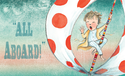
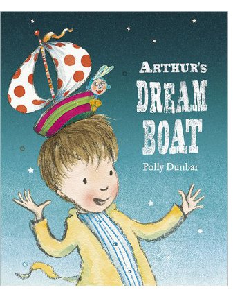
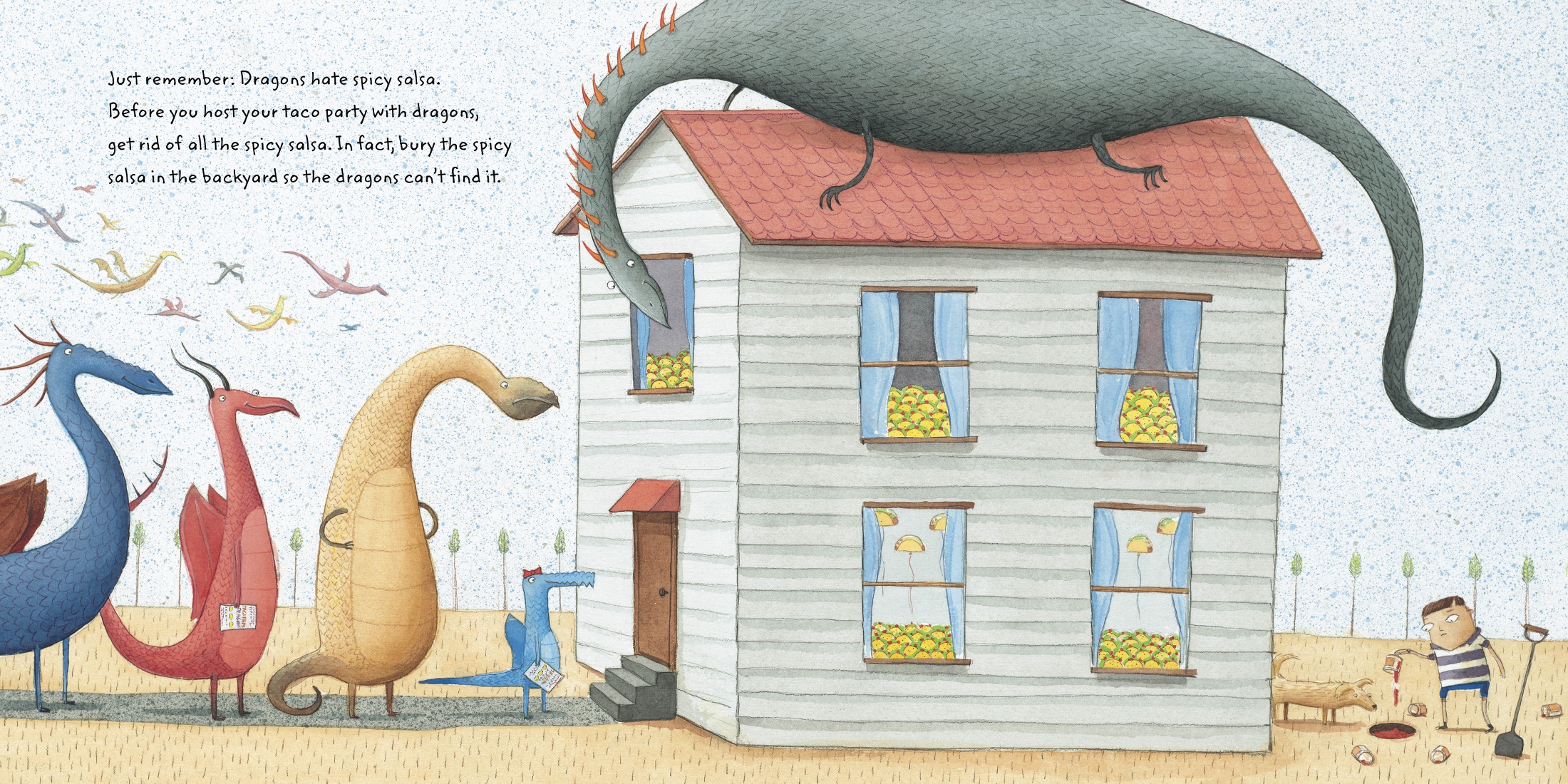
His sweeping spreads are indicative of an artist who started out in editorial illustration — with spreads, Kirkus once wrote, that “combine the iconic and the realistic to compress the visual storytelling into one heightened image.” Or “larger-than-life,” if you’re School Library Journal. And it’s true: John knows how to get your attention, as you can see below in the mixed-media illustrations featured today. There’s an edgy, sometimes darker side to his art, too, that makes you look twice. (And, I must mention, he often hand-draws his text, as you can see in some examples below.)
Most recently, John has brought readers the illustrations for Deborah Hopkinson’s A Boy Called Dickens. That was published by Schwartz & Wade in January, and back then I invited John over for a breakfast chat. I may just now be getting to it, but better late than never. He shares art and early sketches below from Hopkinson’s book, as well his other three previously illustrated titles and other art from here and from there.
So, let’s get right to it, and I thank him for visiting. Read the rest of this entry �
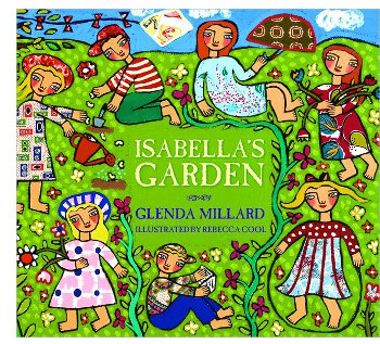
 Kirkus calls her newest,
 This morning over at Kirkus, I suggest some good picture books for Earth Day — new titles, that is.
 This morning over at Kirkus, I’ve got a short Q & A up with author, historian, and critic
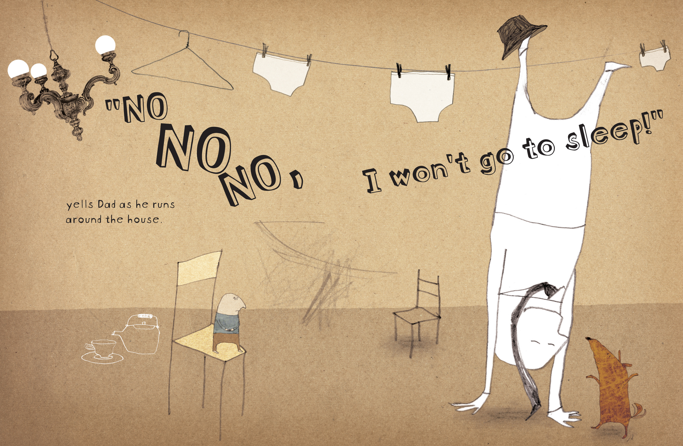
 And that’s for several reasons: 1) I’m sleepy right now but really want to yawp about what a good book this is; 2) what a good book this is!; and 3) Betsy … well, shoot, y’all. She is such a detailed and thoughtful reviewer. (And her INTROS! The intros to her reviews, I always note, are so well-penned. That’s an art and a science right there, nailing an intro and snagging the reader. But I digress.) Once I read her review, I thought, hmmm…what she said. So, I’m going to just shoo you on over to her review — after you take in these spreads, that is.
  —which earned her a
 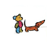 “They are best friends.” Dog and Bear appeared in 2007—winning many honors, including the
 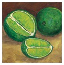 Laura’s newest title,
 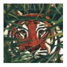 But the reader who settles down and slowly pages through its gorgeous acrylic paintings or, better yet, reads it aloud to a young child, will find rich rewards.” In this one, Laura explores the color green, and I boldly say that you really must get a copy of this in your very own hands and read for yourself. Laura also says a bit more about it below.
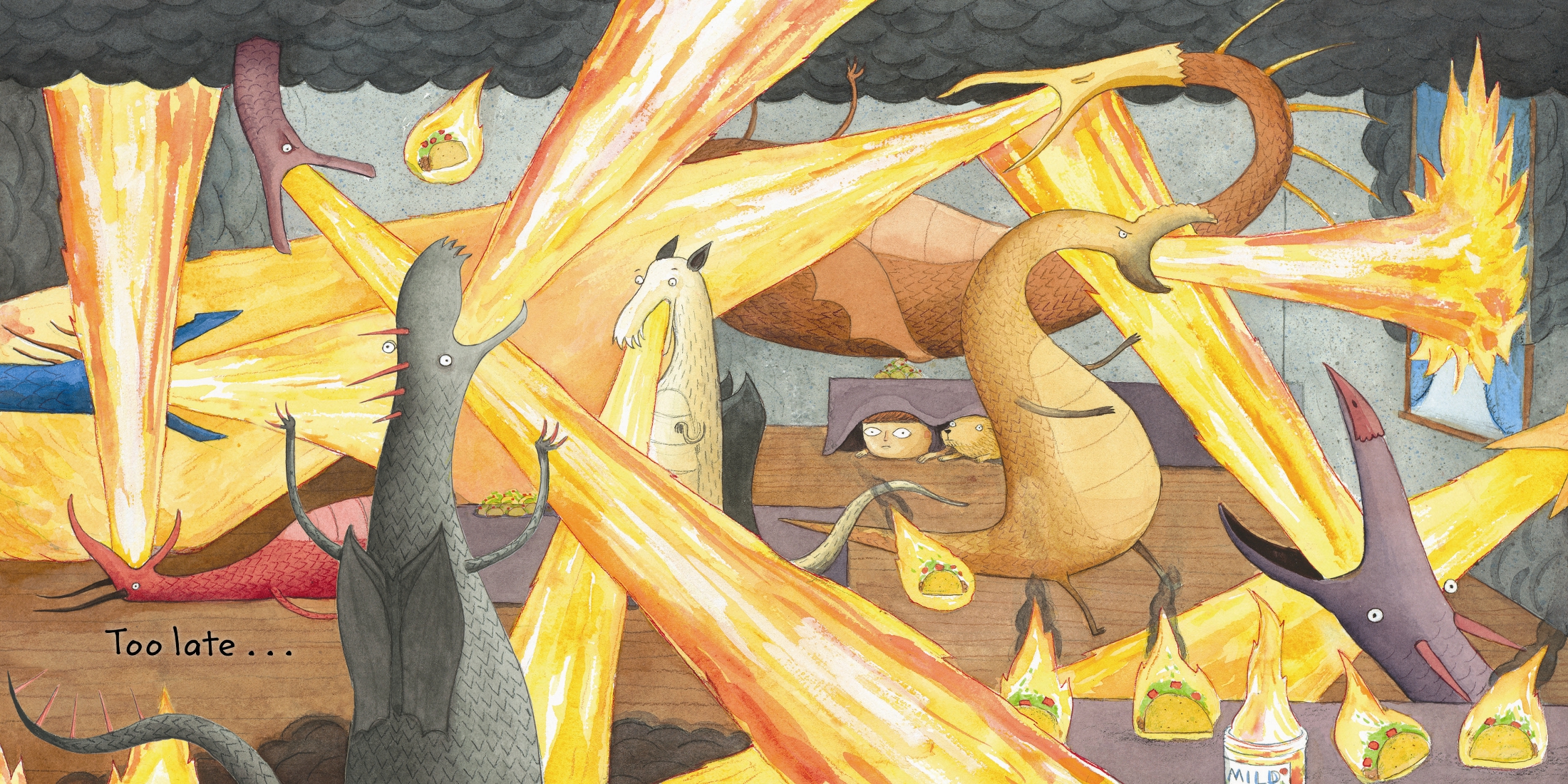
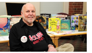 Last week, I conducted a short Q & A over at Kirkus with Children’s Poet Laureate J. Patrick Lewis, pictured left at a school visit. The brief interview is