Fieldnote #1 by Steven Withrow —
Susan M. Sherman: Connecting
Backwards and Forwards
 December 15th, 2009 by Steven Withrow
{Quick Note from Jules Here and I Mean Quick Because I Don’t Intend to Run My Mouth Before Each of Steven’s Interviews: For those 7-Imp readers who missed this recent announcement, writer and researcher and teacher and editor and producer/film-maker and poet (whew again) Steven Withrow will be contributing one interview every month to 7-Imp. He’ll be featuring a children’s publishing professional, or an expert from a related area, who is not primarily known as an author or illustrator—a publisher, editor, agent, art director, designer, critic, scholar, professor, librarian, bookseller, printer, marketer, museum curator, etc. (Suggestions are always welcome, he says.) I’m delighted. I think we’re all going to learn a lot, and all I had to do was format this interview! Yup, it’s all Steven. And I really enjoyed reading it. I’ll see you all soon. Until then, here’s Steven, and I thank both him and Susan for the visit…}
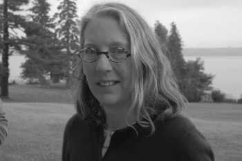 Welcome, Susan Sherman, to 7-Imp. Susan has been designing children’s books since 1977. Currently, she is art director at Charlesbridge Publishing in Watertown, Massachusetts. Over the years, she has been art director of children’s trade books at Houghton Mifflin and creative director at Little, Brown and Company. She also has her own graphic design business, Ars Agassiz.
Susan has taught at the Radcliffe Publishing Program, been a member of the Rhode Island School of Design’s Illustration Department Thesis Review committee, and has given workshops on children’s book illustration at the Maine College of Art and the University of Southern Maine.
She has worked with some of the most well-known illustrators and authors in the field, including Felicia Bond, Margot Apple, Jane Dyer, Michael Emberley, Lois Lowry, Barry Moser, Ed Young, Jane Yolen, David Macaulay, Allen Say, Salley Mavor, and Chris Van Allsburg.
She received a bachelor of fine arts from RISD in 1974 and a master of liberal arts degree in archaeology from Harvard University in 2002.
[Note: A small portion of this interview was published in Illustrating Children’s Picture Books by Steven Withrow and Lesley Breen Withrow.]
Award-Winning Books Designed by Susan
(all published by Houghton Mifflin)
- 1986 Caldecott Medal: The Polar Express by Chris Van Allsburg
- 1991 Caldecott Medal: Black and White by David Macaulay
- 1989 Caldecott Honor: The Boy of the Three-Year Nap by Diane Snyder and Allen Say
- 1990 Caldecott Honor: Bill Peet: An Autobiography by Bill Peet
- 1990 Newbery Medal: Number the Stars by Lois Lowry
- 1984 Newbery Honor: The Sign of the Beaver by Elizabeth George Speare
Withrow: Tell us a little about your childhood.
Sherman: My dad was in the Navy, and so we moved all the time. I was born in California and my brother in South Carolina. We bounced back and forth from coast to coast for a while, but since I was about five, we kept to the East Coast. I was always the new kid, and while I can’t remember the names of most of my schools, I could walk into each town’s library and show you where my favorite books lived. My mom says I was reading on my own well before kindergarten.
In first grade I had already developed a style of drawing and was incensed that my teacher wanted us to color in a certain way. My grandmother taught me fancy needlework. Our home life was rather formal and old-fashioned, but somehow or other my brother and I developed a high level of silliness that made the formality work. My mom read aloud to my brother and me every night until we were into our teens. What I remember most now were some nonfiction books: Kon-Tiki and Peter Freuchen’s Book of the Eskimos. My dad had worked with Jacques Cousteau, so he was a favorite, too.
Withrow: Where does your interest in archaeology come from? And how does it connect with your career in art/design/literature?
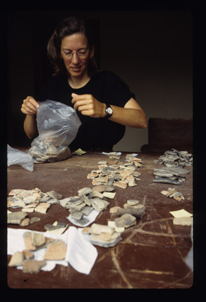 Sherman (pictured here is Susan in archaeologist mode, sorting sherds in the laboratory at Copan, Honduras): Well, I’ve always been a bit of a dilettante, and so tend towards enthusiasms in a variety of subjects that always involve a lot of reading. All through grade school, an underlying passion was Africa. I read everything I could about animals, stories, accounts of explorers old and new, which of course led me to read everything I could about the great paleo-anthropology discoveries. The first movie I went to alone (age 11) was a documentary at the public library about the !Kung people who live in the Kalahari Desert. Between high school and college I made a special trip to see a reproduction of the Zinjanthropus skull on display at the Smithsonian.
I wanted to be a biologist, but as happens to a lot of visual people, there’s a point when you become so intimidated by math that you give up on a career in science. I had a great math teacher my last year of high school, and from him I learned what a great teacher can do. What I was always good at was art, and so I ended up going to Rhode Island School of Design. RISD had just hired an anthropologist to teach the art history of other cultures, Dr. Ned Dwyer. I took every course he offered. I found the synergies between places and peoples exciting.
After college, I taught school, sold art supplies, and eventually ended up in publishing, where all my different skills suddenly came together to make sense. It wasn’t until years later, on a vacation to Mexico, that I started reading a lot about Mayan art and iconography. When I got home, I managed to wiggle into the anthropology library at Harvard, and the next thing I knew I was halfway through a master’s degree. I’d save up vacation days and go on digs or work in the laboratories in the Mexico City University.
Working on a degree sharpened my mind, taught me to think in a more organized way, and honed my research skills. My best friend called it “horizontal diversification,” but really, archaeology is just older art history. Art history is the foundation that I build on to be an art director. The future comes out of the past: If you know what’s gone before, you can help an artist connect backwards and forwards so that they can find their way towards what makes their work resonate. We’ve done two books on archaeology at Charlesbridge, and it’s been great to help them be solid academically as well as great reads.
Withrow: What is the art director’s role in children’s book publishing, especially in terms of picture books? How closely do you work with artists, editors, and designers?
Sherman: The art director and the editor discuss the book, the author’s intent, the age level, and the audience and think about art styles together as they choose the artist to do the book. After reading the manuscript and having initial discussions about the book (much of this happens organically during the acquisition process), I present several portfolios to the editor for discussion. In the best of all possible worlds, the art director is also the designer of the book (I’ll use the two titles interchangeably here). That allows a nice continuity for the book by avoiding the “too many cooks” syndrome in the design, art direction, and final production aspects of the book-making.
Some artists want to have input on the design, trim, page grid, and typeface selections. The designer is usually the prime contact the artist has with the publishing house through telephone calls, email, and in-person meetings, as the book is planned and executed. Depending on the artist, the art director/designer will adjust their way of working to accommodate the artist. It’s this kind of variety that makes each book so interesting to work on. Every project is a new book, but also a new relationship to develop.
The designer then creates a “getting started” package for the artist that includes typefaces; page and jacket layouts; and any production instructions, such as electronic art requirements and ideas for art preparation papers and paints. Since I used to work in art supply stores, I have a lot of material information for artists and can sometimes help them solve technical problems by recommending paints, papers, or computer techniques. I also explain what it is about that artist’s work that makes them the right person for the job–be it palette, design, characters, whatever aspects of their art that seemed right for the book.
The artist then sends in sketches, sometimes for the whole book at once, sometimes character sketches and ideas, before embarking on an entire dummy. These mostly come by email these days. Sketches are put into the page layout mechanicals and reviewed by editor and art director–at many companies, also by representatives from marketing. There is a dialogue with the artist that usually results in some revisions. The dialogue ranges from reminders to leave room for type, to more conceptual discussions about pacing and content, to specifics about consistency of color in a character’s shirt, etc. This is when the diplomatic abilities of the art director are extremely important. It’s important to explain what’s working as well as what isn’t and let the artist solve the problem.
Withrow: What are some of the essential qualities you look for in a successful picture-book submission? Also, what qualities do you look for in an artist’s portfolio?
Sherman: First, I’m looking for someone who has basic technical facility. They need to be able to draw—they don’t have to be a Rembrandt—but every illustrator/artist has to be able to create a competent world, peopled with appealing characters. Most stories are modern-day stories about “real” kids. Despite the popularity of fantasy, it isn’t the most common genre and tends to be for older readers.
Second, the pictures have to tell stories; they need to be intriguing and interesting to look at.
That leads me to the third, but perhaps most important point, which is that I am looking for an artist with a brain. The artist will be reading a stack of plain, typed pages or an email, and as they read, ideas and images need to be forming in their heads. I am always looking for someone who can go beyond the obvious to create illustrations that extend the messages the author has written. The best illustrations surprise and delight with what they’ve brought to the whole.
Withrow: What additional advice would you give to an aspiring or new picture-book writer or illustrator?
Sherman: Hard not to be too negative here, as there are so few who actually make books their primary income. Keep a day job until you are really established! Think of it as “horizontal diversification.”
An illustrator who doesn’t write is faced with a difficult problem: If they do too many books a year, they can flood the market with their work, and if they do too few, they starve. I recommend erring on the “too many” side, though, and to keep ’em coming. I have seen a few folks become forgotten when they didn’t produce enough.
A website/blog presence is essential these days. It needs to be fast-loading and needs to have new work up a few times a year. DO put a photo of yourself–and bio information. School visits are a great way to self-promote.
I love postcards in the mail; they are quick to look at, and I can tell if I want to see more easily. Two or three mailings a year are enough to keep yourself in the forefront of an art director’s mind.
Withrow: Could you describe the design process for Chris Van Allsburg’s The Polar Express?
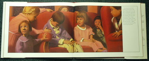
Sherman: I see, as I describe my work, that there tends to be so much synergy between the parts that it is hard to find a crisp beginning for each story. This one starts during my last year at RISD when Chris Van Allsburg was a grad student, and he shared a studio with a guy I was dating. I didn’t know Chris well, but it gave us a starting place to connect when we began working together five years later. But there is another RISD connection, as the art director for Chris’s first two books (The Garden of Abdul Gasazi and Jumanji) was Carol Goldenberg, who was a year ahead of me at RISD. I reconnected with her when I began working at Little, Brown and replaced her at Houghton Mifflin when she and her husband had moved to New York City. Luckily, Houghton had just acquired Clarion, so she became their art director.
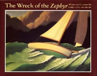 The Polar Express was Chris Van Allsburg’s second color book. For the first, The Wreck of the Zephyr, Chris used pastels, but the drawings were too fragile to ship, so they had to be photographed in his studio. We color-separated from large-format transparencies–no digital in those days. The nuances of the color reproduction and paper were tricky, especially since we were reproducing from photographs, not the real art. When Chris did the art for Polar, he didn’t want to have to have the in-between photographic stage, so he worked in oil pastels on Canson color papers. Chris was so delighted with how robust they were. “You could run them under water,” he told us; though, of course, we didn’t!
We had the art test-separated by several printers and chose the one who gave us the best reproduction proofs. It was printed on lots of small sheets so that the color could be more controlled. I had the text typeset by a small letterpress company to get the best quality letter and word spacing possible. We had it bound Smythe-sewn so that it would lie flat, and it was sewn with a special dark thread so that the stitching in the gutter between signatures wouldn’t be obtrusive. But printing the book was a nightmare. The printer, who had given us such good reproductions, couldn’t give us consistent enough quality for follow-up printings. And there were lots of printings. Chris remained very involved in each reprint, and we all studied each printing to see what worked and what didn’t.
It took a couple of years to figure out how many we needed to print so that we wouldn’t run out of stock; we could never quite believe how well it sold each year. Around the time we were printing the millionth copy, we had a big meeting and went over each printing, discussing which page four was the best, etc. It is that kind of attention to detail that underlies great books.
Withrow: How about for David Macaulay’s Black and White?
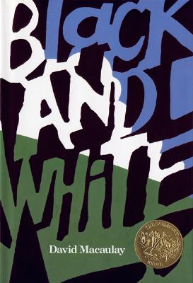 Sherman: David Macaulay had always done wonderfully funny books in between the “building” books; at that time they were The Motel of the Mysteries, Help! Let Me Out!, Baaa, and Why the Chicken Crossed the Road. But they were never great sellers, and by the time I got to Houghton, Motel was even out of print–despite great reviews. Black and White seemed way too intellectual, even though it was a fabulously fun story with wonderful art. I was excited by the design challenges–we needed four different typefaces, one for each story.
By then, Houghton had begun to invest in computers. To me, the advantages were immediate, and Black and White was the first book I typeset on the computer. It meant that David and I could try out different fonts and see how they worked together. We wanted each to reflect the feeling of its own story, and they also had to look good together while being different enough from one another so that you could tell the stories apart. Typesetting on the computer gives me complete control over typesetting. It meant no more hand-lettering type samples on tracing paper to see what something looked like. Later, I learned to digitize my own fonts; now there are many superb digital foundries coming up with great designs every day. The computer has been a change as revolutionary as Gutenberg’s press.
Withrow: Could you talk about one of your more recent book design/art direction projects for Charlesbridge?
Sherman: Every book that comes in to a publisher gets asked the same question of it: Is there anything that I can do to make this a better book? Usually, the author and the editor have been working on this for a while before it comes to art. An editor can help an author with everything from spelling to plot to motivation. The art director/designer does the same. As I mentioned earlier, help can be in the form of technical advice about paper, paints, or colors; it can be advice about drawing; details of place, research, or character; or how to improve pacing or drama. The art director/designer also works to create a physical space for the story–suggesting typefaces, trim sizes, and binding styles, as well as prepping the book for the printer.
Every book has its challenges; some need more help than others. Part of my review of the sketches and art is to see what those challenges are and what I can do–if anything–to make it better.
Some recent examples:
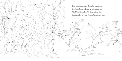
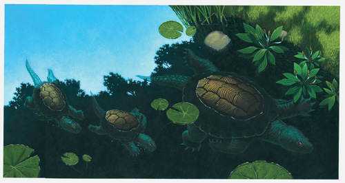
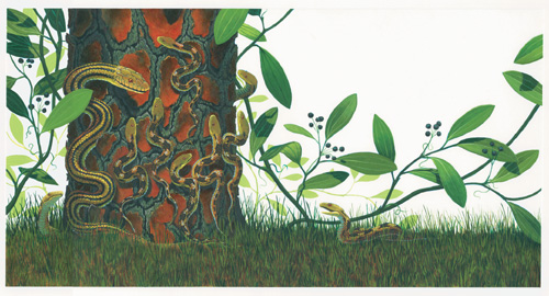
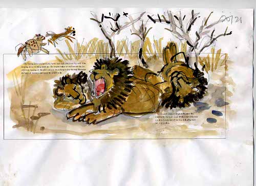
The last book I worked on with Brian Lies—Deep in the Swamp, written by Donna M. Bateman—needed almost nothing. Brian’s sketches were perfect: he’d done his research, the compositions were wonderful, and the drawing superb. Everyone liked the fonts and the trim I chose. Our only tiny challenge was that the first jacket sketch was a bit too anthropomorphic, but in Brian’s second sketch, he got the balance between realism and anthropomorphism just right.
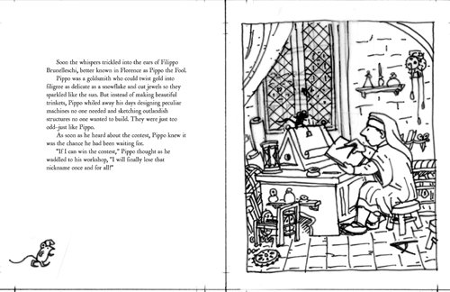
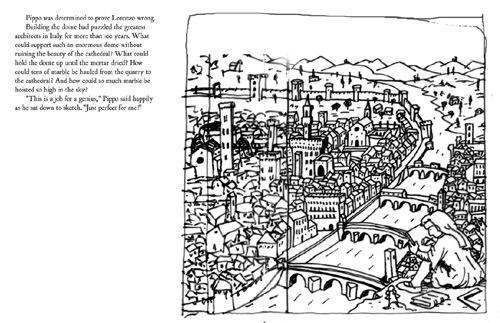
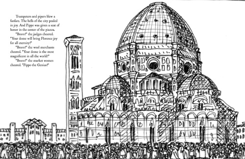
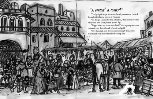
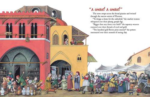
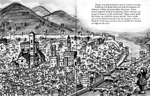
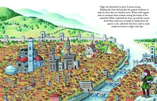
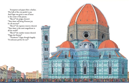
Another recent book is Pippo the Fool, written by Tracey E. Fern and illustrated by Pau Estrada. It’s gotten a couple of starred reviews and a great quote from David Macaulay. More connections: Pau did his graduate work at RISD and did his first and several additional books for me when I was at Houghton, and we’ve always kept in touch, even when I didn’t have a book for him. In 2001, when I visited him in his hometown of Barcelona, Spain, he showed me his sketchbooks, and I realized his ability to draw places was wonderful–well, he had studied with David Macaulay–so I asked him to do a book about Picasso and then Pippo, which is about Italian Renaissance architect and engineer Filippo Brunelleschi. Pau loves research, and his first thumbnails were good, and his first sketches were great. As you can see, they have nice borders; it had a lovely storybook look. But as I was laying them out, I was thinking, “It’s very nice, but a little quiet. At least, the last triumphant picture could be a big spread.” I mocked up the final spread to show Pau what it could be like, and it totally inspired him. The next set of sketches was all bleeds, so much more energetic, and the final art is wonderful.
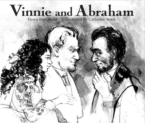
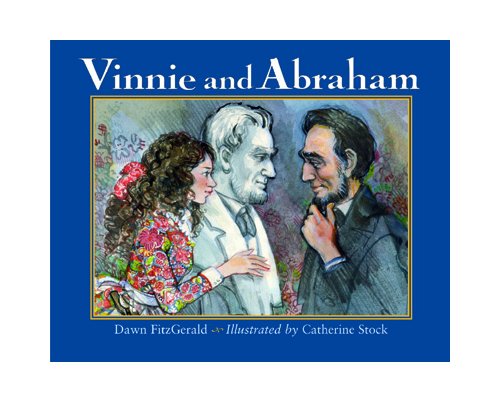
Lastly, illustrator Catherine Stock came to Charlesbridge to do the color corrections for Vinnie and Abraham, written by Dawn FitzGerald. There was one scene we found out had taken place in the summer, and Catherine had painted it in winter. Catherine is one of those artists who’d rather repaint a final than re-sketch; by the same token, her sketches tend to be marvelously like paintings.
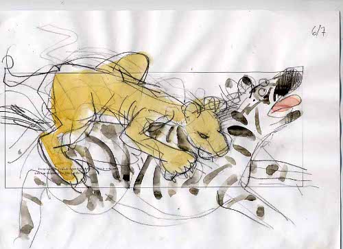
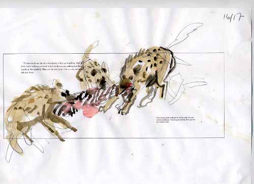
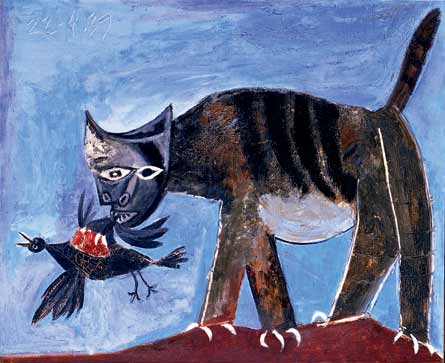
For her latest book for Charlesbridge, After the Kill, written by Darrin Lunde (probable publication date: Fall 2010), the sketches are close to publishable. The sketches came with this note:
Hi Sue,
After sweating a bit about how I was going to illustrate this book, I stumbled across this postcard of a cat catching a bird by Picasso, and it was my “a-ha” moment.
The sketches are very rough, and the composition (positioning of type, etc.) hasn’t been thought through, but I wanted to get this down really fast so the book would have the required energy, tension, and drama in the pictures.
We think she succeeds.
Two years ago, when I complimented Catherine on the vivid colors she can get with watercolor, she said it was all thanks to these great paints she’d just discovered by a company called Schmincke. I got some, and wow, I still can’t paint as well as Catherine does, but I can now sometimes get the same colors. I raved about them at our company party to a watercolor artist we’d begun working with, Frank Dormer. He got some, and you can see the difference in his work if you compare his first book, Aggie and Ben, to his post-Schmincke work in Good Dog, Aggie. His latest book, Aggie the Brave, for which we have only just gotten proofs, has color that is even more jewel-like and brilliant.
What I love about my work as an art director and designer is the variety. Every book, even those in a series, is different. Each has a set of relationships one has to discover and learn. At the risk of sounding all nostalgic and twee, each book becomes a new passion. Of course, for some books the challenges are hard, or it takes so much time to come up with ideas that the author and artist think you’ve died. For others, one develops new ways of swearing before finding the solutions, but that’s–usually–only in an alternate universe.

One of my prize possessions is a sketch Susan did about a dream she had while staying over my house after an exhausting evening looking at artists’ portfolios at a Western Mass Illustrators’ Guild meeting. She’s a rare trouper, that lady, and so interesting to listen in as she talks to individual artists about their portfolios.
What a wonderful insightful interview. Thanks, Steven. And I love the term “horizontal diversification.” I have been doing that for years, just never had a name for it before!
Jane
It really and truly takes a village to publish a book. I’m always intrigued to find the backstory of the neat people in the business.
wonderful post! Thanks!
I learned SO MUCH from this interview. I am planning on starting my own publishing company someday and this post is giving me wonderful and exciting things to think about.
Thank you, Susan and Steve. :o) I can’t wait till the next Fieldnote!
Thanks, you all, and thanks to Steven and Susan for the interview!
Tarie, can’t wait till that publishing dream of yours comes true…
Thanks for reading, everyone! My next post will go up at some point in January — taking a little longer due to the holidays. Happy New Year!
What a fabulous and newsy interview. Thank you Steve and Sue. Happy New Year
Oooch! Feel like I’ve been caught with my pants down! But seriously, Sue is right. I am having trouble repeating the spontaneous energy of the sketches in the finished art…
Thank you Steven for interviewing a great artist and teacher. Growing up with the Vietnam war looming large in my background, Susan was one of a few significant persons in my life who taught me that life didn’t have to be a survival game. Since 1980, she’s shown me, step by step, like in your interview, to see beauty in all things around me, and that the arts restore life’s dignity in spite of war, poverty and injustice. Oh, she has a great sense of humor, too.
Thank you for this interview with Susan Sherman. I am going to my first ever SCBWI meeting in May and she is going to be one of the main speakers for illustrators. I am getting a special session with her as well, so it is really good to get so much background information about her in advance of that meeting.
Thank you for having such an indepth interview with Sherman. This helped me very much when I had a critique with Sherman at the Houston 2012 SCBWI conference. It helped me not ask redundant questions and got me to know and appreciate her more as a person. I’ve also mentioned this site and your name at the conference. Everyone interested in the work of Sherman (and Art Directors in general) will benefit from your interview. Again, thanks. 🙂
This was a positively enjoyable read. I dated Susan in high school and she left quite an impression on me. For one . . . she was a hard worker and endlessly creative. I think her elephant cover of the school literary magazine the Zephyr was best ever. Cheers! Bill