To Be Foiled After Breakfast
 November 22nd, 2010 by jules
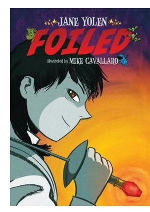
“{R}ocker turned colorist turned animator turned cartoonist” is how one of my guests this afternoon has been described. Illustrator Mike Cavallaro, pictured below, is visiting the 7-Imp cyber-salon, joining me for some impossibly strong coffee way after breakfast (believe me, I’m usually good for an afternoon cup), along with author Jane Yolen (who visited 7-Imp in ’08 for an extensive interview), to discuss Foiled, their YA graphic novel release from this year. (April, to be exact. Sometimes I’m just slow on the uptake. Or, okay, busy. I get busy. Anyway.)
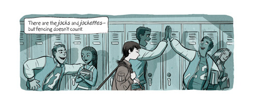
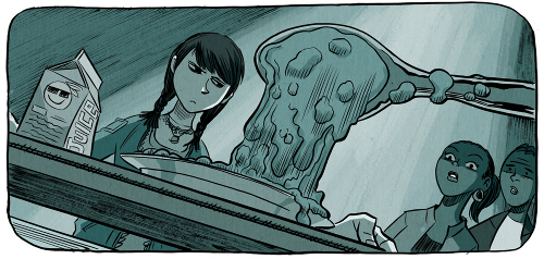
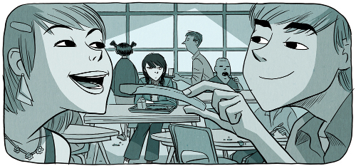
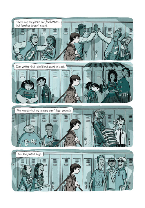
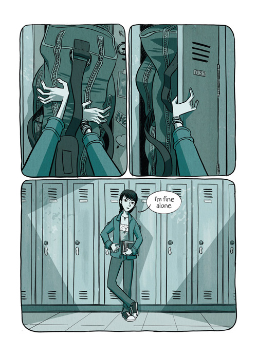
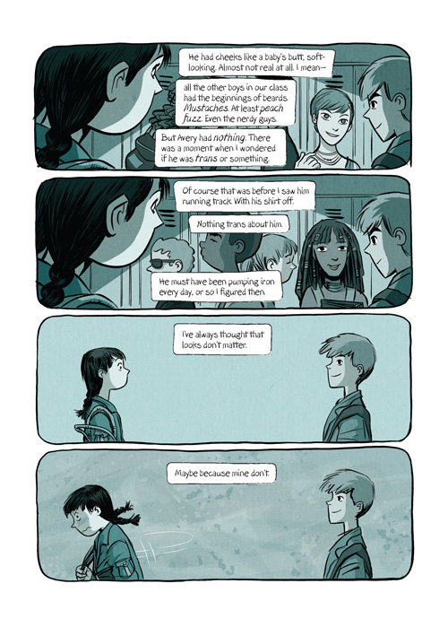
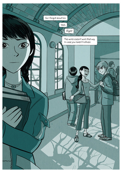
 Foiled, released by First Second Books, is an urban fantasy (described by Kirkus as “an absolute must-read” for fantasy lovers), which introduces us to the spunky Aliera, a New York City tenth-grader who is a talented fencer, not to mention color-blind, a bit of an outcast, and very much an introvert. When she’s not fencing, she’s playing role-playing games with her wheelchair-bound cousin. When the Lank-Thompson-esque new boy, Avery Castle, shows up at school—cute, charming, and quite the flirt—Aliera finds herself falling for him, despite her better judgment. Turns out Avery is interested in her, after all — or, really, her new (though used) ruby-handled foil. It’s on a planned date that leads her to Grand Central Station that the high fantasy begins (involving mysterious, unseen dimensions, some faeries, Cavallaro’s switch from two-toned illustrations to vibrant color, and much more), and Aliera learns that her world is more than what it appears to be on the surface — and that she has an important role in it all. As Publishers Weekly wrote, it’s a story of “romance, mystery, adventure, fantasy, and drama, all rolled into a strong narrative.”
 As mentioned, both Mike and Jane are here this morning to tell us, in their own words, about this title, so I’m going to hand the keyboard over to them, and I thank them for stopping by. Worth noting for fans of this title: Jane says that Mike is about to start working on the sequel, which she has already penned, titled Curses, Foiled Again.
Mike: Many years ago, I dropped out of art school, joined a band, and went touring around the States, plus a few other countries, in a van — for a period of a few years. Like other mistakes I’ve made, it seemed like a good idea at the time. I learned a few things from being in a band, like never pull $10,000 worth of equipment in a trailer you built yourself behind a van held together predominantly by duct tape. Another thing I learned was that if everyone’s playing the same notes at the same time, you’ve got a pretty boring song. Allowing each separate instrument to do what it does best amounts to a more satisfying whole than any one of them could have achieved alone.
Comics are exactly the same, especially when the project is collaborative, like our graphic novel Foiled. Supplying illustrations that simply strike the same notes as the text is the surest way to plunge the work into redundancy. Instead, text and art have to weave around each other like the rhythm and melody of a song to achieve together what neither could on their own.
Whether I’m working with a script by another creator, or on something of my own, it’s these opportunities to contribute rather than execute that I look for. It’s much like riffing or improvising off what a fellow musician is playing. You want to contribute new elements that broaden and deepen what’s already there.
Jane’s script for Foiled had Aliera’s internal monologue providing us with an open window into the main protagonist’s emotions and motivations. With that in mind, I used the other characters, the environments, and the mechanics of the comic itself to amplify and reflect Ali’s state of mind, being careful to keep her always at the center of things.
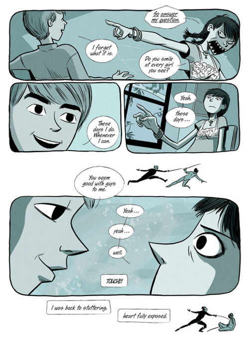
When the dialogue carries a tongue-tied interaction between Ali and Avery, the chapter title icons come to life between the panels themselves to dramatize the duel.
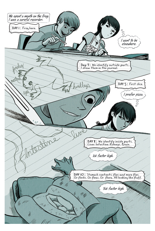
During the biology class scene, cutting, angular panel borders dissect the sequence as Avery gleefully dissects the frog. Ali’s note-taking frames the whole thing.
Lunch can be terrifying …
And sometimes the future seems to balance on a French fry.
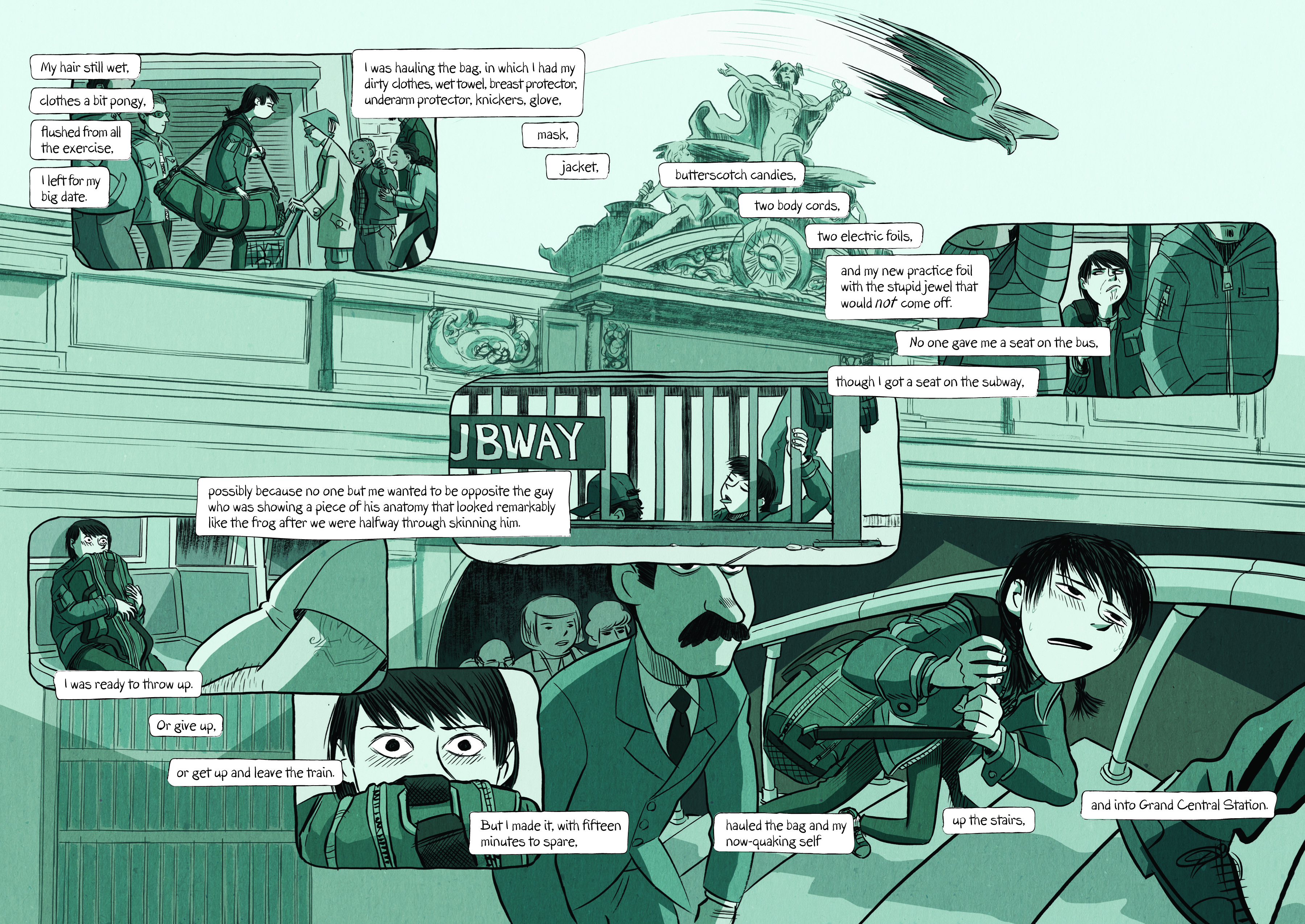
To dramate Ali’s commute home through the NYC public transportation system, I substituted subway map icons for traditional panel borders, sending readers backwards across the page in honor of Ali’s discomfort.
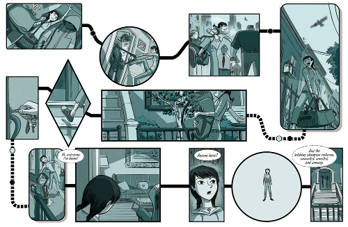
Lastly, let’s not forget color as an extremely powerful narrative device, as we see the tonal signifiers of the Seelie and Unseelie Courts, with a panel arrangement that reveals everyone’s focus of attention.

The hope is that all these elements are working together with a synergy that causes them to combine in the reader’s imagination so that they’re no longer conscious of “text-and-imagery” — and are simply taking in the story as seamlessly as possible.
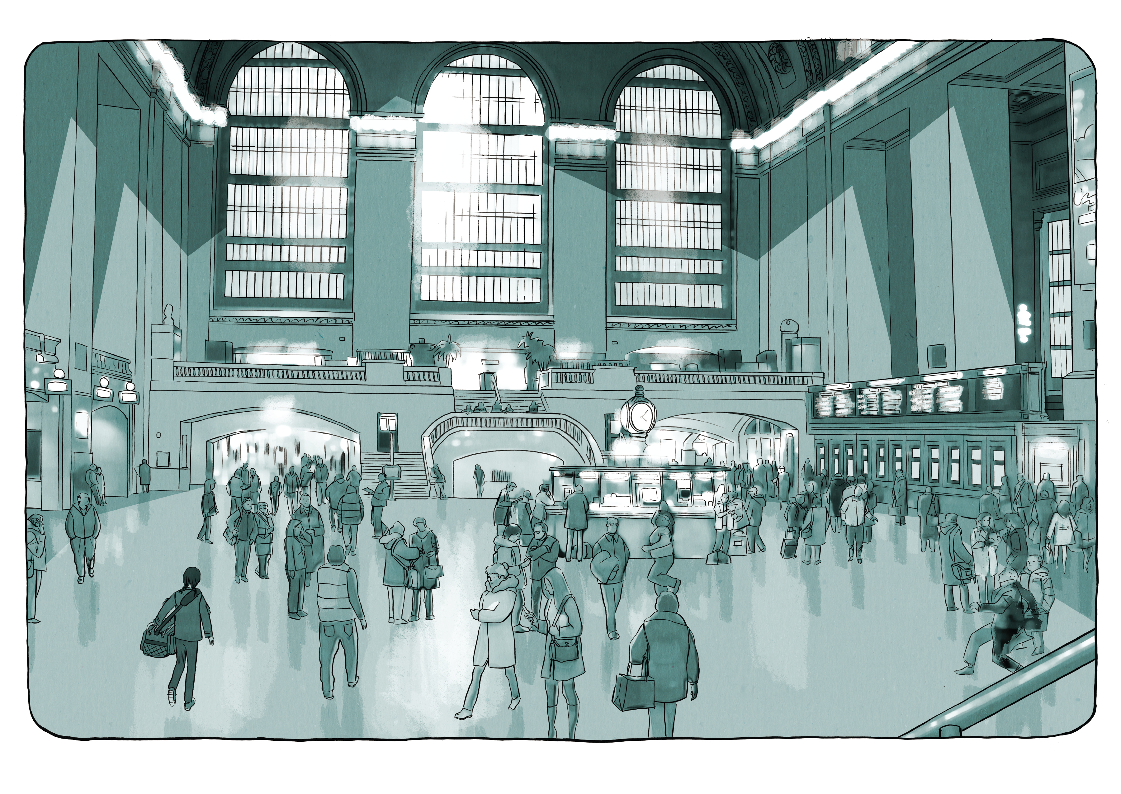
Jane: Foiled began when my eleven-year-old granddaughter, Maddison, became an avid fencer. I had promised a story for one of the Datlow/Windling anthologies and thought this was going to be that story. Not only was it based around Maddison’s winning ways as a fencer, it was also about my own days as a Smith College fencer when I lost my foil on a date in Grand Central Station. Yes, you heard that right. I lost my fencing foil on a date in Grand Central Station.
Why, I hear you wondering, was I on a date in GCS when I went to college in Massachusetts? Why was I carrying a foil to a date? Who was the date with?
Now, now! I am 71 years old. You can’t expect me to remember—or tell you—the details! Suffice to say, it was the late ‘50s. These things often happened then.
Actually, I have no idea why I had a weapon with me on a date, or why I was on a date in Grand Central, or with whom. But the connection between Grand Central and my lost foil is so strong, it has to be true memory. Or as true as anyone who has spent her working life lying as a vocation.
So, I started the short story, “Foiled,” for the anthology — with the idea that my young heroine, Aliera (named after one of my other set of grandkids’ best babysitter, because it was the perfect name), would meet the handsome new boy in school on a date at Grand Central. Because he is late, and because of an annoying bird that has gotten caught inside the station (this often occurs, you know), Aliera puts on her fencing mask. Suddenly she is able to see the world of the faerie, both the good fairies of the Seelie Court and the ogres and goblins and trolls, oh my!, of the Unseelie court, only she doesn’t know that at first.
Aliera is—unbeknownst to herself or her parents—the last defender of Faerie…
I thought, given my background writing picture books, novels, and screenplays, that doing a graphic novel would be a piece of cake: When Mark Siegel of First/Second and I shook hands over Foiled, even before he and my agent did historic battle over the terms of the contract, I thought: This is going to be fun. How hard can it be?
 The short answer was: It was very hard. The learning curve was huge. It turned out that all I really knew going in was how to write.
Here are the steps to writing I discovered:
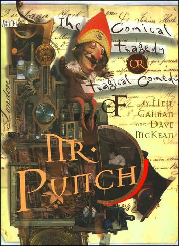
Step One: I wrote the script, using Neil Gaiman’s pattern for Mr. Punch. He kindly shared pages of his actual manuscript with me. Neil’s script was a fortuitous happen-
stance. Mr. Punch is one of Neil’s most personal stories, and it has a lot of text as well. It fit exactly with what I was trying to do with my story, though it was a lot darker than the story I was trying to tell.
His manuscript showed me how to set down my ideas so that the artist for Foiled—the marvelous Mike who had worked for many years in comics (though he still looks like a teenager!)—would understand where I was going with the book. All his white hairs are due to working on Foiled, I am afraid. Neil’s manuscript taught me how to indicate I wanted characters to talk in speech balloons or talk in thought balloons. Neil’s manuscript showed me how to indicate narration in text boxes or events occurring in sequential panels. Mike was often frustrated by my lack of understanding and wrote notes like this to the editor: “I’ve taken for granted that it’s ok to deviate from what I’ll call the ‘camera directions’ indicated in the script. … Regularly, the script assigns full-page illustrations to mundane moments while dramatic and/or action-oriented sequences are crammed into ten-panel pages. Some of these sequences should breathe more, while others don’t require the space that was given to them.” And, boy—was he right!
Step Two: I revised the manuscript seven times for my editor, this after having done thirteen revisions on my own. My editor, Tonya McKinnon, was tough, as tough as she could be. She insisted over and over that I had to think more graphically, seeing the story in my mind’s eye as it would be in panels. One notices huge, slow moments this way. In a regular novel, those slow movements get covered with words. Texture adds to the novel-reading experience. Where is your character walking, standing, sitting. What does your character walk on, stand on, sit on. What clothes she wears helps define her character. What food he eats and how quickly he eats it tells us a lot about him. But in a graphic novel, pictures do most of the texturizing. I don’t have to say, “She rode through a dark, tangled wood, which smelled like mushrooms on a dark night, or grave clothes rotting. The only spots of color were the tiny blood-red flowers clotting by the riverside.” The artist gets to show all that. However, I might say this in a sparer way to the artist in my panel directions. “The wood is dark, tangled. Blood-red flowers dot the riverside. Spooky. Think Tim Burton.”
Step Three: My script went to artist, Mike Cavallaro. His breezy yet specific illustrative style caught the tone of the story. It is high-schoolish, often funny, not the truly dark stuff of, say, a Holly Black book, but not particularly light, either. It is snarky. Snark runs true in the DNA of Yolen women. And except that I am Jewish and Mike is Italian, except that I am female and Mike is male, I’d have guessed that he got the Yolen snark gene, too!
Step Four: Mike read and re-read the script till he knew it better than I did. He made character sketches. We all talked about them—the editor, the art director, Mark, and me. I sometimes think that in working on a graphic novel—since it is so collaborative—the talking phases are the most important initial step! I commented on the monsters, the faeries, the main characters. The book is set in a very real New York City. I was born and brought up there so know it well, and Mike lives there now, so we didn’t have to talk much about setting. Though, as a sidebar, I must admit that in the next book, when a big section takes place in the Trollholm (which is under the subway system, in case you didn’t know that), we may need to discuss setting a bit more. And Mike talked to the art director, the editor, and me about pacing, and about some big holes he saw in plot. So, back I went and re-wrote. Again.
Step Five: Worried that some of Mike’s sketches of Aliera getting into her fencing gear were not accurate, my daughter Heidi took photos of Maddison getting in and out of her gear, labeled all of it, and sent them to Mike. Maddison was to say later, looking at one of his finished pictures, “Hey—that’s my butt!”
Step Six: What followed was weeks and weeks of back and forth. Mike would post sketches to a password-protected area on his website for all of us to review. Sometimes I had to adjust how I had been seeing something in my head, because he showed me a better way. Sometimes I had to remind him of things—like, Aliera was color-blind until the incident with the mask in Grand Central Station, so everything needed to be in shades of gray until then. Or I had to ask my daughter and granddaughter to check the fencing school stuff or the high school stuff and how a high schooler would say something differently than an almost 70 year old! And in each case Mike improved brilliantly on what I wrote.
Photo of Mike Cavallaro used with permission of First Second Books. Photo © Seth Kushner.
FOILED. Text copyright © 2010 Jane Yolen. Illustrations copyright © 2010 Mike Cavallaro. Published by First Second Books, New York. All spreads used with permission of Mike Cavallaro and First Second Books.

I loved reading this book, so thanks for letting me in on how it was made!
Fencing is certainly a more adventurous and least written on sport for young literature and I appreciate the uniqueness of it. As fas as checking with young people for what’s up at school, have you heard of the book “Alex Opalstone and the Window of Heaven’s View: Life 101?” I read the free chapters preview and couldn’t stop reading. It’s not very often you read about a girl who helps out other kids in school against poverty and bullying and has a hobby of imagining how God blesses us. Have you heard of it? If not, I highly recommend the free chapters preview. I’m excited for when the book is finally published.
Thanks, Jules–always an honor to be on this page.
Jane
I loved reading this about Jane and Mike’s work. My son loves graphic novels, and this will be a wonderful book to buy for him. Great story and interview, Julie!
This was fabulous! Thank you so much for giving an inside look at graphic novel – I esp enjoyed Jane’s perspective as a writer and how she trained herself to think more graphically. What a wonderful experience and opportunity for both her and Mike.
[…] 7 Impossible Things Before Breakfast- This time I read about a graphic novel Foiled. I am not into graphic novels. I believe it is the new generation that has this craze, but I think it is excellent to have. The kids I watched this summer read this like crazy. They don’t take long to read, they have pictures, and they are exciting. What more is there to like? Share this:TwitterFacebookLike this:LikeBe the first to like this. […]