Seven Questions Over Breakfast with Adam Gustavson
 March 27th, 2012 by jules
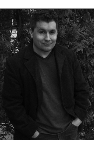 Illustrator Adam Gustavson is visiting for breakfast this morning. It may be a cyber-breakfast and we may not actually be face-to-face over the breakfast table with either the coffee or wine mentioned in my 7-Imp interviews, but he tells me he “answered these questions over a few cups of coffee, actually, whereupon I proofread it all over a glass of red wine. I think we’ve had the full experience here.”
Adam states at his site that at first, he was going to be a cowboy. I’m glad he turned to children’s book illustration instead, though I do believe in the power of his two-pint ten-gallon hat of childhood. As you can see below, Adam’s had a relatively long and prolific career in illustrating children’s books, and he also teaches. His teaching is something he also discusses below. (Can I just say that I’d like to clone him as an interviewee? I really enjoyed formatting this interview and appreciate how detailed he is in his responses, as well as the thought he put into answering the questions.)
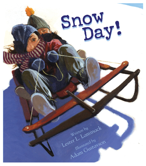
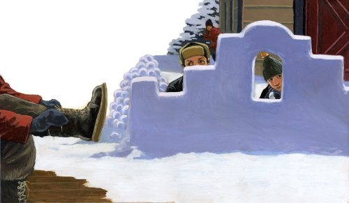
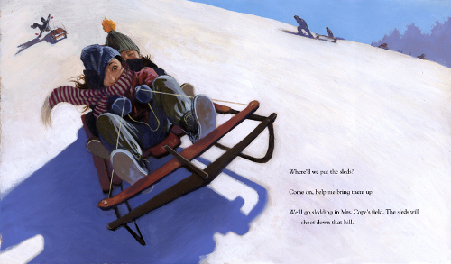
Adam works in oils, rendering lush, detailed illustrations with rich colors. He often plays with perspective and captures many a text’s atmosphere with precision and spot-on pacing. “Gustavson creates a festive mood with his oil illustrations, so luxurious and ample they feel like bundles of winter clothing, topped with bright scarves,” wrote Kirkus about his illustrations for Lester Laminack’s Snow Day (Peachtree Publishers, 2010).
Looks like he and I are eating well this morning. “When I can, I’m a bagel-with-cream-cheese-and-lox breakfaster,” he tells me. “If I’m planning ahead, I make my own lox using my Finnish grandmother’s time-tested technique.”
Sounds good to me. I’ll set the table while I get the basics before our seven questions over breakfast. I thank Adam for stopping by.
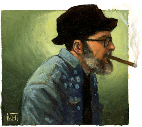
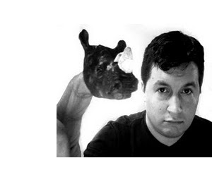 Jules: Are you an illustrator or author/illustrator?
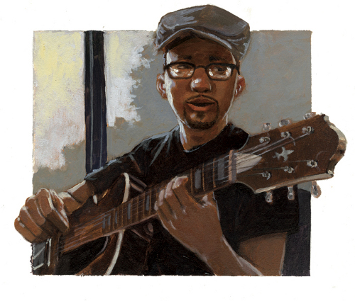
Adam (pictured right): Published illustrator. As an author, I won’t deny delusions of grandeur. We Gustavsons delight in making up absurd characters.
Jules: Can you list your books-to-date?
Adam: Let’s see…
- Good Luck, Mrs. K! by Louise Borden. Simon and Schuster.
- The Day Eddie Met the Author by Louise Borden. Simon and Schuster.
- Bad Dog Dodger by Barbara Abercrombie. Simon and Schuster.
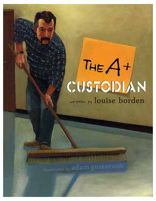
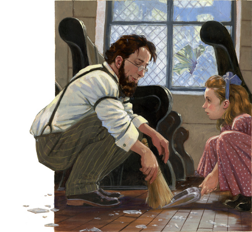
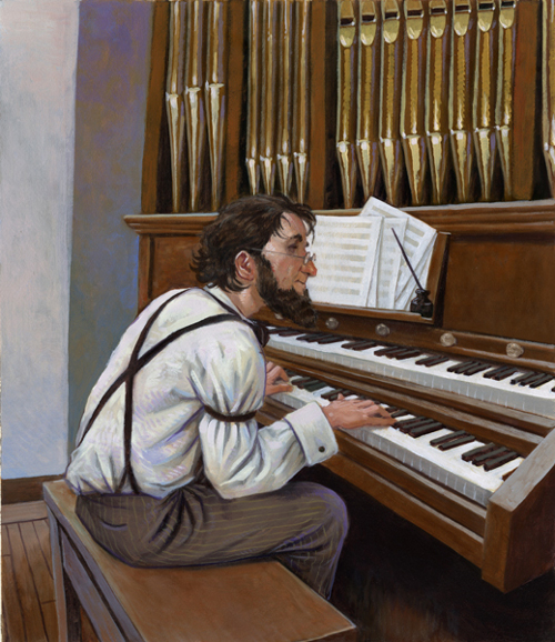
- The A+ Custodian by Louise Borden. Simon and Schuster.
- The Last Day of School by Louise Borden. Simon and Schuster.
- The John Hancock Club by Louise Borden. Simon and Schuster.
- The Lost and Found Tooth by Louise Borden. Simon and Schuster.
- Where the Big Fish Are by Jonathan London. Candlewick.
- Just Kidding by Trudy Ludwig. Tricycle Press.
- A Very Improbable Story by Edward Einhorn. Charlesbridge.
Past five or so years (I think):
- Snow Day by Lester Laminack. Peachtree Publishers.
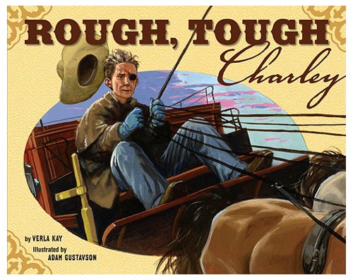
- Rough Tough Charley by Verla Kay. Tricycle Press.
- Yankee at the Seder by Elka Weber. Tricycle Press.
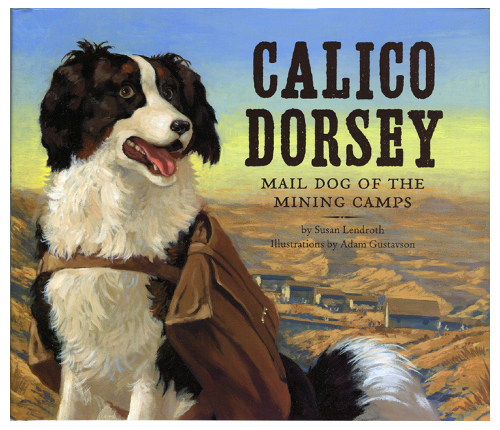
- Calico Dorsey by Susan Lendroth. Tricycle Press.
- Better Than You by Trudy Ludwig. Tricycle Press.
- Tippy-Too by Julia Schnebly Black. Corby Street Press.
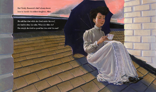
- Mind Your Manners, Alice Roosevelt! by Leslie Kimmelman, Peachtree Publishers.
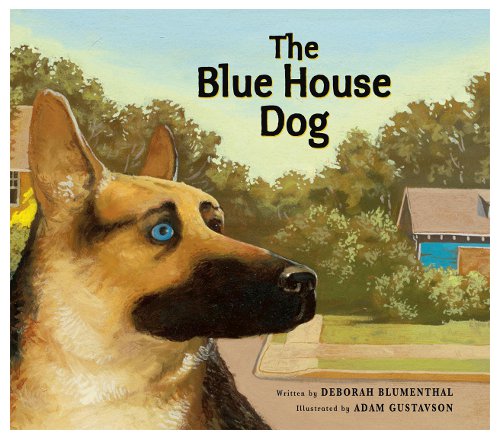
- The Blue House Dog by Deborah Blumenthal. Peachtree Publishers.
- Jingle Bells: How the Holiday Classic Came to Be by John Harris. Peachtree Publishers.
- Lost and Found by Bill Harley. Peachtree Publishers. (Fall 2012)
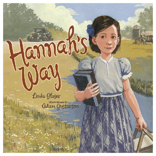
- Hannah’s Way by Linda Glaser. Kar-Ben. (Spring 2012)
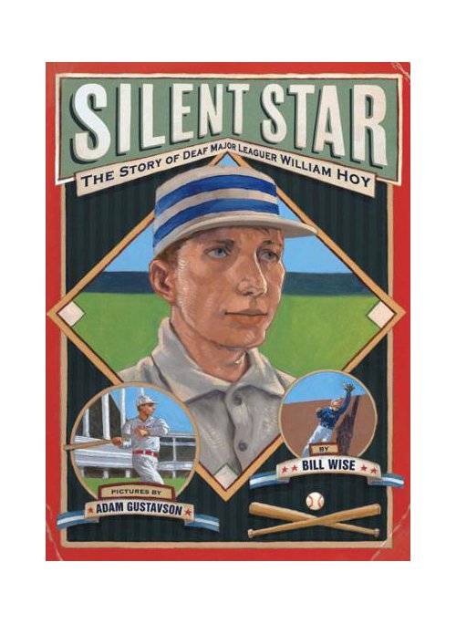
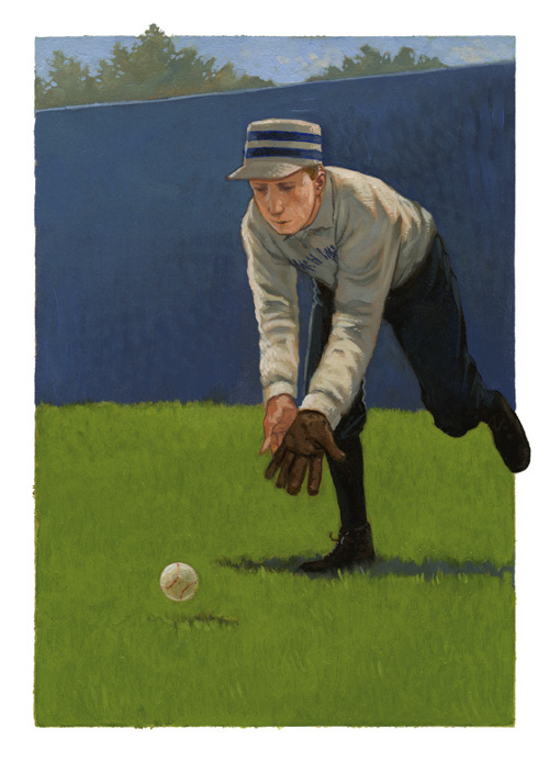
- Silent Star: The Story of Deaf Major Leaguer William Hoy by Bill Wise. Lee and Low. (Spring 2012)
Chapter Books:
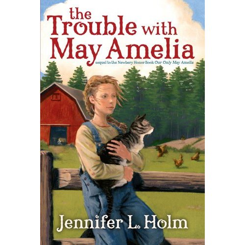
- The Trouble with May Amelia by Jennifer Holm. Simon and Schuster.
- Magic By Heart by Amy Gordon. Holiday House.
- The Mystery of the Jubilee Emerald by Gary Wassner. Mondo Publishing.
Neat Oddball Opportunities:
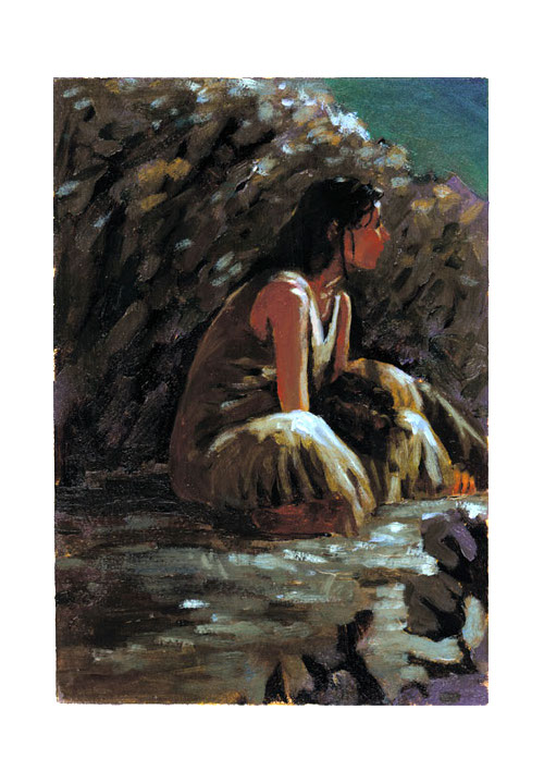
A Painted House [pictured below] by John Grisham. Serialized in its original publication by the Oxford American magazine over the course of six bi-monthly issues. Every two months on a Thursday night, 50± typewritten pages would spill out of my fax machine, unannounced; I had till the following afternoon to get 4-6 pencils drawings faxed back, the weekend to do 4-6 oil paintings, and then had to package them so they could finish drying en route to a printing service bureau in Arkansas — where on Tuesday they needed to be scanned so the magazine could finish being printed. It may have been the most exciting job I’ve ever had.
Jules: What is your usual medium, or––if you use a variety—your preferred one?
Adam: Oil on paper.
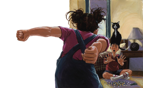
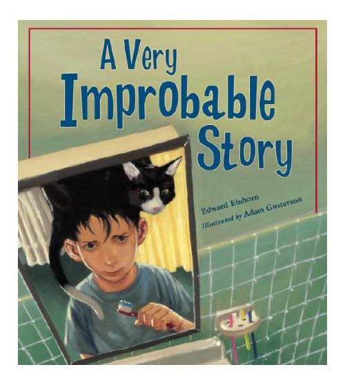
Jules: If you have illustrated for various age ranges (such as, both picture books and early reader books OR, say, picture books and chapter books), can you briefly discuss the differences, if any, in illustrating for one age group to another?
Adam: I tend to treat everything very similarly; I don’t change my rendering or compositional style much. There are visuals that I came upon at a very, very early age that still stick with me, that affected in a very real way how I see the world and the types of things I notice… that two-second scene in Dumbo, where an elephant pulls her foot out of the mud and the impression fills in with water, for instance. I try to throw the kitchen sink in everything and let an audience’s mind edit out what does or doesn’t make sense.
Jules: Where are your stompin’ grounds?
Adam: I live in West Orange, NJ, though I grew up in Dover, NJ; they’re two of the most culturally diverse places I’ve ever been.
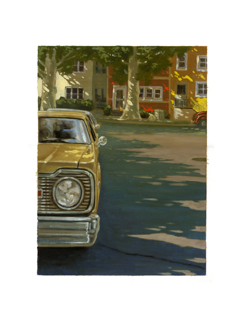
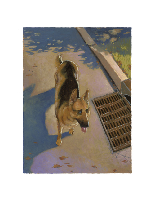
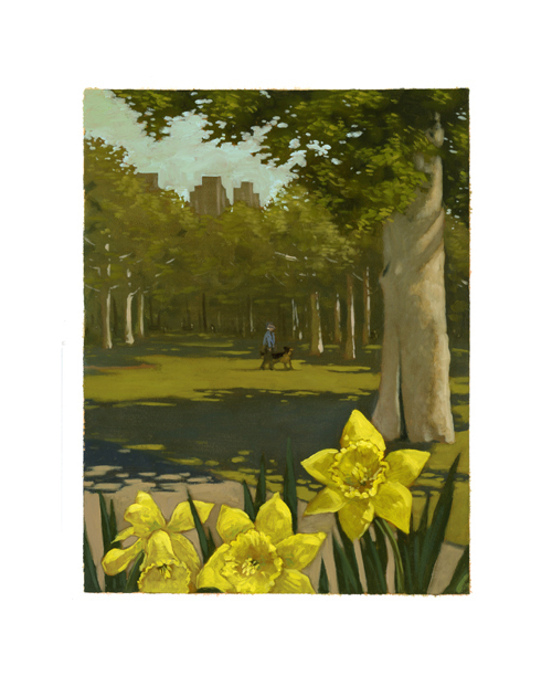
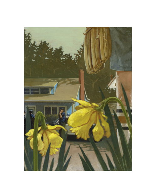
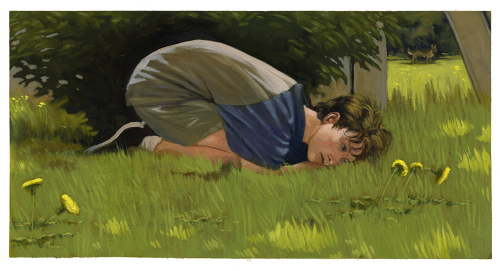
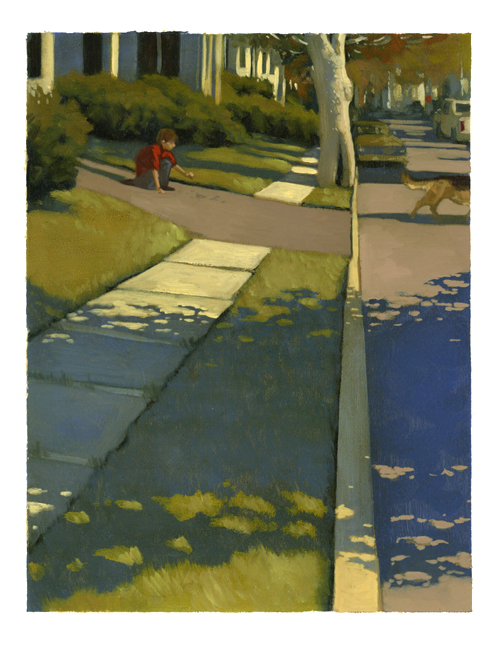
(Peachtree Publishers, 2010)
Jules: Can you briefly tell me about your road to publication?
Adam: When I was majoring in illustration at Glassboro State/Rowan College/Rowan University (it changed its name a lot), I started sending out color copies of my work to anyone and everyone that I thought might hire me. 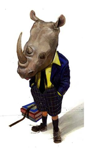 I used to haunt newsstands at bookstores, poring over periodicals looking for illustrations, then writing down in my sketchbook the names of the art directors or editors from each staff box.
I started working for Cricket and the Oxford American while still in school, and once I’d done a few jobs featuring four or five images of repeating characters, I started hawking to children’s book publishers much in the same way I had approached magazines. My first offer was from Simon and Schuster the year after I graduated. (I had spent the summer at the Illustration Academy, then held just outside of Kansas City, MO.) They paid me enough to afford my train ride into grad school and didn’t mess with my sketches much at all. I was just naïve enough to think that a) the advance was more than I’d ever made before and b) this would be pretty easy.
I once read a great interview with the jazz guitarist Earl Klugh, where he was asked about playing with the luminary George Benson when he was a teenager. When pressed about getting such an opportunity at a young age and the impact it had on him, he pointed out that as a teenager, it’s not uncommon to think that that sort of thing could happen. It’s only when we become older and less precocious that we realize how overwhelming the odds are — or how small we may be in the grand scheme of things.
Sigh…

Jules: Can you please point readers to your web site and/or blog?
Adam: My web site is adamgustavson.com. It’s a flash site and needs an update that I’ve (thankfully) been too busy illustrating and teaching to attend to. But it needs to get done this year.
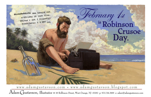
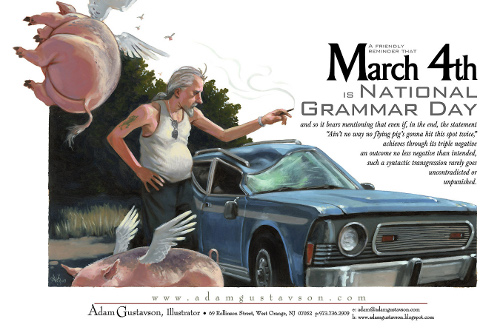
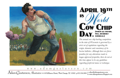
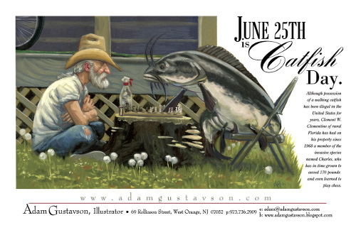
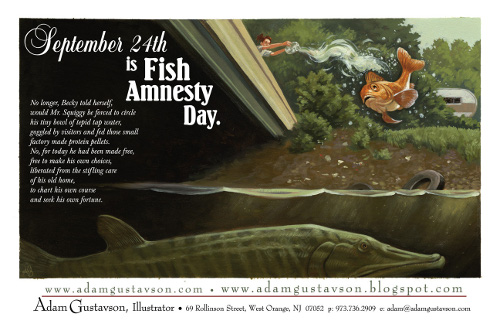
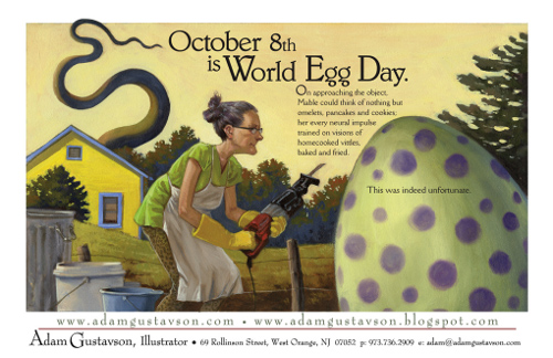
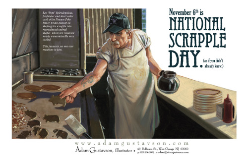
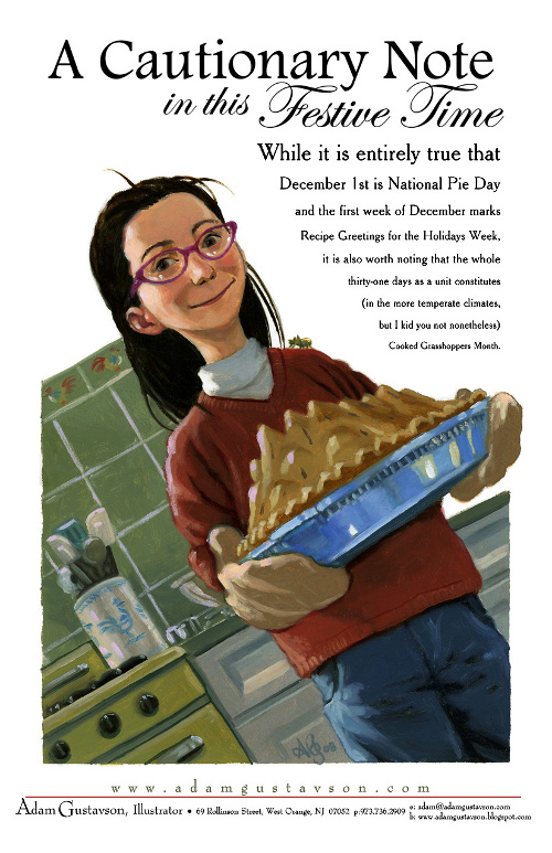
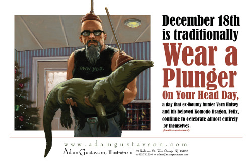
My blog, which is much more up to date, is adamgustavson.blogspot.com. It features sneak peaks of projects I’m working on, glimpses into my studio process, demos I’ve done for classes I teach, and an ongoing series of under-appreciated but nonetheless real holidays that I create cards for as my one-man promotional campaign (Penguin Awareness Day, Ask a Stupid Question Day…).
Jules: If you do school visits, tell me what they’re like.
Adam: I talk to small groups, preferably 50 or so kids at a time. I tend to focus on a particular book for the talk, though I always start with an illustrated synopsis of what illustrators do for a living, 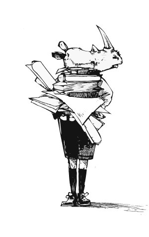 who they work for, and how they find books to illustrate. I then drag everyone through a project from manuscript to thumbnail to research to pencil drawings to revisions to final paintings, all in about 45 minutes, and all while pacing frantically, gesturing wildly, and talking in an array of different voices.
I don’t do a Powerpoint. I bring in original work. There are a few reasons for this. For one, I feel like technology—laptops, projectors—can be either really cool or really cold, both of which can be distracting. I’ve had them crash before, and in my teaching experience a day that relies on technology for smooth sailing has almost never gone right. I’ve never had a dry oil painting crash.
But aside from my cave-man leanings, books are already reproductions of something. Children see reproductions of things all the time. They’re on the TV, on the radio, and of course, in books. The talk is supposed to be about stripping away the magic trick of that; aside from peeling apart the layers of process and hard work that go into a book, seeing the art from a book is supposed to feel like passing a movie star on the street. Real stuff just has a different presence to it, and I always feel that there’s nothing like the chance to occupy a room with it.
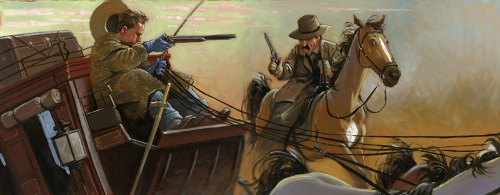
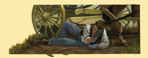
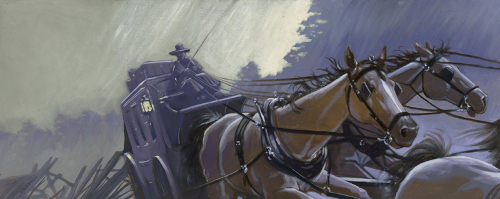
(Click each to enlarge slightly)
Jules: How does teaching illustration influence your work as an illustrator, if at all?
Adam: If all goes well, I try not to think about it too much when I’m working, though I can’t help from time to time wondering, “How would I explain this to someone?” or “Did I just make the same mistake I made someone feel bad about yesterday?” Teaching intro-level courses can create havoc in the studio; 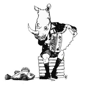 having to concentrate on communicating fundamentals to a room for an extended period of time isn’t always the best exercise for the part of the brain that comes up with high-minded sophisticated solutions and messes about in advanced technique.
And yet, trying to help a couple dozen young artists through their respective problem solving hurdles can be a like a burst of right brain calisthenics and forces me to think about creative process in ways I perhaps haven’t in some time. So, from that standpoint, teaching keeps me from getting too set in my ways and occasionally forces me to take my own advice.
Jules: Any new titles/projects you might be working on now that you can tell me about?
Adam: I have a few firsts coming down the pike.
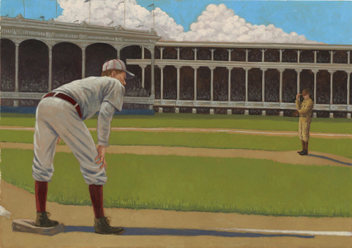
My first sports book ever, Silent Star (by Bill Wise), about a deaf 19th-century baseball player, Billy Hoy, will be out this Spring from Lee and Low. For anyone new to illustration as a profession, I feel its worth noting that they were on my mailing list for fifteen years before this book landed in my lap.
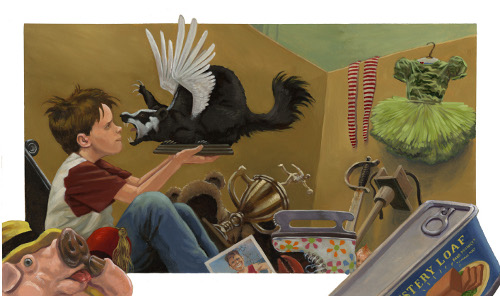
My first silly book, Lost and Found (by Bill Harley) is slated for Fall of 2012 from Peachtree. This is pretty momentous for me. I approach silliness with a fervor and dedication that I reserve for little else in my life. My two sons have known since birth to only believe a tiny portion of anything I say. A manuscript where a two-page spread features the words “The stuff I found was getting weirder and weirder” was like having the clouds part and light stream down as angels sang yodeling cowboy songs in celestial harmony. With flying badgers.
I’m now getting started on some music-themed picture books with Christy Ottaviano Books at Holt. I’ve been a semi-professional musician for years and years now but never found the chance to really put the two things together, so this is pretty exciting, too.
I’m working with my first agent, too, Abigail Samoun at Red Fox Literary. We’d worked together on a number of books when she was an editor with Tricycle Press, and it’s been a real joy and relief to have a kindred spirit as my real world, commercially-driven, arts-employment advocate.
 Okay, the coffee and bagels are on the table, and it’s time to get a bit more detailed with seven questions over breakfast. I thank Adam again for visiting 7-Imp.
1. Jules: What exactly is your process when you are illustrating a book? You can start wherever you’d like when answering: getting initial ideas, starting to illustrate, or even what it’s like under deadline, etc. Do you outline a great deal of the book before you illustrate or just let your muse lead you on and see where you end up?
Adam: I read the manuscript a bunch of times, then sit on it for a while. Not literally, of course, though I probably have done this by mistake once or twice.
I love doing page breaks. I really labor over where pages get turned, what gets a spot, a full page or a spread, or where the text can get dense and instructional and where it wants to be laid out sparsely. I lay it out in an InDesign document, then look at the shapes of all the text blocks and their placement with respect to each page’s dramatic content. Do we want to see a picture, then read? Do we want to read, then see the picture? Where should this happen — at the top of a page, the bottom, the left or right?
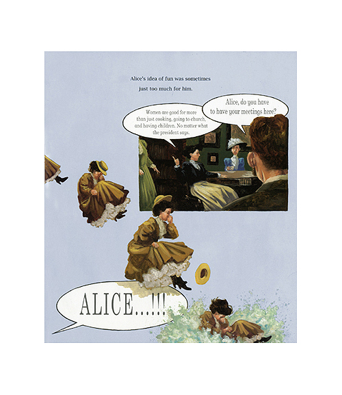
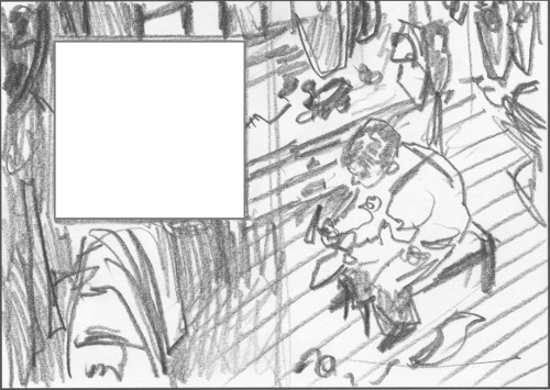
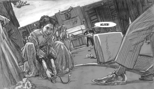
I shove them around a bit, print out all the spreads at about 50% scale, and look for compositional elements in the shape of the text blocks. THEN I start drawing. Loose, scribbly thumbnail sketches, but usually involving tone. I try not to fixate on what to show in each image, but put my energy into how to show it and how each image will affect what the next image wants to be. In spite of the friendly realism of my work, for this stage I’m a huge fan of Pierre Bonnard, Balthus, Richard Diebenkorn, and the photographer Robert Frank, to name a few, for how they each drag a viewer’s eyes around a composition. I’m also not above Cézanne-inspired perspective-cheating when it might help the picture.
(Click to enlarge slightly)
With historical fiction, this whole process is laced with research. I surround myself with books of archival photography, costume design, geography, and architecture (and thank you, too, Internets) so that every time I close my eyes, my default setting is the visual language of, say, hoop skirts and bustles or first-generation automobiles.
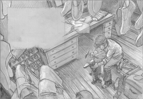
Once we’ve crossed into the land of tighter sketches, I shoot reference, though I just as often make things up. (When I was learning to draw, all the way up through college, I thought that’s what everyone did. I had no idea people used models and, once I realized that, I still didn’t know where to find one, let alone the person I needed for a particular project.) I do tight pencil drawings on brown or gray paper, then heighten them with white gouache to work out the lighting and the full value scale. These are usually done at 100% of the book’s scale.
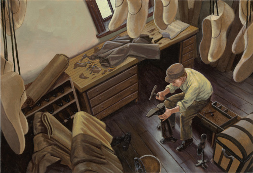
For finals, I enlarge and print the sketch to whatever scale will be most comfortable to paint, rarely any smaller than 150% of reproduction size. Aside from the simple fact that the bigger I paint the more accurate my brushwork gets, there’s also a truth that the optimum viewing distance for a painting on the wall is usually halfway across the room or at closest arm’s length, and a book seldom gets perused at such a distance. There’s a tightening up with respect to detail that happens when work is reduced, and having that happen in reproduction sort of simulates that scale differential of eyeing a painting from across the room versus snuggling up with it in one’s lap.
Or maybe I’m just not good with little teeny sable brushes. It could always be that.
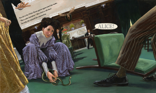
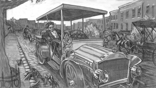
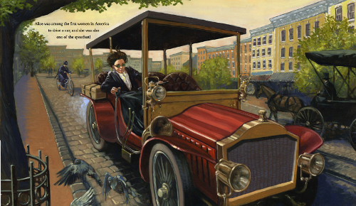
Alice tried to tell them. Secretly, she enjoyed the commotion.”
(Click to enlarge slightly)
The paintings are done in usually about three layers of paint, on either soft textured watercolor or printmaking paper, primed with a diluted PVA adhesive (polyvinyl acetate, a pH neutral glue used in bookmaking), which seals the paper from oil and solvents but keeps the texture pretty unadulterated. To me, off-the-shelf gesso always feels too much like plastic when it dries, and it sacrifices much of the natural tooth of the paper. I use the same assortment of paints, no matter what the project; they’ve all been chosen for their versatility and ability to work well with others.
So, ahem, here they are… Titanium white (big tube), cadmium yellow light (it’s a very straight down the middle yellow, not too orange, not too green), yellow ochre (about the color of dijon mustard, though baby poo is also an accurate comparison — value-wise, it’s a perfect 50% between black and white), cadmium red light (and orange-tinged scarlet), permanent alizarin crimson (a deep ruby, violet-tinged red), Ultramarine blue (a deep, vaguely violet-tinged hue), and cerulean blue (a lighter, green-tinged blue). Off to the side I use sap green (when mixed with the Alizarin, it make a lovely warm black) and transparent red earth or burnt sienna. I’ll use some burnt umber, too, but never for mixing a brown. I use different brands, depending on the desired mixing consistency (and price) of each color.
and she was also one of the speediest!”
(Click to enlarge slightly)
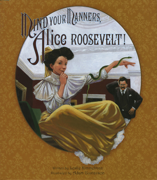
by Leslie Kimmelman (Peachtree Publishers, 2009)
2. Jules: Describe your studio or usual work space.
 Adam: I work in a third-floor studio in my little mock Tudor house. It’s about 7/8 finished; work on it ended abruptly when my first son was born ten years ago. There’s a little windy stairway up to it (a portrait of Queen Victoria hangs at eye level, reminding one to bowm so as not to clock one’s head), and it’s cluttered with musical instuments, a Mac with a big scanner and a printer, three immense flat files, a 2’ x 3’ (homemade) light table, and enough art books to make me nervous about the structural integrity of my house. There’s a big ol’ easel in the corner (if a room with slanted walls can really have a true corner), three small skylights, a screwy little first-generation futon (it’s the only seating that could fit up the windy stairs), and a really, really high ceiling, about ten feet or so at the peak.
I sketch at the computer table or on the screwy little futon with a drawing board propped on my lap. To the right of me is another table, where I transfer sketches to watercolor paper, and to the right of that is the easel with a glass palette-topped side table to its right. In front of that is a big red “fire can” for all of my oily detritus.
If I’m working in watercolor or gouache (it happens, particularly on quick-turnaround educational work), I often come down to civilization and work in my dining room.
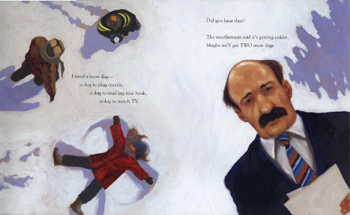
Maybe we’ll get TWO snow days.”
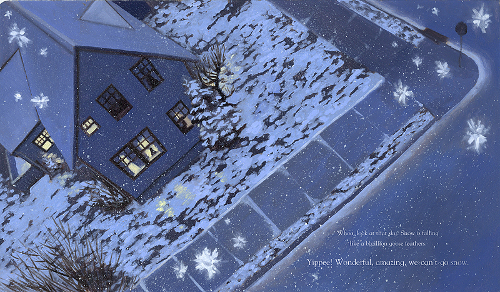
Yippee! Wonderful, amazing, we-can’t-go snow.”
(Click each to enlarge)
3. Jules: As a book-lover, it interests me: What books or authors and/or illustrators influenced you as an early reader?
Adam: I adored Mercer Mayer—particularly One Monster After Another and his Professor Wormbog books—and the illustrator Philippe Fix, whom I know almost nothing about and have been unable to dig up any particulars on. My mother was a nearly photo-realistic pastel portrait artist when I was growing up (she’s now a very gifted quilter), and we had only well-illustrated books around — and lots of art books. I still think my life changed when I stumbled on Goya’s Saturn Devouring His Son in one of her books, somewhere around third grade. That and Thomas Hart Benton’s Susanna and the Elders—with its highly-designed organic shapes and exagerrated secondary light sources (and nudity, let’s not forget the nudity)—just etched themselves into my mind instantly with a visceral intensity that’s hard to describe.
by John Harris (Peachtree Publishers, 2011);
For another spread from this book, visit this 2011 7-Imp post…
4. Jules: If you could have three authors or illustrators—whom you have not yet met—over for coffee or a glass of rich, red wine, whom would you choose? (If they’re deceased, I won’t tell.)
Adam: Man, I should have filled this out earlier. We’ve lost a few of them recently.
In my precocious first year out of the gate, I used to track down my idols by phone with cold-called interviews or find them at book signings and invite them out for coffee.
Sterling Hundley. Mercer Mayer. Lane Smith.
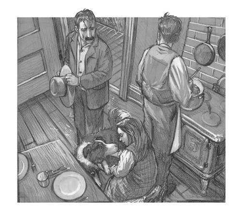
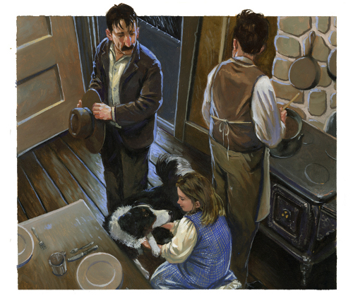
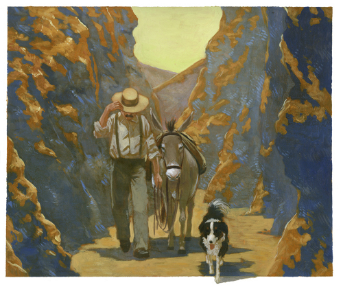
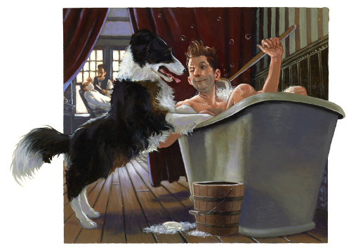
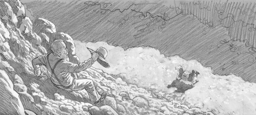
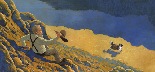
5. Jules: What is currently in rotation on your iPod or loaded in your CD player? Do you listen to music while you create books?
Adam: Sometimes I theme my playlist to the project; not literally, though during the turn-of-the-century baseball book I was listening to the earliest pop/jazz music I could find. But there are times where I’ve gotten so immersed in the specifics of a project I need to be forced in a less predictable realm. I keep Ornette Coleman, Marc Ribot, 1970-era Hendrix live recordings, and Miles Davis’ fusion stuff around for those moments.
I do my thumbnail ideation stuff in silence, usually. After that, though, I have a folder called “work music,” which from beginning to end is about 100 hours of songs, heavily laced with:
- Antonin Dvořák
- Chuck Berry
- Marc Ribot (usually his “Cubanos Postizos” projects)
- Elmore James
- Tom Waits
- Charles Mingus
- Andrew Bird
- Lonnie Johnson
- Miles Davis (all periods)
- John Coltrane (all periods)
- Tin Hat Trio
- Jenny Scheinman
- Bill Frisell
- Jim Hall
6. Jules: What’s one thing that most people don’t know about you?
Adam: I’ve played guitar, upright bass, banjo, and lap steel in a rock band called The Unpronounceable with my gifted younger brother, Pete, for the past twelve years.
If someone is reading this that knows that already, though, let’s divulge that I can’t wear an article of clothing with a visible logo on it. I blame Indiana Jones for this.
(Click each to enlarge slightly)
7. Jules: Is there something you wish interviewers would ask you — but never do? Feel free to ask and respond here.
Adam: Why do your people look the way they look?
I can’t help it, so I’ve tried to figure out why everything I draw looks like I did it and then just embrace it, and maybe make it a better version of itself.
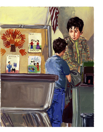 I never really liked the way I drew, from a pretty early age, and rarely produced anything that made me say, “Wow, that’s exactly the kind of art I like.” It was always sort of the visual equivalent of hearing my own voice on recording or a home movie, thinking, oh no, do I really sound like that? How does anyone listen to me? When I went to college, I tried desperately to draw like someone other than me. Egon Schiele. Andrew Wyeth. Dave McKean. Edward Hopper. I took up different, uncomfortable media. I’d get three images into anything, and it started to look like I did it again.
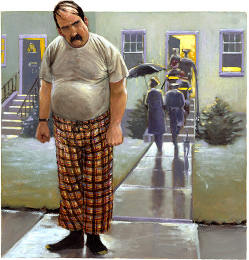
[Ed. Note: Pictured left is an illustration from The Day Eddie Met the Author by Louise Borden, published by Simon and Schuster in 2004].
So, I decided that I’d just have to learn to like it. Oddly, once I made that decision, I found myself running into people, here and there, who really hated the work I did with a palpable intensity, who found my people in particular to be grotesque. I think that got me to realize more than my own nudging or dissatisfaction that there’s a very particular lineage to how my view of the world developed. Yep, there’s nothing like defending yourself to make you less hard on yourself, at least while you’re, you know, busy defending yourself.
I can’t wrest my view of people away from 19th and early 20th century illustration, with it’s very slight, highly nuanced propensity to caricature and, well, grotesqueness. Honoré Daumier, or Thomas Nast, or even ol’ Norman Rockwell. (I don’t see the difference between him and John Currin, really. I’m not really convinced they’re even saying anything altogether different about the behaviors or idiosyncrasies of people and society.)
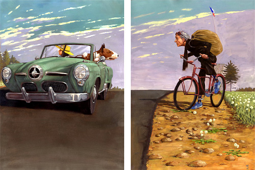 (Another unpublished piece, Frank and Margie)
It’s not an intentional “I want to do that” sort of love; it just made sense to me. I feel like the things that pull us to people really are our exagerrated internalizations of what we see. If we broke out calipers and measured people’s features and proportions, there’s not much difference between a big nose and a little nose or wide eyes and squinty eyes. But we assign these things importance, which changes how we perceive them. And then there are designs that we see in people from different angles, the way a nose hooks into a browline or the way a chin juts out into negative space, that are too engrained to do battle with.
So, I’ve had to make peace with the fact that no matter how I might try, the way I place value on these proportions and relationships and the slightly tweaked way I always commit them to memory is something I’m stuck with. People are a little grotesque. That’s why we can tell them apart from each other. I do love—even prefer—art that presents humans as sort of physiological archetypes or perfect, objective specimens, trapsing through compositions from an emotional distance, whether it’s Vincent Desiderio or Jack Kent. I just can’t do it, and I’m okay with that now.
Jules: What is your favorite word?
Adam: I’m fond of “lugubrious.” I found it on the SATs and looked it up when I got home.
Jules: What is your least favorite word?
Adam: “Fart.” Right? Really, who doesn’t like that word? What’s wrong with me?
Jules: What turns you on creatively, spiritually or emotionally?
Adam: Good stuff. Usually with an air of unpredictability. I just don’t feel like myself unless I’m making something, so art, music, or thoughts that I wish were mine make me want to live. I’ll forget about this sometimes, then, say, walk into a room with a painting in it or hear a musical phrase that suddenly wakes something up inside me.
Jules: What turns you off?
Adam: Pop culture. That sounds cranky. Lets say anything that’s didactically or cynically written, slickly produced, or of an overall manufactured quality. I actually feel a real kinship to the people who make those things. It does take talented, hard-working people to make them, and pinpointing the fickle tastes of a million people at once is a gift I find incomprehensibly daunting. But the products themselves leave me feeling instantly deflated. I tend to think of the way that sort of stuff needles me as a personal weakness, not a point of pride. Still, I’d rather watch Mick Jagger dance around like a goofball and miss half his notes than watch Usher bust moves in a line of perfectly synchronized dancers while singing over an autotuned backing track.
Jules: What is your favorite curse word? (optional)
Adam: The BBC introduced me to “clunge.” I can’t help but think it’s pretty great.
Jules: What sound or noise do you love?
Adam: The rattly rhythmic ker-thunk of a subway car.
Jules: What sound or noise do you hate?
Adam: Anything scraping on nylon. I’ve never been able to wear a windbreaker or tracksuit as a result.
Jules: What profession other than your own would you like to attempt?
Adam: Entomology.
Jules: What profession would you not like to do?
Adam: [Insert repetitive task here.]
Jules: If Heaven exists, what would you like to hear God say when you arrive at the Pearly Gates?
Adam: “Oh, good. You’re here.”
All artwork and images used with permission of Adam Gustavson.
The spiffy and slightly sinister gentleman introducing the Pivot Questionnaire is Alfred, © 2009 Matt Phelan.

Probably one of my favorite interviews. Full of lil’ nuggets of wisdom.
thanks to the both of ya’s
Adam Gustavson is a genius and all-around cool guy. So many fascinating aspects of his work and the workings of his mind. Thank you so much for this interview — inspiring and funny. So glad to have had breakfast with you both.
Oh, wow, I think I am going to have to go back and read through this again. This is one amazing interview. We have many of Adam’s works in our school library but I’m going to be out and about gathering some up for my personal library. Thank you both so much.
Wonderful interview!!! I love the answer to #7, about embracing your style… although try as I might, I really can’t imagine anyone disliking your work with a “palpable intensity”!
Thanks, all.
I’ve already said it, but I love everything about this interview, too, and it’s all thanks to Adam for being so thoughtful about his responses. I truly enjoyed working on this one.
As Amy said, there are all kinds of nuggets ‘o’ wisdom here, but my favorite part is the Mick Jagger part. Smiley emoticon here.
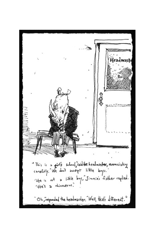
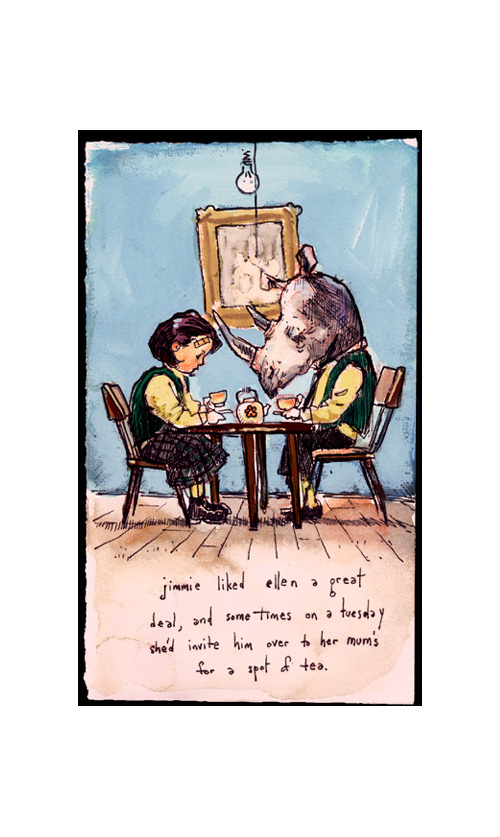
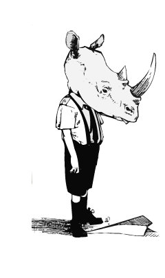
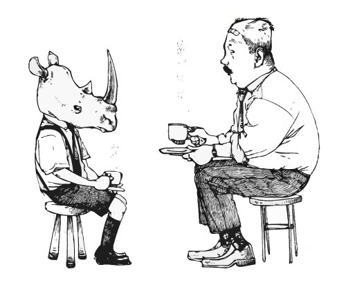
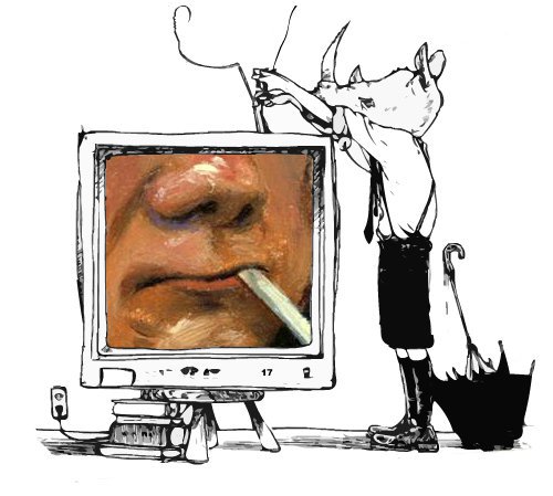
If you can’t already tell (Adam gave me free reign/permission to take what images I’d like from his site, besides the images he sent specifically for the interview), I want to see the story of the rhinoceros boy put into print.
Outstanding interview — really a classic. Thanks to both Adam and you, Jules, for bringing it!
I want to see the rhinoceros-boy book, too. (I want to know if he wears T-shirts, in particular.)
And can I just say… GLASSBORO?!? Woot! Go, Profs! (Yes, that is — or was — really the team name, dating back to when just about the only graduates they churned out were teachers.)
Awesome interview Adam. It was so much fun to see the inside story…you ARE as crazy as I thought you must be, and even more prolific. Good choice Jules!
Although it’s the second Roosevelt whose era is the setting for my work, I loved the trope of Alice sitting on the roof!
She was a rakehell.
Incredible! I love the way Adam says he approaches silliness. Thankyou for introducing him to us!
Awesome interview Jules. I may be a tad biased but I think this Adam guy is terrifically talented.
Thanks for sharing insight on your huge talents, Adam. Everyone should get a chance to hear you sing and play guitar, too!
(How’d I miss Cow Chip Day?!)
Wow what a great interview. I’m going to send this interview with the excellent art to my RISD students as an example of interesting perspective use in a composition. You are a master at it!
Thanks for sharing your breakfast with us.
I have really enjoyed reading through this interview… so much so, I did it twice :o)
Thanks for such a good show af fab artwork, and so many interesting answers.
Thanks for this. I really enjoyed it. What a fascinating person, deep thinker and good writer. If I had time right now, I’d read it again to really absorb a lot of what he said. I appreciate the large quantity of artwork. His work is beautiful.
what a fascinating interview – one of my very very favorites! Adam’s work is gorgeous
Dec 18 made me laugh out loud. Fabulous fabulous fabulous post, thanks for the introduction to a great bunch of work, an illustrator with a very interesting take on the world AND someone who knows how to spell pored… As a kid I would get dropped off at the children’s section of the library where I was free to choose anything I wanted to read so long as I stayed there while my father browsed upstairs in the adult section. I would find an illustrator whose work I liked and hunt through the place for every book I recognized until I ran out and had to find a new artist to follow. Continued this trend even after I learned to read. I felt I could TRUST Robert McClosky, Dr. Seuss, Hilary Knight, Maurice Sendak and anything they had put pictures to must be a good read. Now I have to do the same w. Adam Gustavson.
P.S. Any chance of getting his Grandmother’s Lox recipe? (got my fingers crossed)
I feel very lucky that Adam illustrated my book, Calico Dorsey, and hope that we will have the chance to work together on another book one day — preferably involving Komodo dragons and plungers or lugubrious lemurs.
[…] Adam Gustavson (March 27, 2012), pictured right, on why he brings original paintings to school […]
[…] blaine […]