Because I Think Even the Sketches of
David Small Are Sublime…
 September 12th, 2012 by jules
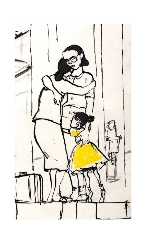
I do. I think, that is, that even the early versions—the sketches, the doodles, the brainstorms—of author/illustrator David Small’s illustrations are splendid. Above is one from his latest illustrated title, Sarah Stewart’s The Quiet Place, to be released next week by Margaret Ferguson Books/Farrar Straus Giroux.
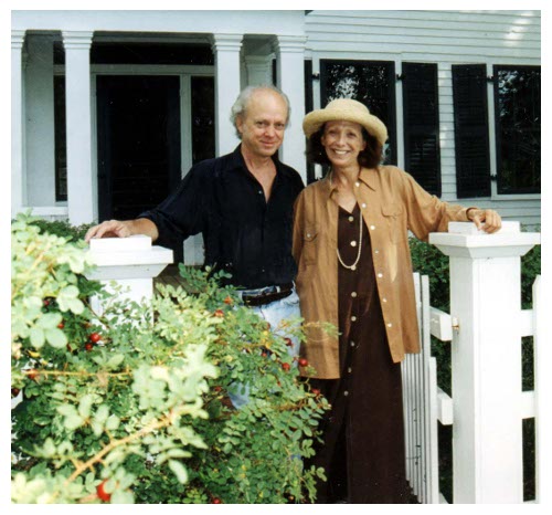
 Last week, I chatted with David and Sarah over at Kirkus. We talked about their new book and what’s next for them. They also discussed how they collaborate (or, more accurately, don’t collaborate). “David Small and I have a great marriage,” Sarah told me, “because we do not collaborate as artist and writer. I write every day. Occasionally, a story emerges –- sometimes, excerpts. I read it to him. If he likes it, I send the manuscript to my editor. If she likes it, she buys it. And then the words go to my sweetheart, who with his magic pens and paints deepens and broadens the story. I’m the luckiest picture book author on earth!”
Here is that Q&A, as well as more about The Quiet Place, if you missed it last week.
I’m here today at 7-Imp with a bit more art from the book, as well as some of David’s early sketches, since—as my readers know—I get twitchy until I’ve the chance to feature some artwork from the books about which I write.
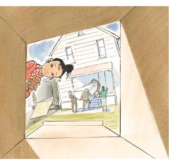
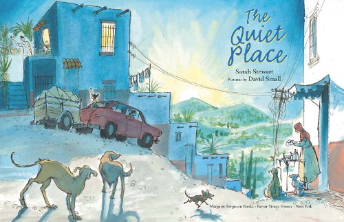
Let us take a moment to appreciate one of my top-five favorite picture book spreads of 2012 — straight from Sarah’s and David’s book. You’ll see in the Q&A that I asked David specifically about this beautiful creation:
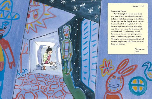
I am a big sucker for stories about the ability of art to heal, and you can place the story nestled in this extraordinary book in that category. As I wrote over at Kirkus last week, by creating her own “quiet place” in her new home—using large boxes she decorates with crayons and paper—the young protagonist, Isabel, finds herself.
Many thanks to David for sharing today — and to both Sarah and David for taking the time to chat with me last week.
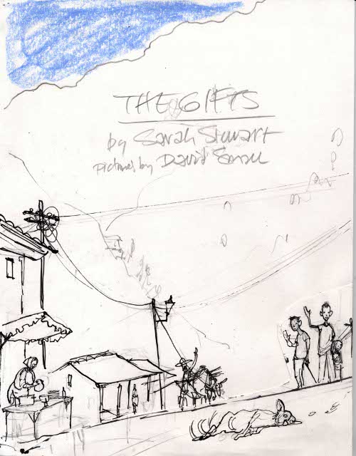
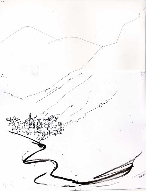
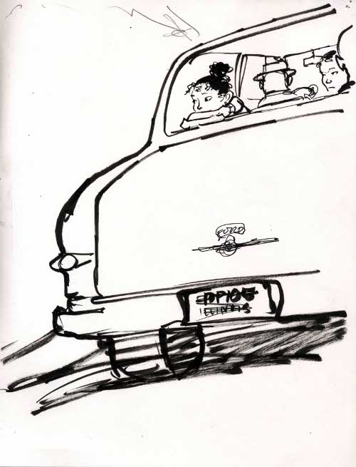
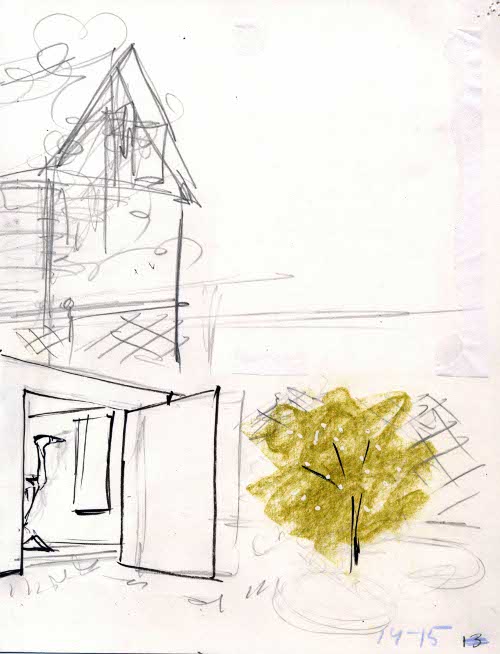
David: This [below] was the original sketch for the full title page [first image is left side; second image is right side]. As you can see, I had penciled in the title we were considering at that time, The Gift or The Gifts.
One of the problems with this design was that I had left the space for the title on the left-hand side of the spread — when, most often, the design works better if the title and author information goes on the right. Don’t ask me why, because the explanation would get technical and boring. It just does!
I also didn’t know at the time I made this whether or not we would be able to have painted endpapers. Later, when we got them, I used the endpapers to extend the action, which in this sketch is all packed into one scene.
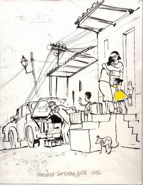
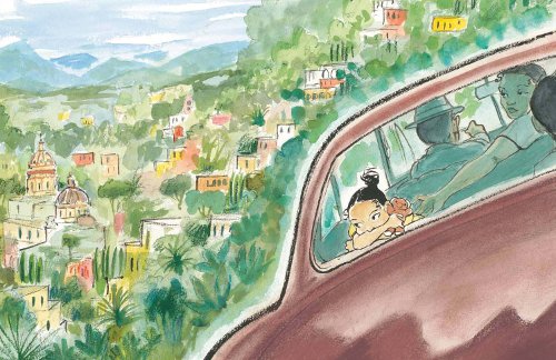
We decided this sketch had way too much emphasis on the car, not enough emphasis on Isabel, and that the town should be shown in more detail. In the finished art, you can see we have a much better sense of the lovely place they are leaving behind, which in a few short pages will be in stark contrast to the bleak urban landscape they are moving to.
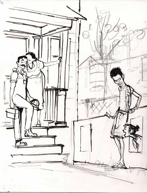
Sometimes, looking back at sketches, it’s hard to remember what made you change and substitute one thing for another. I liked this drawing at the time and still do. Here we get a real sense of Isabel’s close family. Mother is kissing Dad as he returns from the factory. Chavo is obviously proud of helping his sister, and little Isabel is ecstatic in her new box playhouse. This would definitely have gone into the book except for the fact that –duh—I had miscounted the pages and we found there was no room for it!
These are five different versions of Isabel’s face as she gazes at the snow angel:
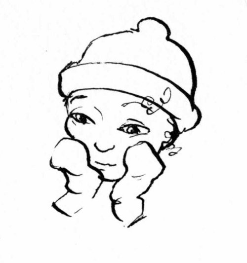
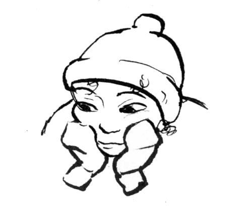

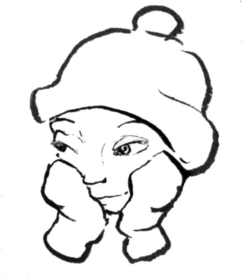
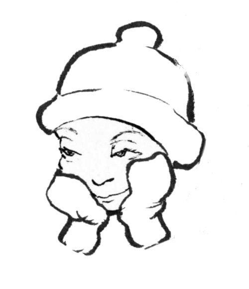
(Good, but a little too sly-looking. Face should be less scrunched-up.)
For the final, I settled on something halfway between number 4 and 5:
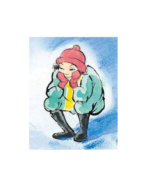
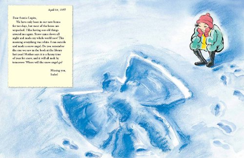
Mother says it is a funny time of year for snow, and it will all melt by tomorrow.
Where will the snow angel go? …”
(Click to enlarge)
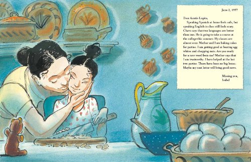
Thanks again to David for sharing. I’ll close out quietly with two more beautiful spreads from the book.
(Click to enlarge spread)
(Click to enlarge spread)
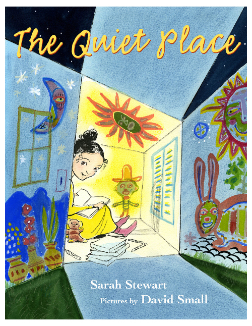
THE QUIET PLACE. Text copyright © 2012 by Sarah Stewart. Illustrations copyright © 2012 by David Small. Published by Margaret Ferguson Books/Farrar Straus Giroux, New York. Sketches and illustrations posted with permission of David Small.



Can’t wait for this!! I love Stewart/Small creations!!
For the time it took me to look carefully at each illustration and read the text, I was no longer at my kitchen counter. I was at The Quiet Place. What a remarkable couple. Thanks to all of you for this post. It’s the best kind of way to close a nearly fall day in northern Michigan.
Wonderful. Thanks, Jules!
Oh, I can’t wait to see this book. I love that the text is Isabel’s letters and the art, especially Isabel’s drawings, looks exceptional. Thanks Jules for sharing.
I’ve been looking forward to this all week. Love these sketches, how interesting the several tries to get Isabel’s expression right. I wonder how many expressions he did this for? I love the sketch that didn’t make it in the book! Can not wait to read this…. I need to have his line work pasted up all around my studio. you are right, it is sublime
Genius!! Going to give this book out as going away gifts to little friends. And I totally understand that writing is easier than speaking. Lovely!!
Beautiful. David Small is an artist in the truest sense. Whether it’s a finished piece or a sketch, I could decorate a room with his works.
Wow. Thanks.
Lovely
Concept of the Story is great like the illustrations. Way to pull yourself into your audience. Such a strong
relation to the theme. (human vs change) Even I hate change-
Lovely! Your site never fails. I actually posted on FB that it’s my go-to site for inspiration! I wish I had David Small’s work on my walls!
These characters have so much FEEL to them…. LOVED this!!
Love your style and technique and the feeling your images evoke. Great job! I’ll be watching for more of your work!
What a truly beautiful place to be today! Thank you, Jules for your inspiration and love of the quiet places and for sharing them with us!
We have been reading a couple other David Small books at our house — So You Want to Be President and My Senator and Me. Small’s brushstrokes look so sure and strong…like he is just whipping out these perfect facial expressions. It’s neat to see the series at the end of this post of various attempts at drawing the girl’s face.
[…] David Small (September 12, 2012) on creating the illustrations for Sarah Stewart’s The Quiet Place (Margaret Ferguson […]