Drawing Blind with Philip C. Stead
 October 22nd, 2014 by jules
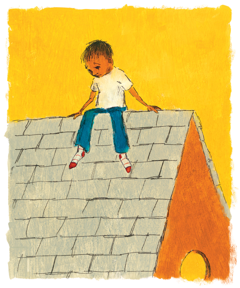
‘There is nothing to see on my street,’ he thought. ‘Nothing to see at all.'”
(Click to enlarge)
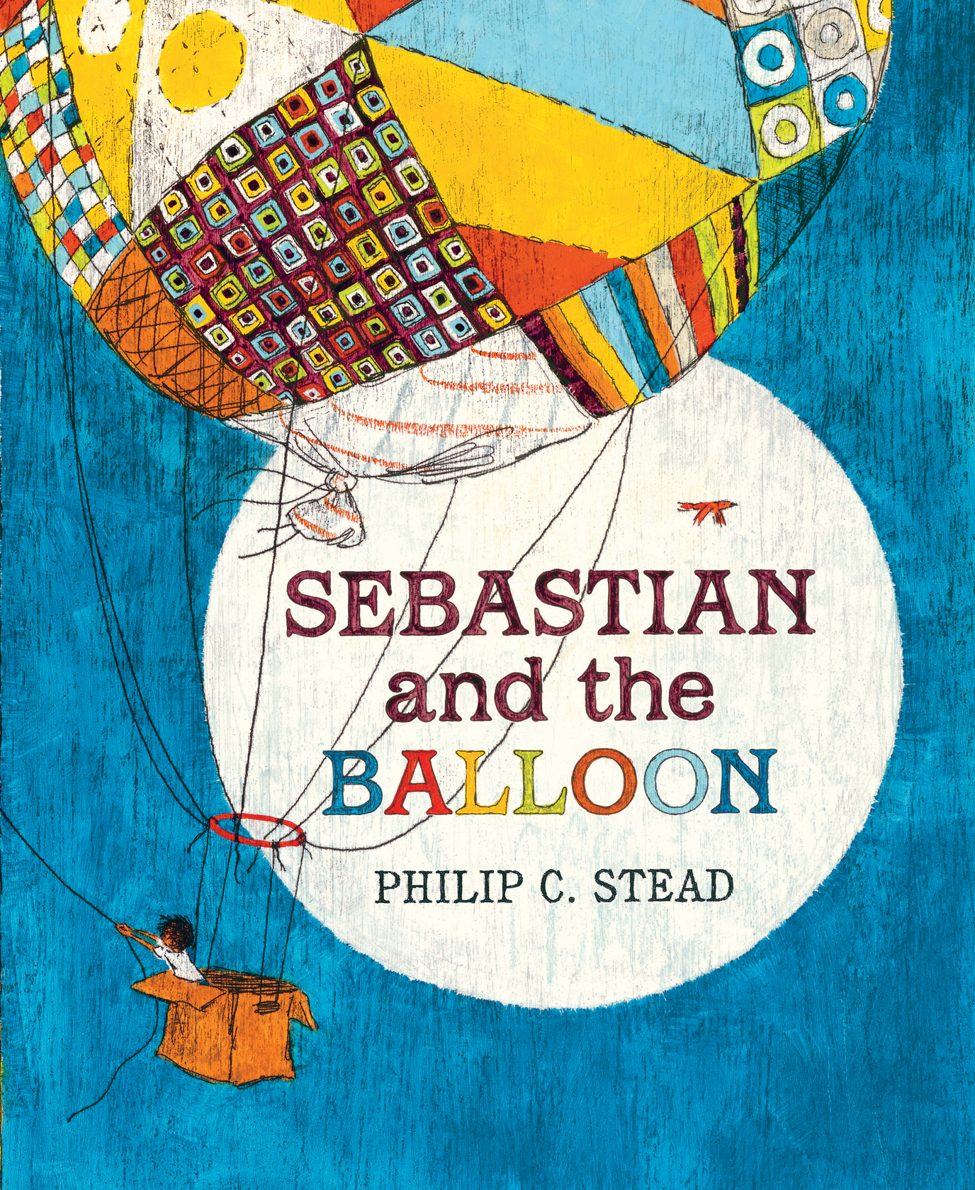
Author-illustrator Phil Stead is visiting today to chat with me about his newest picture book, Sebastian and the Balloon, released by Neal Porter Books/Roaring Brook earlier this month.
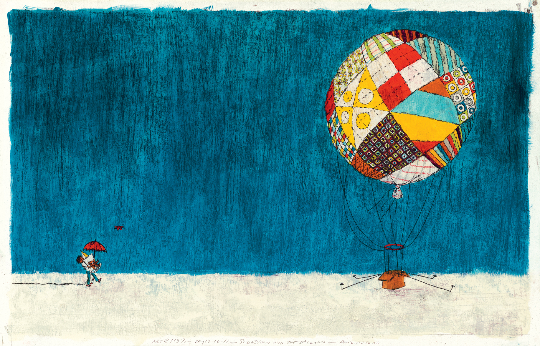
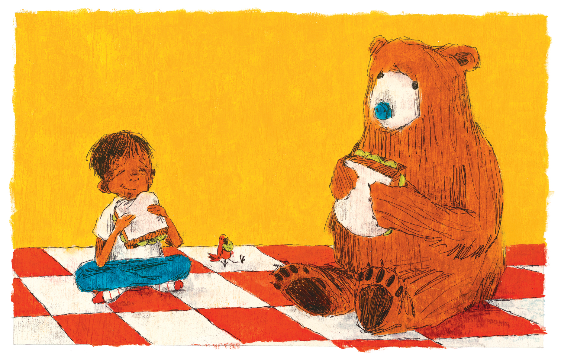
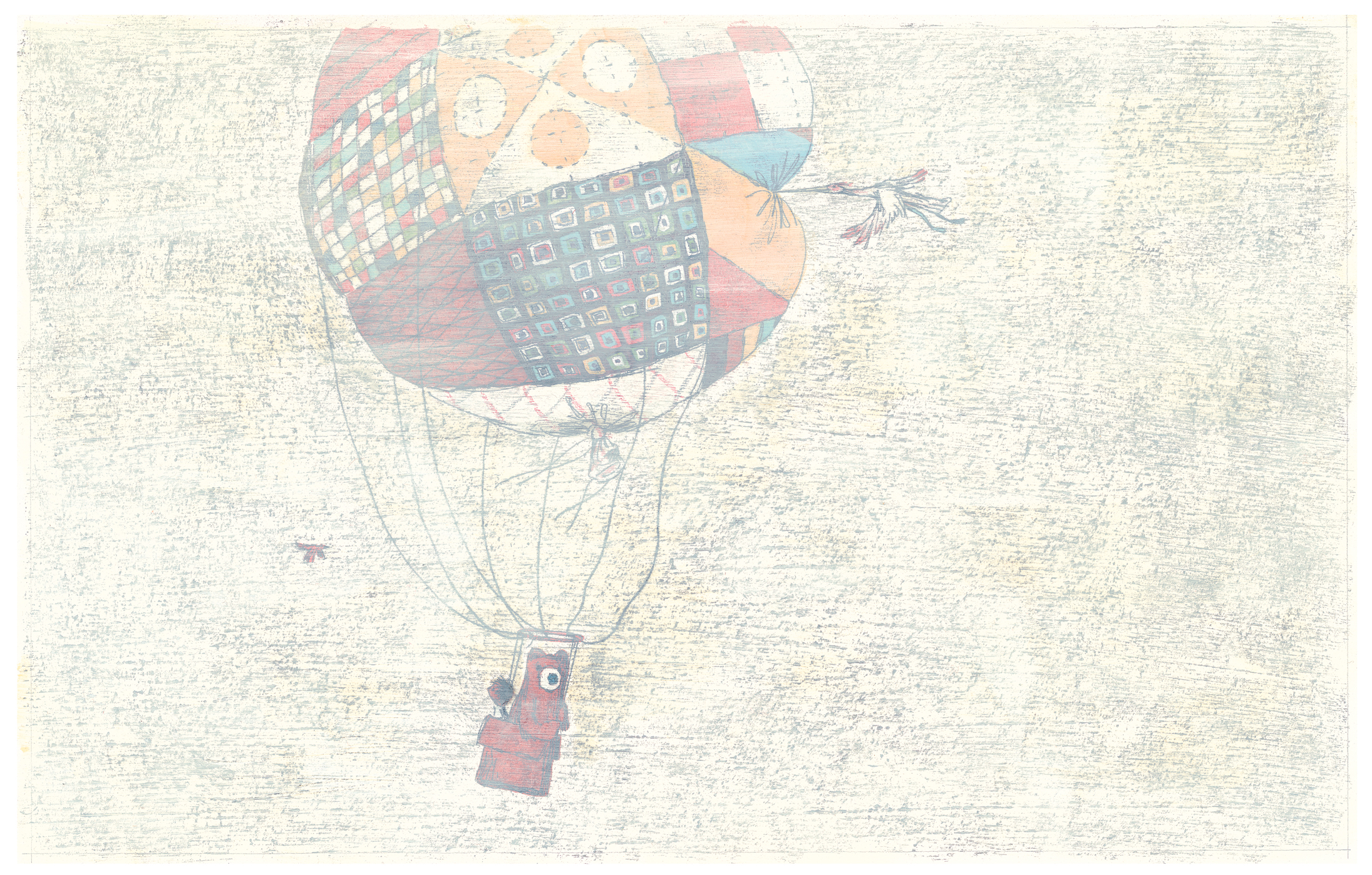
This is the story of a young boy who sets out on an adventure with “all the things he would ever need” and charts a course for the skies — in a balloon he’s built from his grandmother’s afghans. Along the way, he meets a bear (a real one), who joins him in the balloon, yet it’s popped at the beak of a “very tall bird.” Turns out, though, they’ve landed on the house of three elderly sisters, who mend the balloon and help the boy, the bear, and the bird shoo away some pigeons on the other side of the mountain near where they live. The pigeons have gathered on the “most perfect roller coaster,” which together the crew fixes up for an exhilarating ride.
Phil chats with me below about how he made his art, letting nature take its course on your illustrations (and embracing humor error), and leafless trees needing company too. (P.S.: You can see a few other spreads from the book in this June 2014 7-Imp post.)
Jules: Hi there, Phil. Let’s talk about Sebastian, shall we?
So, first up: I want to ask about the art. I hope that’s not a boring way to start.
It almost looked to me like the cover was painted on wood. But I’m not an artist, and I often get these things wrong. I see on the official copyright page note that you used pastels, oil paints, and pressed charcoal. Am I right that this is the first time you’ve used charcoal, or am I dreaming that?
Phil: Hi, Jules!
You are not dreaming. This is the first time I’ve used charcoal.
I gave myself a tricky challenge in making the art for this book. I really wanted to use oil paint as the primary medium. I can get bright color using oils that I’ve always had trouble getting with gouache or acrylic. At the same time, though, I wanted elements of the book to be drawn with my natural hand. The trouble is that you can’t really draw on an oil painting. Oil paint is usually the end of the road. I was getting really frustrated trying to figure this problem out when this little accident happened in my sketchbook:
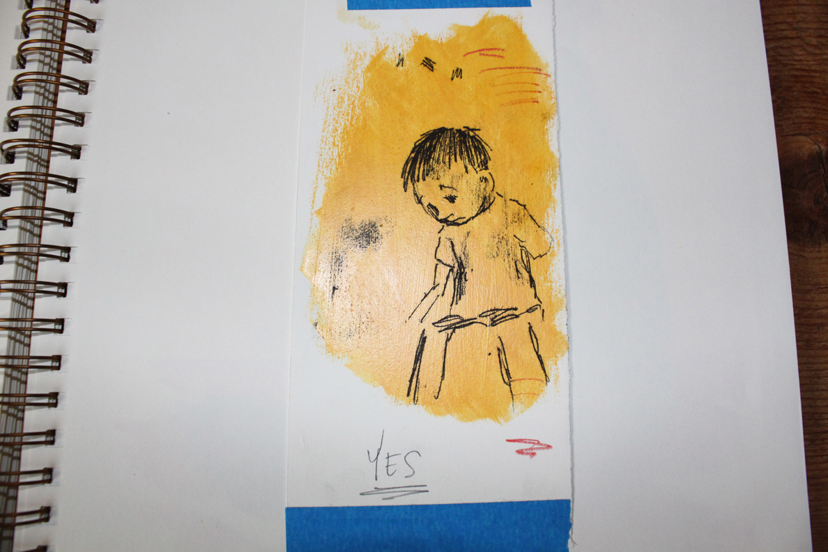
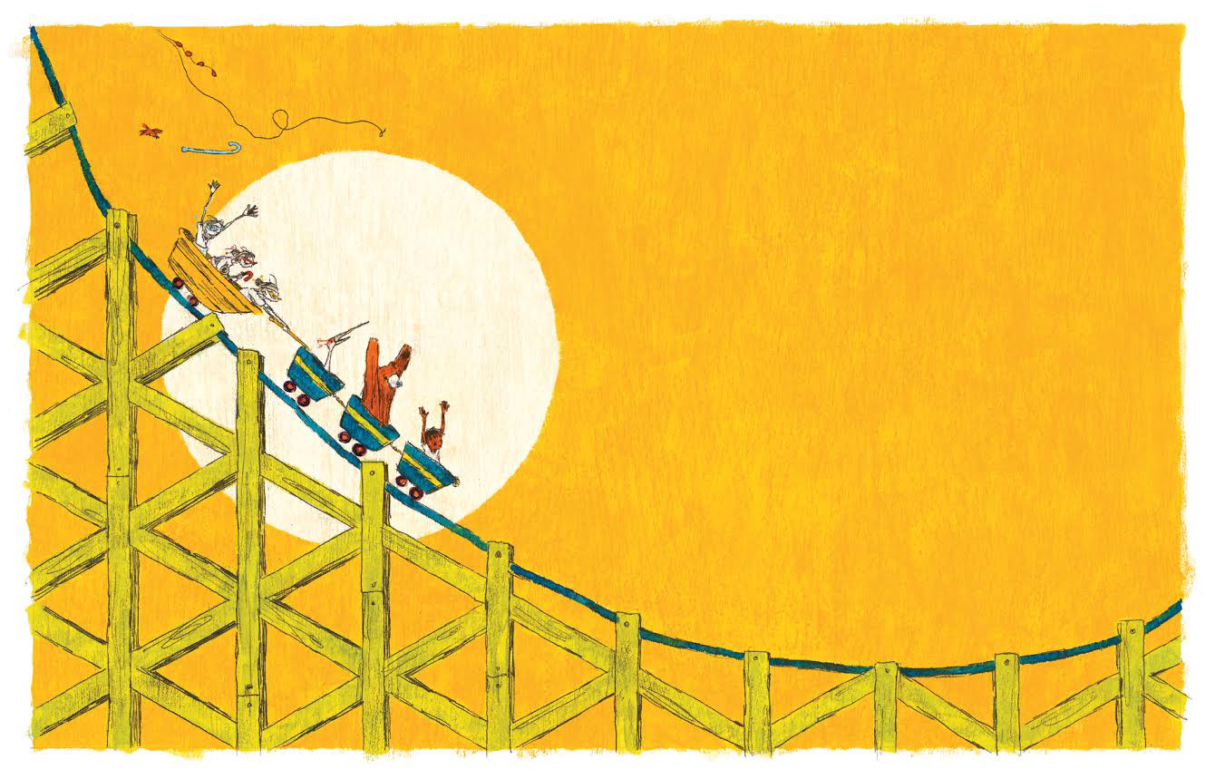
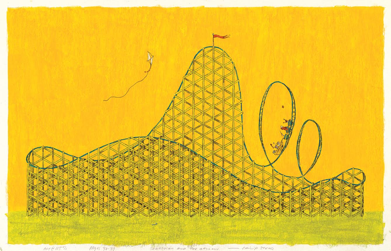
Now, this might be confusing, but I’ll try to explain as best I can. When an oil painting is mostly dry—tacky to the touch—you can press charcoal into the paint by using homemade carbon paper. I coat one side of a sheet of paper in charcoal, lay that paper on top of the oil painting, then draw with a pencil on the white side of the paper. The pressure of the pencil presses the charcoal permanently into the oil painting. There is one big pitfall to this approach. That is, you’re essentially drawing blind. You can’t see what you’ve made until you peel the carbon paper back off the oil painting. I can live with the kind of mistakes and flubs that come from this kind of uncertainty, though. In fact, I kind of like it. The only time drawing blind made me really tense was on exacting, mechanical images, like these ones of the roller coaster:
(Click to enlarge)
(Click to enlarge)
But on others, like these, I didn’t mind:
(Click to enlarge)
By the way, what you’re seeing as a wood-like texture is actually pastel drawing that’s showing from underneath the oil painting. I probably should’ve documented the making of one of these images so I could show rather than tell, but unfortunately I didn’t think of it at the time. David Ezra Stein used a similar technique as this, though, in his book Because Amelia Smiled. He calls his technique “Stein-lining.” You can watch a video about it here:
If you substitute crayon for charcoal, you basically get “Stead-lining.”
Does that help?
Jules: Ooh, neat. Thanks for the explanation. Plus, I hadn’t seen that David Ezra Stein video. Chickens playing oboes. Bonus!
This explains a lot about the lines in this book. The first time I read it, I thought that your line was more relaxed than in other books. I like this relaxed, sketchy quality.
One thing I’m very curious about is the color palette. The colors here remind me of picture books of yore. Any particular reasoning behind the dominant colors chosen here? That is, the rust, the tealy-blue (I have spent about 30 minutes now trying to find the name for this color, but I have failed and “tealy-blue” is the best I can do), the yellow.
Also, one more technique-type question before I ask a few more about the story: How’d you pull off the “milky gray fog”?
Phil: I’ll start with the fog.
(Click to enlarge)
It’s actually so simple that I hate to admit it. Especially since I seem to get more questions about this spread than any other. All I did here was make an entire finished image in full color, wait for it to dry, and then paint over the entire thing with white oil paint. The white paint has been thinned with a quick-drying medium, making it translucent. This is one of the biggest images of the balloon in the book, and I’ll admit that I was sad (and scared) to paint right over it, obscuring a lot of the detail. But it had to be done!
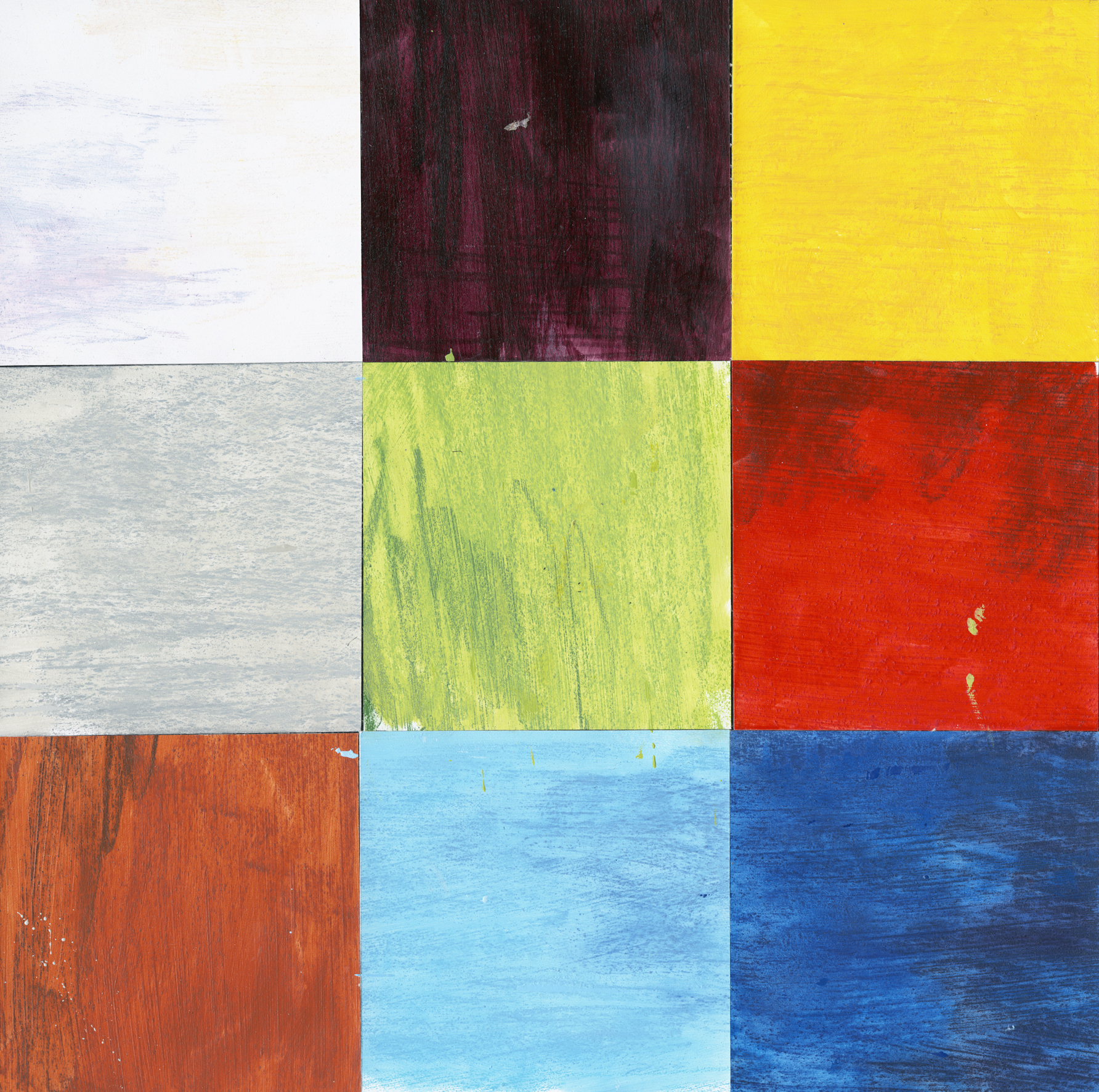
As for the color in this book, I decided early on that I wanted to work in a very limited palette. There are only nine colors used in the book, with some variance due to human error. (Fun fact: Erin used only eight colors in A Sick Day for Amos McGee.)
(Click to enlarge)
Any time you limit color choices in a children’s book, I think it naturally calls to mind an era when color choices had to be limited in the days of yore. That said, I did not deliberately limit the colors in this book in order to make it look old-fashioned. I did it, rather, in order to introduce a set of rules into a universe that could’ve easily gone spiraling out of control. A lot of weird things happen in this book. Keeping the color palette so orderly was one way to make the world seem grounded and believable. The restricted palette adds a dead-pan element to what is, admittedly, an pretty insane story arc.
And then there’s one more thing about the color, something that I didn’t originally intend. Remember I mentioned human error? So, I used a quick-dry medium to speed up the drying times of my oil paints.

When using this medium, my paintings would dry in about 48 hours. Without the medium, their drying times would vary from 4-6 weeks, which is way too long when you have a deadline. I’d used dryers before but never in high quantity. Turns out, I was using so much that it accelerated the aging process of all my paintings. About two months after a painting was finished, it would start to yellow and age. It turned my light blues into the tealy color you described. It turned my whites to cream. All of the colors were affected in some way, and to make matters worse they were all aging at different rates. Of course, at first I panicked. But then at some point I started seeing the process as something natural, completely out of my control, and in a weird way, desirable. It was like letting a cheese or a wine age: You begin the process, but nature finishes it.
(Click to enlarge)
Jules: I was going to say that it sounds like making the art for this one was a roller-coaster ride when, OUCH, I realized the horrible pun I’d made.
Okay, just a question or two about story. I always worry about analyzing a book to death when maybe we should just sit back and enjoy it and the art, so okay, I’ll only ask one:
I love how the story begins with Sebastian having a bad case of ennui. I don’t mean depression, which is a serious thing for many people. But he’s got the humdrums somethin’ fierce and really needs an adventure. Maybe I was thinking about that a lot today [Ed. Note: This part of our conversation clearly took place on a Sunday], because Sundays always run the danger of being Ennui Days for me. (Maybe ’cause Monday looms? I dunno.)
So, you call it a “pretty insane story arc.” Once you knew Sebastian needed an adventure, how’d you reign yourself in? I assume you have Sebastian outtakes, parts of his adventure that were maybe cut?
Also, apropos to not-that, I love how the leafless tree ends up having company there at the end. Everyone is happy.
Phil: There have been two feelings that have dominated my psyche over the course of my life so far. And those two feelings are the two main themes in my books as well. They are:
- I wish we could all learn to be kind.
- I gotta get the heck outta here.
Number two is an amorphous sort of feeling that is part boredom, part dread, part dissatisfaction, part curiosity. This feeling has been with me every day of my life. And to me it’s the feeling that drives Sebastian throughout the story. Boredom-Dread-Dissatisfaction-Curiosity is, after all, the makeup of most kids that I know.
Weirdly enough, there were no deleted scenes in this book. Everything present in the first draft is present also in the final book. When I was writing I wasn’t thinking WHAT NEXT! Really, I wasn’t even trying to be over the top or intentionally strange. The story just went where it wanted to go, and I tried not to get in the way.
I love that you mention the leafless tree. Those three lines are my favorites that I’ve ever written:
And the pigeons flew off,
all the way to the leafless tree.
And the tree was glad to have company.
I didn’t realize it till long after they’d been written, but they sum up everything I hope to accomplish as an artist. I wish I could explain it better than that, but I don’t think I can. All of my books exist in those three lines somewhere.
Jules: Ah. I think we should fade out here …
Thanks, Phil, for visiting.
SEBASTIAN AND THE BALLOON. Copyright © 2014 by Philip C. Stead. Published by Neal Porter Books/Roaring Brook Press, New York. All images here reproduced by permission of Philip C. Stead.

Great interview Jules! Can’t wait to read “Sebastian.” Going to a signing this weekend with the Steads, so glad to have this insight before.
Holy moly… Nearly every time I read about how Phil makes one of his books, I feel so process inadequate! Like I need to be adding about 13 more steps into the art I’m doing in my books. [sigh] That leafless tree is one detail that always makes me do a tingly smile. That and pickle sandwiches.
Don’t forget strawberry sandwiches. Mmm.
[…] look at Philip Stead’s artistic process for his new book, Sebastian and the […]