From Zine to Picture Book: Greg Pizzoli
Discusses the Making of Tricky Vic
 March 3rd, 2015 by jules

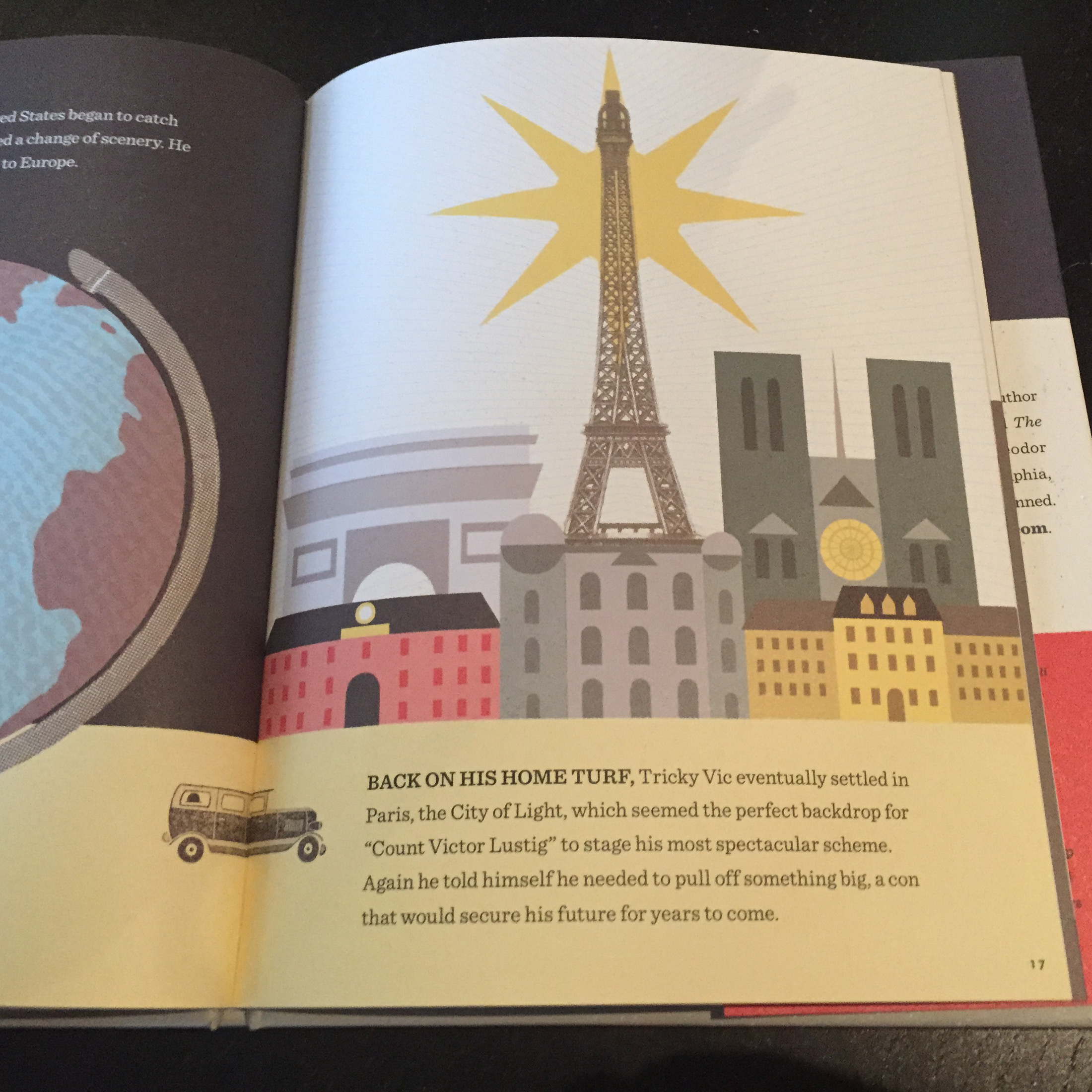
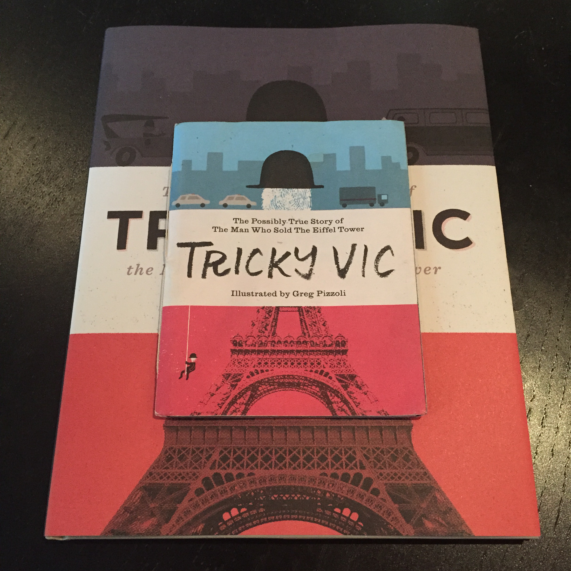
 Author-illustrator Greg Pizzoli visits 7-Imp this morning to talk about his entertaining new picture book from Viking, Tricky Vic: The Impossibly True Story of the Man Who Sold the Eiffel Tower, on shelves next week — and a book, as you’ll read below, that started its life as a zine. It tells the story of the sly and brilliant con artist Robert Miller, who later became Count Victor Lustig and who is known, as the title tells you, as the “Man Who Sold the Eiffel Tower.” It’s a fascinating story with a smart closing Author’s Note from Pizzoli. (“Stay sharp” are his final words to readers.) And he created the art using pencil, ink, rubber stamps, halftone photographs, silkscreen, Zipatone, and Photoshop. Many of the photos in the book come from a Paris trip he took years ago, but then again, you can read a lot more about this below.
Greg has a couple more books coming out this year, but he may actually visit again at a later date to discuss those. Right now, it’s a Tricky Vic kind of morning. Let’s get to it. Grab your coffee and get ready to get conned. I thank him for visiting.
Oh, and by the way: Greg mentions Mac Barnett below, which makes me think of his new book, co-written with Jory John and illustrated by Kevin Cornell and which also happens to be about conning (and practical jokes and all-things-mischief). It’s called The Terrible Two, and it was released in January by Amulet Books. It is very funny. It’s selling well and was recently optioned for a film adaptation, as Travis Jonker noted here. So, you’ve probably heard of it already. If not, I highly recommend it. No joking.
Now, I welcome Greg …
Greg: Okay. So, Tricky Vic.
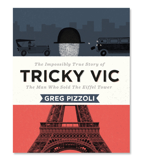
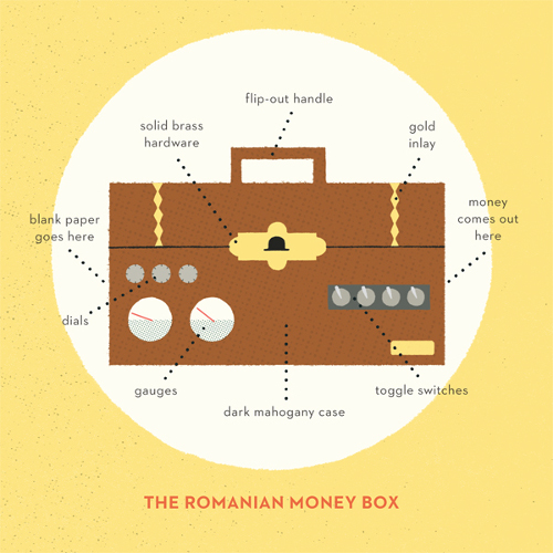
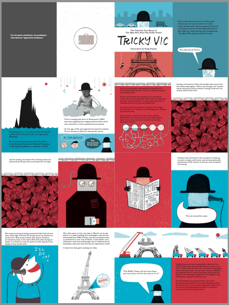
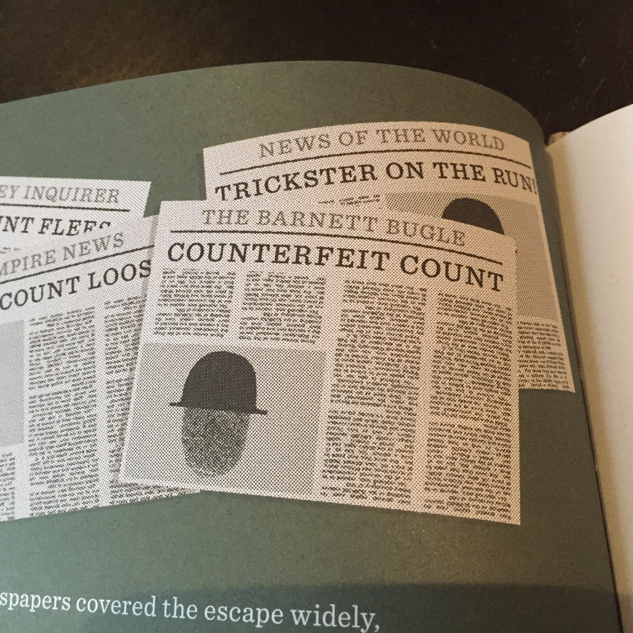
Tricky Vic: The Impossibly True Story of the Man Who Sold the Eiffel Tower is a nonfiction picture book about the life of one of the world’s greatest con artists [Robert Miller/”Count Victor Lustig”]. His most infamous trick, of course, was selling the Eiffel Tower for scrap metal, but he also conned Al Capone, escaped from prison by literally tying bedsheets together and climbing out a window, and repeatedly sold “money-printing boxes,” which in reality did nothing at all.
Tricky Vic started back in 2009 when I was in graduate school, studying Book Arts and Printmaking. I had heard the major points of Miller/Lustig’s life and had the idea to make a comic or a zine out of it — but never did. Then I graduated and sort of forgot about it.
Fast forward a few years of working hard at illustration, getting my first book deal (for The Watermelon Seed) and, one day, getting lunch with Mac Barnett. Actually, we went to The Rosenbach Museum and Library here in Philadelphia, which at the time housed the Sendak collection, where we saw Sendak’s pencil sketches for a proposed edition of The Lord of the Rings, among other things.
But after that, we got lunch. And we were talking about nonfiction picture books and why they often seem to fall flat. Mac was at the time working on President Taft is Stuck in the Bath, and I told him my con-artist idea from back in grad school. He told me I had to make it. I said, “I guess I could make a zine.” And he said “MAKE A ZINE!”
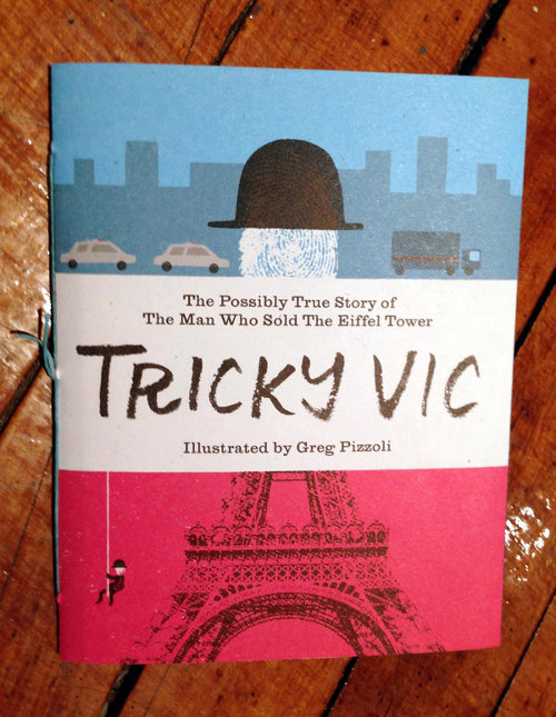
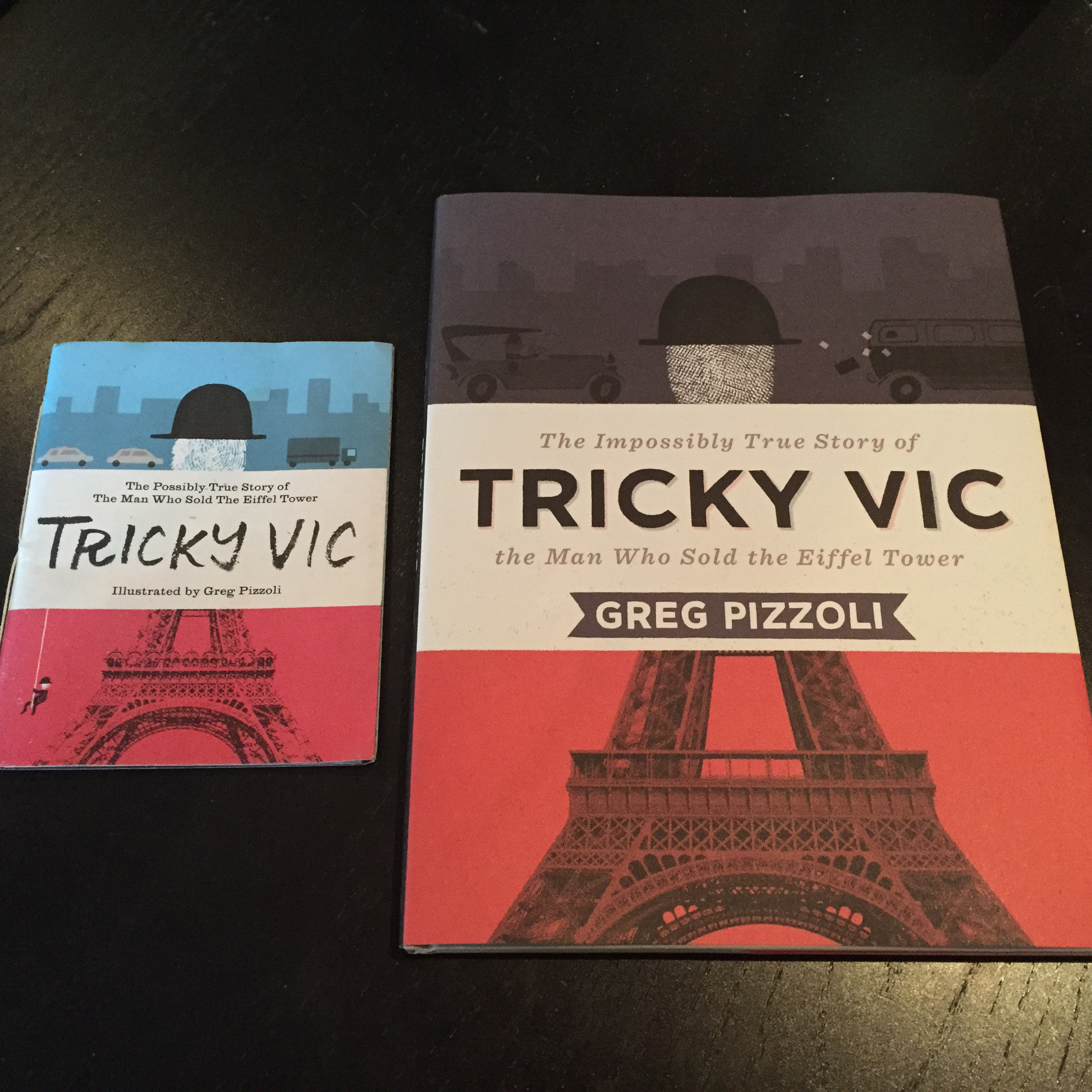
A few months later, I made a zine. Here it is:
The University of the Arts, where I went to grad school and where I occasionally teach, has a couple of offset presses. And once a year the Printmaking department offers a class called Book Production, where you make a book in an edition of at least 100 copies. So, the first half of the class you are making book dummies (which some people seem to call “mock-ups,” but which I will always call dummies), and you talk out ideas during critiques and try out different formats. And the second part of the semester you are printing and assembling the books. I had taken this class previously as a student, and my department head was the instructor. She graciously allowed me to audit the course so I could explore Tricky Vic.
I was going to illustrate the book in a more “usual for me” kind of way, but the limitations of only being able to print five layers of ink (two colors on one side of the paper and three on the other)—plus having basically three weeks to put the whole thing together, not to mention the approaching deadline of Not Very Scary—forced me to simplify everything. I approached each spread or illustration like it was an editorial assignment and came up with stuff that looked pretty different than my usual kidlit work.
Here are some examples:
(Click to enlarge)
So, then I put a couple dozen of the zines together (they were all hand-sewn by me) and made little rubber stamps for the envelopes and sent them to kids’ book people I know — and one to my agent Steve. I sold a few on Etsy, too, I think.
I really enjoyed making it, but I had no thought that it could be a “real” picture book. It just seemed too weird, too dark, too much about-a-criminal-who-scammed-people-out-of-their-life-savings to work for kids’ books, ya know?
Well, like I said, I sent it to my agent Steve, and he just has an amazing vision for this kind of thing. And before I really even realized what was happening, I had a two-book deal with Viking.
Then came researching, re-writing, more researching, re-writing, re-writing, re-writing, and nine months or so later, I had the story at a point where I could start thinking again about pictures.
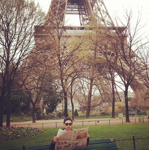
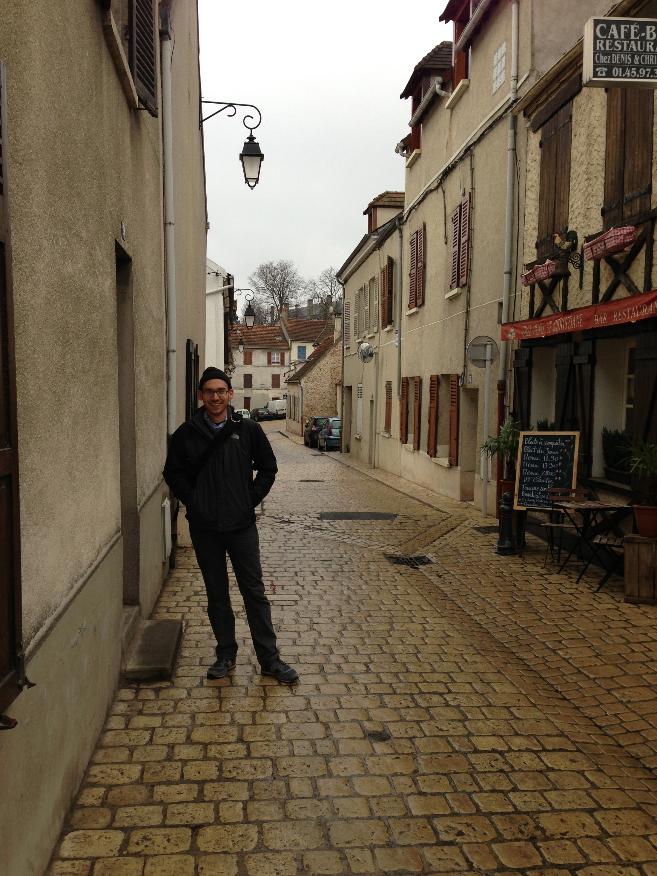
Part of my research process involved going to Paris, and since I had just proposed to my (now) wife, we left for Paris the next day. We stayed in the suburbs with some family friends, who live in a 17th-century converted farmhouse. They live a nice life.
(Click to enlarge)

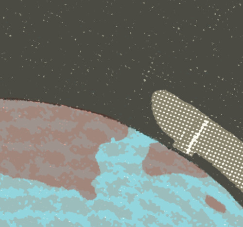
which appears in Tricky Vic
(Click to enlarge)
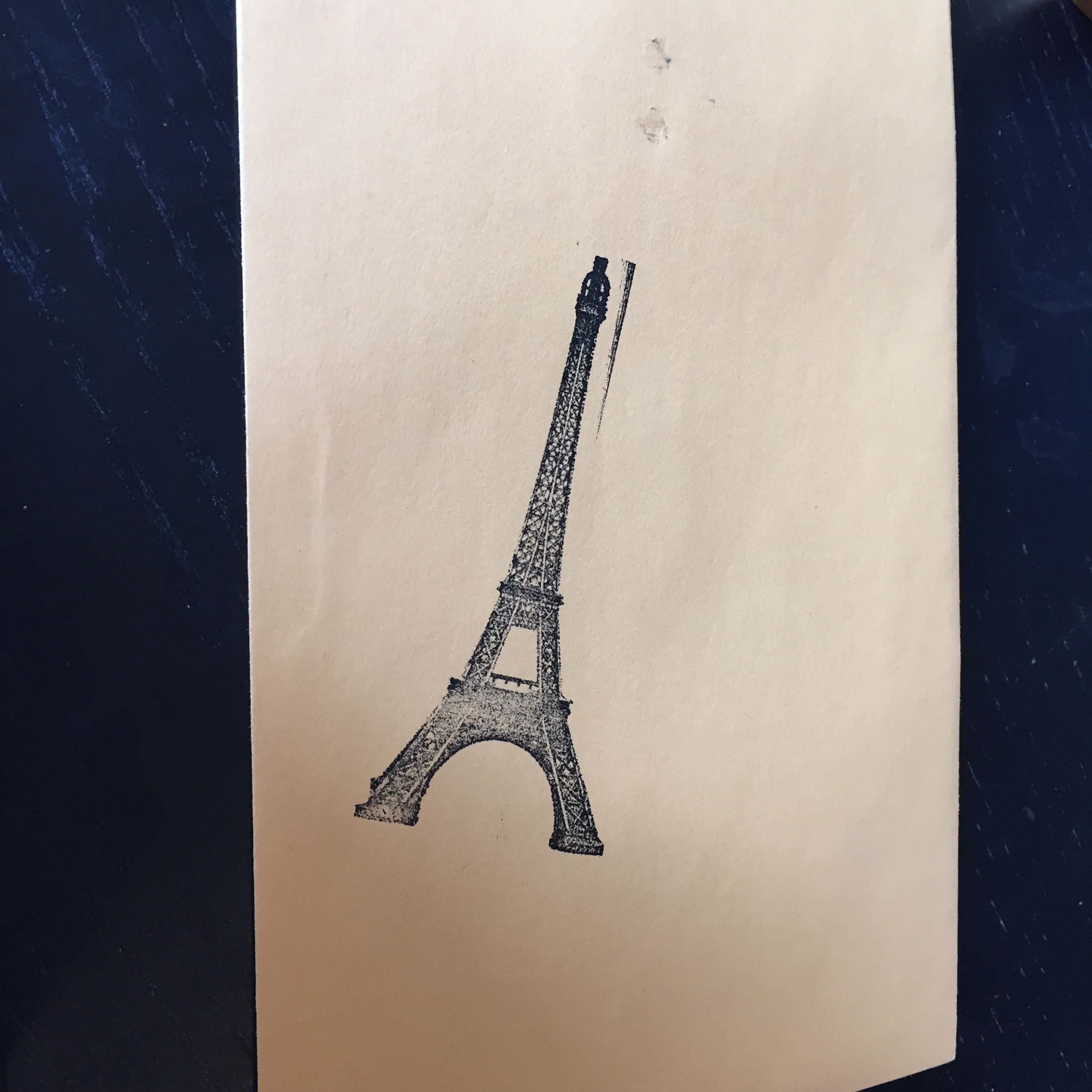
We went all over Paris doing all the things two newly-engaged people do, especially when one of them is working on a picture book about a guy who sold the Eiffel Tower. I took a ton of photos, and a lot of Paris is in the book — in subtle ways sometimes. For example, this is part of the floor of the Eiffel Tower platform:
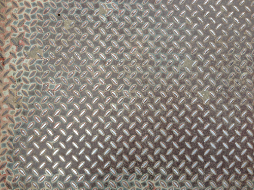
It’s also the photo I used to make all of the halftones throughout the book. The gritty texture, this stuff:
Also, this photo. This is the floor of The Louvre.
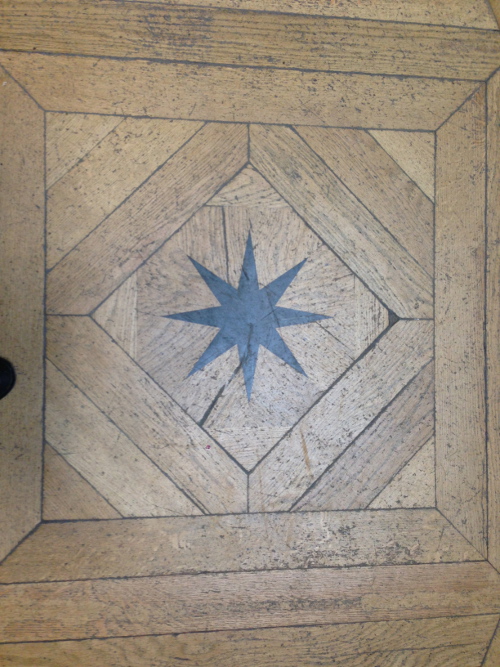
That shape is used throughout the book. And I don’t expect that anyone would recognize it or—in the case of the halftone grit—even have a chance of knowing, but to me it adds layers to everything. It makes it all more about my experience there, and it feels more (again, to me) like it has more depth than if I hadn’t included those elements.
(Click to enlarge)
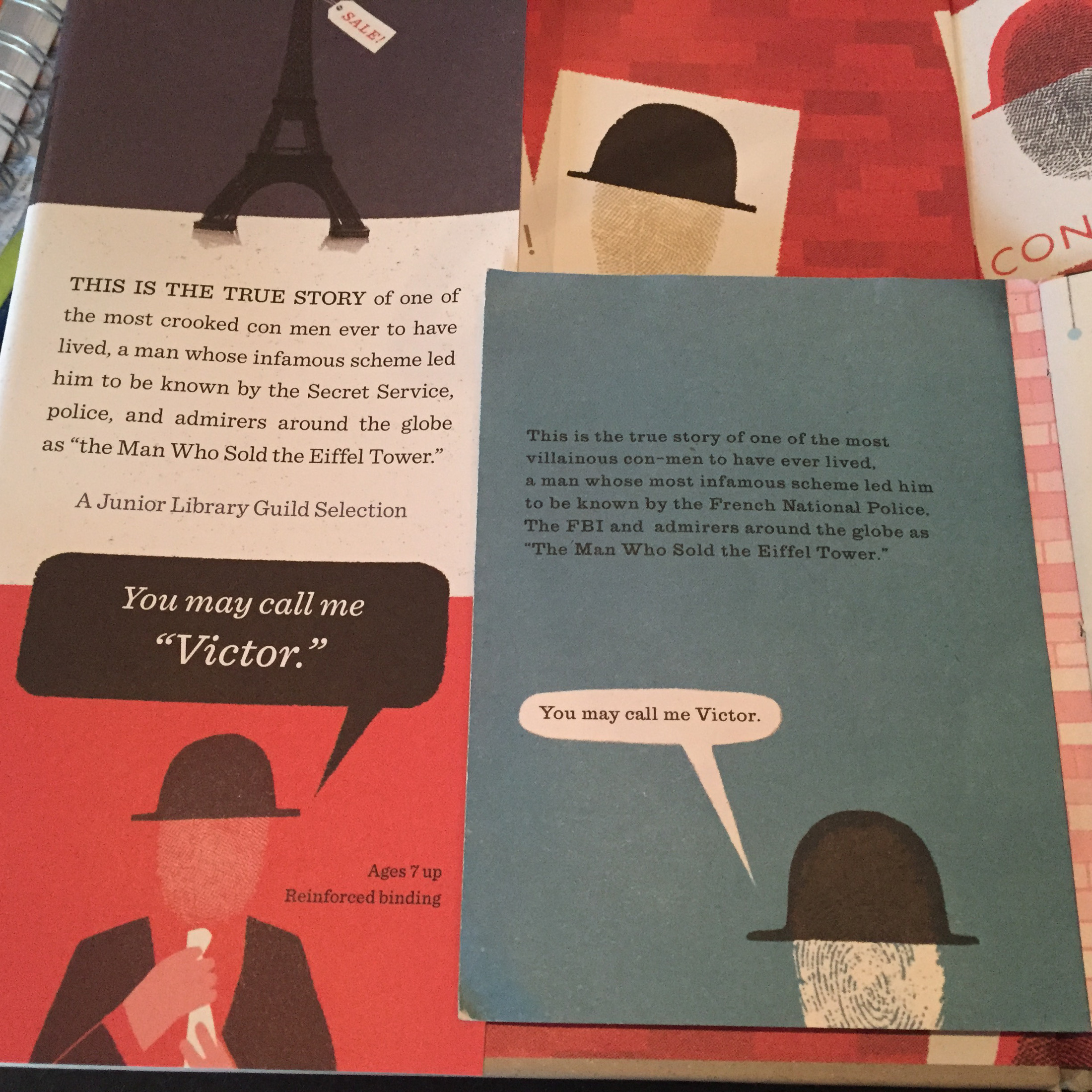
The original zine had a huge influence on the look of the final book, and lots of the ideas from the zine came through unscathed to the final. I’m really happy about that in one sense, but I definitely think the final book is a great improvement, largely due to my editors, art director, and friends who helped me along the way. It’s much more considered, but I hope not fussy. I had more time to work on it — the zine took three weeks, and the book took six months. At this point, the zine feels like a sketch for the book that came later. Pictures probably work better than my ramblings. Here are some side-by-side comparisons:

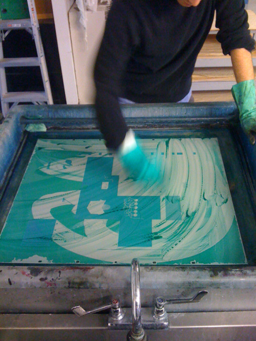
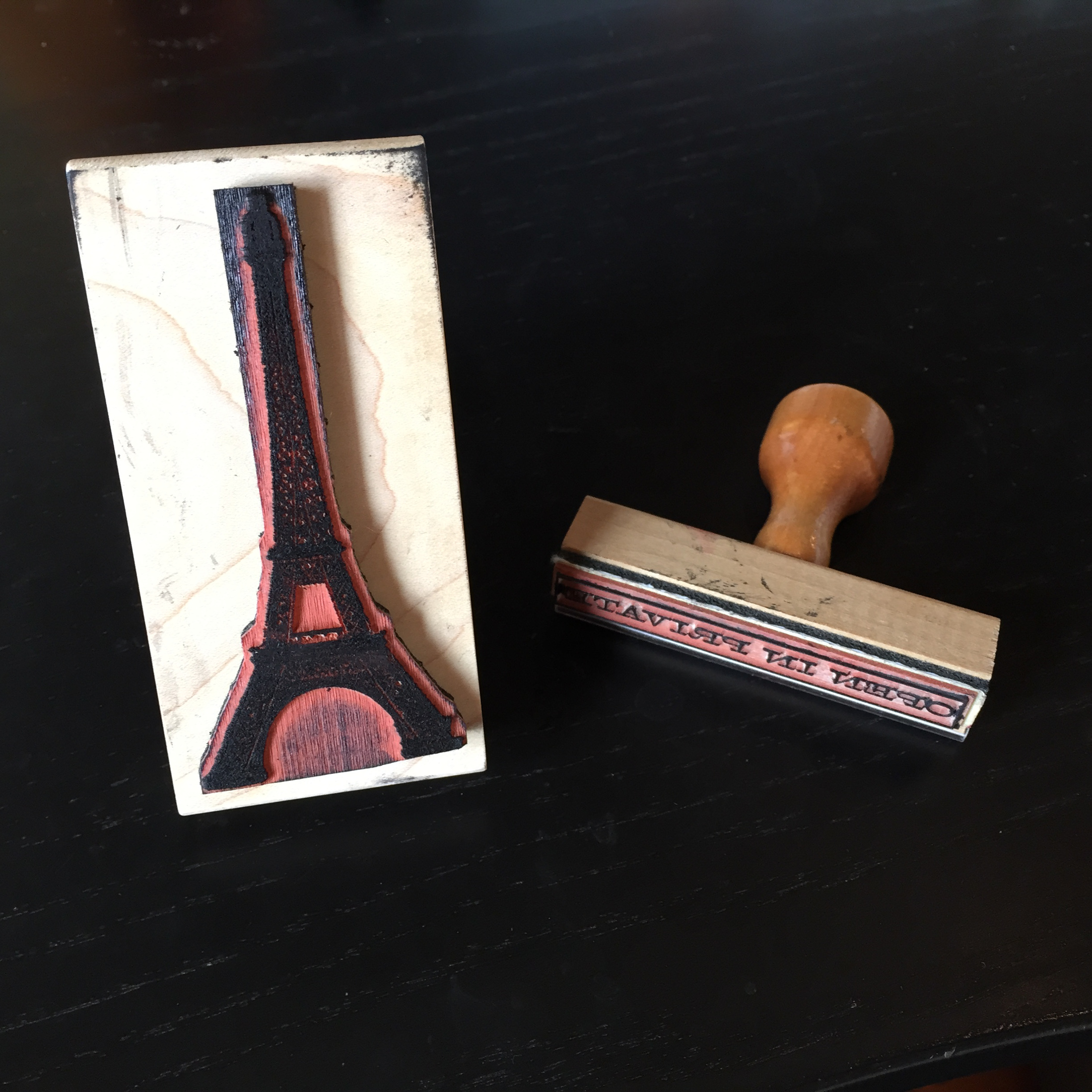
One of the things I did for this book’s final art is incorporate rubber stamps. I love rubber stamps. At some point I want to illustrate a whole book with custom-made rubber stamps — but I’m taking it one step at a time.
For Tricky Vic, I drew police cars, limousines, etc. and had a company I’ve been using for years, Simon’s Stamps, make wooden handle rubber stamps for me. It’s a nice way to have something that’s reproducible and quick, but—whereas copying it digitally would be maybe a little lazy and maybe look too slick—this adds some grit that I like.
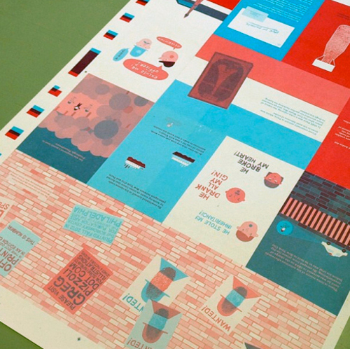
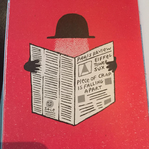
Something else: On another trip—for another book I hope we talk about next year—I went to London and, at the Museum of London, found this report card from 1906. Like a criminal, I lifted the basic layout and the tone of the language for Miller’s school report card, which in the book shows that he got an “F” in Conduct but an “Excellent” in Theatre. I made those grades up.
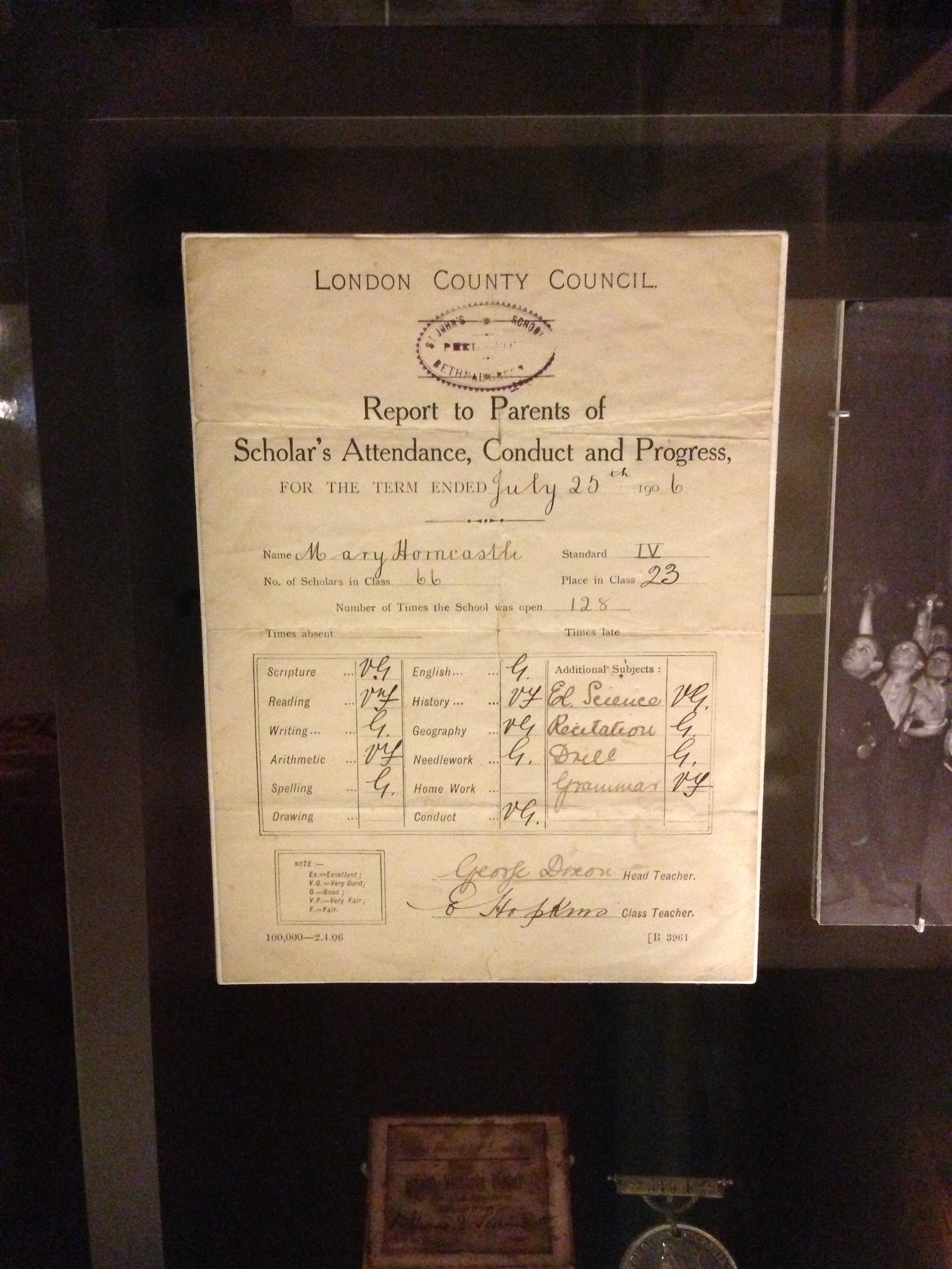
(Click to enlarge)
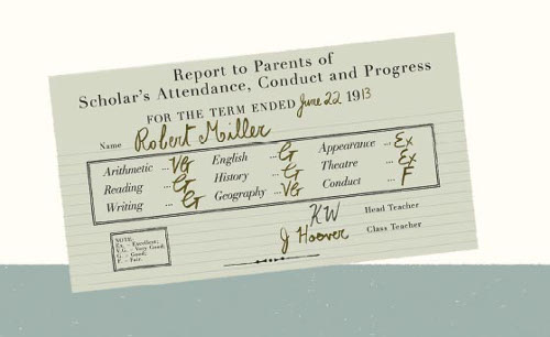
my art director, snuck into the report card.”
Again, I don’t necessarily expect that everyone will notice these things, but I think some kids will, and I bet we would get along. My dream for this book—besides, ya know, ten million copies sold—is that some kid who maybe is dreading yet another book report on a goody-goody President “who never told a lie” can pick up Tricky Vic and write a biography of the man who conned Al Capone. I’d love to see that.
(Click to enlarge)
Another thing that might be of interest is the case cover. Like all of my books I’ve written so far, the case cover is different than the jacket. The jacket is obviously pretty close to the zine — just (I think) more sophisticated.
(Click to enlarge)
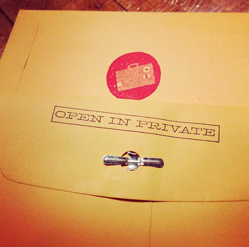
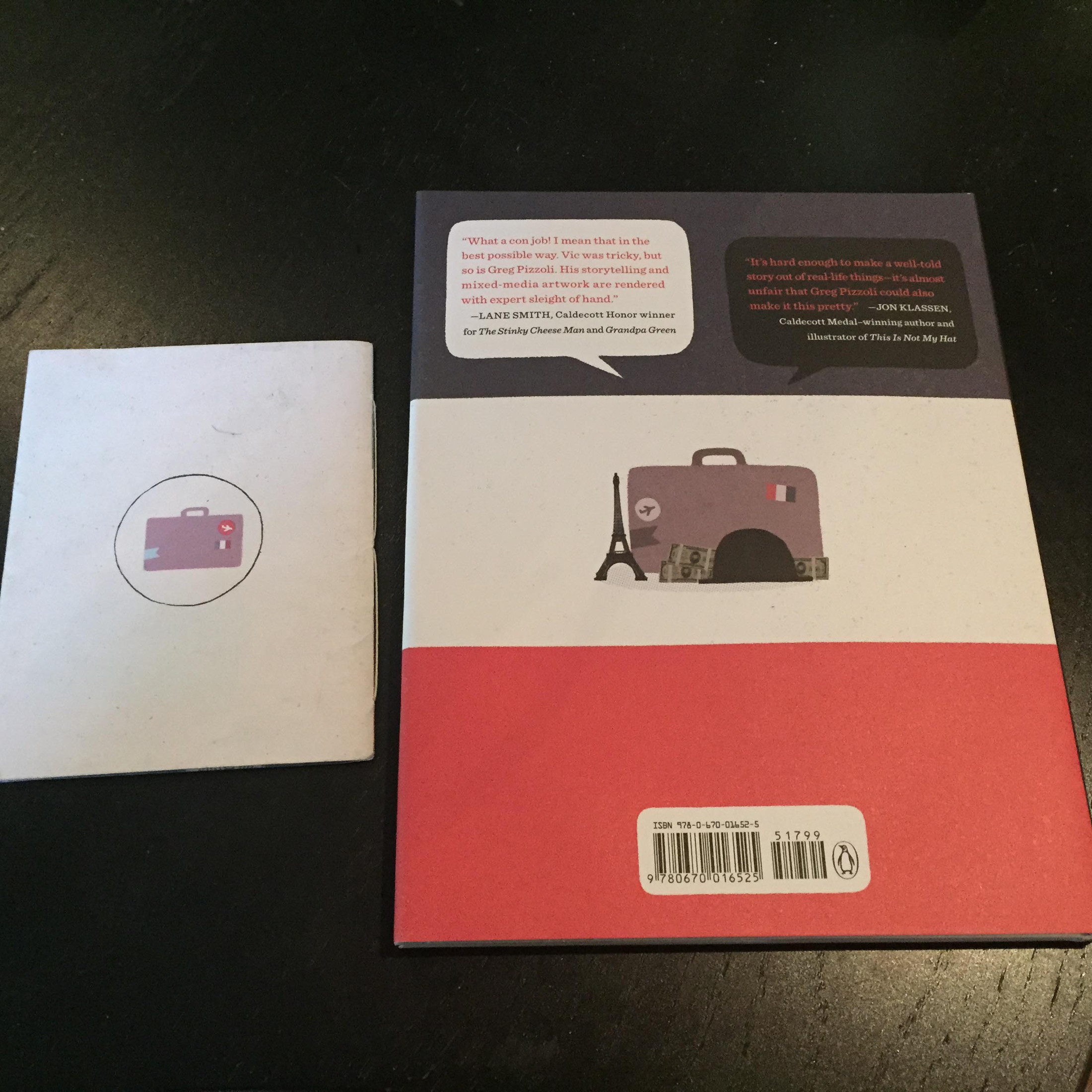
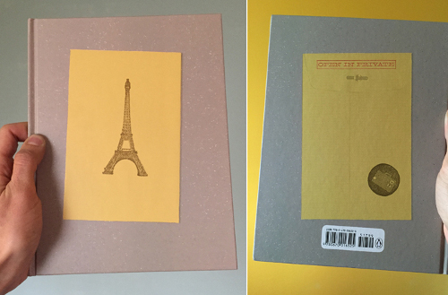
The case cover, though, was a blank slate, and as publishers seem to generally let me do whatever I want on the case covers, I decided to recreate the envelope that I used when I sent out the original zines. It shows up in the book, too. I figure when the pristine uncoated paper stock of the jacket gets ripped to shreds, there will be the case cover — with this mysterious envelope that reads “OPEN IN PRIVATE.”
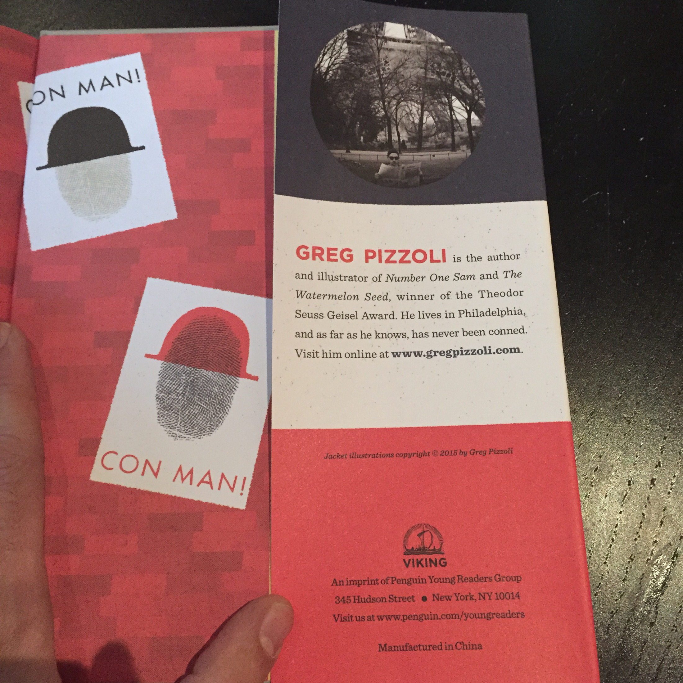
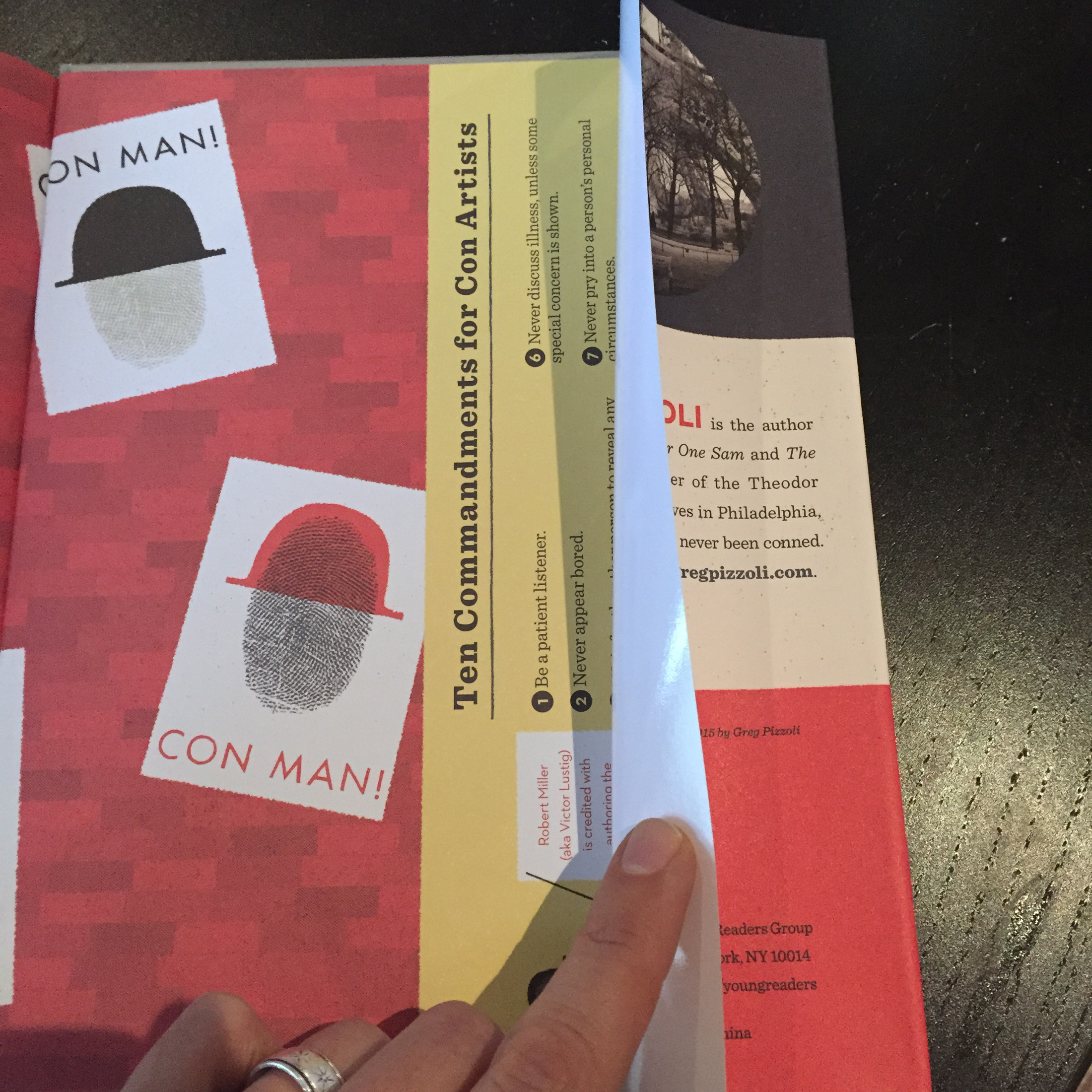
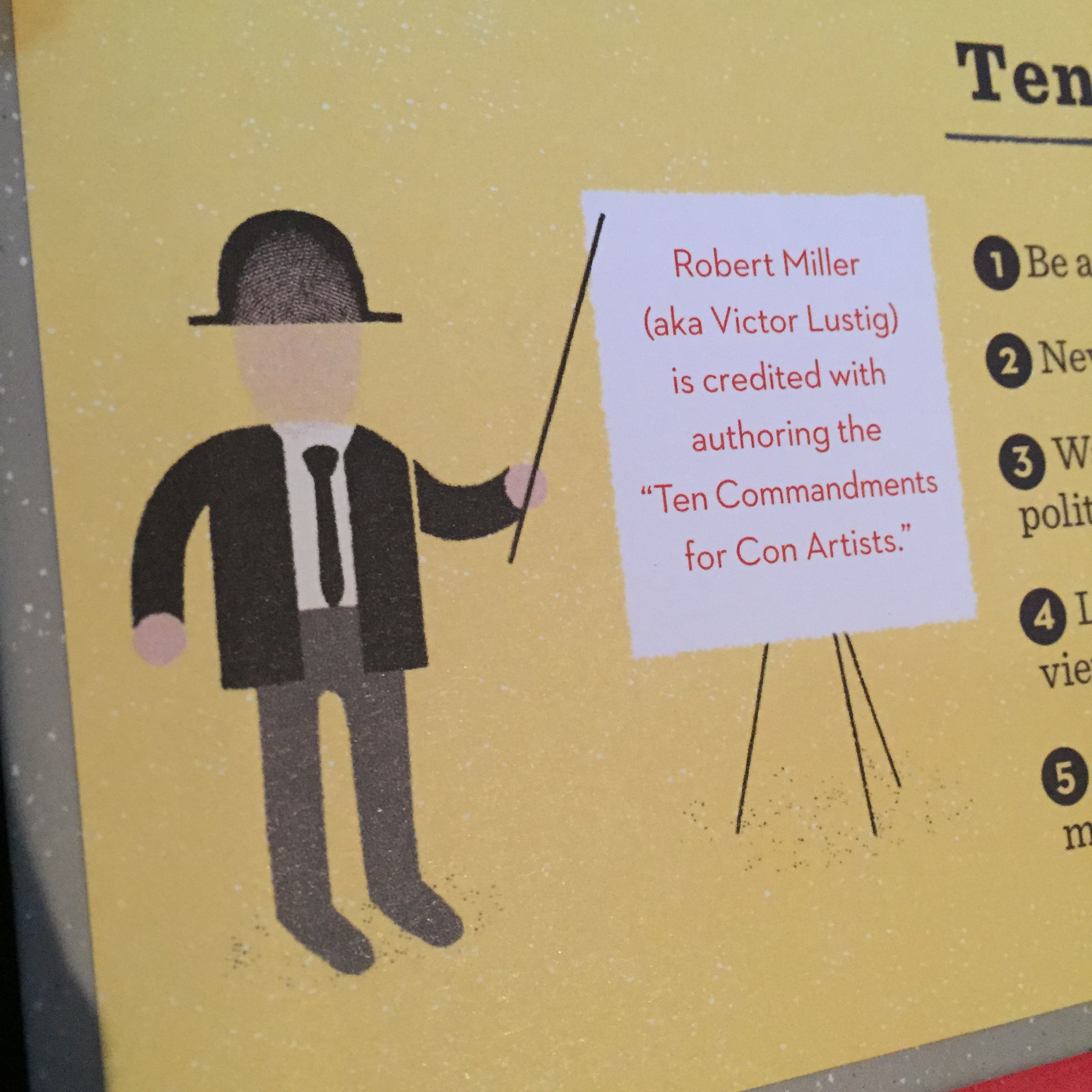
And, probably to the annoyance of librarians everywhere, I hid something under the back flap. Miller/Lustig is credited as writing the “Ten Commandments for Con-Artists.” And sneaking them under the back flap seemed the best solution to make sure that they weren’t spotted by concerned parents — and weren’t missed by discerning kids.
(Click to enlarge)
(Click to enlarge)
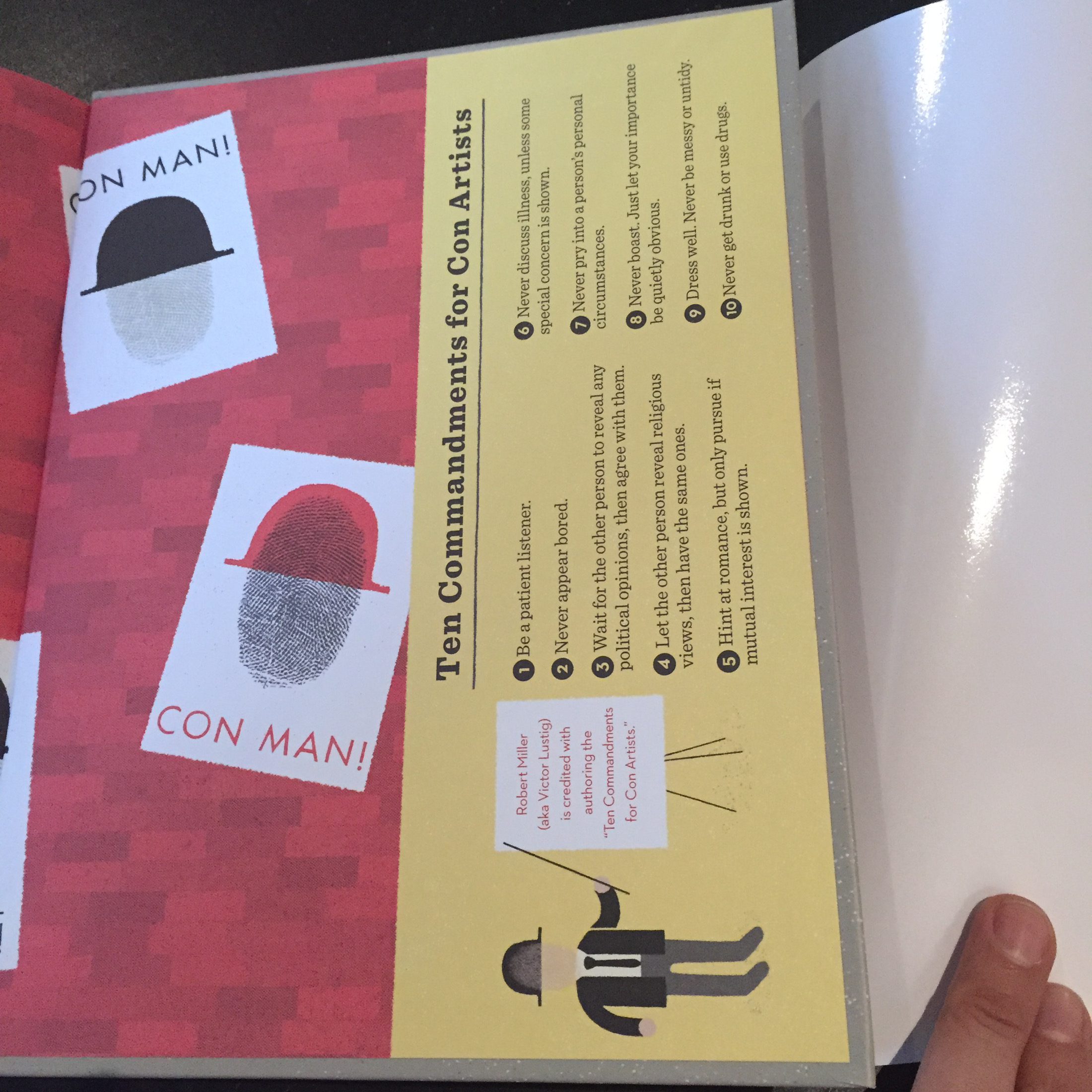
(Click to enlarge)
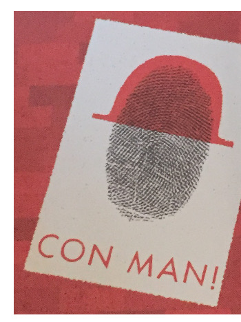
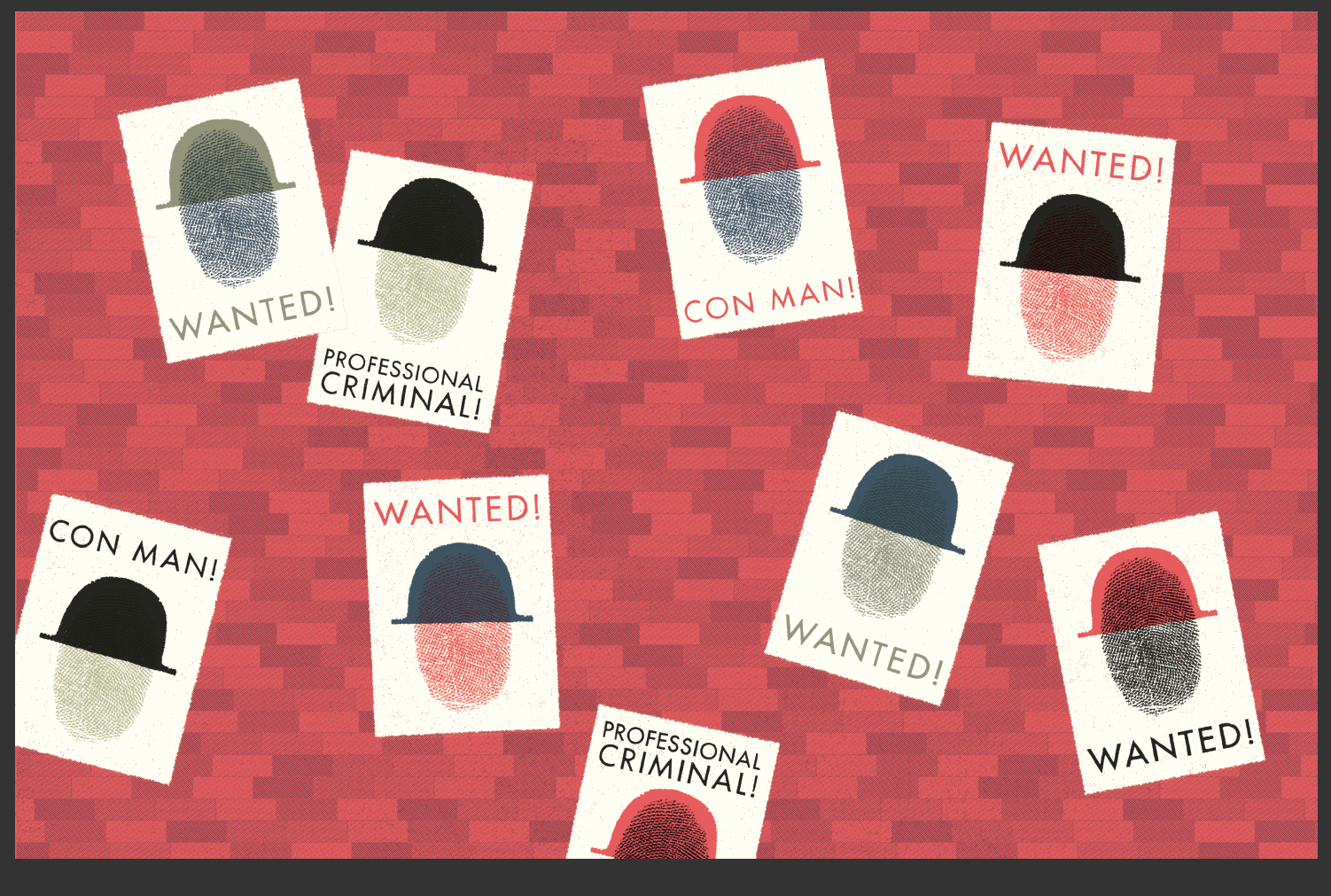
Also, you should know: Yes, that is my thumbprint.
(Click to enlarge)
TRICKY VIC. Copyright © 2015 by Greg Pizzoli. Published by Viking, an imprint of Penguin Group, New York. All images here reproduced by permission of Greg Pizzoli.

Thanks for the post and the nice write-up, Jules! Always a pleasure to visit your site.
This book is a game changer. We’ll look back and site it as the beginning of an entirely new category of kids lit. Congratulations Greg!
[…] want to know even more about Greg’s process for creating TRICKY VIC can sneak on over to the Seven Impossible Things blog. Greg says, “My dream for this book—besides, ya know, ten million copies sold—is […]
I agree with OHora! This thing is a game changer! GREG. You made a nonfiction book that is phenomenally interesting, has illustrations and design elements that are off the charts of anything that’s been done before and, frankly, you ruined it for the rest of us hacks who are just trying to write about bunnies. Thanks, man.
Ha! Agreed. Everyone has to start upping their game starting… NOW. Only nonfiction with an absurdly interesting subject, impeccable design, dry humor, and layers of hidden details now will do.
This so cool book is going to win ALLLL the things. Wow. I am torn between wanting to make prints, wanting to get out all my stamps, wanting to make fingerprint faces…
…and can you imagine what it will do for actual kids? Again, wow.
I absolutely LOVE, LOVE, LOVE, LOVE, LOVE all the elements you so cleverly and meaningfully incorporated into this book, Greg, like the platform as texture. You–are–amazing! The photos in Paris are wonderful to see, too. I’m really looking forward to seeing this book! Thanks, Greg and Jules, for sharing all this with us 🙂
What a comprehensive look at an incredible book! Thank you for sharing – this will make for some great discussion with my students before they embark on our annual book-making venture! They are going to LOVE all of these fun elements!
Wow, this is tops!! I love the insider secret information about the paris textures and louvre-floor shapes. Way to go, Mr. Pizzoli, and thanks Jules, for sharing.
[…] a post on “Seven Impossible Things Before Breakfast,” author/illustrator Pizzoli discusses the making of Tricky Vic which started as a zine. Completed in […]