A Visit with Darren Farrell
 March 10th, 2015 by jules
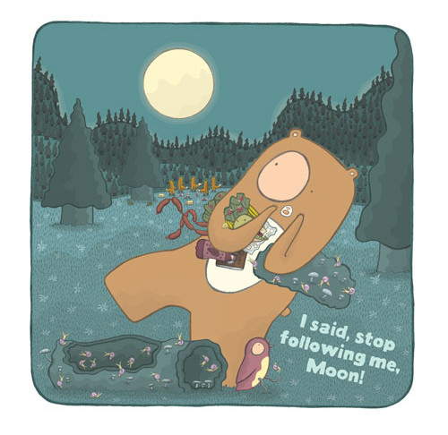
Author-illustrator Darren Farrell (or is it Shel Silverstein?) visits 7-Imp this morning to talk about his work and to give me a sneak-peek at his upcoming 2015 book, Stop Following Me, Moon! (pictured above). I asked him about his inspirations, and then he took it from there, as you’ll see below.
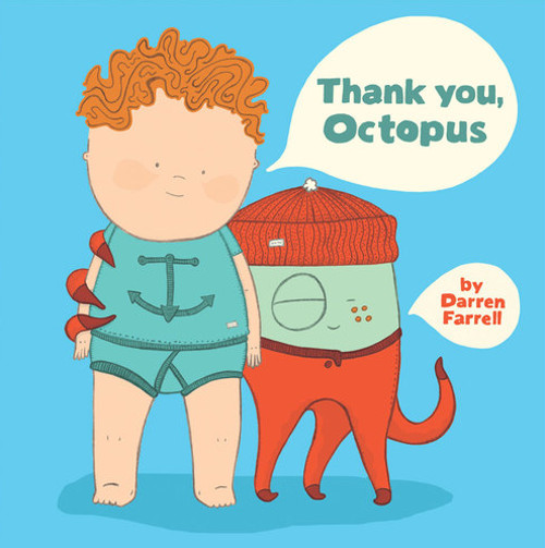
This is Darren’s third picture book, his most recent being last year’s Thank You, Octopus! from Dial Books, which the Horn Book described as a “hilarious nautical comedy of errors.” And never was there a weirder or more wonderful bedtime companion than Octopus. Bleep, blarp, bloop.
Let’s get right to it. I thank Shel Darren for visiting.
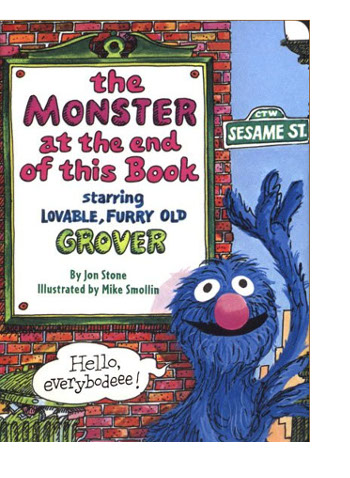 What inspires me? John Oliver, street art, Oliver Jeffers, hip hop, jazz, skate videos, Mo Willems, The Monster At The End Of This Book, heaps of yogurt, writing in a notebook while commuting on public transportation, hanging out with my family, the New York Times, church, and—right now—the color purple (not the book, although it is fabulous, but the actual color purple).
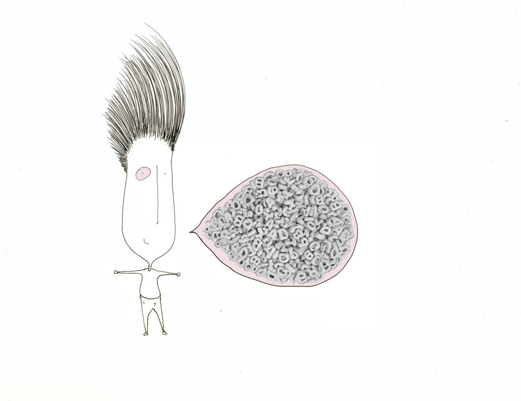
My original inspirations were Hong Kong artists Michael Lau and Eric So, mixed with the minimalist black and white work of Shel Silverstein. I set out to create odd characters who had a unique, asymmetrical design. I didn’t want them to be perfectly cute or perfectly symmetrical. And so I gravitated toward a design with one huge pink eye and one dot eye. To me that felt cool and strange and graphically strong. People I showed those early big eye characters to really seemed to like them, and so I kept working on that style. Originally, I intended to make black and white illustrations, where the only color was that big pink eye.
where he was still a wild haired human and before he turned into a colorful sheep.”
(Click to enlarge)
— still with the pink eye”
(Click to enlarge)
Ultimately, I began to explore color, and today color is one aspect of creating a book that I most enjoy. Honing a color palette, trying to tighten everything into a cohesive color theme — this is something I spend loads of time on, mostly because I do not know what I am doing and I just keep working until my eyes are happy.
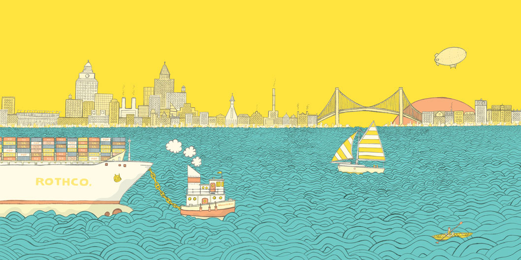
For the opening endpaper of my latest book, Thank You, Octopus, I tried oodles of color combinations for the city and the sunset. I wanted four shades of the same color — with the buildings and trees reflecting the sky and blending into the it. I tried a chocolate city with a creamy sky, an all-pink city with a dark pink sky. So many different versions. I finally landed on a yellow city with a deep golden sky, and I just fell in love with it. From here, the gold worked its way into my Thank You, Octopus color palette and was used throughout the book.
(Click to enlarge)
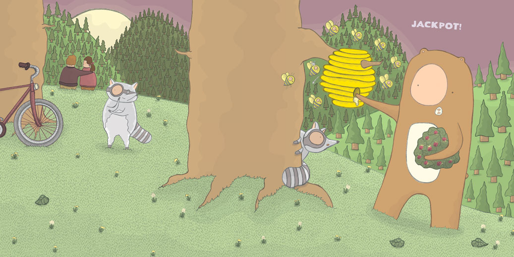
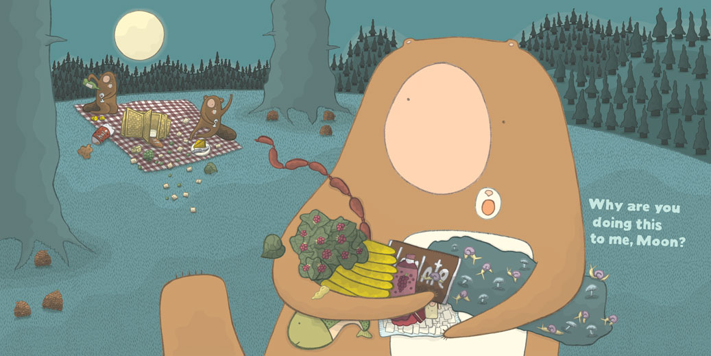
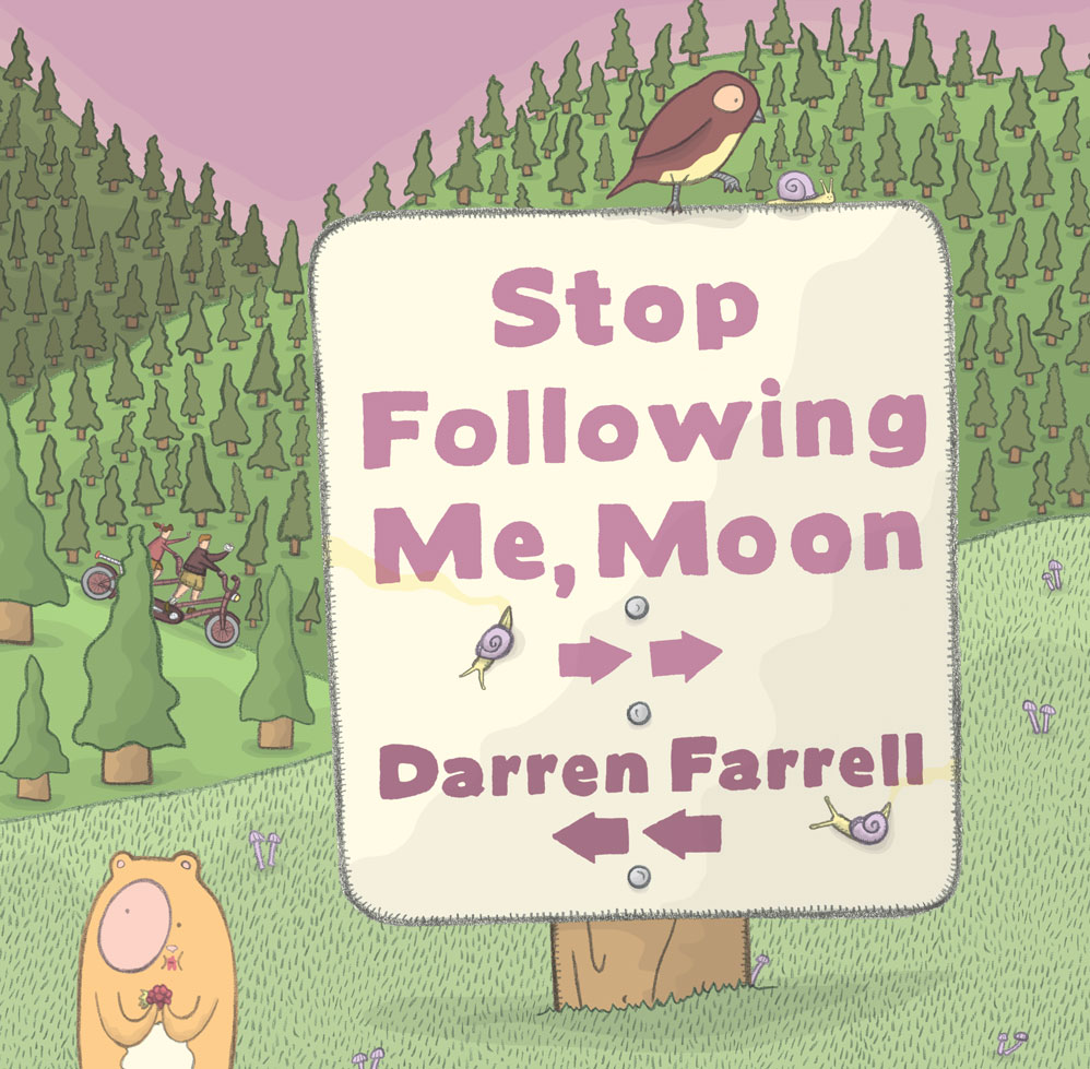
My next book, Stop Following Me, Moon! [Dial, Winter 2015], has a grape-jelly color scheme with lots of plums, mauves, lavenders, and deep grayish purples.
(Click to enlarge)
I also experimented with a new shading concept in Stop Following Me, Moon!, which was loosely inspired by vintage Missoni prints. I added bands and waves of shade to almost everything on each page. So the colors get several steps deeper as they move away from the moon. Usually, there are two waves on each item for three shades of deepening color.
The act of shading Stop Following Me, Moon! was for me almost an exercise in Zen meditation, as I made wave after wave of color and shadow.
(Click to enlarge)
Stop Following Me, Moon! was inspired by a taxi ride in Seoul, South Korea. My wife, son, and I were riding home from dinner, and as we wound around one of Seoul’s elevated expressways, we kept watching the moon dodge in and out between the tall apartment buildings. My son was three at the time, and so we talked about how the moon was following us — and I watched his eyes as he kept searching for it while we drove along.

which charge extra $$ for being extra fancy”
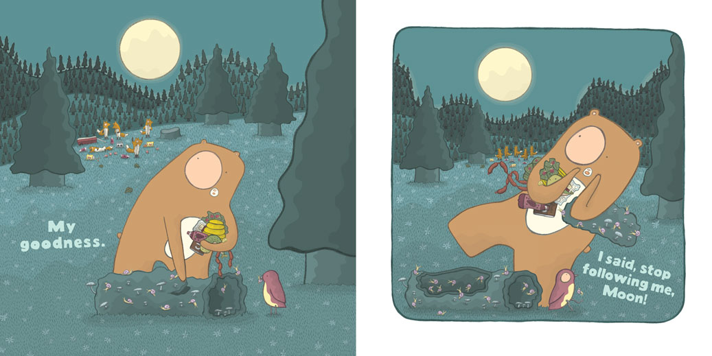
My son’s fascination stayed with me, and almost immediately what popped into my head was, wow, what is you don’t want the moon to be following you? I mean, who wants something following them around all night long!? And I just imagined this crazed bear out in the woods, running away from the moon and yelling these funny outbursts up at the moon in a hopeless effort to escape.
We get to see toward the end of the book how this bear feels when the moon actually does “listen” to him.
Stop Following Me, Moon! is a really nice and silly way to begin a discussion about how and why the moon follows you around all night long. It’s also a book about sharing, so hopefully it will generate good discussions about what it means to be a kind friend.
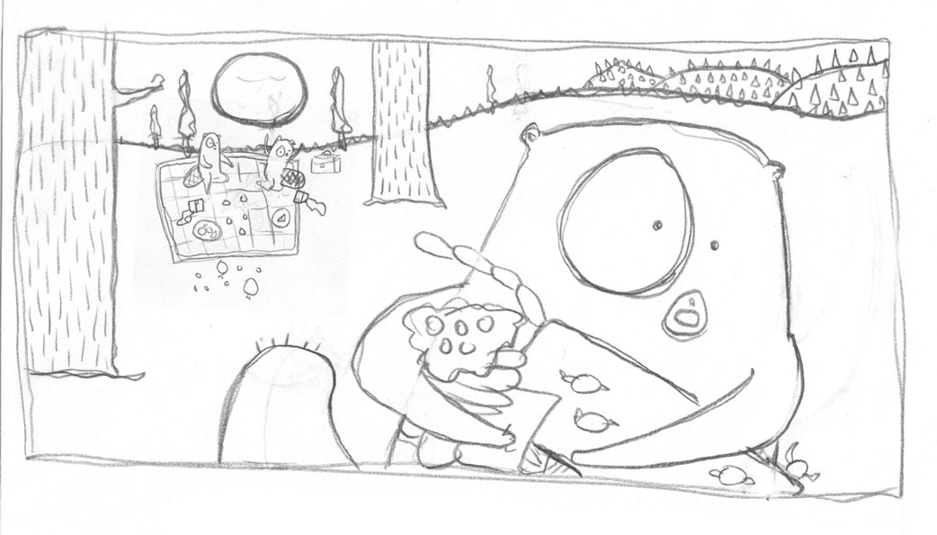
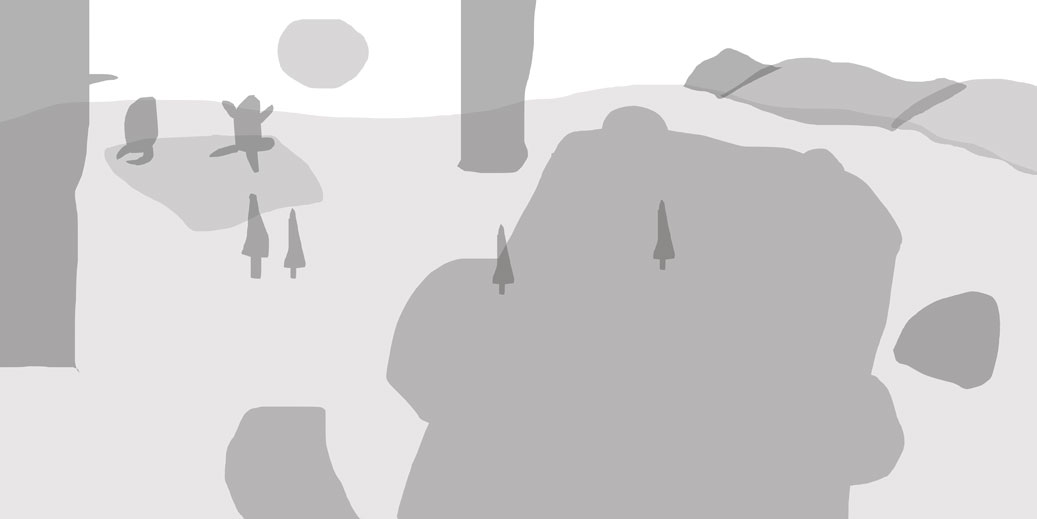
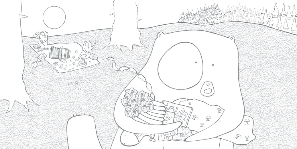
Here’s how a Stop Following Me, Moon! page comes together for me:
1. A rough pencil sketch. Here, we see the bear running almost directly into the camera, right through a picnic two beavers are having.
2. I block everything out in greys, full-size on my computer, and take measurements so that I know roughly how large everything needs to be.
3. I draw everything by hand—in pencil, item by item—and add everything to the page, based on the measurements I took earlier. And one by one, the grey items disappear — and the final pencils take their places.
4. I color.
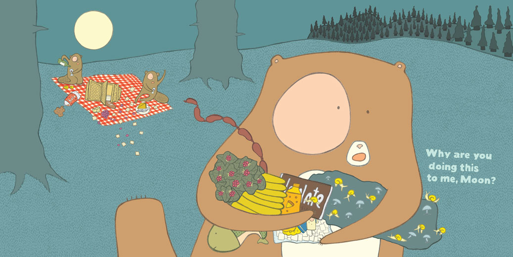
5. I shade.

6. I refine the colors and fine-tune the shading and build on the artwork and the layout — until I am completely happy with everything right up until the very end. Here, I revised the hills and the shape of the bear and played with the colors and shading quite a bit.
7. I add the final type. Here, I swapped in a new line to help set up the story in a stronger way and give the bear’s dialogue slightly better pacing.

Speaking of type: When I make my type, I use a combination of hand and digital. First, I lay the words out in a chunky typeface to use as a guide. Then I hand-make all of the type. And last, I digitally fill the hand-made type with a color and take away my line work. What’s left is a hand-made type that sort of looks like it is cut out with scissors.
P.S. I’ve made an awesome new Letters for Kids over at The Rumpus. You can check out the first page of my four-page letter below. It’s hand-made by me, and it features my delicious recipe for Bulgogi (Korean BBQ), plus other stories and fun things I’ve experienced in Seoul. Head to The Rumpus and subscribe to Letters for Kids! It’s an exciting (and super affordable) program to join. You’ll receive two real live letters from two real live authors or illustrators each month. We’re talking real paper letters you can hold in your hand, delivered conveniently to that box your mail appears in (whatever that box is called, I can’t remember).
My letter goes out in March or April, so sign up soon!
And you can always check out more of my sketches, work, and ideas at darren-farrell.com.
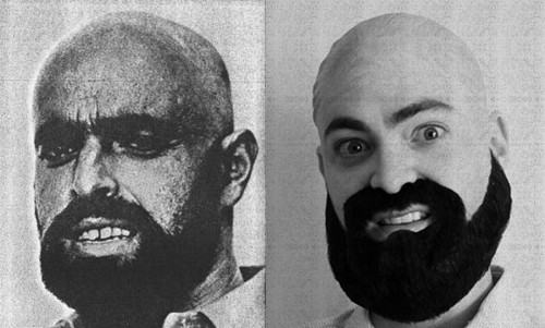
By the way, I was so happy to read in Wild Things! that you are all big fans of the Shel Silverstein author photos. I made a vain attempt at Penguin allowing me to use this below with the subheading “My Shel Silverstein Years,” along with a regular photo that I guess read something like, “My Me Years.” Here’s the official Shel photo so you can see the side-by-side twin-ness. Uncanny, no?
All images here are reproduced by permission of Darren Farrell.
