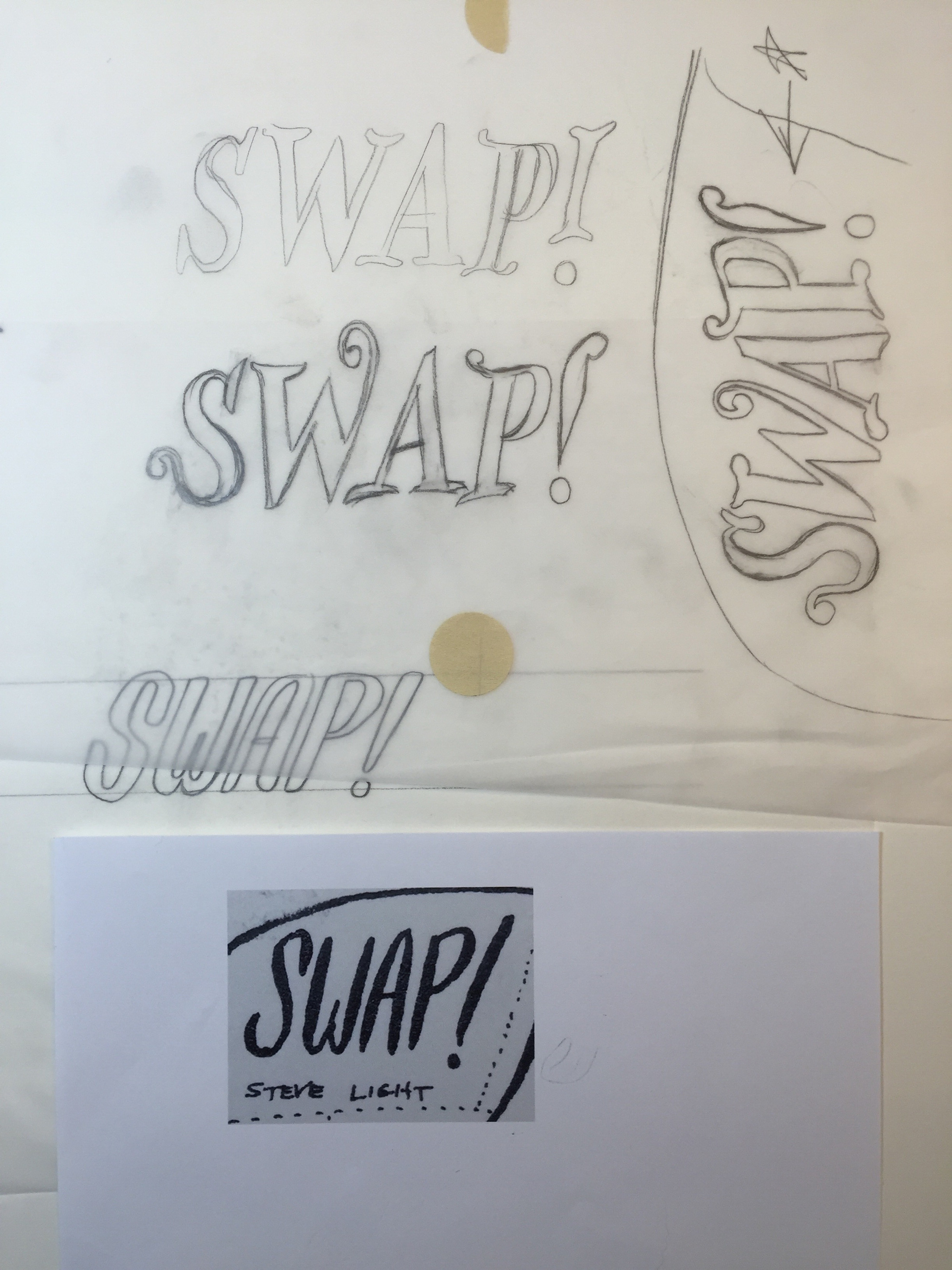
Setting Sail with Steve Light
 January 26th, 2016 by jules
If I think of children’s book illustrators working today and style—that is, their manner of expression as determined by their use of line, color, shape, texture, etc.—I think author-illustrator Steve Light has one of the most distinctive styles, a you-can-spot-it-from-outer-space kind of style. In particular, his line is terrifically distinctive, and he’s visited 7-Imp several times to share his pen-and-ink sketches and artwork — and to show off those lines at my request.
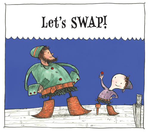
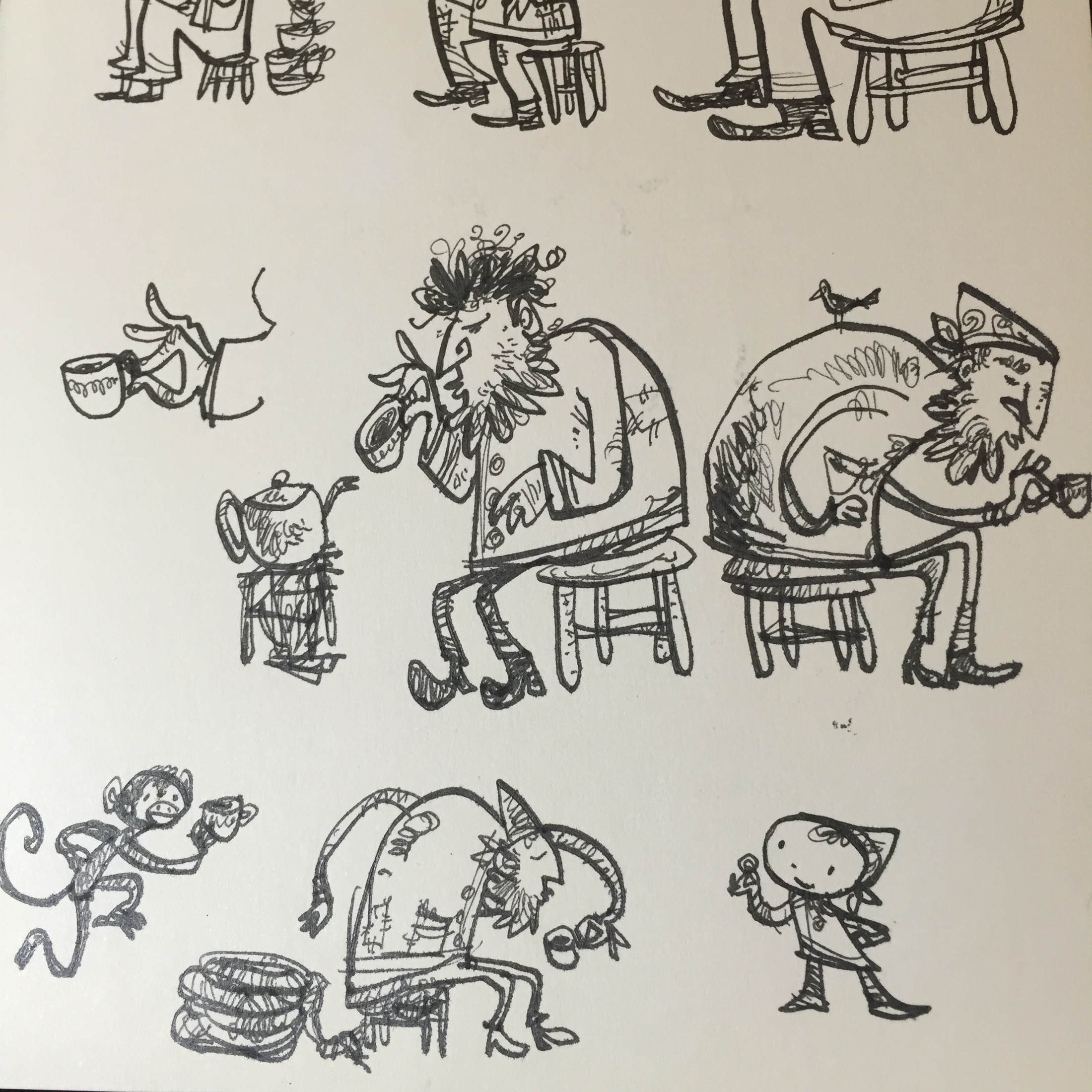
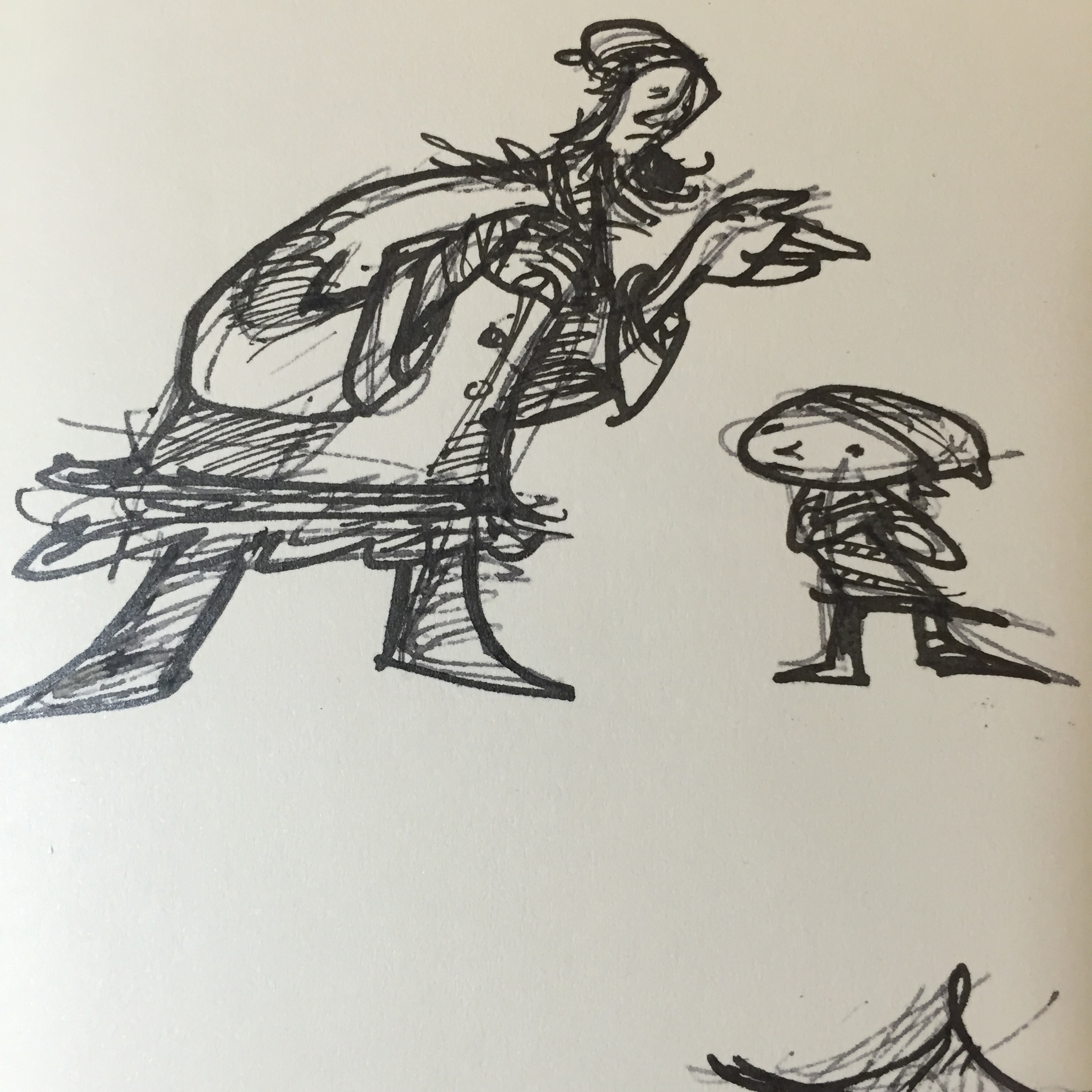
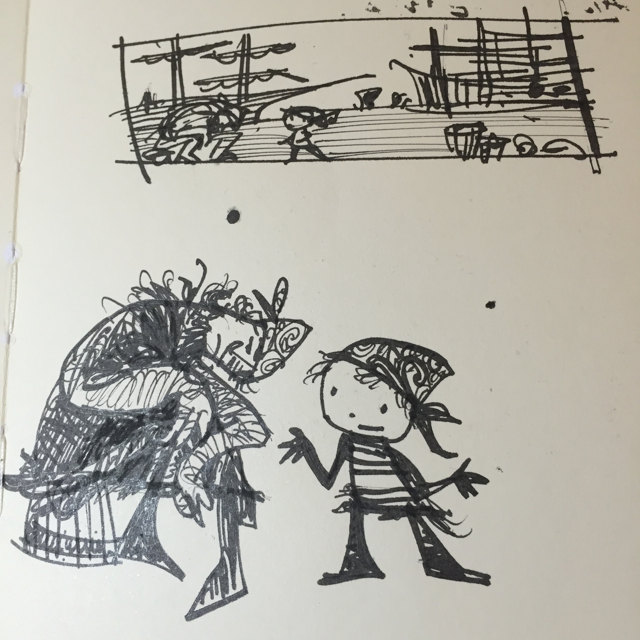
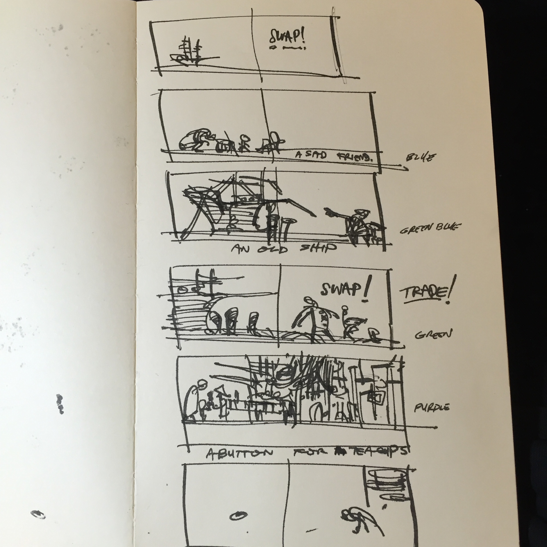
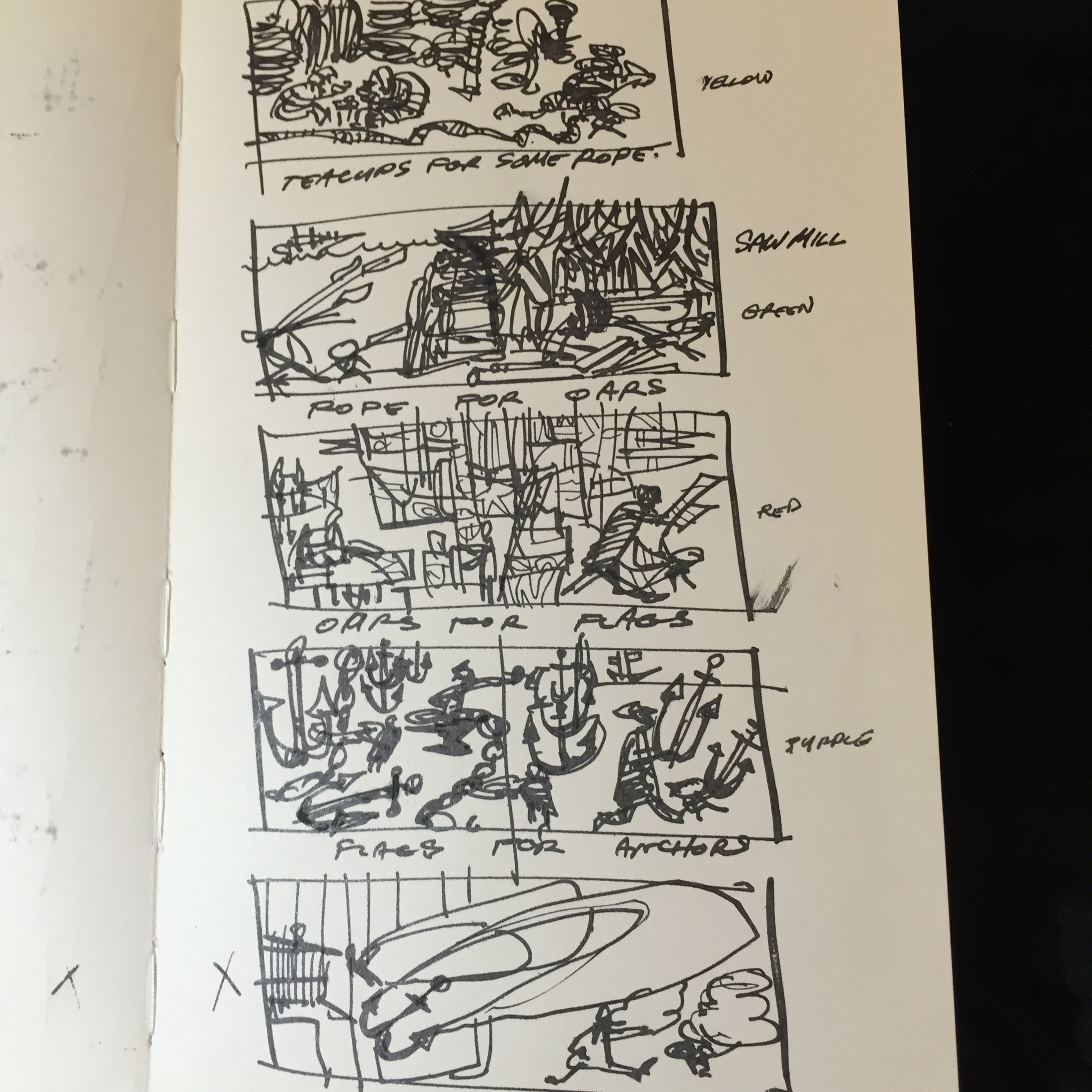
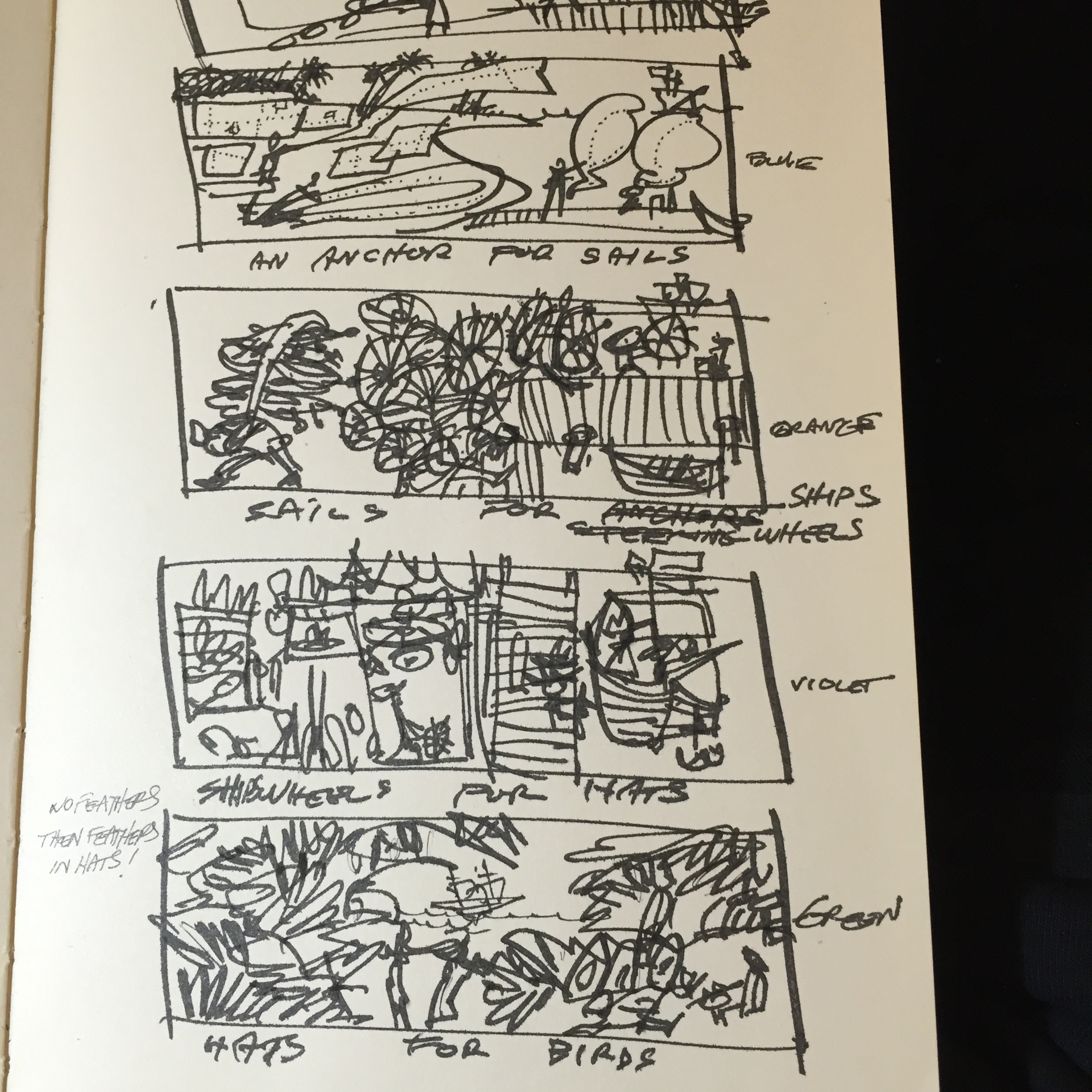
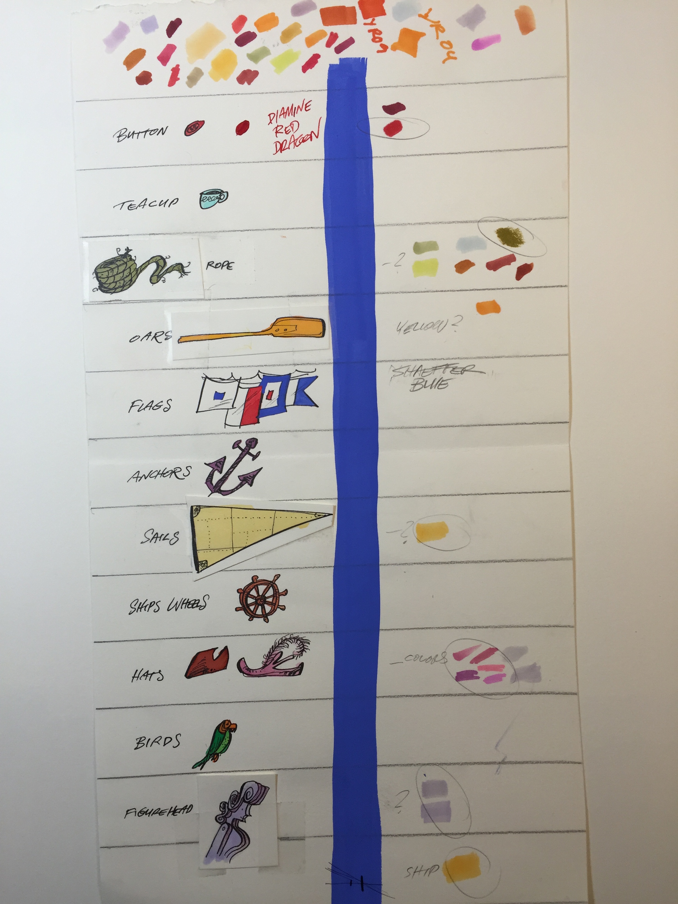
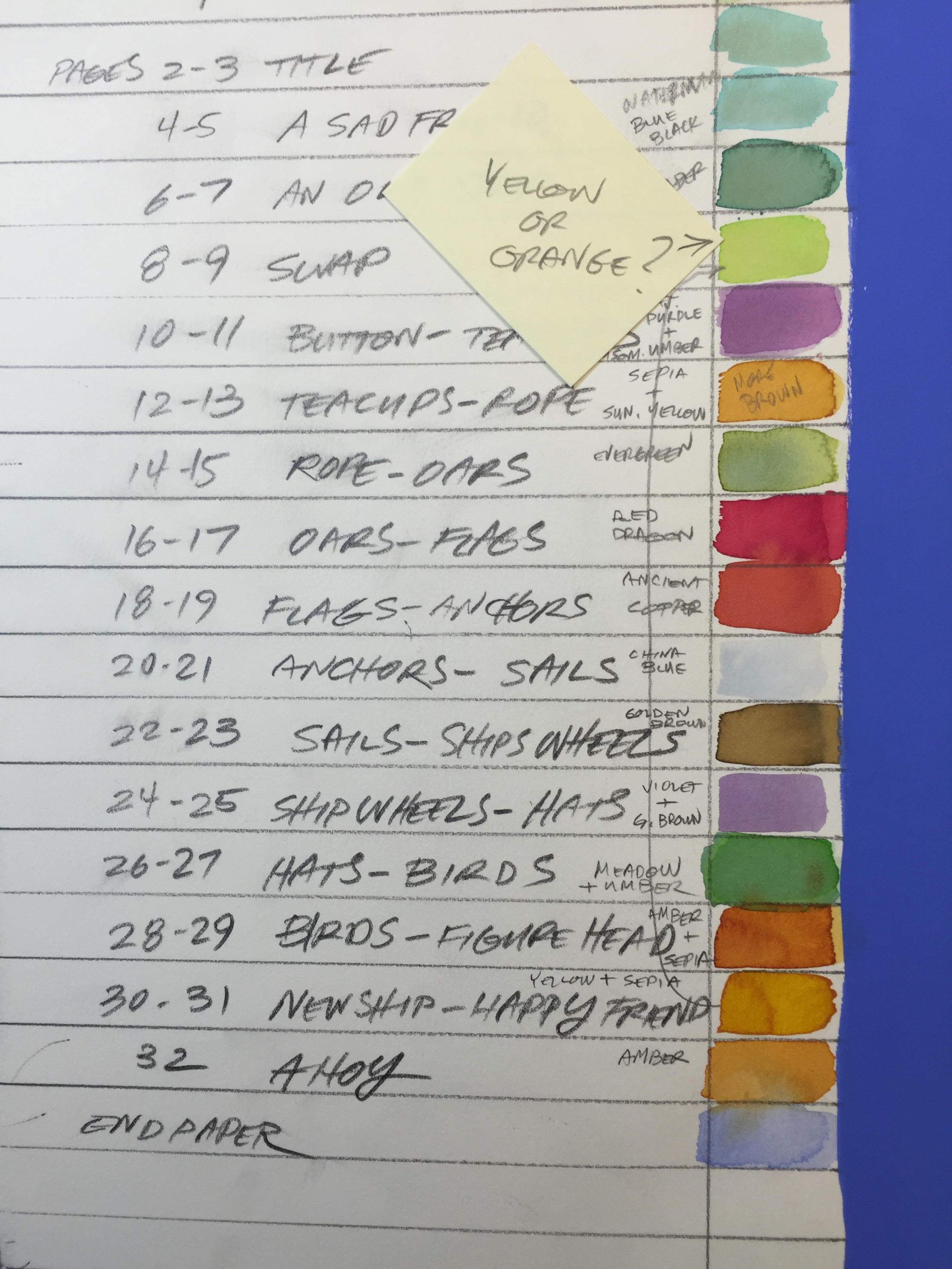
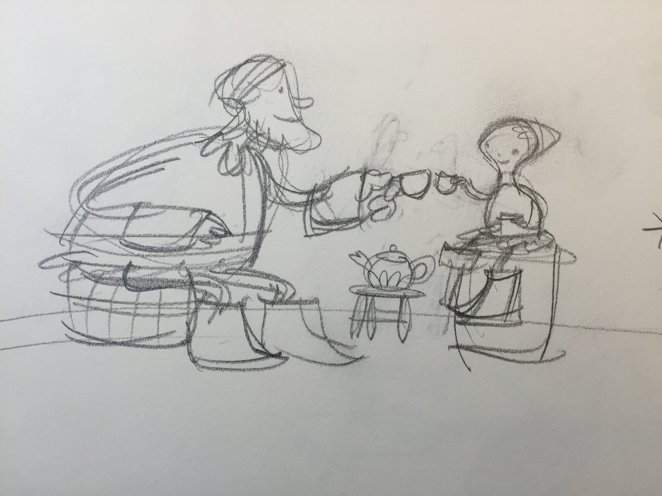
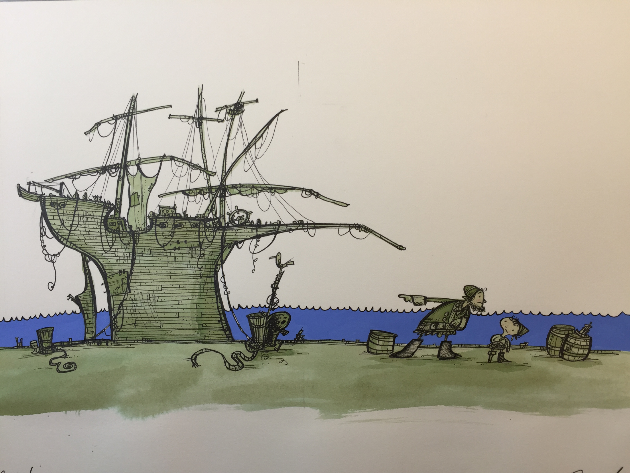
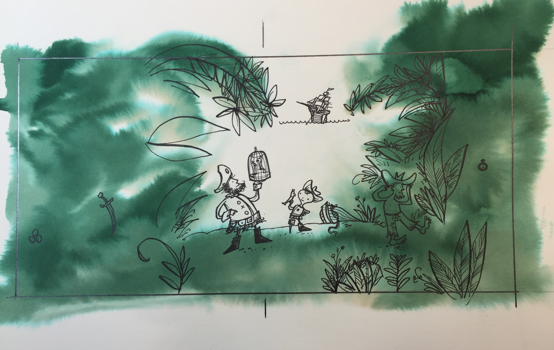
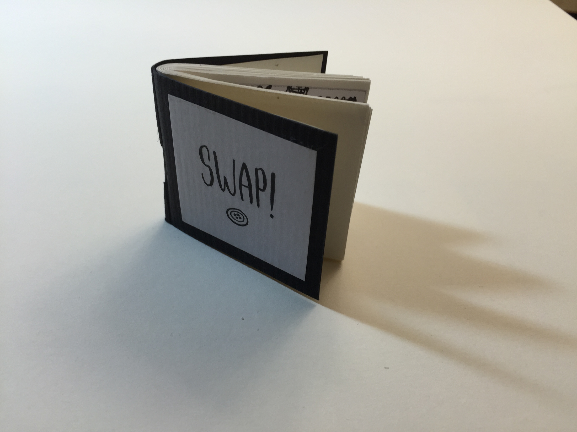
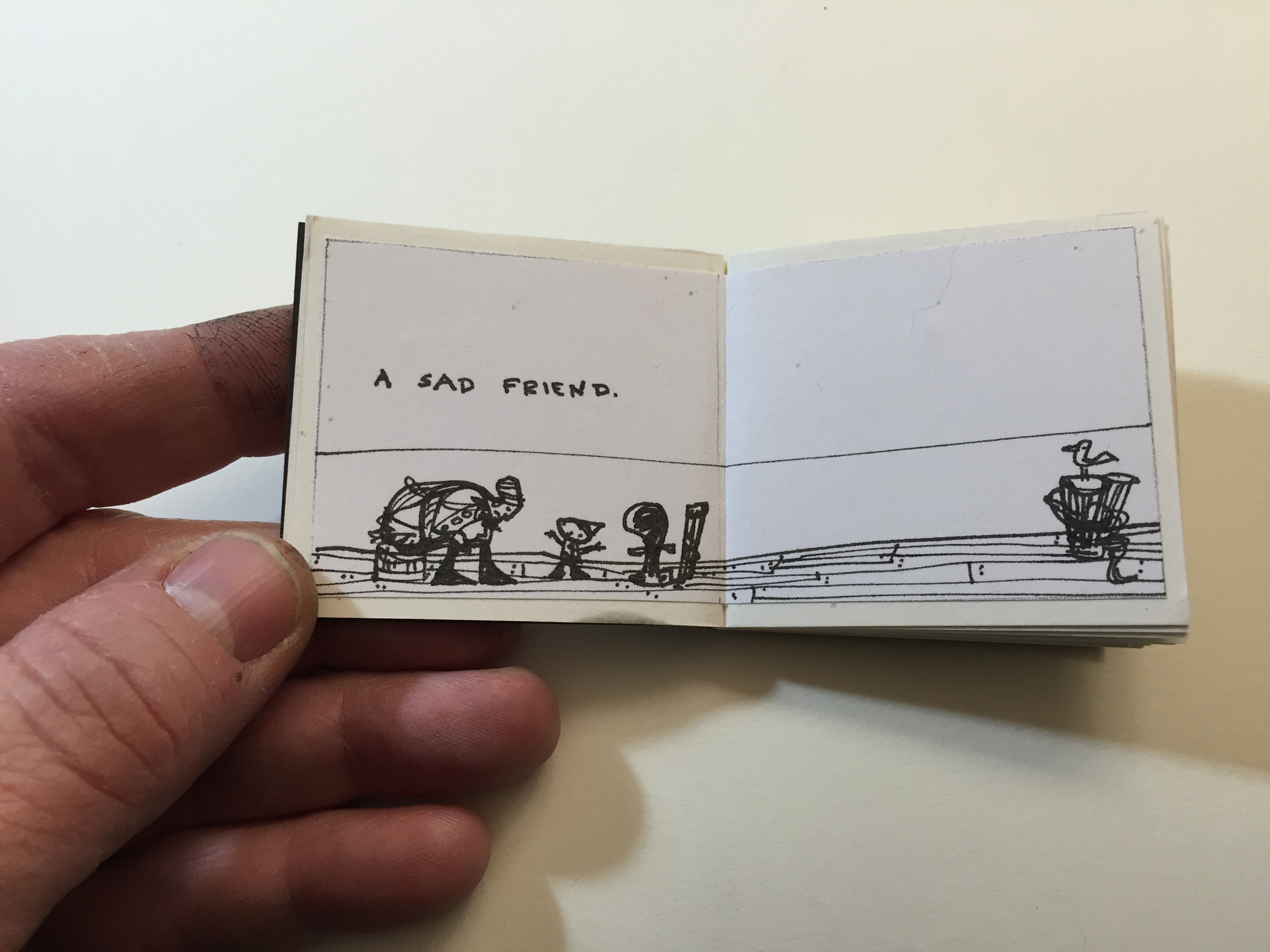
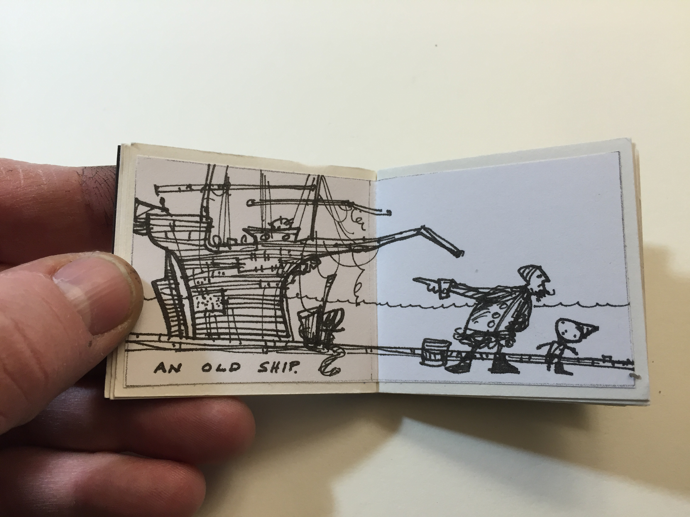
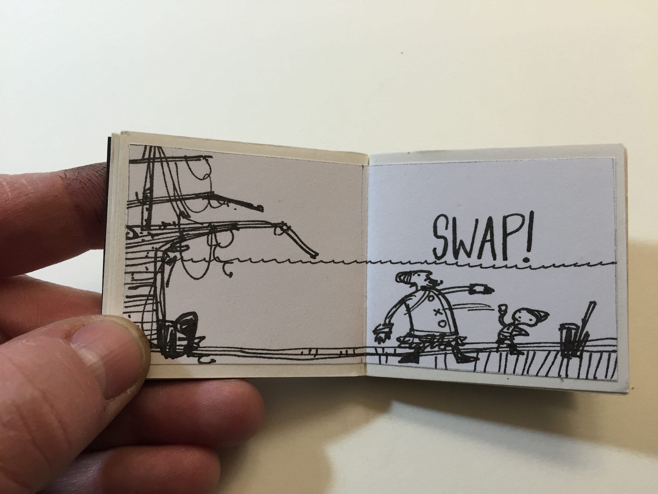
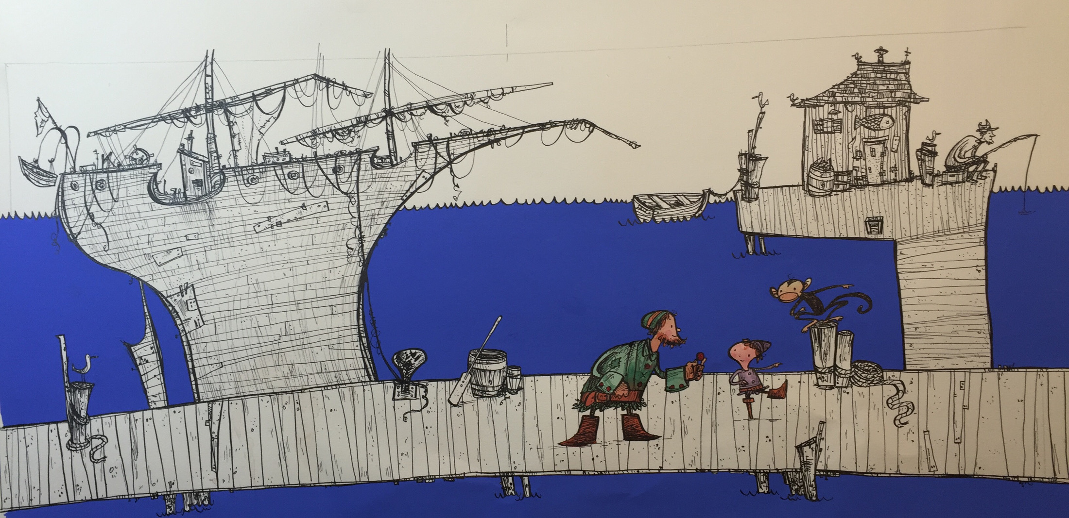
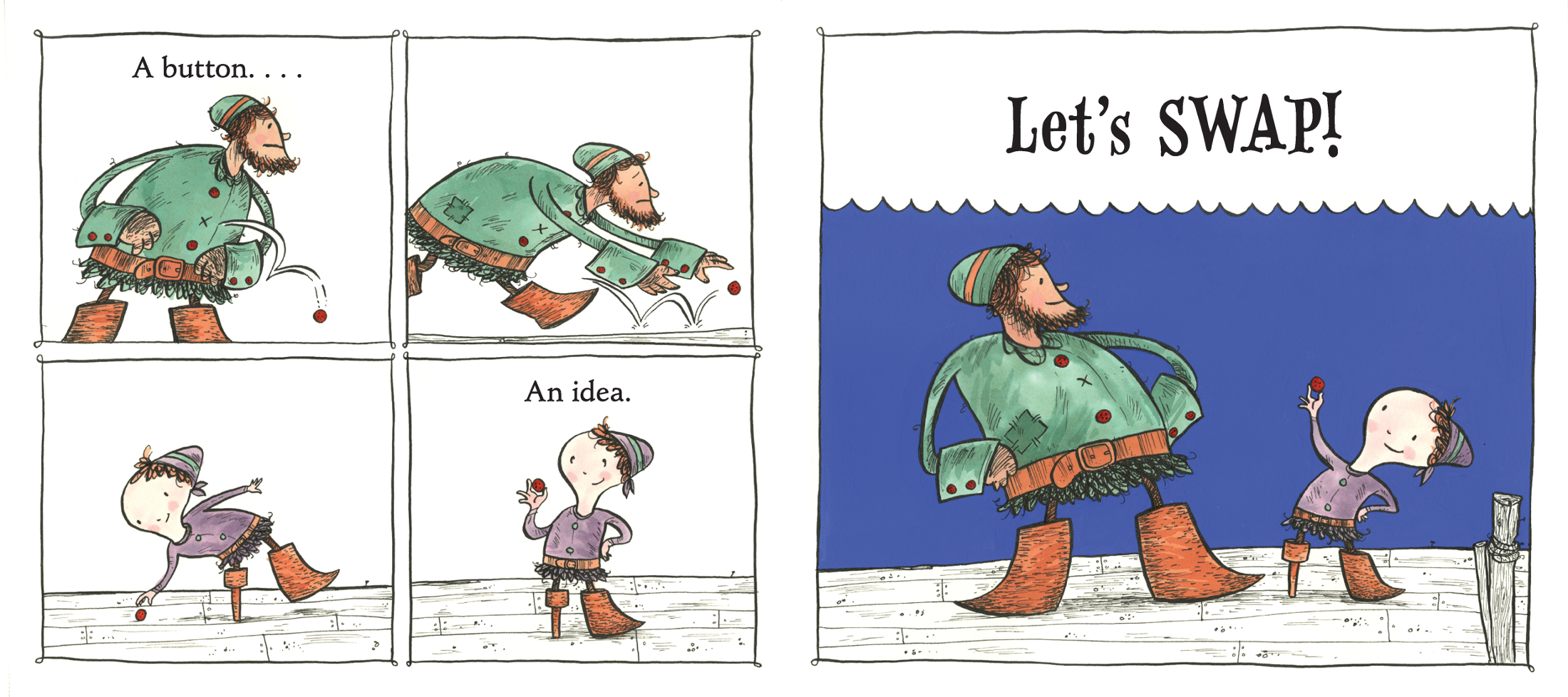
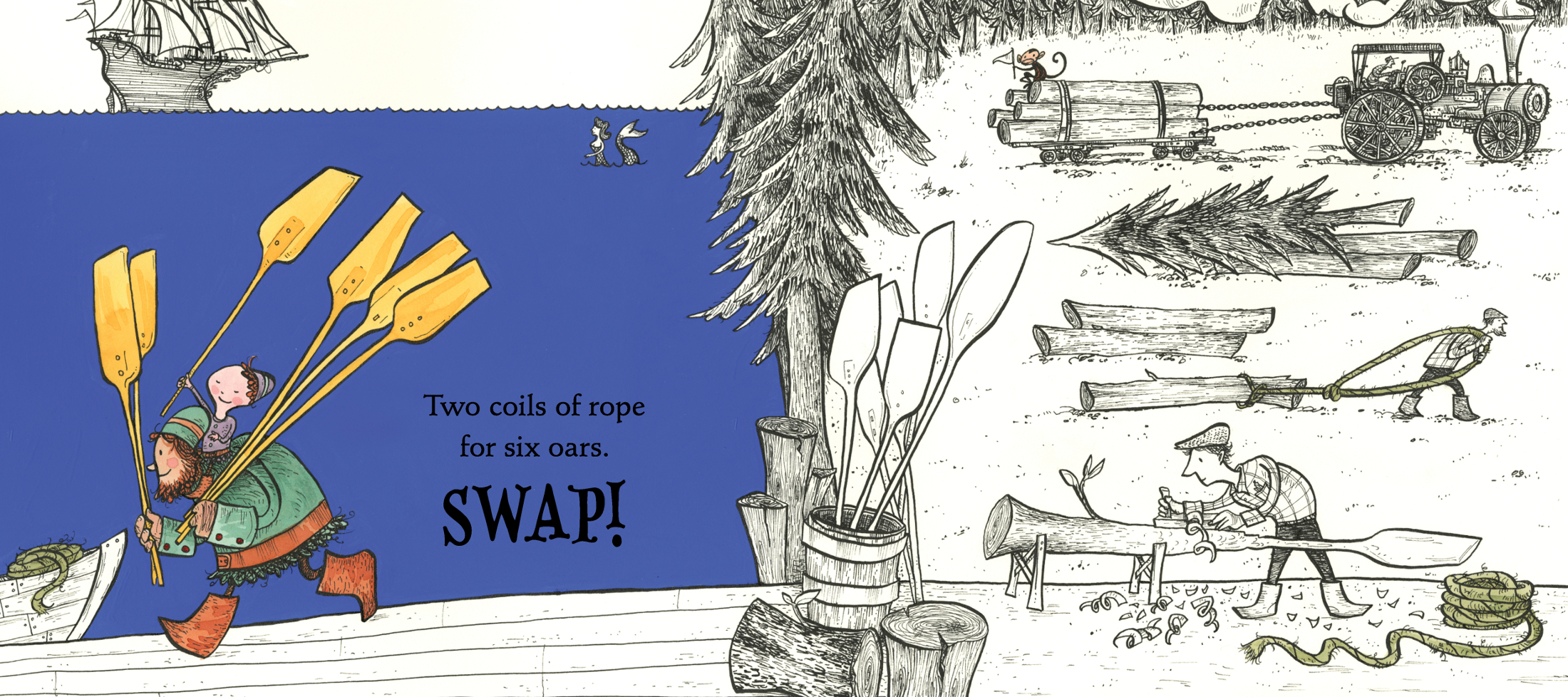
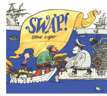 Steve’s latest book is called Swap! (Candlewick), and it will be released in early February. It’s good stuff, and if you don’t believe me, trust me when I say it’s already garnered some starred professional reviews. It’s a sweet, but never saccharine, story of friendship. A young boy (the jacket flap refers to the child as “he,” though one of my daughters thought it was a girl, and I like this about that character), with a peg for a leg, sets out to cheer up a friend, a sea captain whose ship is falling apart. Through a series of barters, starting with the trade of a button for a teacup, the child helps fix up the ship for his friend. And it’s through these barters that the adventures occur and readers meet a cast of wonderful sea-side characters — from tattooed burly men drinking tea; to a get-it-done female blacksmith, forging anchors; and just about everything else in between.
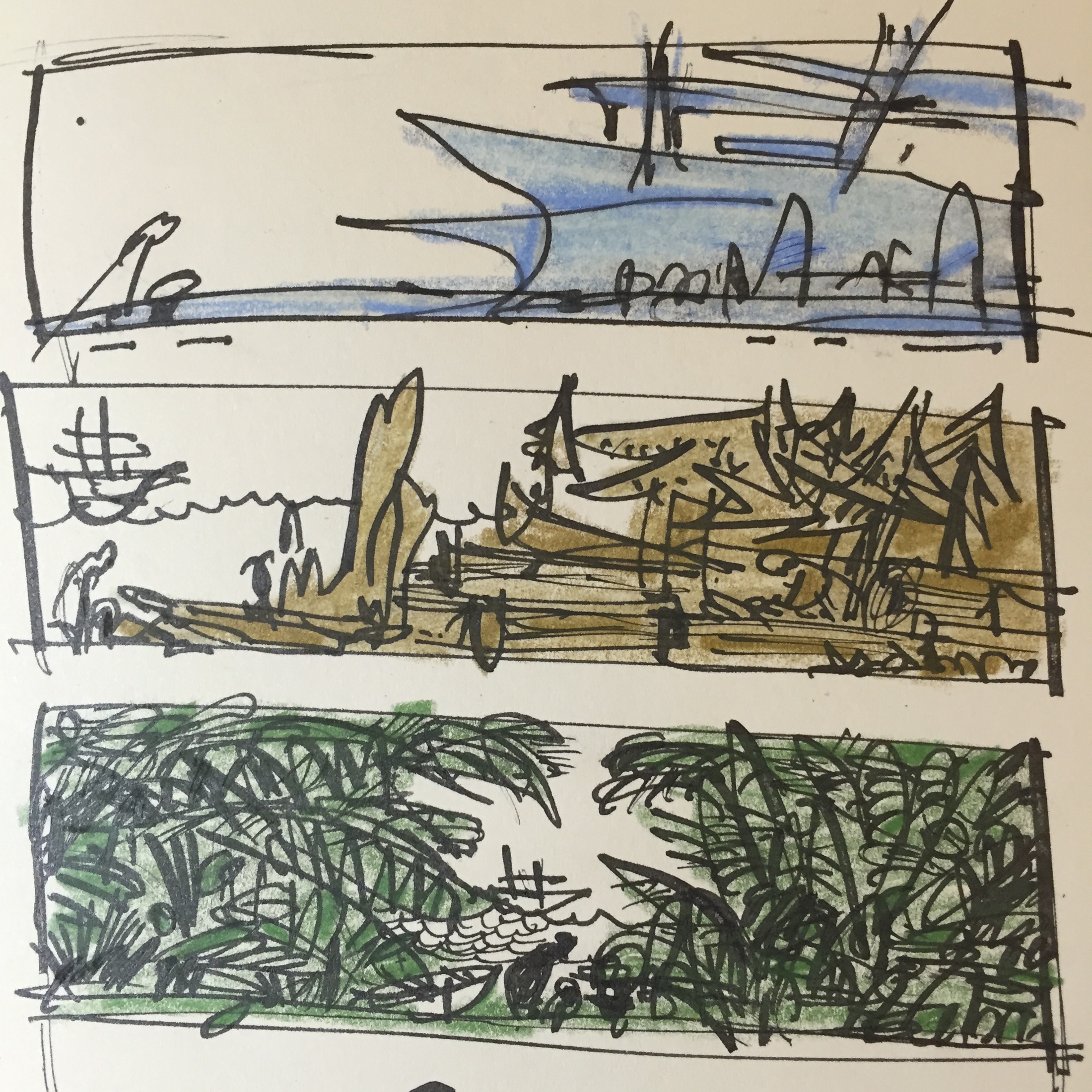
The hand-drawn illustrations were created using a fountain pen and then hand-colored, using inks and gouache. Steve gives color to our two main characters, as well as the items they’re trading. And the blue! O! The blue, blue ocean on most of the spreads is simply lovely. As always, readers are treated to elegant, detailed drawings, the kind you could pore over for days. Also, be sure to remove the dustjacket to see the surprises on both the front and back cover. (The endpapers are also delicious.)
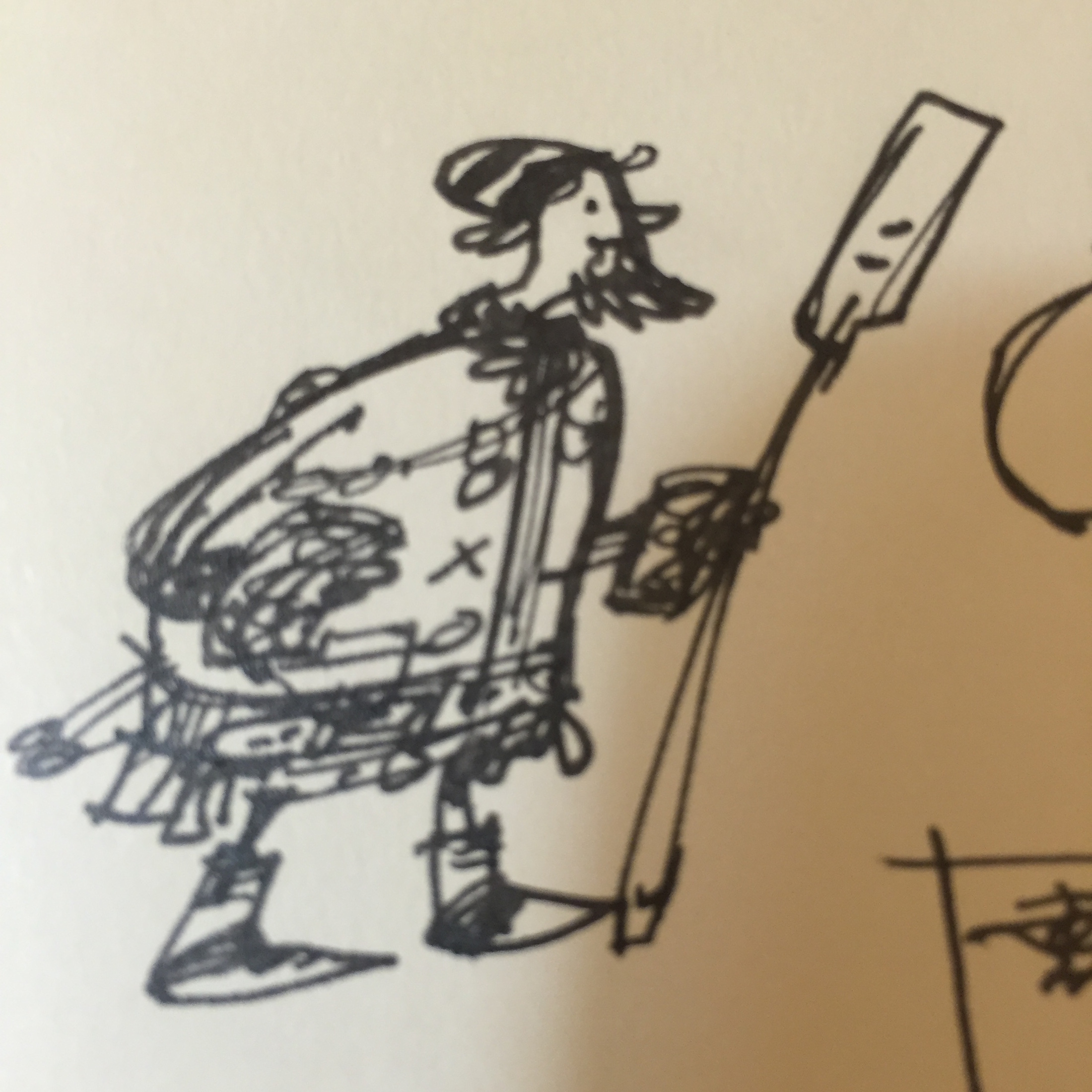
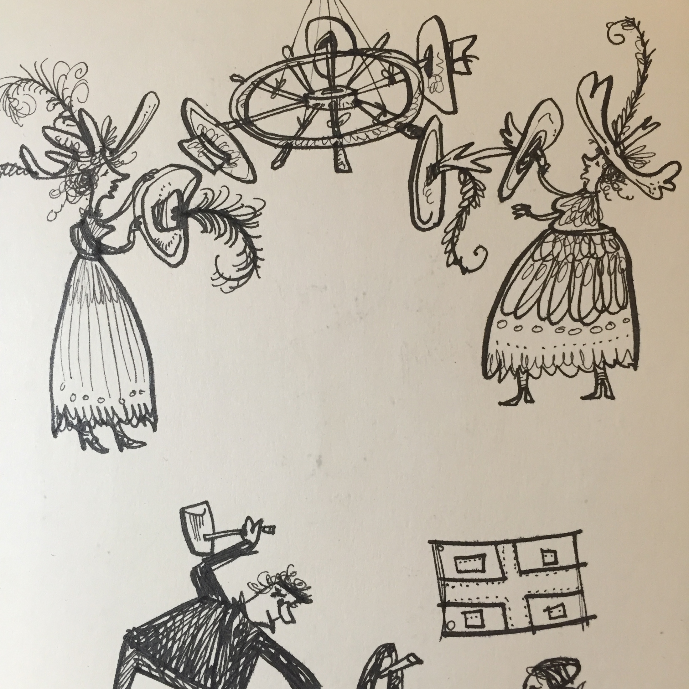
I’ve got two spreads from the book at the bottom of this post, but before that, Steve visits to share lots of process images — with commentary to boot. I thank him for sharing.
Enjoy!
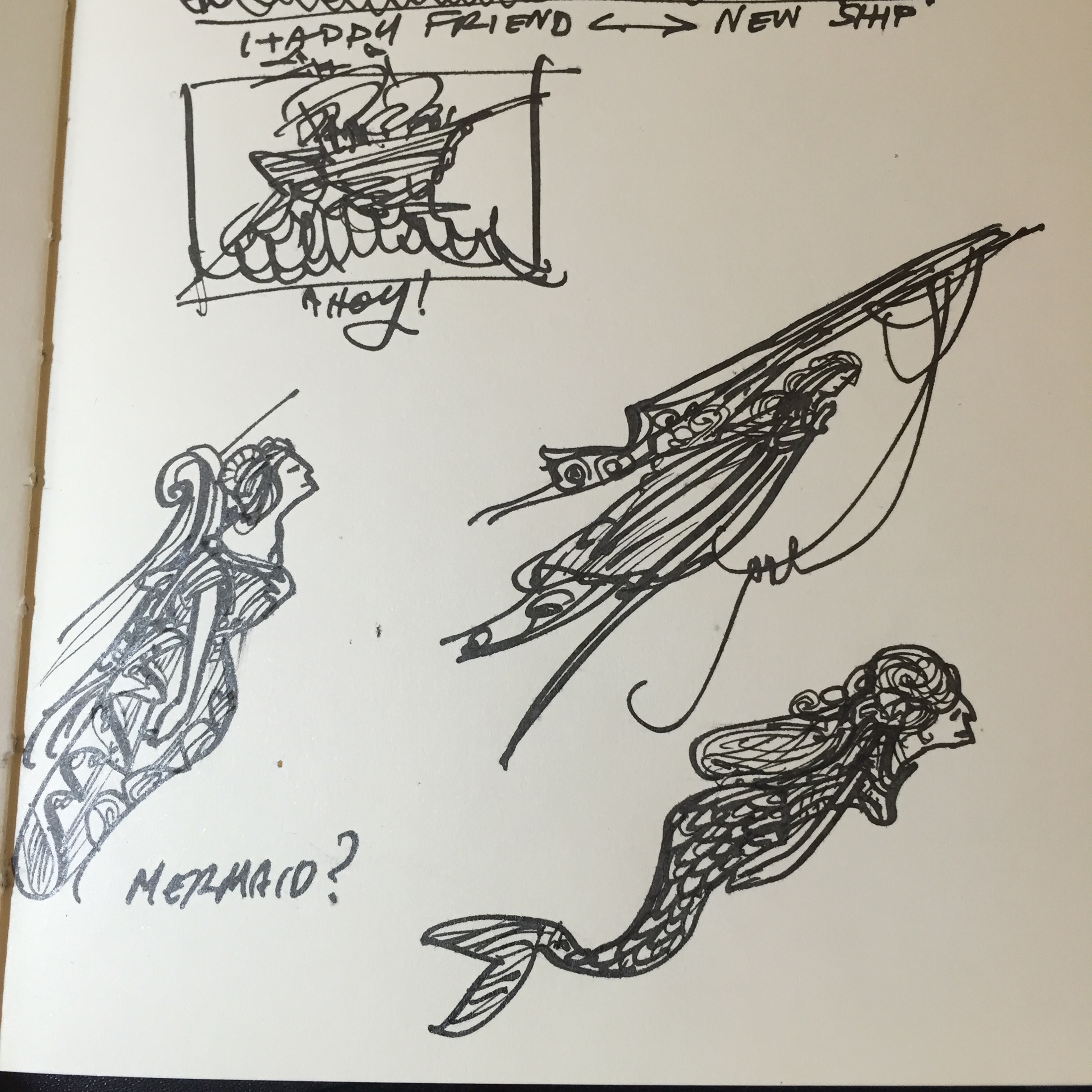
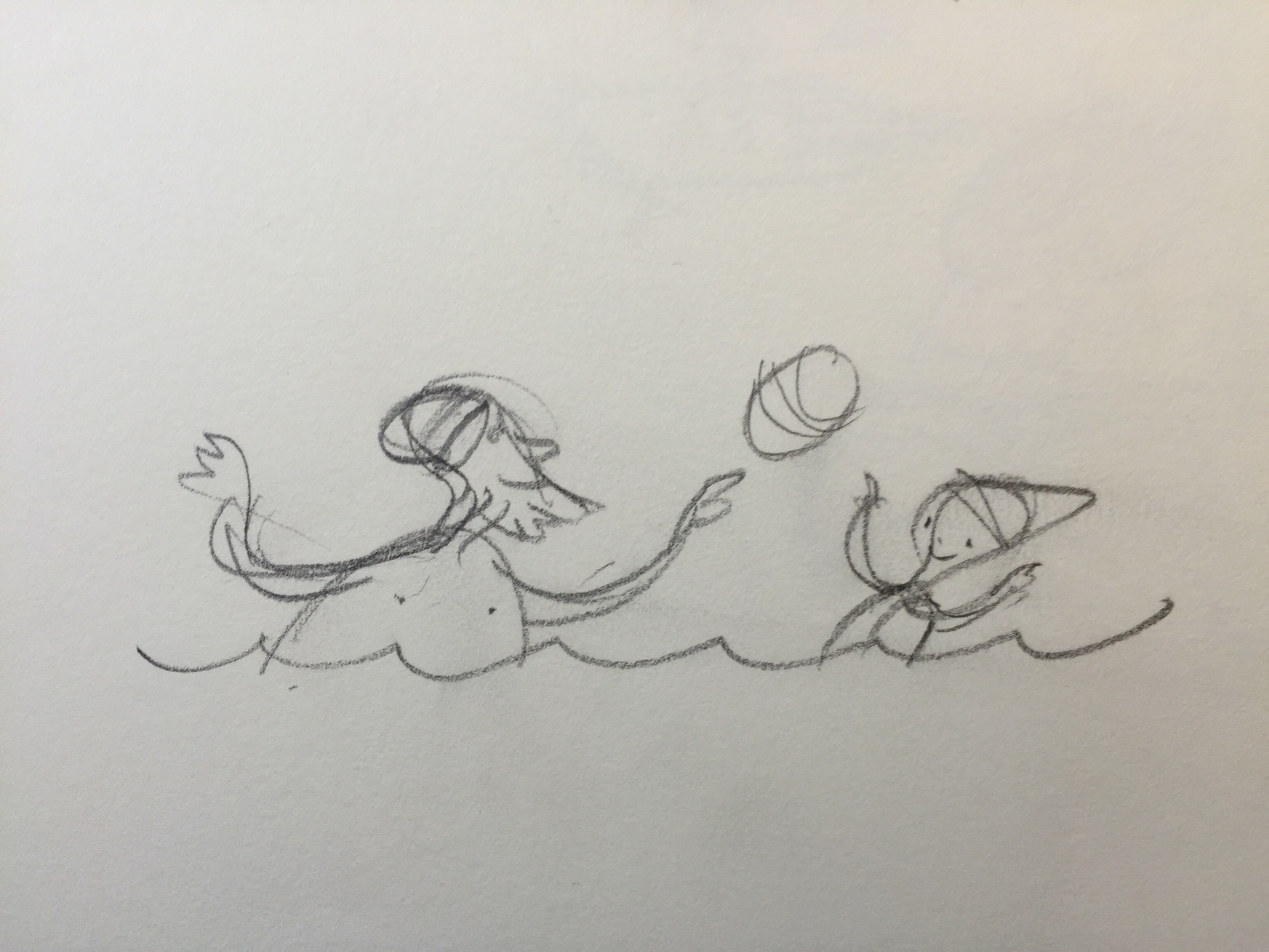
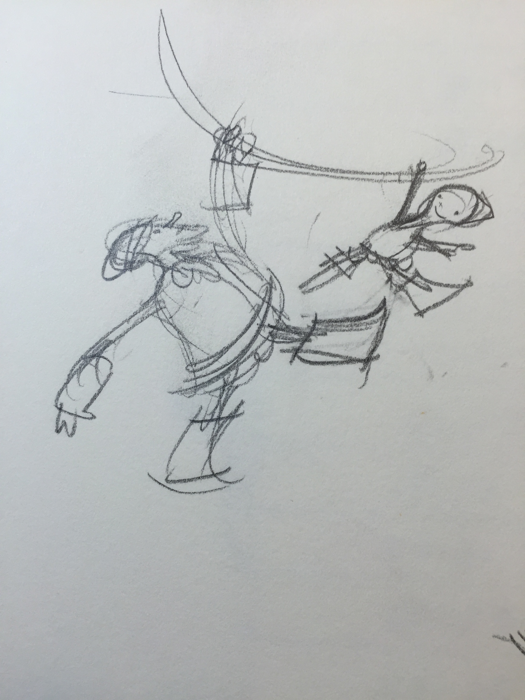
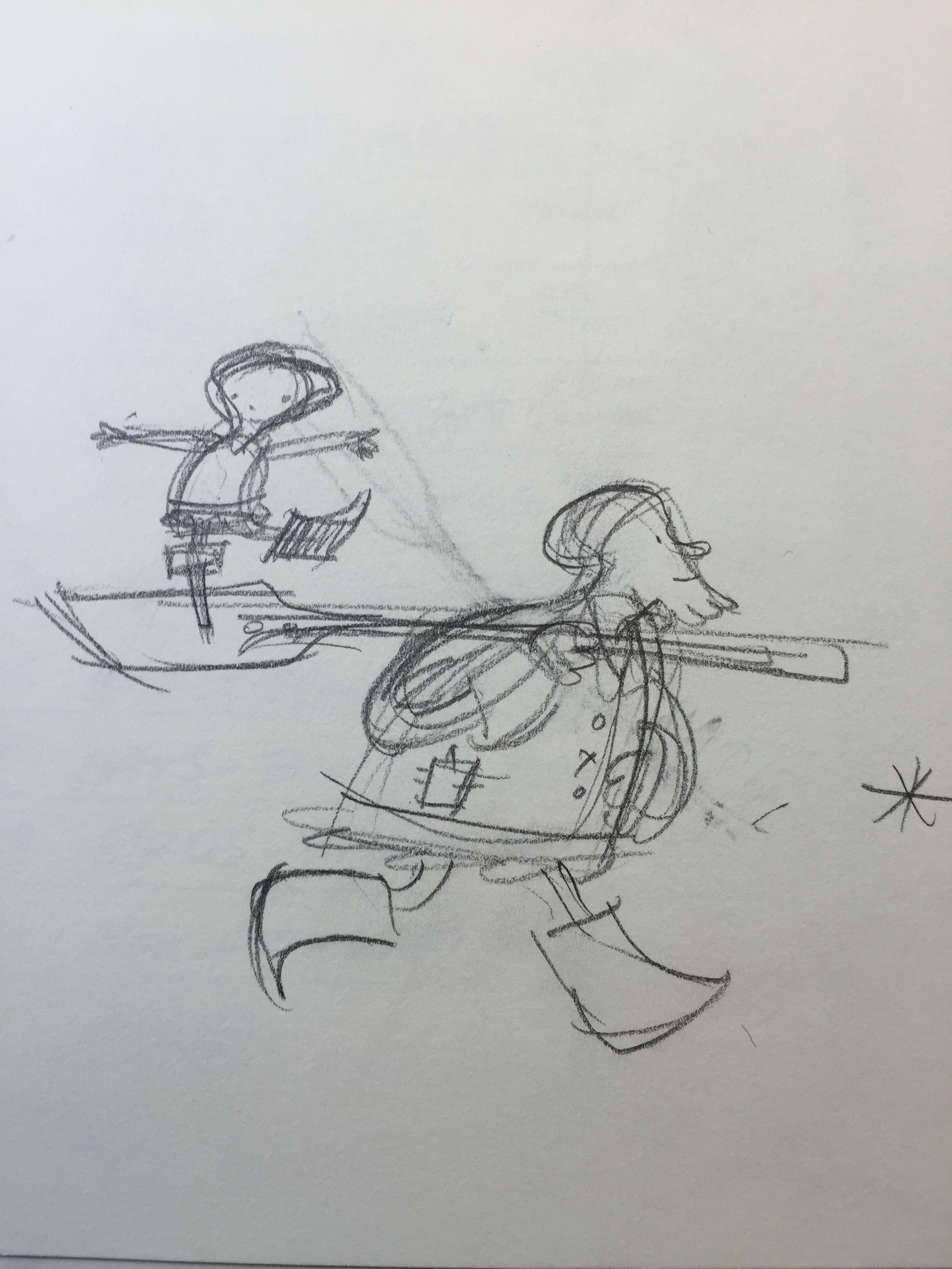
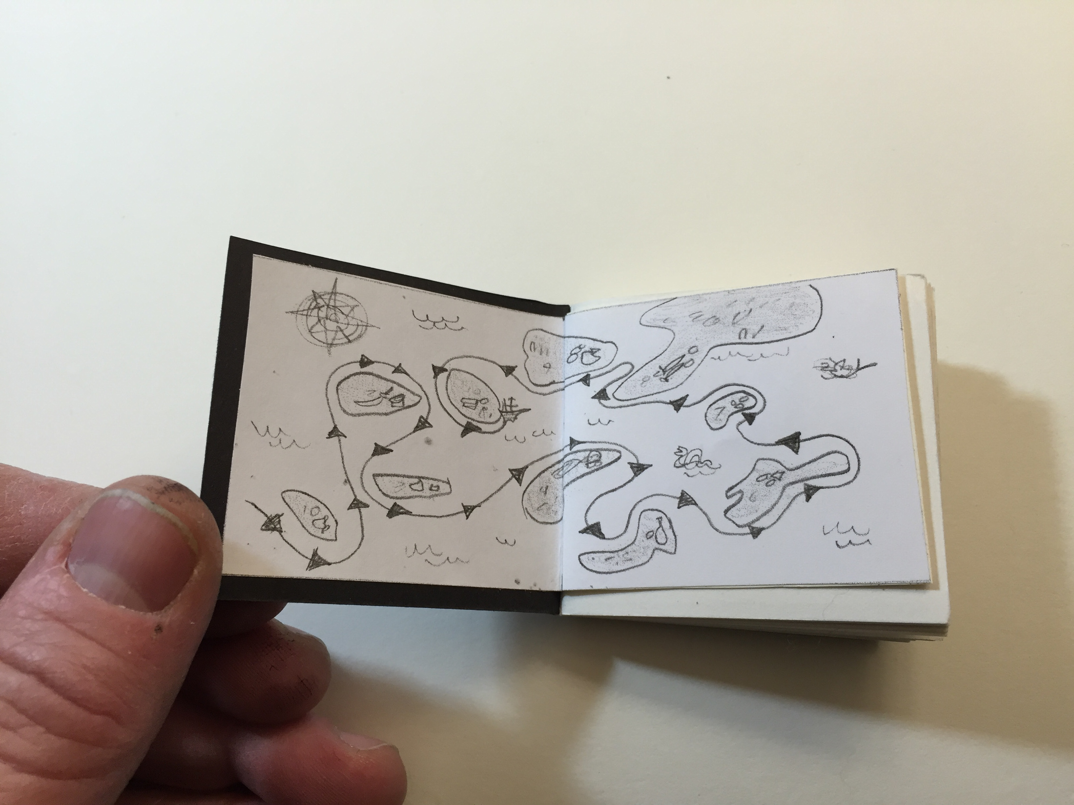
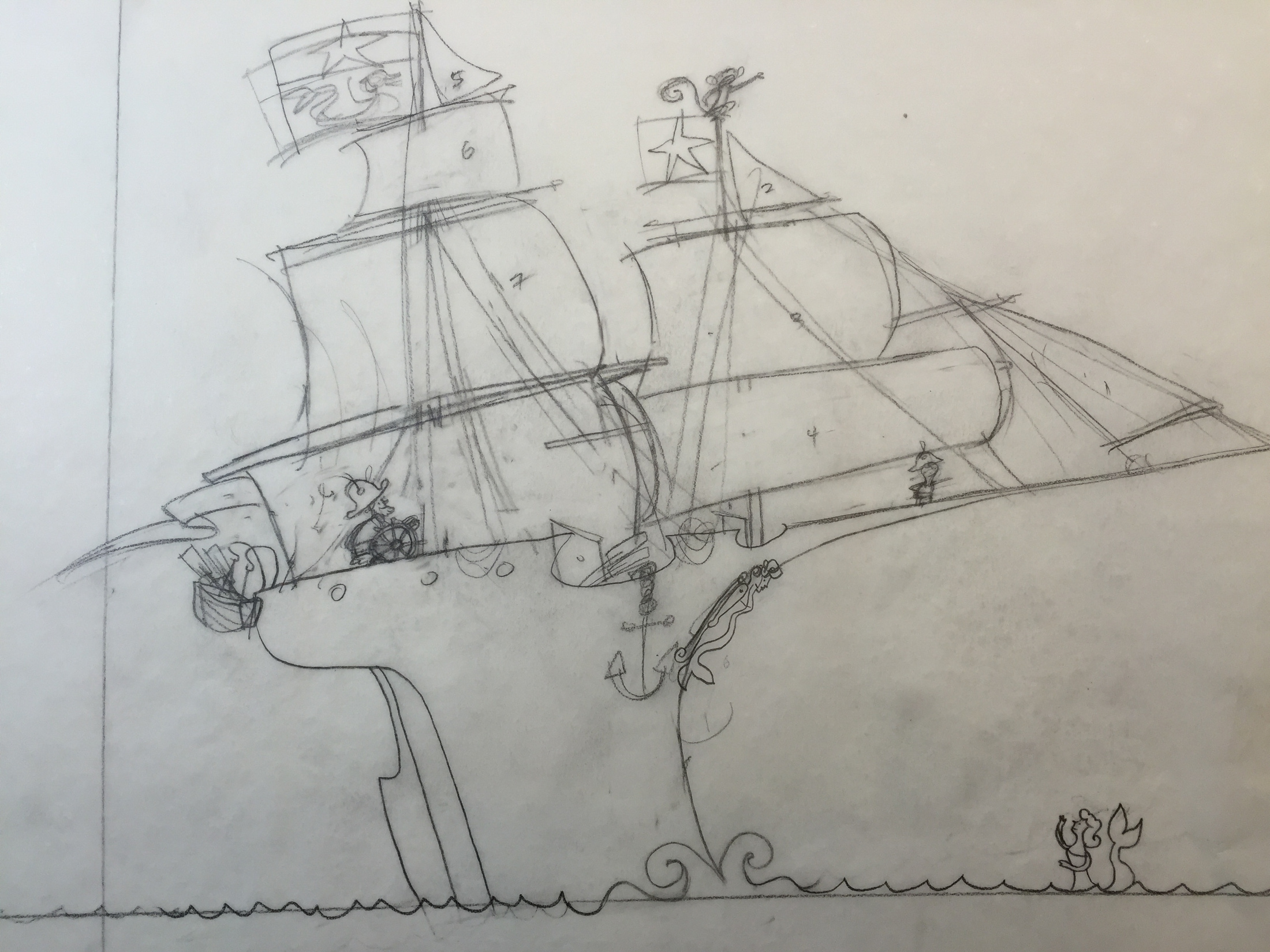
Steve: Swap! started with me wanting to draw sailing ships. But not actual ones, more fanciful ones. As I researched ships, I got introduced to trade and shipping routes and such. I know I wanted these two characters, a boy and a pirate/salty dog, to go different exotic places in their ship. Then I thought of how kids love to trade stuff, from lunches to baseball cards — and Swap! was born.
(Click to enlarge)

(Click to enlarge)
(Click to enlarge)
(Click to enlarge)
(Click to enlarge)
(Click to enlarge)
(Click to enlarge)
seeing if I could get the right emotions across.”
(Click to enlarge)
(Click each to enlarge)
during the making of this book.”
(Click each to enlarge)


Yes, it has a name, and it is smalt blue.”
(Click each to enlarge)
the dustjacket flap.”
(Click each to enlarge)
(Click to enlarge)
(Click to enlarge)

(Click to enlarge)


(Click each to enlarge)
very useful.”
(Click to enlarge)
(Click to enlarge)
These are some of the tracing pencils I did.”
(Click to enlarge)
Swap! was so much fun to make. I love drawing ships and crazy places and maps.
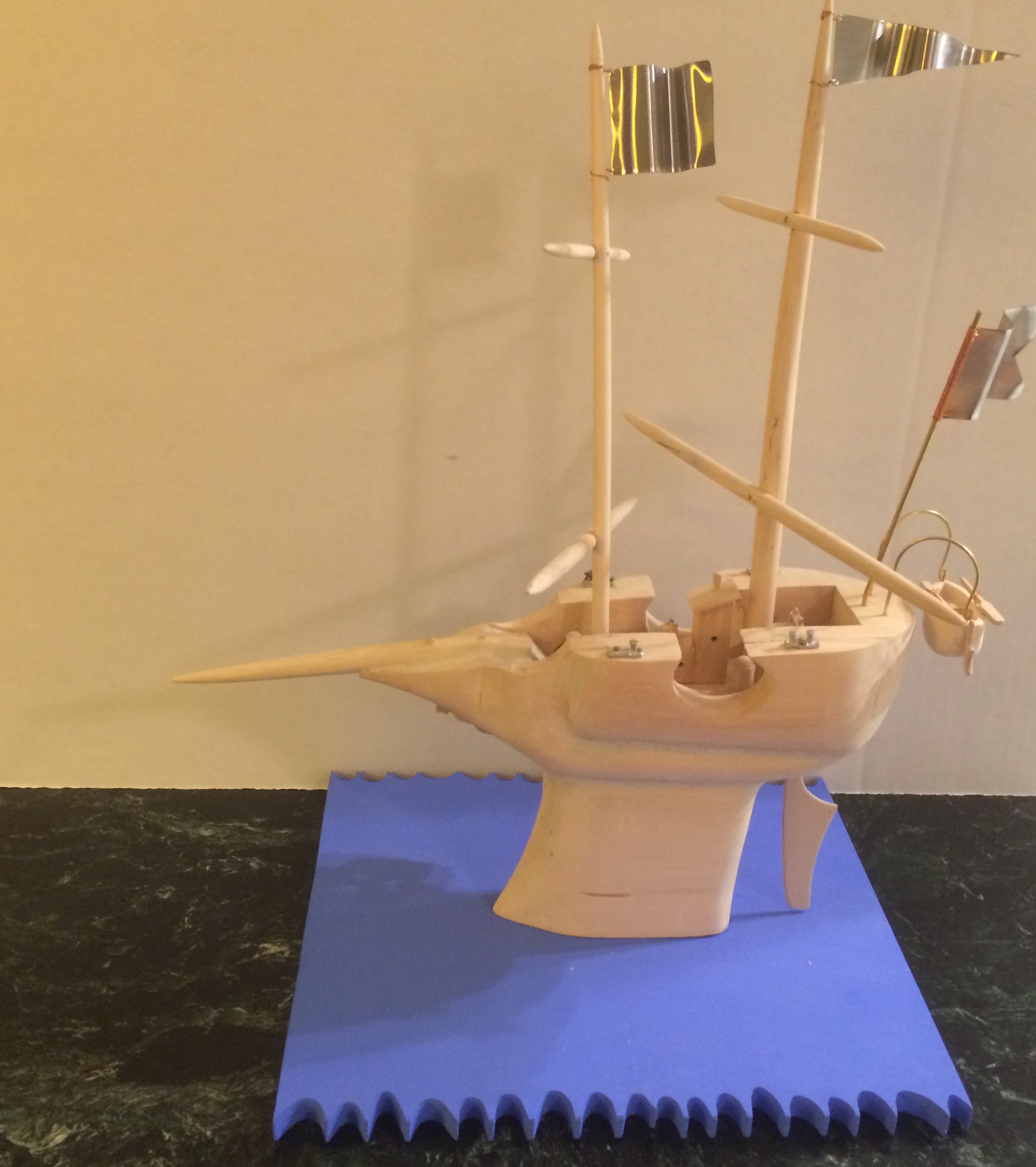
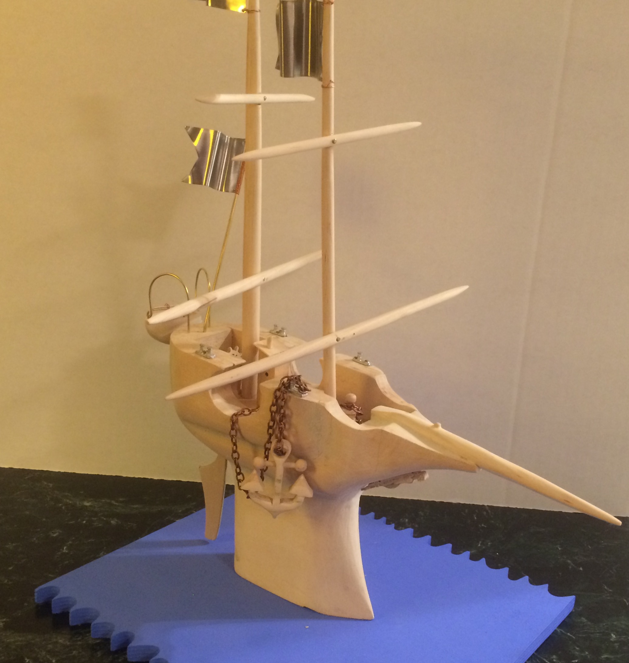
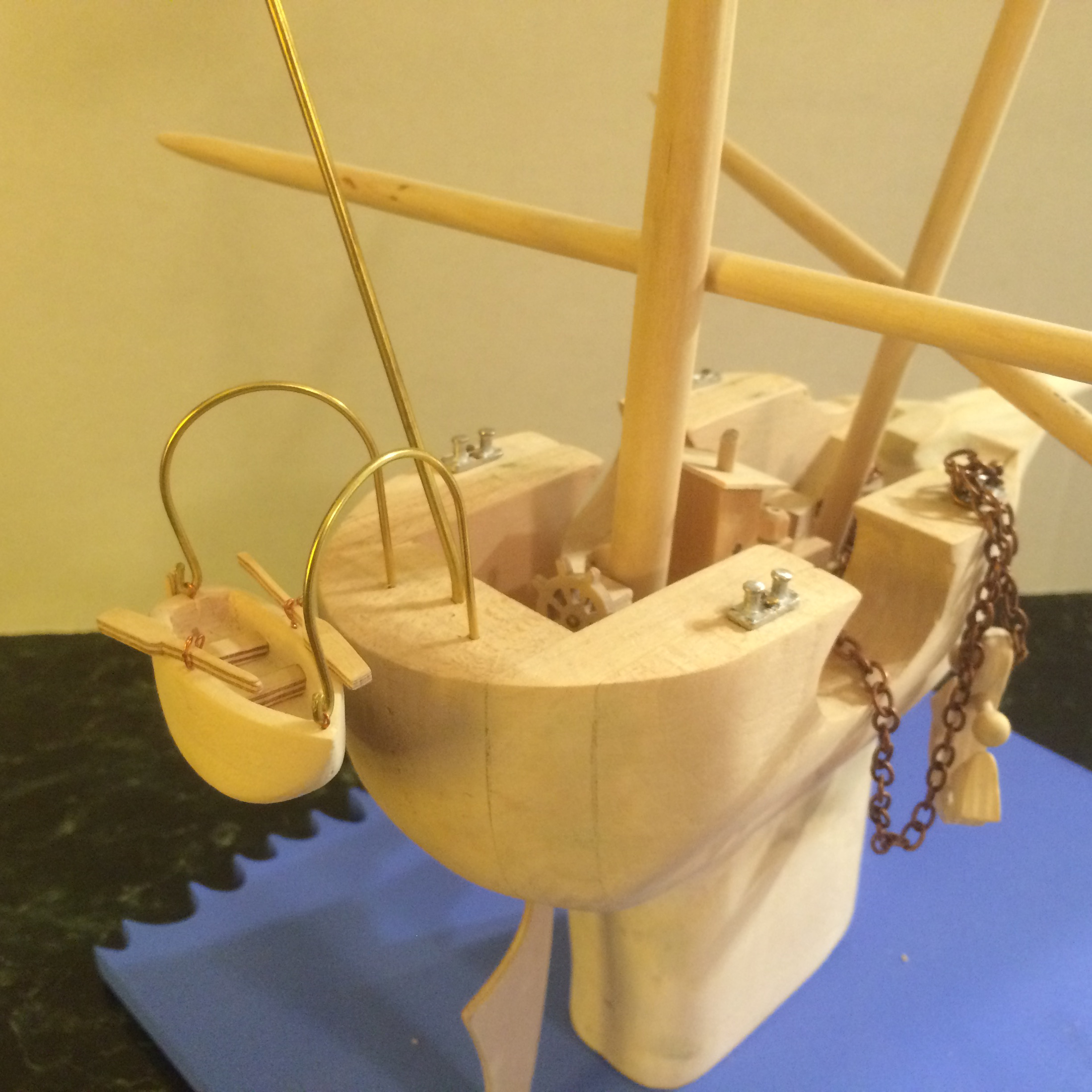
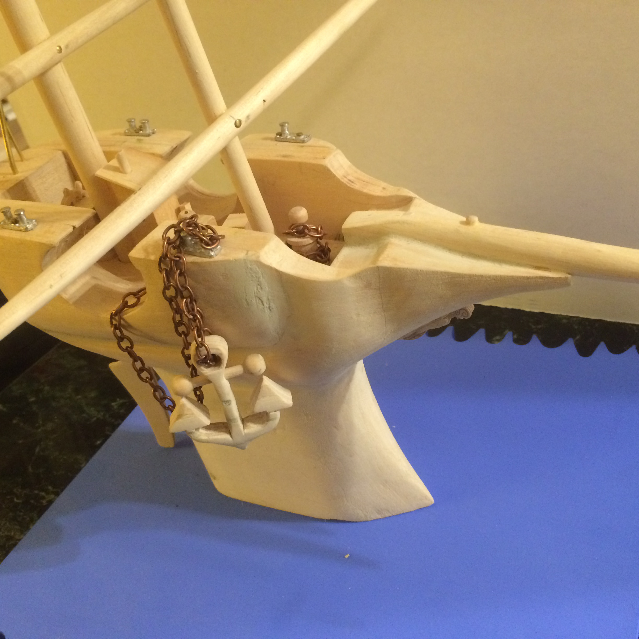
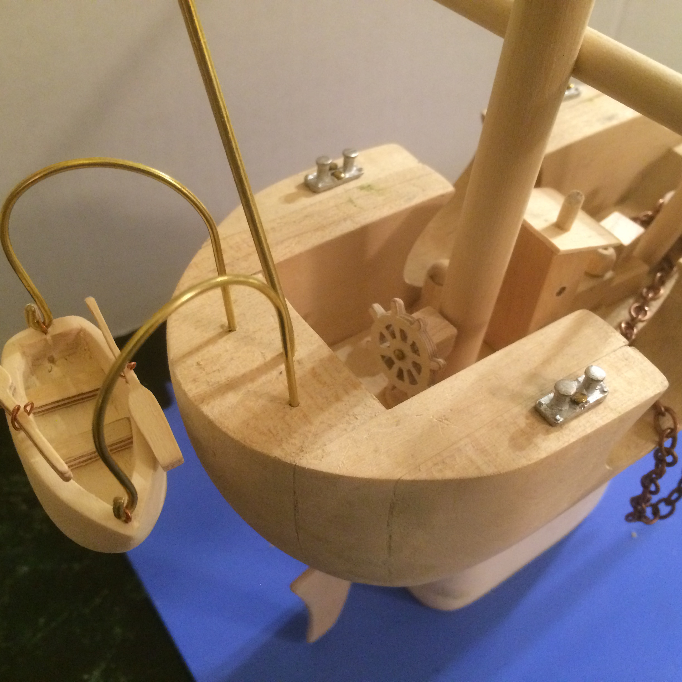
Also, people always ask if I draw from the models I make. I don’t. I mostly make them to see my drawings come to life. And it’s fun! And it keeps me thinking about the book while I’m doing something else besides drawing. It gives my mind a change of pace, so I can figure things out, and keeps me busy while I wait for sketches to be approved, etc. My model of Zephyr’s flying machine from my book Zephyr Takes Flight is hanging in the Eric Carle Museum of Picture Book Art, which is a dream come true, so I guess I’ll keep making them.
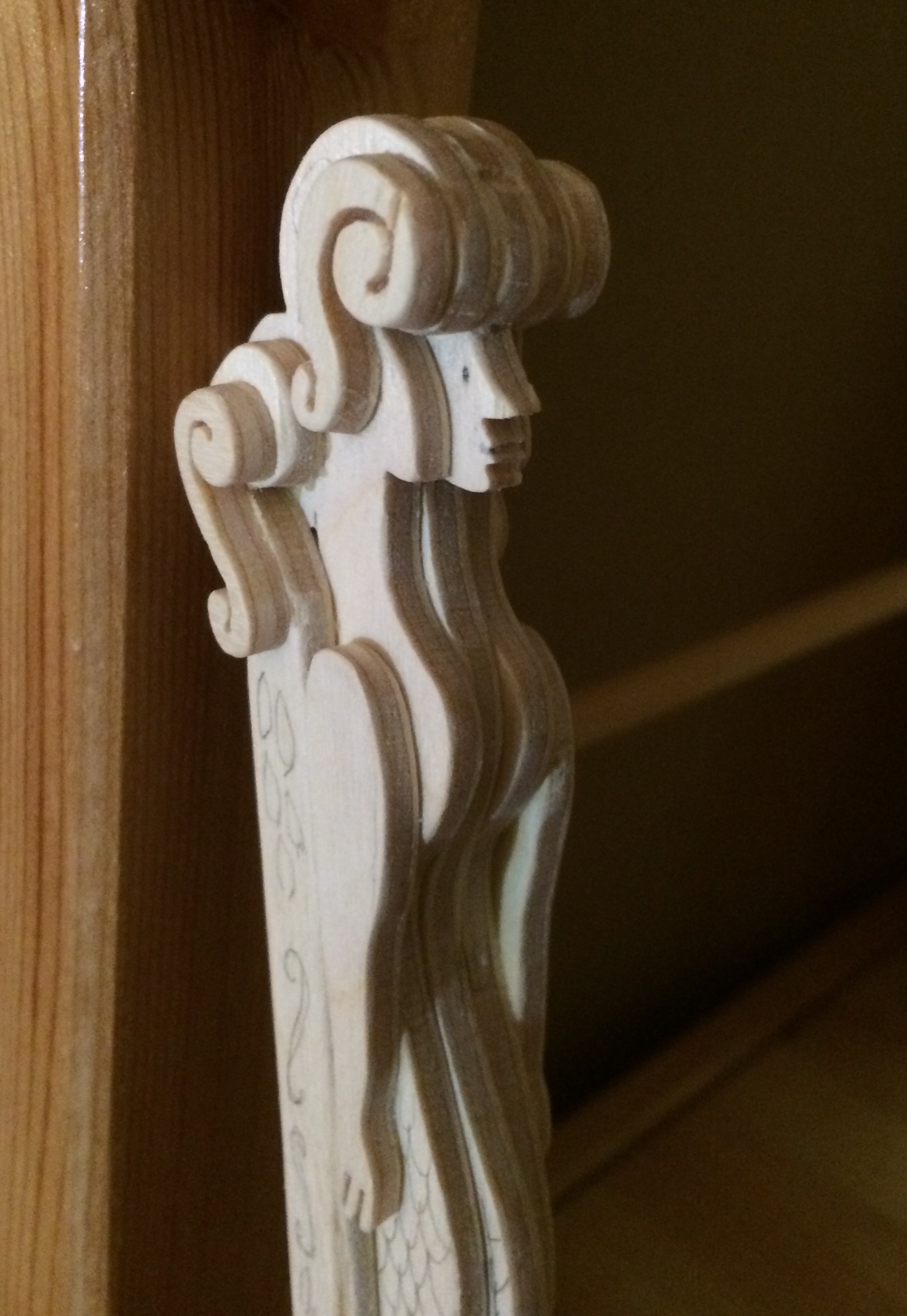
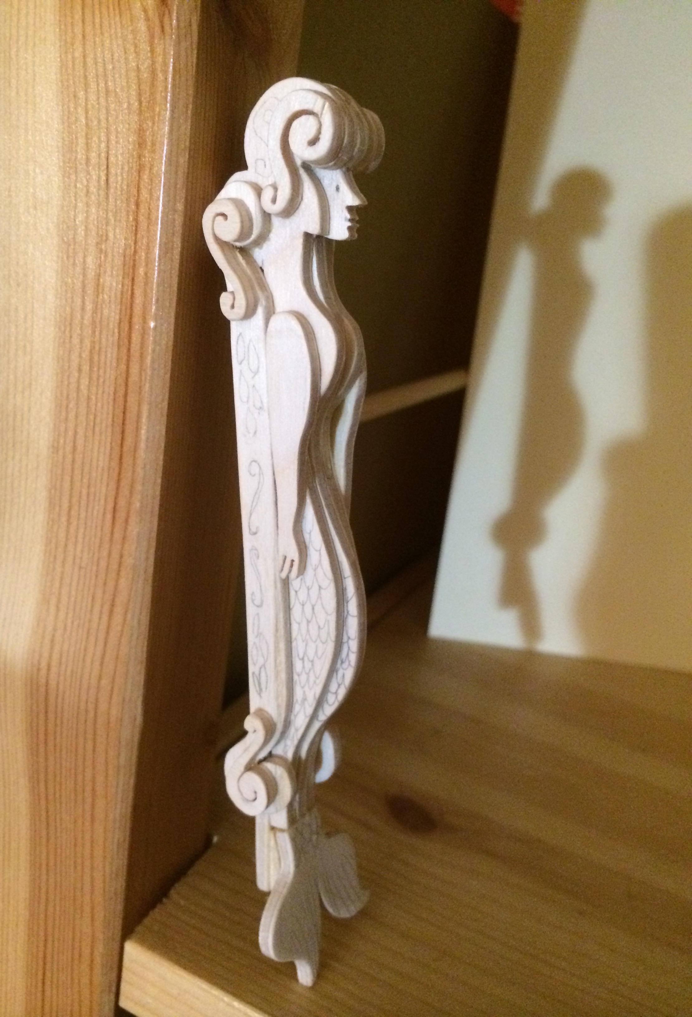
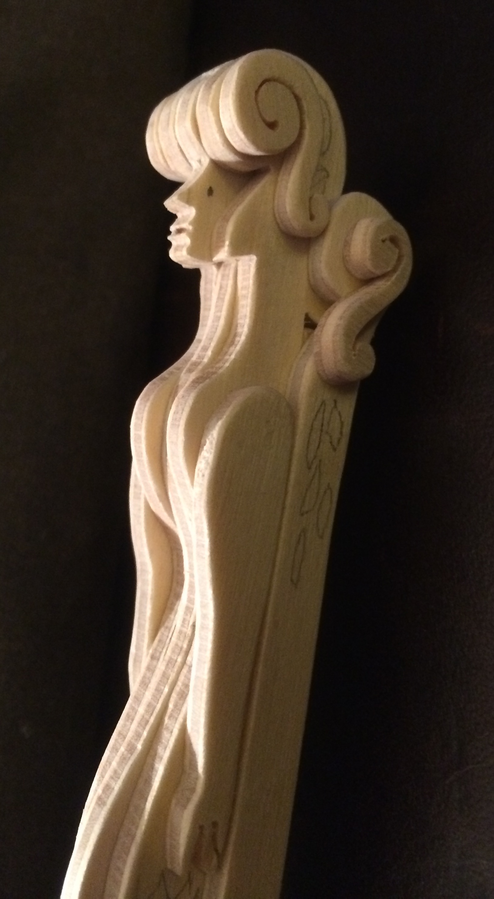
The Mermaid figurehead [below] was made to show my editor and art director what it would look like — that it would look like it was made of wood and not the “real” mermaid strapped to the ship. I guess my sketches of the mermaid figurehead were too rough. So, I made this model and drew pictures of how I was going to draw it in the final art — and they were convinced.
(Click to see spread in its entirety)
(Click to enlarge)
My book launch party will be at Books of Wonder on February 13 from 1-3 p.m. Everyone is invited.
SWAP. Copyright © 2016 by Steve Light. Final art reproduced by permission of the publisher, Candlewick Press, Somerville, MA. All other images reproduced by permission of Steve Light.

Absolutely brilliant. Thank you!!
Can’t wait to own this!
Steve, I LOVED seeing your process. The models you made for the book are equally as wonderful as your drawings. Thanks for sharing.
I adore that ship – Well done STEVE! I loved seeing your sketches!
You are so inspiring…and you make me want to draw, draw, draw!! I read Swap at ALA a few weeks ago and loved it (and the blue!)– can’t wait to own a copy.
Fantastic! Love seeing your process. Thank you!
So fab!
Fantastic! Thank you so much for the process imagery and a peek into Swap!’s obsessions. Smalt!
Wow! This is all so cool. Thank you so much for sharing your process — I love everything about this interview!
Brilliant and beautiful work! Love it.
This was so much fun to see! I love that you shared the color planning process, your teeny tiny book dummy, and the sculptures, too! I always enjoy the energy of your drawings. So generous of you to share, and much appreciated! Great interview!
Awesome, loved what you showed and the progression. Keep me posted when it appears.
thanks