What I’m Doing at Kirkus This Week,
Plus What I Did Last Week, Featuring Jonathan Bean
 August 12th, 2016 by jules
(Click to enlarge spread)
You won’t find me writing about magazines … well, ever. Until today. This morning over at Kirkus, I take a look at Illustoria, a promising new children’s magazine with a focus on children’s book authors and illustrators.
That link is here.
Last week, I wrote here about Kate Hoefler’s Real Cowboys (Houghton Mifflin, October 2016), illustrated by Jonathan Bean.
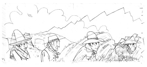
Today, Jonathan shares some process images and final art, as well as some thoughts on creating the illustrations for this book. I’m happy he’s sharing that today, so let’s get right to it.
Jonathan: First, I have to say that it took no time for me to decide to illustrate this beautiful text by Kate Hoefler. Having grown up around farms and farmers and having spent a little bit of time now in the picture-book field, I’ve seen that there is a scarcity of picture books that depict rural farming or ranching life with both realism and poetry. Kate’s text does that, and then some!
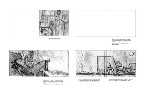
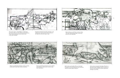
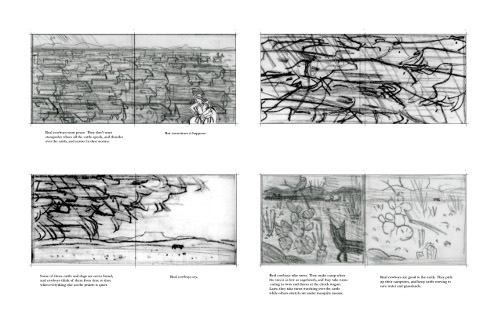
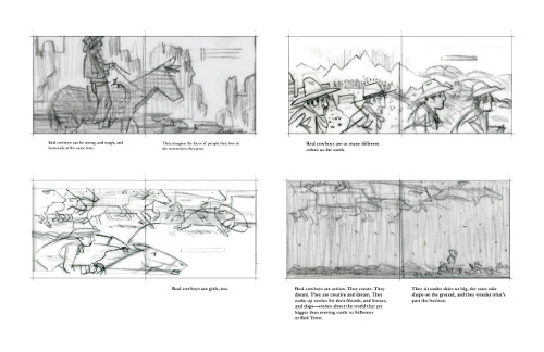
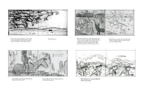
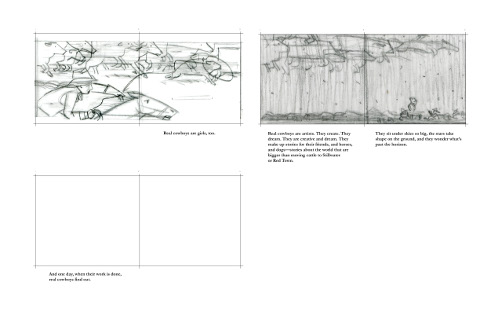
(Click each to enlarge)
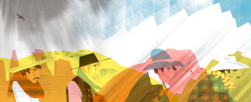
For the art, I leaned toward flat and, for me, more basic geometric shapes. I think of the cowboys, cattle, and landscape in these images as being “real” in the sense that they are composed of more visually basic shapes; there are lots of horizontals and verticals and, at times, smoothly arcing curves. However, I didn’t want the flat shapes to feel cool or chilly; I wanted there to be warmth, because the text overflows with warmth. That’s where the stencils came in. Nearly every shape in this book, including those filled with a flat color, were formed by hand-cut stencils that I used with sponges, potatoes, spray paint, toothbrush splatter, and other techniques to give the shapes a warm, earthy texture. I then scanned all of those stenciled shapes and composed the pre-separated, color images in Photoshop.
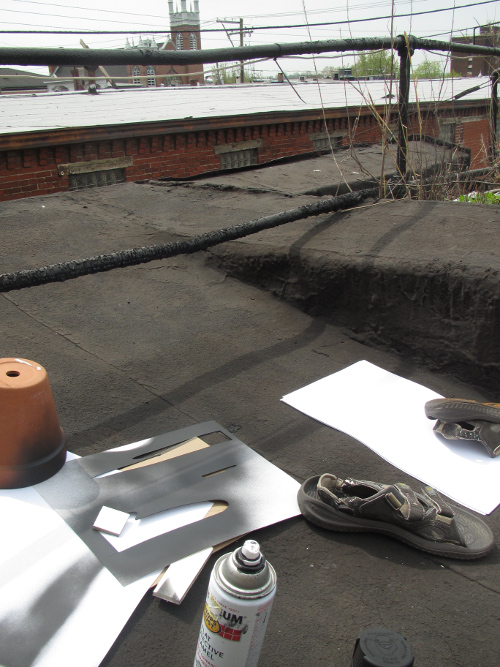
Here’s a photo of some of this book’s paper trail:
I won’t say too much about the color, except that I chose a bright palette so that I could, in many spreads, stay away from the sepia-toned images of cowboys we have come to expect. Also, I knew from the start that I would use a bright pink, because I wanted to dress some of the cowboys in pink shirts and hats!
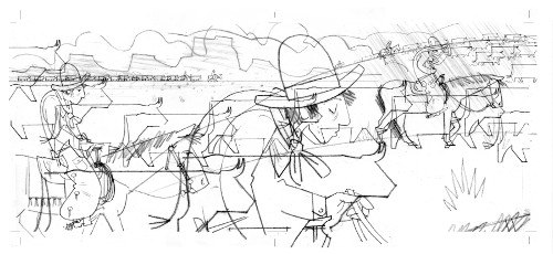
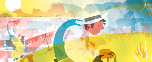
Real cowboys are patient. Even on a fast horse, they have to move with the slow rhythm of a herd, and it can take a long time to get places.”
(Click to enlarge spread)
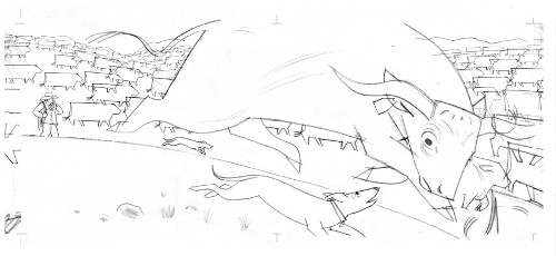
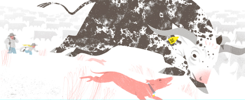
(Click to enlarge spread and see text in its entirety)
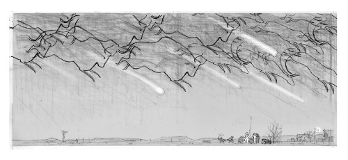
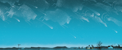
(Click to enlarge spread)
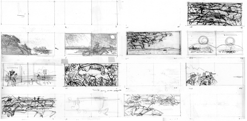
Finally, this is the first book I’ve illustrated that doesn’t have a traditional story line. I spent a lot of time deciding how to visually tie the spreads together and ended up with a very long storyboard that I slid over my desk one way or the other, depending on what section I was considering.

A careful observer will notice that a small stream of cattle begins on page five and continues to snake and grow until the reader reaches the stampede spread, in which the cattle completely take over the image. I’ve included a jpeg of the entire storyboard, joined spread-to-spread, so that your readers can look for other ways I attempted to join the visual stanzas of Kate’s beautifully-written song.
[Ed. Note: I’m breaking that very long storyboard up into two parts, so maybe we can all see it better.]


[Ed. Note: And now here’s some more final art from the book. Thanks again to Jonathan for sharing.]
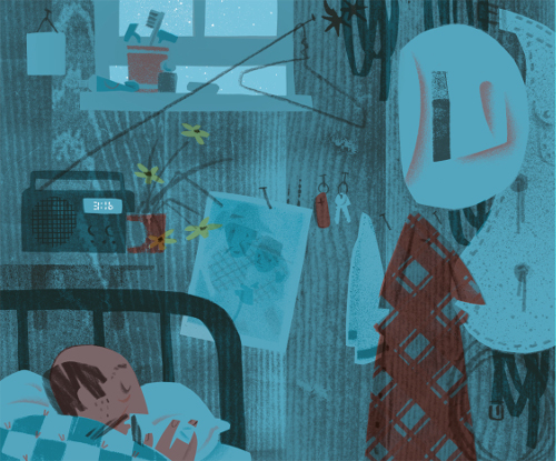
(Click to enlarge)
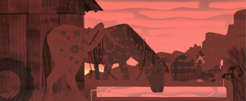
(Click to enlarge spread)
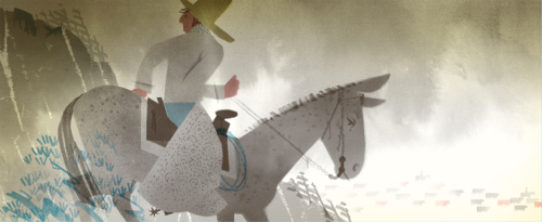
the sound of distant thunder.”
(Click to enlarge spread)
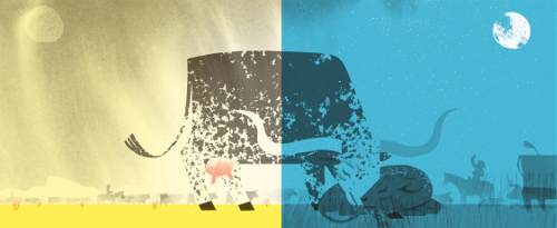
(Click to enlarge spread and see text in its entirety)
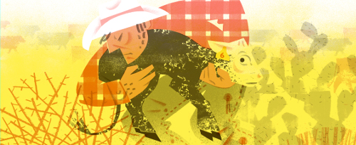
(Click to enlarge spread and see text in its entirety)
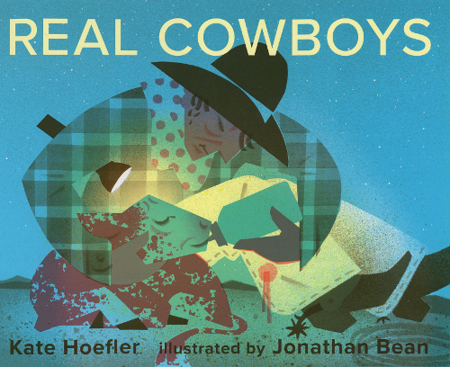
REAL COWBOYS. Copyright © 2016 by Kate Hoefler. Illustrations copyright © 2016 by Jonathan Bean. Preliminary images and some illustrations reproduced by permission of Jonathan Bean. Other spreads reproduced by permission of the publisher, Houghton Mifflin Harcourt, Boston.

Ohhhh, this is beautiful. Both the words and the images. I can’t say I was really into cowboys, per se, as they’re historically tied to problematic American mythology with “Injuns” but — wow. This book.
Love the juxtaposition of a stereotypically tough subject, treated with such vivid tenderness by both author and artist. Thanks for sharing your process, Jonathan, and for such an inspiring review, Julie.
I can’t wait for this book! The Bean has created a masterpiece with this work.
I’m crazy, crazy about this book so all these images – process and finished – are a treat. The text is so special and the art just extends the sensibility.