A Mighty, Mighty Peek at Picture-Book Process
 April 18th, 2017 by jules
One of my favorite things is when illustrator Tom Lichtenheld stops by 7-Imp to talk about the thought processes that go behind his work. (He’s done that at least once before.)
Today, he visits to talk about creating the artwork for Sherri Duskey Rinker’s Mighty, Mighty Construction Site, released earlier this year. This is the sequel to 2011’s Goodnight, Goodnight, Construction Site (which has a great publication story). Bonafide bestsellers these books are. And this follow-up, which introduces some new characters, delivers the goods. Best of all in this new story, Skid Steer and Mighty Flatbed are explicitly she machines. Attagirls!
Let’s get right to it so that Tom can do his thing. I thank him for visiting.
(Click to enlarge)
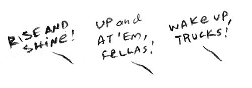
Tom: One thing we knew for sure [with this new book] was that this story would begin with our characters waking up in the morning — to follow up from the ending of the first book. We just had to decide what the guy in the building would be yelling to wake up all the sleeping trucks.
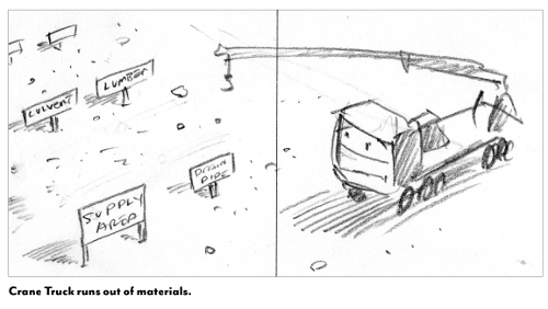
Sherri came up the idea of a new crew of trucks that would come in and help the five trucks from the original story, which gave us two essentials: action and a theme — cooperation. These sketches show how we explored problem/solution situations, where one truck would help another.
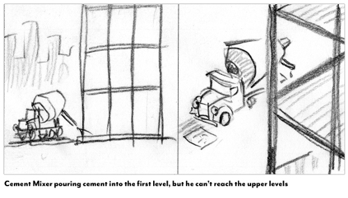
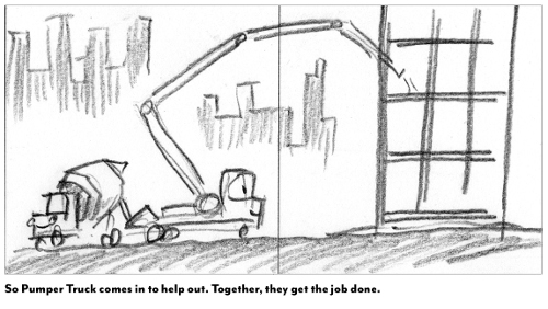
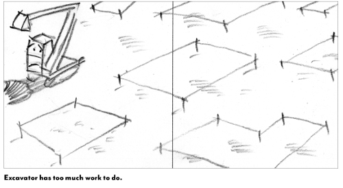
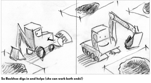
These concepts are the backbone of the whole story, so we created lots of them and picked the best ones.
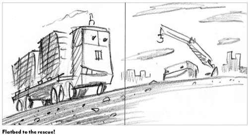
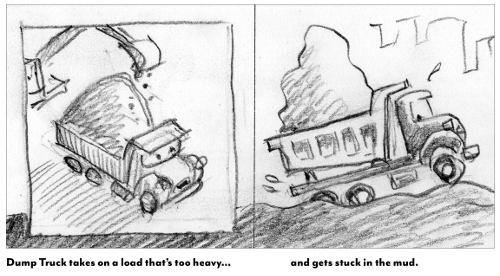
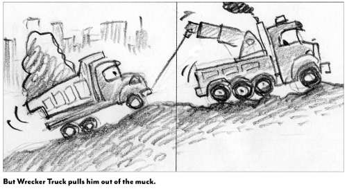
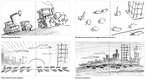
My initial sketches are rough and small, so I can do lots of them. In this early version [above], the story ended with all the trucks finishing their work and staying together for a sleepover.
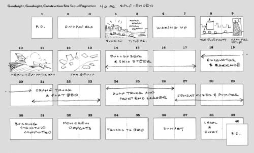
With the basic elements in mind, we created a pagination to figure out the flow. Creating a set-up, closing, and five different truck scenarios within 40 pages was a challenge — but a fun challenge.
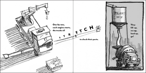
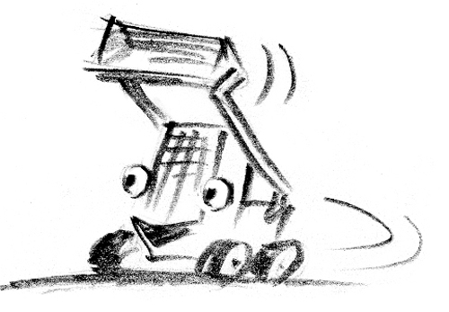
The first book gave us lots of elements to reprise and develop in the sequel. For instance, we knew Excavator (and his teddy bear) would start the day with a big, stretching yawn.
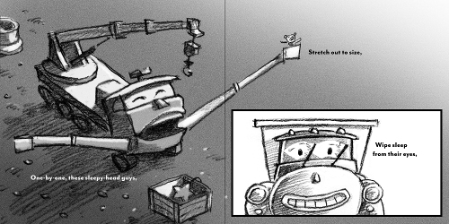
I tried it a number of different ways.
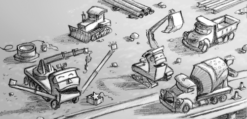
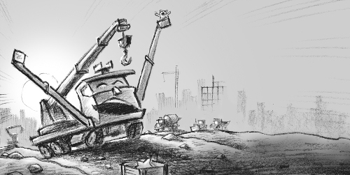
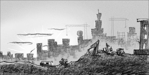
We finally chose this view [above], because it’s dramatic and the background elements—sunrise, buildings, and other vehicles—accomplish a lot of visual storytelling in one image.
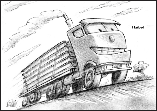
Character designs [above]. Anthropomorphizing trucks is as much fun to do as it is to say!
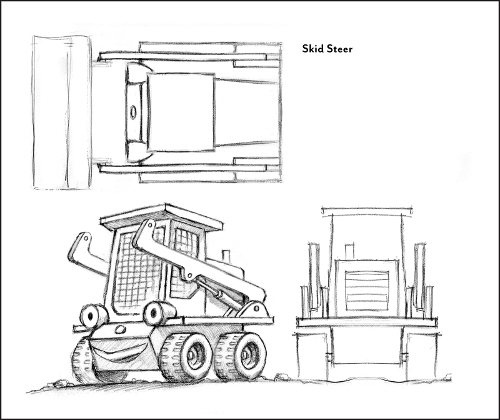
Some of the vehicles have lots of mechanical bits, so I had to work out the design from every angle.
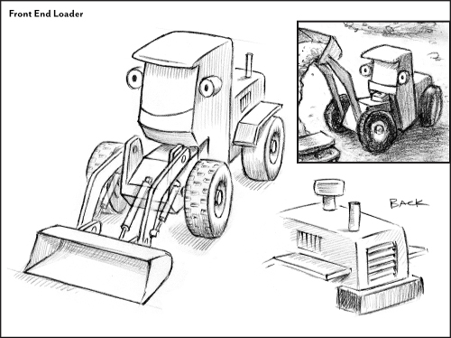
The articulated front end made this one [above] especially difficult to draw at an angle. (Still not sure I got it right.)
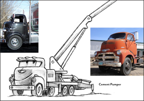
Old trucks have beautiful, human-like shapes, so they’re much better reference than newer trucks.
[Below] is a progression of black-and-white art for one spread. This is the point in the story where the new trucks enter to help with a big construction project. This first sketch is quick and small, probably 3” wide.
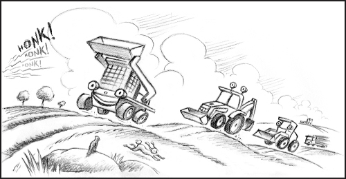
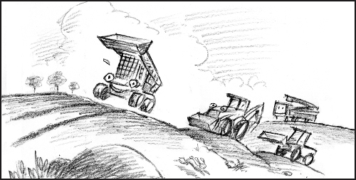
The second sketch is a little tighter — and larger.
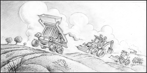
With the final sketch, I work out lighting, details, and depth. At this point, the challenge is to retain the energy of the first sketch, while filling all the details.
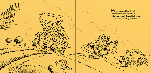
All the shading goes away when I create the final line art, which is printed on colored paper [above]. Then I spend many days adding color with crayons.
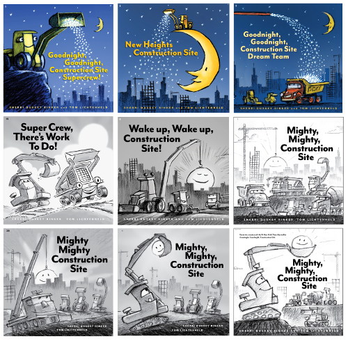
[Above are] lots of cover concepts and lots of title options. Ultimately, we decided to echo the composition of the first book and show it as a day-time scene, so the image is both familiar and new.
Of course, not everything we like can fit into the book, so these are some of the things that were left behind.
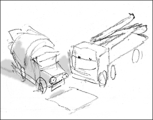
[Above] is Cement Truck and Pumper, looking over a blueprint. I like the way the geometry and expressions convey intimacy between these two tough characters.
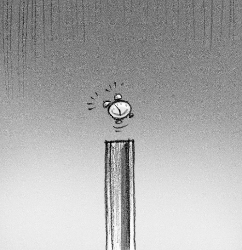
An alarm clock idea for the half-title page, which we didn’t have room for.
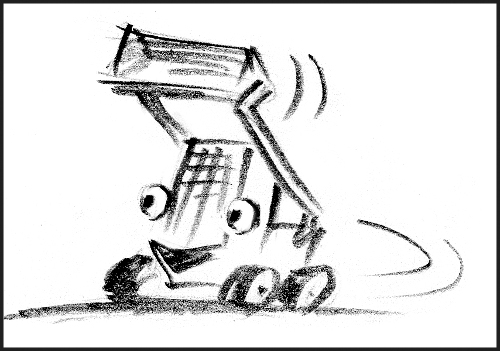
A good example [above] of the way an initial sketch can capture energy that’s hard to retain in finished art. Someday, I’ll do an entire book that feels this simple and fresh. [Ed. Note: This is the same image that opens this post.]
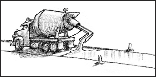
I like drawing concrete being poured, because it reminds me of soft-serve ice cream — loads of it!
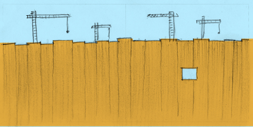
[Above is] a front endpaper concept. The square hole would be a die-cut revealing the next page.
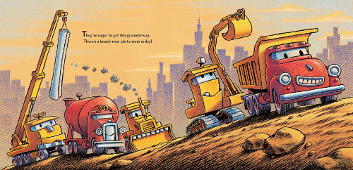
(Click to enlarge spread)
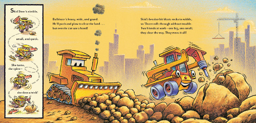
(Click to enlarge spread)
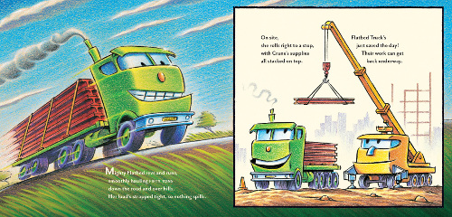
(Click to enlarge spread)
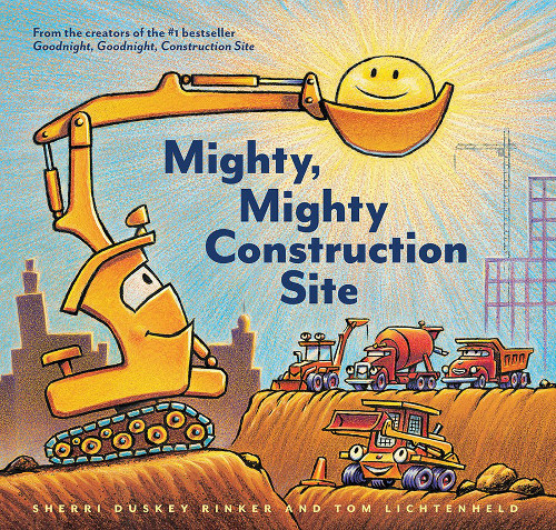
MIGHTY, MIGHTY CONSTRUCTION SITE. Copyright © 2017 by Sherri Duskey Rinker. Illustrations © 2017 by Tom Lichtenheld. Published by Chronicle Books, San Francisco. Preliminary images reproduced by permission of Tom Lichtenheld. Final art reproduced by permission of the publisher. All images here are ©2017 TomLichtenheld.
