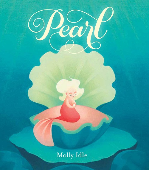
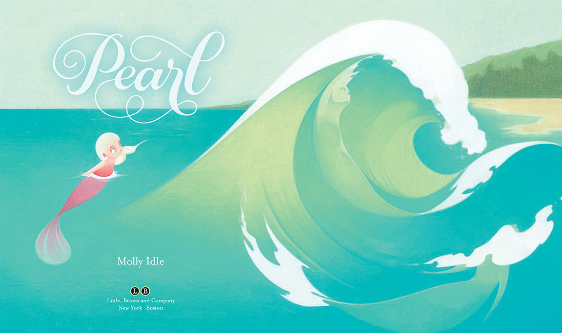
Pearl: A Visit with Molly Idle
 October 17th, 2018 by jules

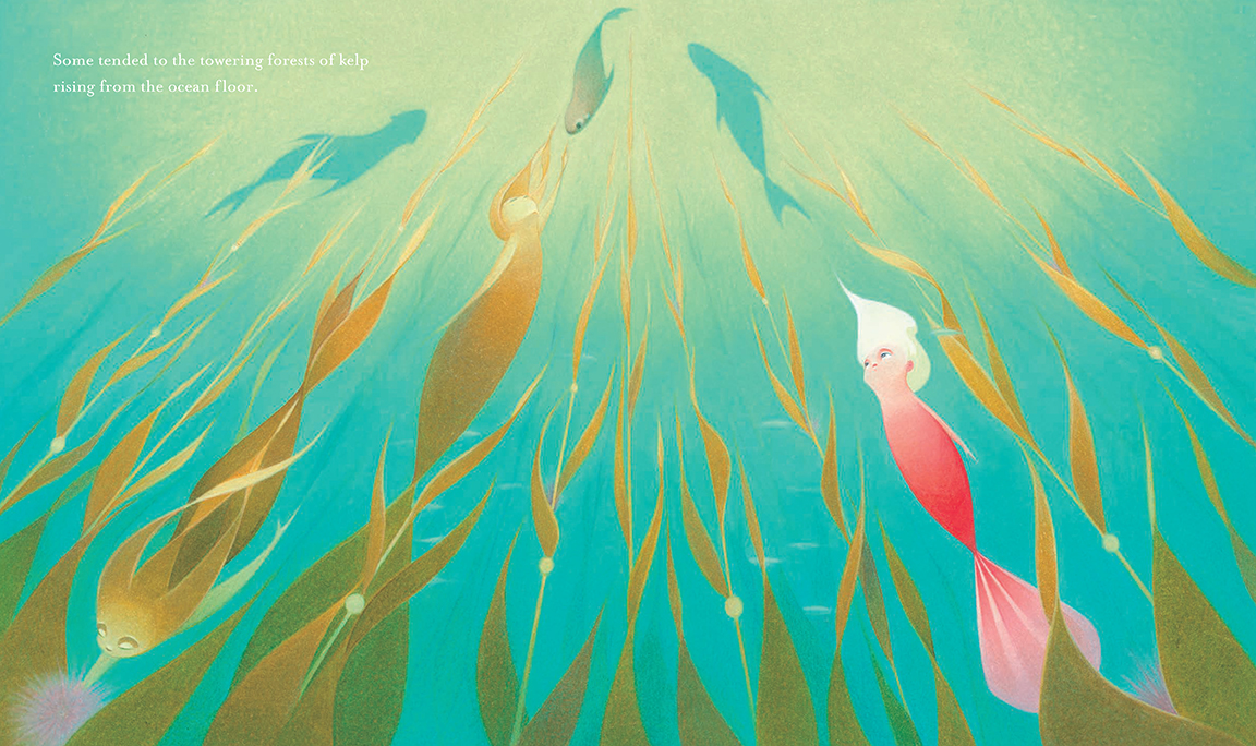
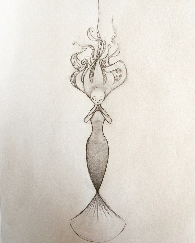
rising from the ocean floor.”
(Click each to enlarge)
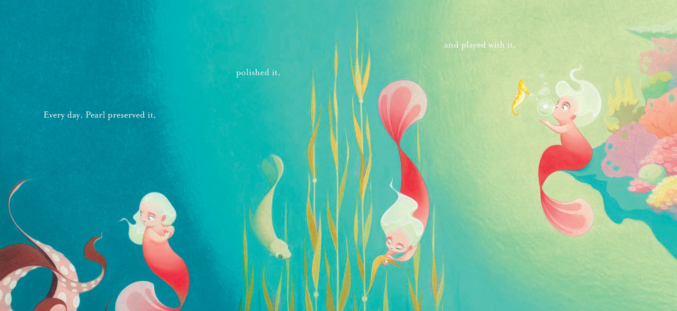
Author-illustrator Molly Idle visits 7-Imp today to talk about her newest picture book, Pearl (Little, Brown, October 2018). It’s the story of a small mermaid, eager for a big job. When her mother tells her that Pearl’s job is to care for and keep safe a single grain of sand, Pearl is disappointed. She doesn’t truly hear her mother’s words: “The smallest of things can make a great difference, Pearl.” (And that’s all I’ll tell you about the plot so that I don’t ruin the read for you.)
Molly is here to talk today about creating the book, and she shares work-in-progress images and final art from this glimmering beauty of a thing, filled as it is with flowing lines, expert compositions, and a drop-dead gorgeous palette. Let’s get to it, and I thank her for sharing.
Jules: What is the genesis (the pearl, if you will!) of this story?
Molly: First of all, may I just say, NICE wordplay. I am known by my family as The Sugar Pun Fairy, due to my deep and abiding love of good puns (and bad puns — any puns at all, really). But I digress. Let’s dive* back into your question.
* Sorry about that. See** what I mean?
** It took all my will power to type “See” and not “Sea” in the previous footnote.
Jules: Impressive.
Molly: The genesis of Pearl’s story mirrors the creation of an actual pearl. Do you know how they’re made? The whole thing begins when a single grain of sand finds its way into an oyster.
If you’ve ever been to the beach, you know how uncomfortable a tiny bit of sand can be when it gets stuck to you. Well, when oysters get that uncomfortable feeling, they coat the sand with a soothing, iridescent substance called nacre, also known as “mother-of-pearl.” Over time, layer upon layer of nacre is added to the sand until … ta-da! A pearl is created.
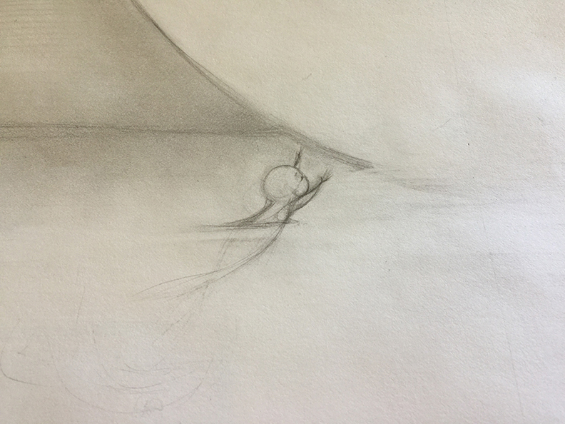
A few years ago, I realized that I had been so busy with work that it had been ages since I had drawn just for fun — without a project in mind or deadlines attached. And that realization stuck in my mind, like a grain of sand in an oyster. It made me uncomfortable. So, I took out my sketchbook and started to draw. Without a plan. Without a purpose. Drawing just for the sheer joy of making lines on a page. And when I put down my pencil, there was a mermaid.
I’ve always loved mermaids. Drawing one felt so good that I drew another the next day. Then another. And another. As happiness is best when shared, I started sharing my mermaids on Instagram.

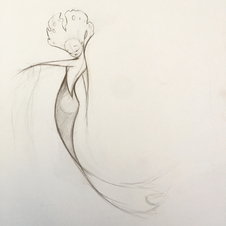
And that’s when my agent, Steve Malk, wrote to me saying that he loved the mer-drawings I had posted and asked if I thought they could become something more. And I said something like, You mean like greeting cards? Or like a calendar? No, no wait. Paper dolls! To which Steve said something, like: I was thinking more like … a book.
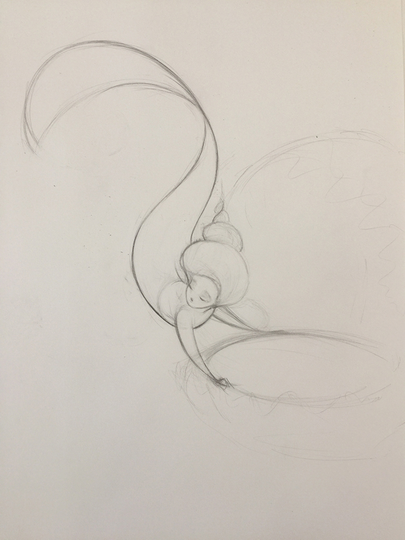
A few days later I drew this:
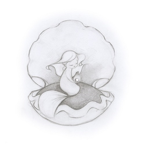
… and I knew I wanted to tell her story.
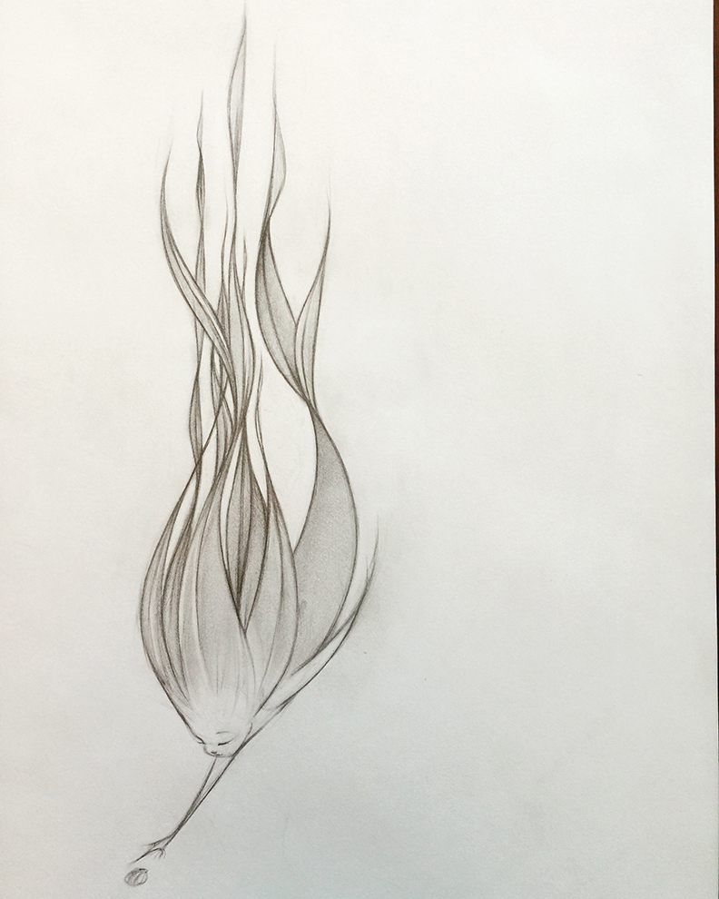
Jules: Was it daunting to create an original mermaid tale in a world filled with many of them?
Molly: Again, “a mermaid TALE”? Jules, you’re a wordsmith after my own heart. We’re PUN PALS.
Jules: I didn’t even mean to do that.

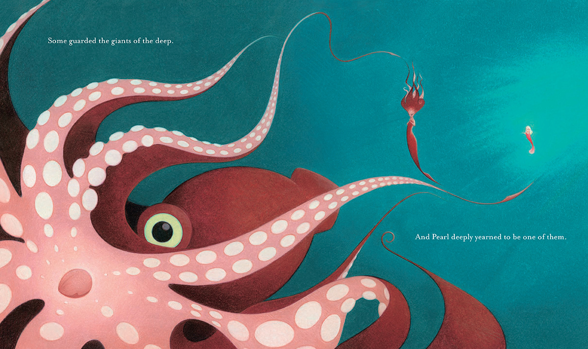
And Pearl deeply yearned to be one of them.”
(Click each to enlarge)
Molly: More daunting to me than the thought of creating an original mermaid tale was the prospect of creating any tale using so many words. I am so much more comfortable communicating my ideas visually than I am verbally. And the prospect of creating a story that was neither wordless (like the Flora books) nor a how-to guide (like the Rex books) — but a traditionally-told tale — terrified me.
And that’s what convinced me to try it. I always want to keep pushing myself as an artist. And if I’m completely comfortable with the the process, I know I’m not challenging myself. I often think of this David Bowie clip:
So, I channeled my nervous energy into creating a story that is itself about the process of creating something.
Jules: Tell me about creating the artwork for this.
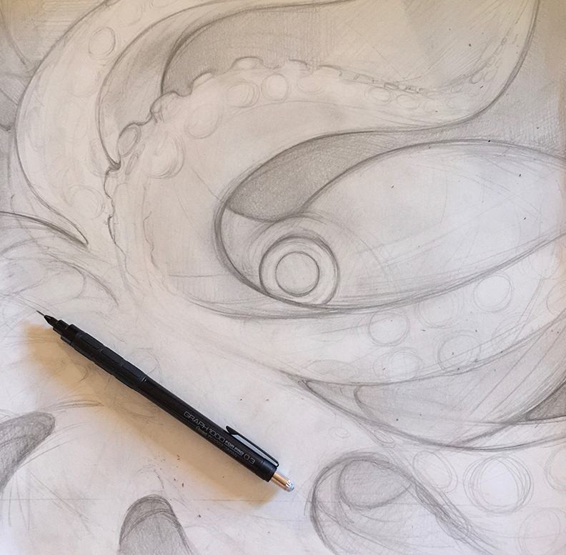
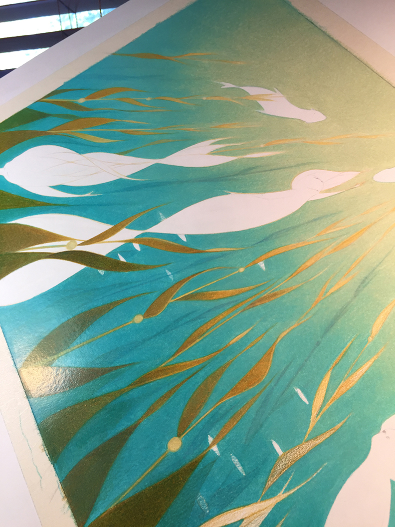
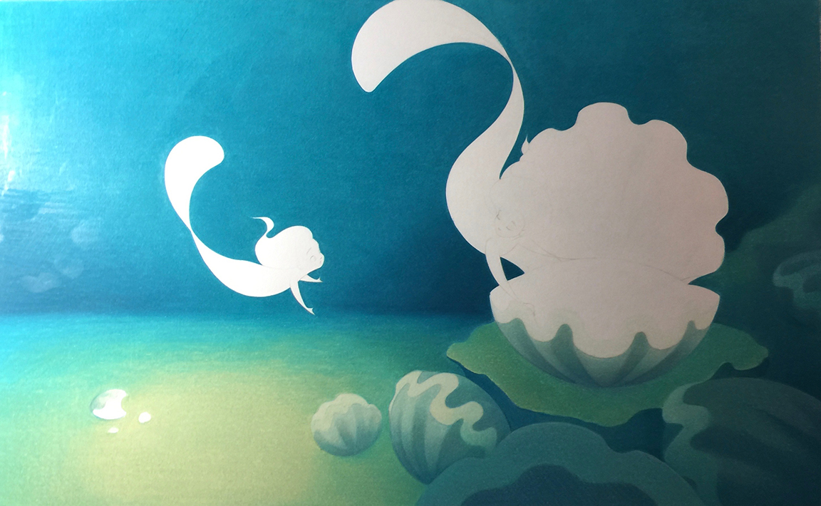
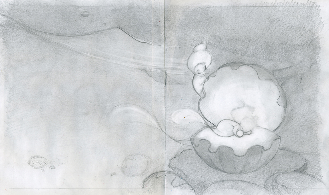
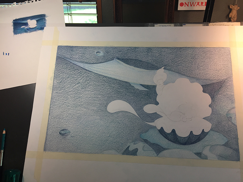
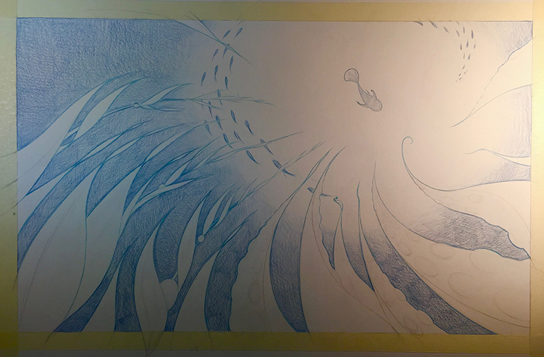
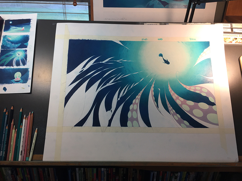
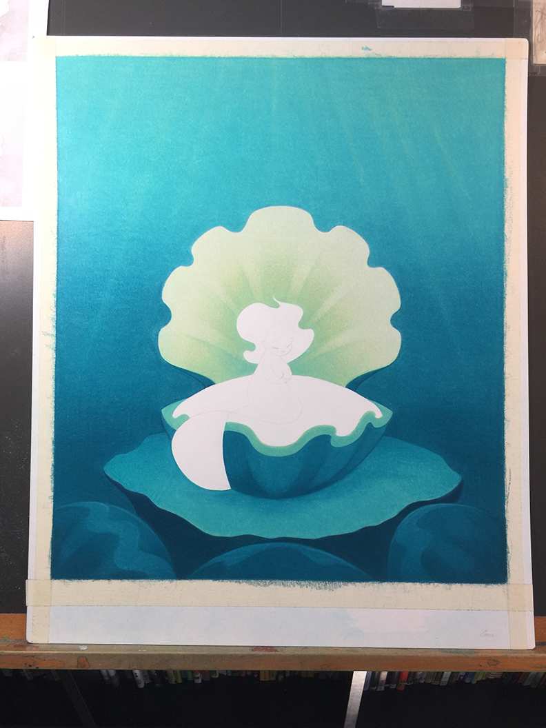
Molly: The process of creating the artwork for this book took far longer than any other project I’ve worked on. I really wanted to achieve smooooooth transitions in the colors of the water and the characters. And though there’s no waiting around for paint to dry (because I work in colored pencils), that sort of effect just takes time to create.


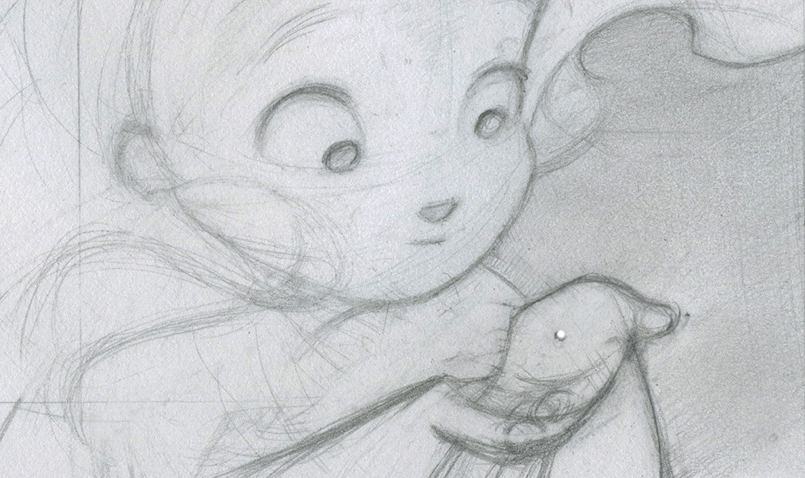
(Click each to enlarge)
I begin by tracing the sketch onto a sheet of vellum finish bristol paper, so I’m left with a clean line drawing. Then I start building up an underdrawing and work from back to front, just as if I were working in paint.
I really love the sort of half-way point in a piece when the background is finished, leaving the outlines of the shapes and characters in the foreground in sharp relief. That’s when you can really see how the interplay between positive and negative space works. Here’s a little time-lapse piece of the process:
Jules: Can you talk about the book’s design? It has pearlescent ink on the jacket, yes? Did you have a hand in design decisions?
Molly: Yes! Yes, there is pearlescent ink on the book jacket! I’m SO excited about that. Incorporating pearlescent ink into the book’s design was something we had in mind from the very start. And when I say “we,” I mean my editor Andrea Spooner, my art director Saho Fujii, and myself.
Making a book really is a team effort, and I find I work best with collaborators who feel comfortable with an overlap between all the individual aspects of bookmaking. I’m so fortunate that the rest of Team Pearl feels the same way. It meant that when we first got together to go over my initial sketches and talk about the look of the book, everyone felt comfortable offering editorial suggestions, illustration notes, and design suggestions. And I love that!
The whole team was awesome about taking design dreams and finding ways to make them design realities. One of my favorite examples is the reversed-out type throughout the book. From the outset, I wanted the words on the page to be visually tied to Pearl and the pearl she makes, which becomes … (I don’t want to spoil the ending) … so let’s just say it becomes … something illuminating.
Well, that sparked the idea of creating an “illuminated” manuscript by using type that seemed to be made of light. When I first put this idea forward, I knew it would be a tricky thing to pull off well. I also knew it would mean more work for everyone involved (printers, designers, art directors, etc.), but the whole team immediately agreed that it was exactly what the book needed. So, we all worked together coordinating the colors of the illustrations, the fonts, and the layouts around our illuminated text. And thanks to everyone’s extra effort, it turned out brilliantly (some pun intended).
(Click to enlarge)
Jules: Speaking of illumination, o! the light! In this book! Gorgeous (not sure I have a question here, unless you have anything you want to say about it? Sorry. Just emoting.)
Molly: Thank you, Jules!
The sea has always fascinated me. When I was little, I wanted to live in it. I watched every Jacques Cousteau special on PBS, again and again. I plastered the walls with drawings of mermaids and whales. And though I’m older now, my preoccupation with all things oceanic hasn’t changed.
When I started working on Pearl, I watched every marine life documentary I could find on Netflix to get a feel for the light and life that fill the ecosystems featured in the book. And while there are a lot of good films out there, there’s nothing like the real thing. I mean, there’s just something magical about the way light filters through the ocean in real life, isn’t there?
(Click to enlarge)
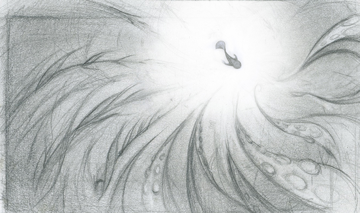
So, road trip! My husband and I piled into the car with our boys and headed up the California coast to the Monterey Bay Aquarium. It’s fab! My absolute favorite exhibit is their giant kelp forest. It’s over three stories high … er … deep. Any which way you measure it, it’s AMAZING. A mermaid’s eye view of the ocean world.

(Click each to enlarge)
Jules: If it’s not too personal, can you tell me about the dedication?
Molly: The dedication reads: “For Mr. Keane and Mr. Malk.”
Mr. Malk, is of course, Steve Malk. I am so grateful to him for seeing in my mermaid sketches the makings of something more — and encouraging me to make my own Pearl.
“Mr. Keane” is Glen Keane, the animator of many iconic Disney characters, including Ariel from The Little Mermaid. That movie came out when I was about 12 years old, and the emotion and life in Mr. Keane’s drawings absolutely floored me. Seeing marine life, mermaids, and art combined? It was my own personal trifecta. I decided then and there, in the movie theater, that I would become an animator. But I had no idea how to do that. So, I wrote Mr. Keane a letter, asking him how I could become an animator too (and I sent him some of my own drawings). And you know what? He wrote back. I still have the letter. In it, he encouraged me to keep drawing, to pursue a degree in art, and enclosed a pamphlet about job opportunities at Disney Animation.
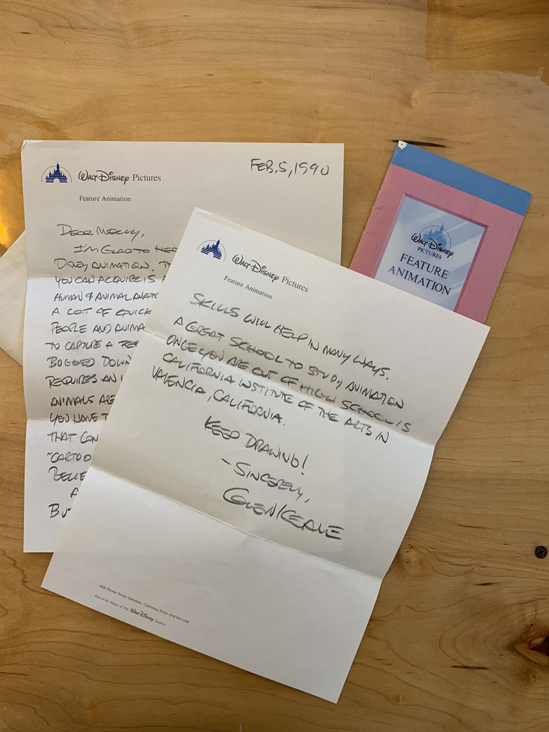
Looking back, that letter was like my own little grain of sand. It set me on the path to earn my degree in drawing, which led to working for DreamWorks Animation … which led to making picture books … which led to drawing mermaids … which lead to making Pearl.
Which brings this tale full circle.
Jules: And I hope the book does swimmingly. (You’re welcome.)
Thanks for sharing, Molly!
(Click each to enlarge)

(Click to enlarge)
(Click to enlarge)
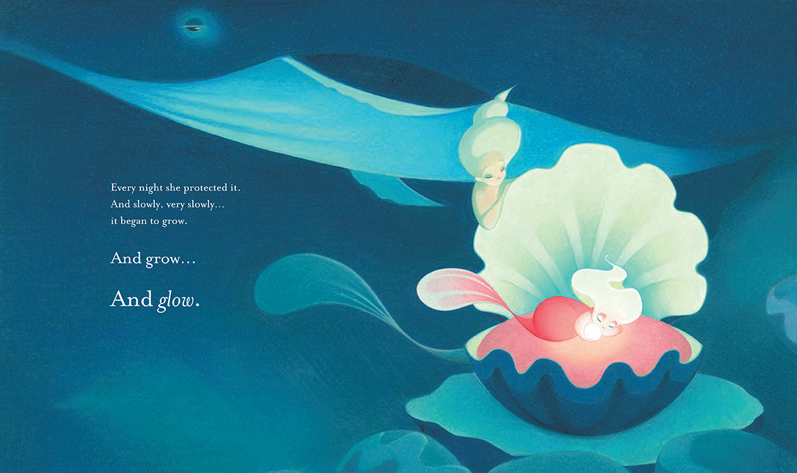
And slowly, very slowly … it began to grow. …”
(Click each to enlarge)
the towering forests and illuminated the giants rising from the deep. …”
(Click each to enlarge)
(Click to enlarge)
PEARL. Copyright © 2018 by Molly Idle. Published by Little, Brown and Company, New York. All images here used by permission of Molly Idle.

Thanks for sharing so many details about the inspiration and creation of this stunning piece of work. I can’t imagine the time and focus it took to produce each illustration, but Molly’s dedication produced something exquisite.
The Monterrey is, of course, the one I wanted you and the girls to visit when you were in Cali. It far exceeds every other aquarium I’ve visited!
I love that this all came about from a sketch to reignite the joy of drawing “just for fun” and I adore that Bowie clip; that’s words-for-life there.
Please subscribe me to your blog. Thanks!
This is such an informative post. Thank you Jules and Molly!