The Case for River
 October 10th, 2019 by jules

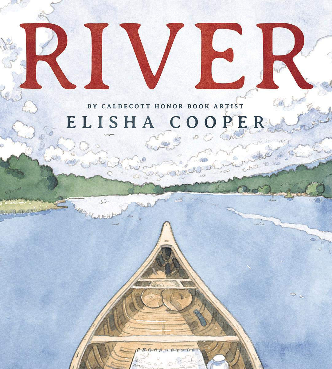
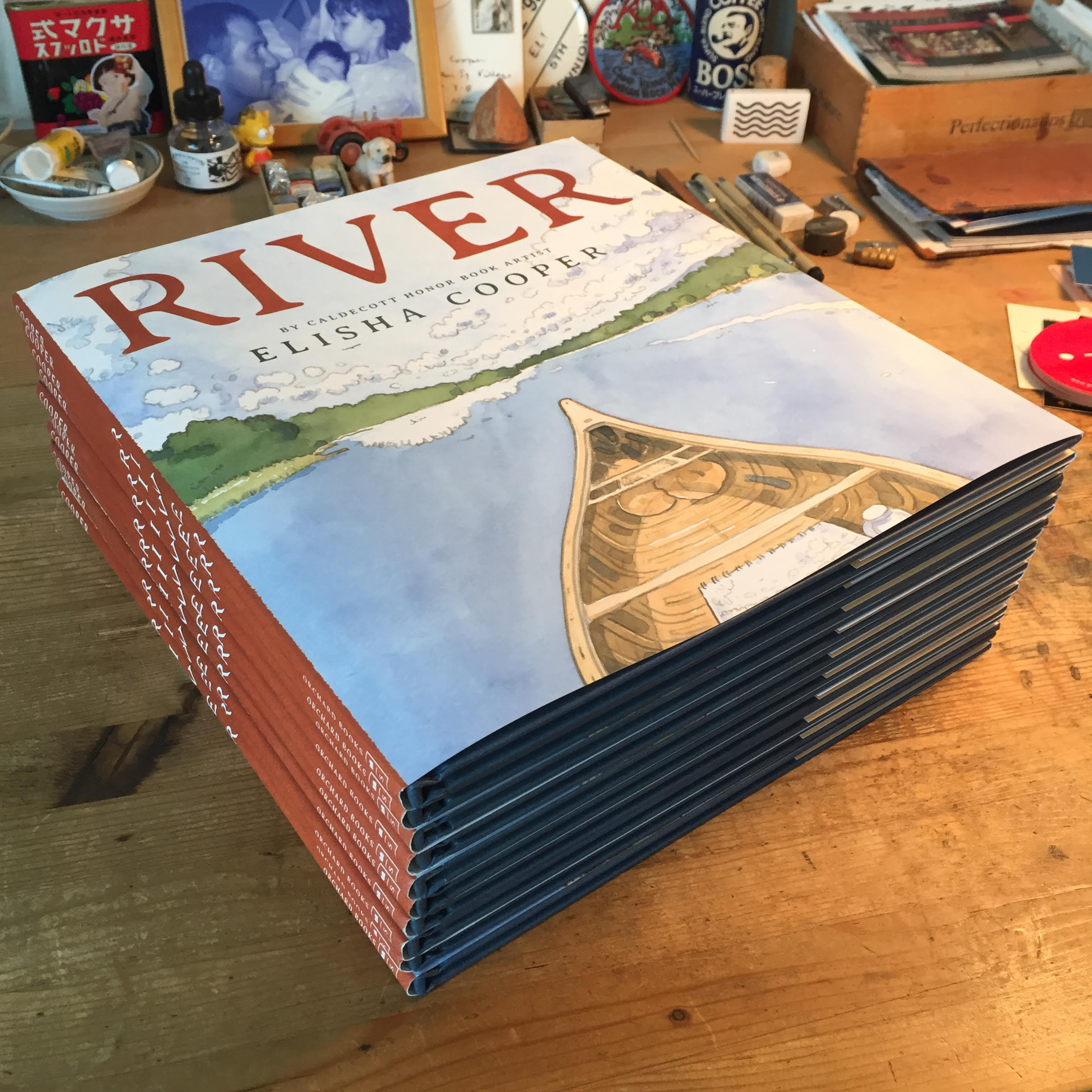
Author-illustrator Elisha Cooper visits 7-Imp today to talk about the making of the case for his newest picture book, River (Orchard, October 2019). The final case is pictured above. I love love love what he shares below and particularly like that he focuses (very specifically) on the thought and care that goes into the making of a picture book cover.
Normally, I’d weigh in here on the inside of this book and why it’s one of my favorites this year. But I’m actually going to write about it next month over at the Horn Book’s Calling Caldecott. So, I’ll wait till then. [Edited to add in November: Here is that post!] If you haven’t seen this one yet, it’s the story of one woman’s journey in a canoe down the Hudson River, but it’s about much more than just a nautical adventure. It’s about the beauty in the natural world; it’s about setting off on one’s own; it’s about strength and perseverance; and it’s about the anchor that is a loving family, waiting at home for your return.
I’ll turn it over to Elisha now, and I thank him for sharing.
Elisha: Today, I’d like to talk about the case. Not the book’s interior pages or the book’s cover. Just the case.
The most important thing about a case is its edge — what we see when the book is viewed from the side, especially in a stack. And how that band of color interplays with the colors of the cover.
After finishing the book’s interior, I came up with some ideas for the case and showed them to David Saylor, Scholastic’s art editor. David is great. He has that slightly disarming editor quality of saying little — but then speaking with quiet authority. (I wish I had that quality.) So, when David says something, I listen. When he doesn’t say anything, I listen even more.
On seeing this particular concept . . .

. . . he said, “It’s okay. [pause]”
None of my ideas inspired enthusiasm — from either of us. And I think we both really liked the book we had made, so to not attempt something as good as possible with the case felt like a missed opportunity.
I went home and sketched. I though how much I like original sketches, the rough process they show. (Hello, 7-Imp!) I painted a dark blue wash (Payne’s Gray) to get that edge. I painted an overlaying light blue wash. I chose some original drawings from the two battered sketchbooks I’d filled over the course of journeying up and down the Hudson River. I took my reference photos, changing them to black and white (to make them look arty). I painted some color swatches. Then I laid everything out, with the Adirondacks wilderness on the back (left) and New York Harbor on the front (right), mimicking the journey the canoer in the book takes as she paddles down the Hudson. It is arranged, too, in such a way to show the progression I myself took: photo of the thing; sketch of the thing; then, inside the book, painting of the thing. I made the case a mess — but an intentional one, brought to life by the patient and skilled designer Charles Kreloff, who put up with me muttering over his shoulder: “Move bear to the right. No, left. No, right. There.”
Here are some notes, starting on the case’s back. Upper left is Henderson Lake, the navigable source of the Hudson River. It was raining when I was there, so I had to take off my sweatshirt and tent it over my sketchbook to keep the drawing dry. Those watercolor marks are supposed to look like rain.

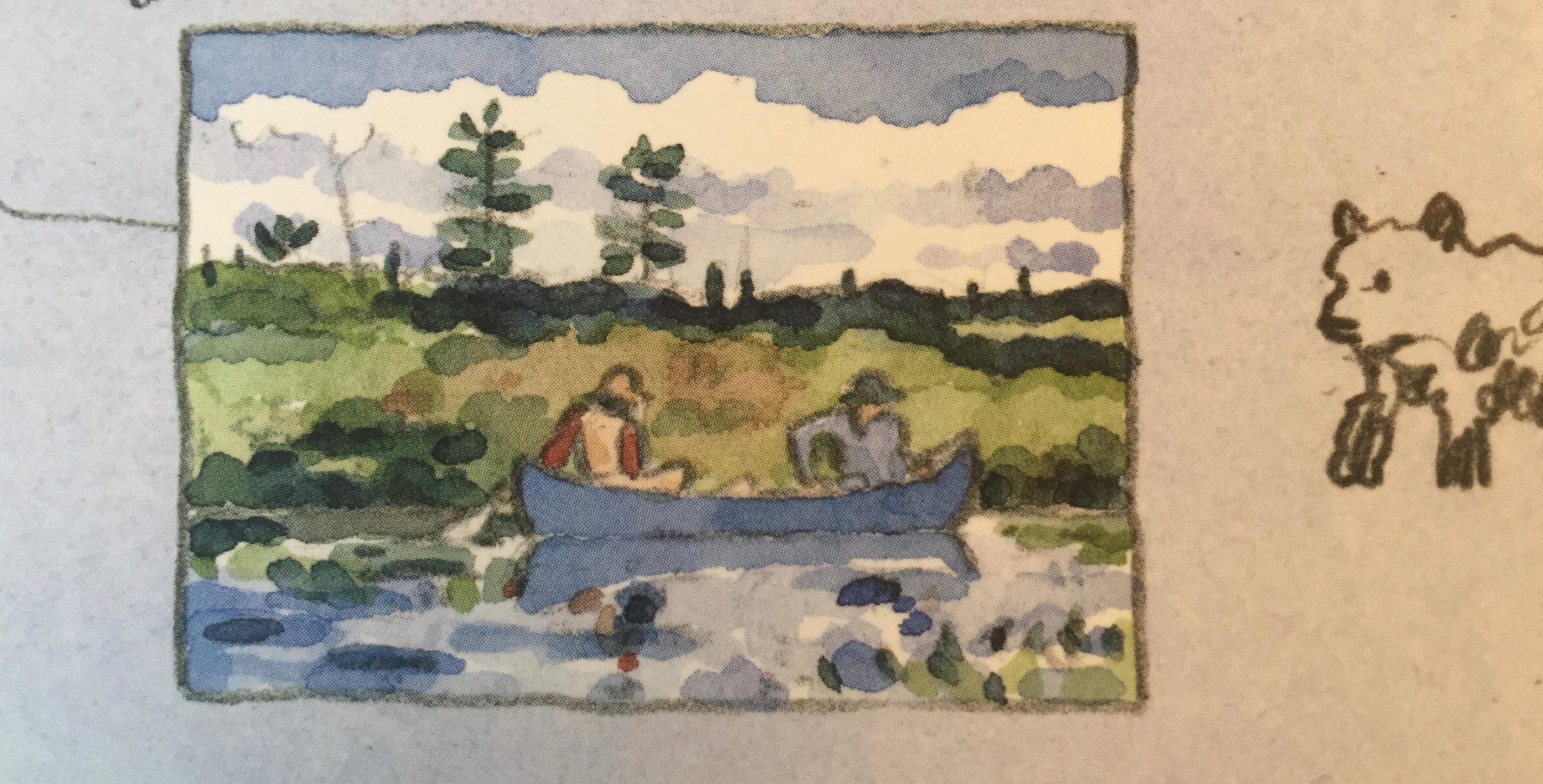
Then, down to the right, a depiction of Winslow Homer’s watercolor The Blue Boat. It’s such a beautiful painting (appropriately, of the Adirondacks and a canoe). I taped a postcard of it above my desk when I was painting the book, a talisman:
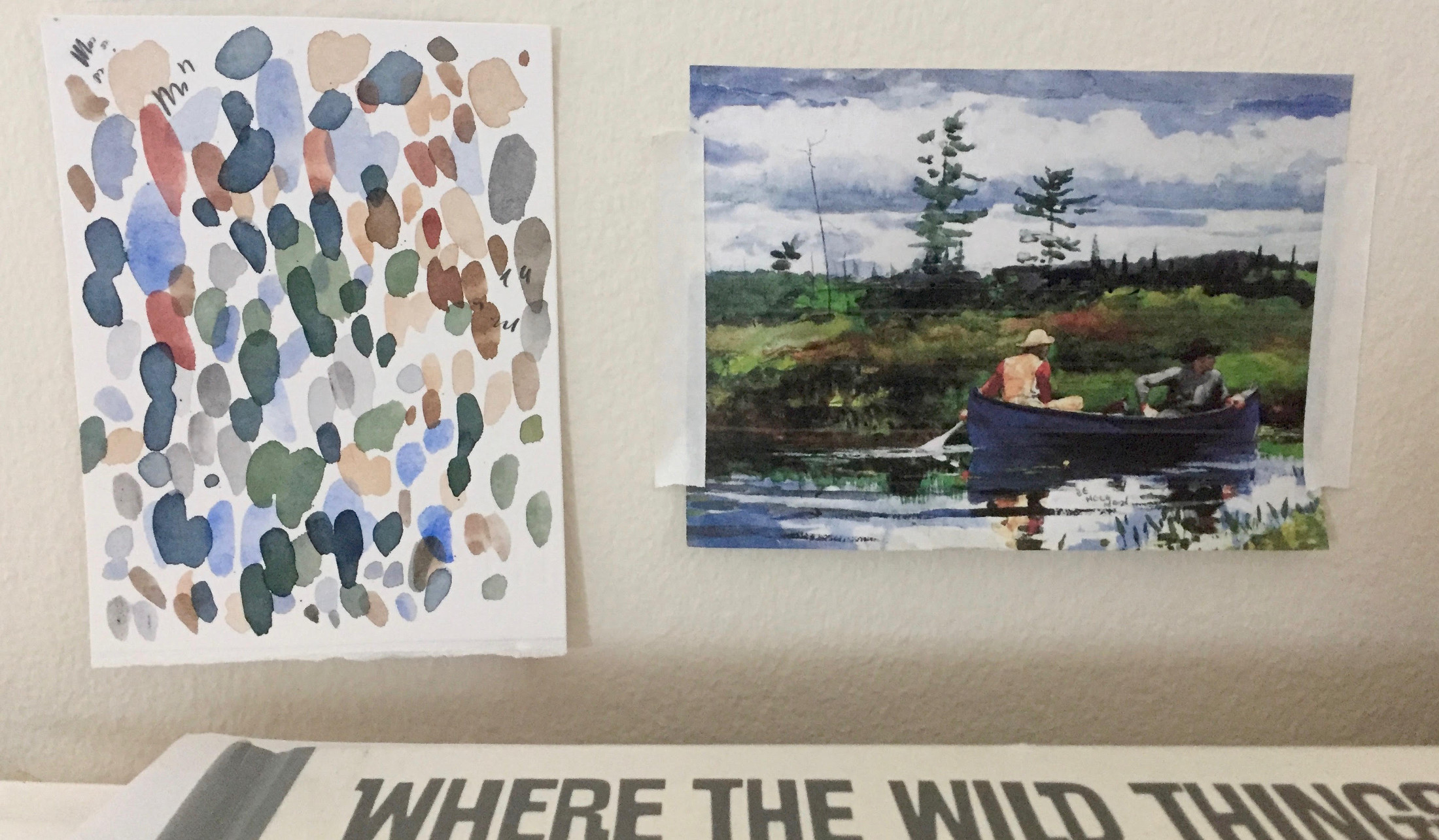
For the case , I created a copy. (Scholastic’s legal team was a little concerned, though eventually okay with it).
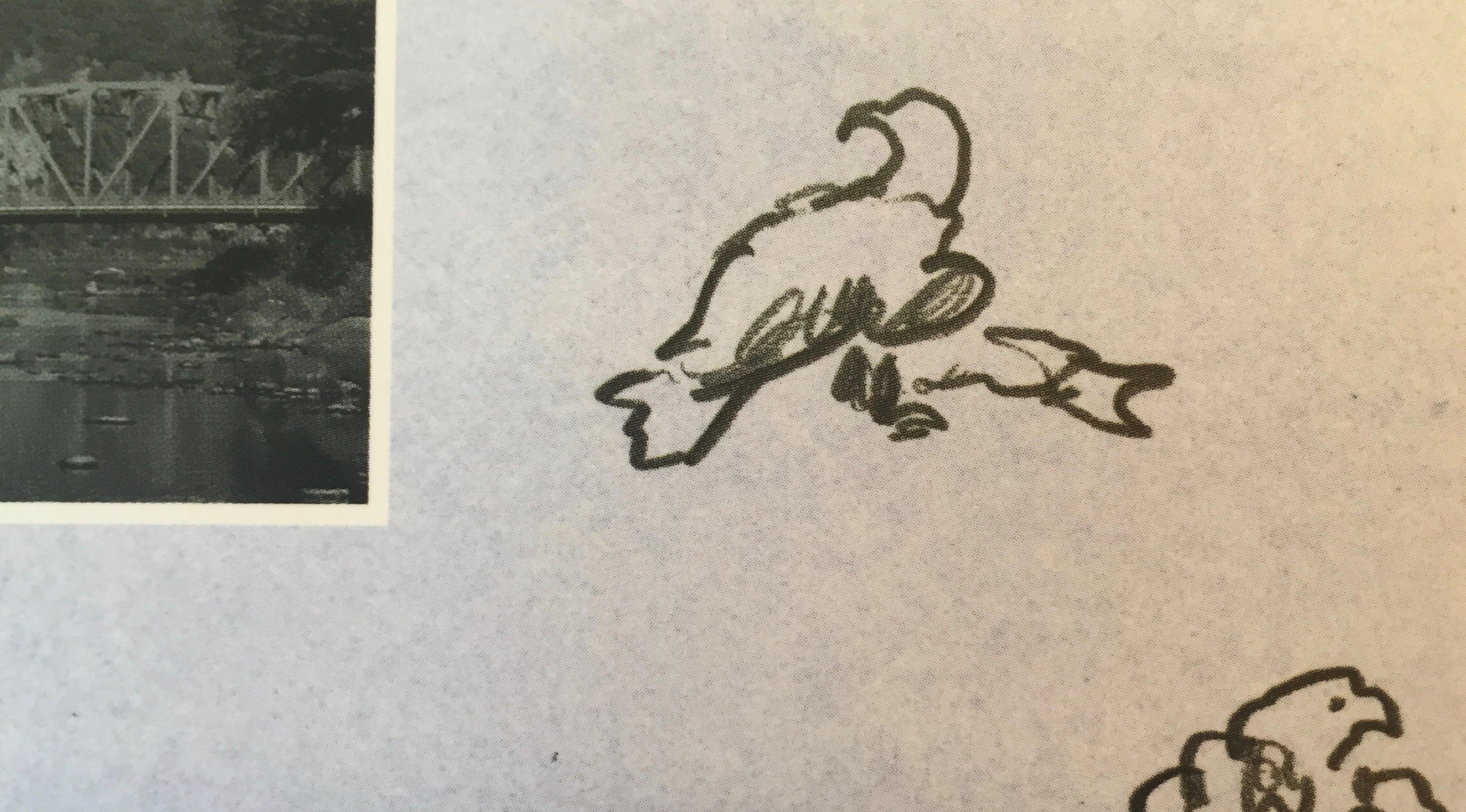
Then, a sketch of the locks, whose engineering I found fascinating. A sketch of one lock boat, the first sketch I did for this whole project. The drawings of moose and eagles are of taxidermy moose and eagles in the dioramas at New York’s Museum of Natural History (a wonderful resource for any artist here in the city). There’s even an eagle in the museum eating a salmon.
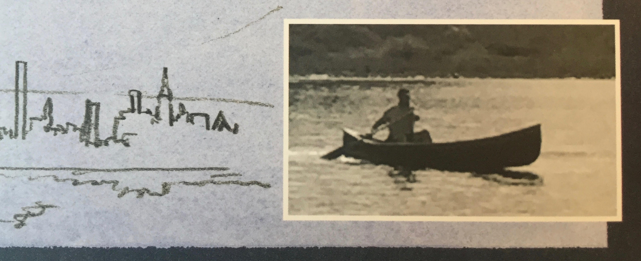
Let’s move to the case’s front. Paralleling the spine, I placed vertical red swatches, mirroring the red spine of the dust jacket. Then a sketch of Manhattan, drawn from Hoboken. Note that in this sketch I drew the Empire State Building too short, so I wrote, “taller, elongated” to remind myself to fix this in the finish.
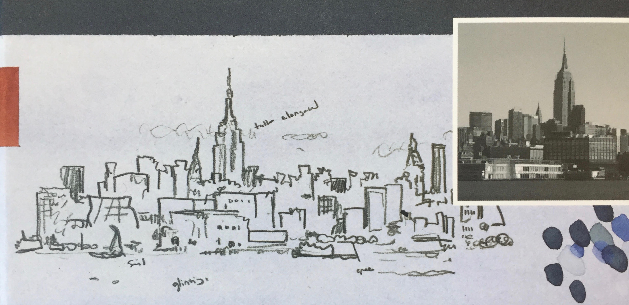
Also, sketches of container ships and ferries, bristling with notes on their coloration, and a photo of the canoe on which the book is based — and a photo of a paddler in that same canoe. (That’s me.)
Lastly, I recreated a map sketched by Lewis and Clark of the Missouri River on their canoe trip west. I like its roughness, recording the American landscape as they set out into the unknown.
Now, if you’re reading closely, you will notice that I have been dishonest. I said I wouldn’t talk about the book. Just the case. But the case is not only the case; it’s the book writ small. It’s a little meta (a lot meta). It depicts both the journey of the book’s hero down the Hudson River, as well the journey (to be a little portentous) of the book-making process. How I made River.
I loved making this case and hope that you — if you open up the book — may like it too.
RIVER. Copyright © 2019 by Elisha Cooper. Published by Orchard Books, an imprint of Scholastic, New York, NY. All images here reproduced by permission of Elisha Cooper.

I love Elisha Cooper’s books, all of them, and can’t wait to pore over this one. Thanks so much to Jules for the feature, and to Elisha for the details. I’m a children’s librarian, and love to pique people’s interest in a book by being able to drop the author/illustrator’s details into my book talks.
I too love Cooper’s books, whether for kids or grown-ups. What a gift to see these sketches today!
Happy to feature Elisha’s work. So glad you can use such things in book talks, Laura!
Yes, the closeups were extraordinary, as are Elisha’s narrative of the process of making the book and the photographs. Thanks.
Serendipitous indeed that the Pennsylvania Academy of Fine Arts is doing a complementary exhibition of early views of the Schuykill and the Hudson Rivers and environs and what it all meant to painters and artists before the Hudson River School as such was initiated.
I too loved this book, in so many ways. First of all the art – the front cover close-up draws you in as if you’re the traveler on this journey while the art on the hardcover (under the book jacket) shows the amount of detail thats involved in the story, with the end papers giving us maps of the area and the journey. Perfect!
The lovely watercolor pictures accompany an interesting story that supplies a good amount of detail to make the story enticing without overwhelming it. It’s a fascinating journey on the Hudson that you can imagine making (well, maybe) on your own, going from beautiful countryside to the ultimate urban experience, New York City. This book can be read over and over to discover more and more details in the telling.
Good book to gift to young adventurers. Thank you Elisha Cooper.