A Visit with Calef Brown
 October 23rd, 2019 by jules
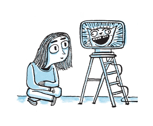
She watches the SILLIESTUPIDESTUFF — / it doesn’t seem to matter.”
Today, I’ve a visit from poet and illustrator Calef Brown, who talks about his latest book, Up Verses Down: Poems, Paintings, and Serious Nonsense (Christy Ottaviano/Henry Holt, June 2019), as well as the book that came before it in 2015 — Hypnotize a Tiger: Poems About Just About Everything. He discusses why he sees them as companion books; what they have to do with The Tao of Physics and miniature paintings; and how Twitter can spawn a poem. Or two.
I always like to see what Calef, the “inveterate punster” (as Kirkus has called him), is up to. I thank him for visiting today.
Calef: I’m very happy to be here to chatter about my new book, Up Verses Down: Poems, Paintings, and Serious Nonsense, as well as a previous one, Hypnotize a Tiger: Poems About Just About Everything. These two books are quite different in some ways and similar in others, but I think of them as a pair — as siblings. Both were published by Christy Ottaviano Books/Henry Holt in 2019 and 2015, respectively.
 Hypnotize a Tiger came out in the spring of 2015, during a time when my family and I were preparing to move from Canada back to the States. It was a hectic and stressful time, and I didn’t really get a chance to talk about it too much or share my process in any detail, so I am very grateful to be able to do so now.
The manuscript for Hypnotize a Tiger was a collection of about a hundred poems that I wrote and gathered between 2012 and 2014, while living in Vancouver. While it wasn’t a dramatic departure from the way I conceived any of my previous books of poems, it definitely seemed like the collection might be suited to a slightly older audience than the others. Considering the vocabulary, concepts, and overall humor, as well as the fact that there were many long-ish (for me) poems, it looked like the book might be best for middle grades. Having said that, however, I have always struggled with the idea of an intended age range for my books. My aim has always been to try to provide something for everyone — all ages. From very little ones hopefully enjoying the imagery and characters in my artwork during read-alouds to the adults who may be doing those readings — often many times over, if the kids like what they’re hearing and seeing. I have always wanted to engage and entertain everyone, including myself first.
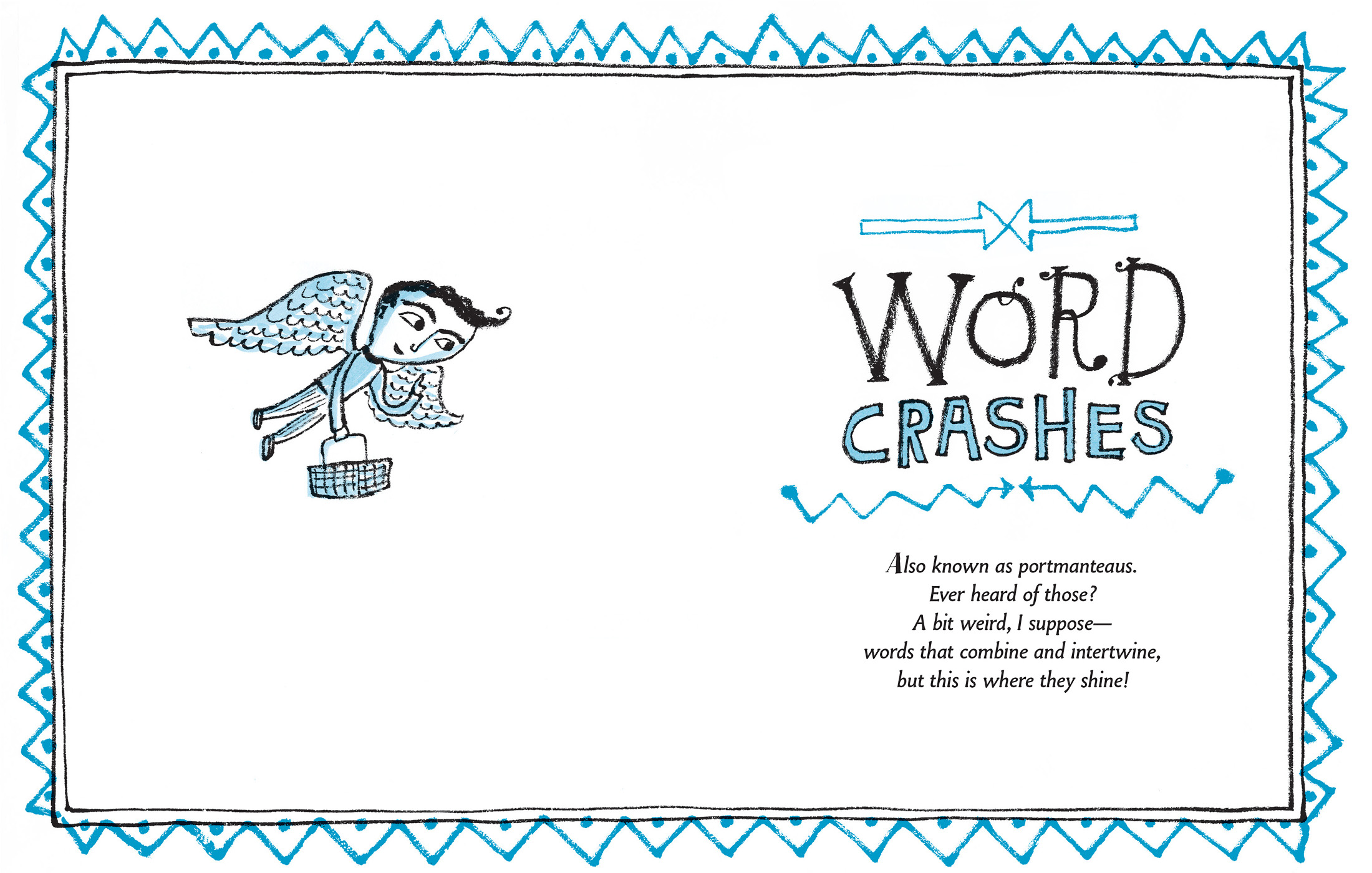
Hypnotize a Tiger is my first collection organized into categories. My previous books happen to be populated with plenty of poems about animals, food, and eccentric human characters — broad subjects I seem to naturally gravitate toward — so those sections were already well-represented. I then took some time to write new poems to fill out other groupings, and together with my editor, Christy Ottaviano, decided on sections about school, nonsensical “facts,” insects, vehicles, a miscellany group, and lastly, a collection of poems centered on portmanteaus, which in the book I call “Word Crashes.”
There were a number of other aspects of this book that were new for me. My previous poetry collections were 32-64 pages with between 14 and 28 poems. When we chose the final poems, we had selected 84 — and the book ended up being 138 pages.
Both Christy and I really wanted this book to have a completely different look as well — a break from my focus on full-color painted spreads — and try a style that was more graphic. After experimenting with a few different approaches, I decided to use brush and black ink on rice paper. When the initial drawings were done, I worked on a light box and added grey washes on separate sheets of watercolor paper over the black ink illustrations. These were digitally composited and toned blue.
(Click to enlarge)
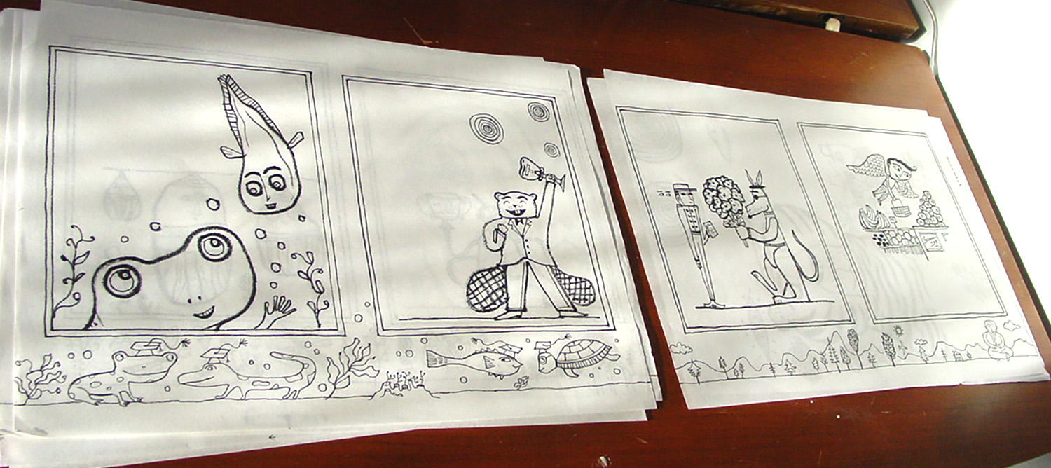
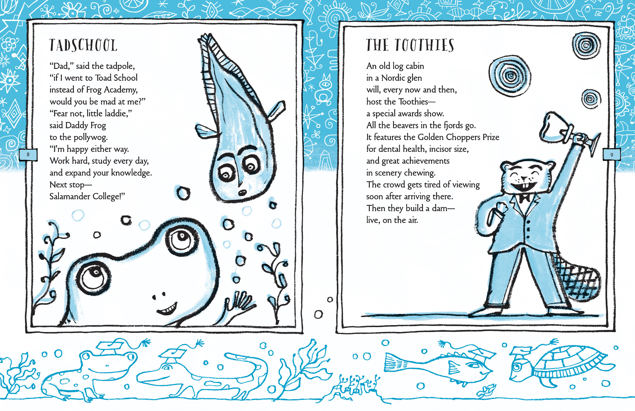
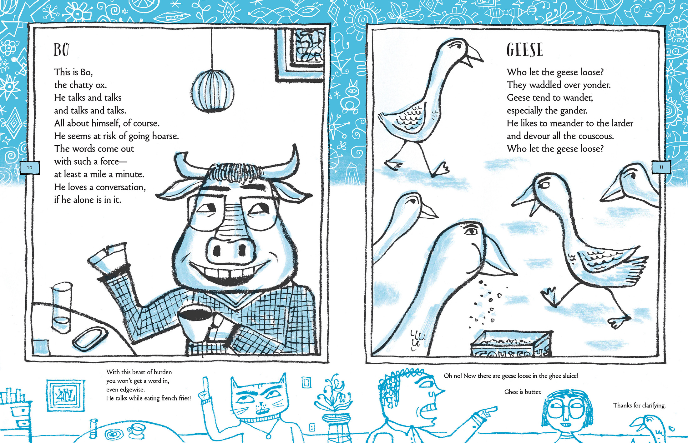
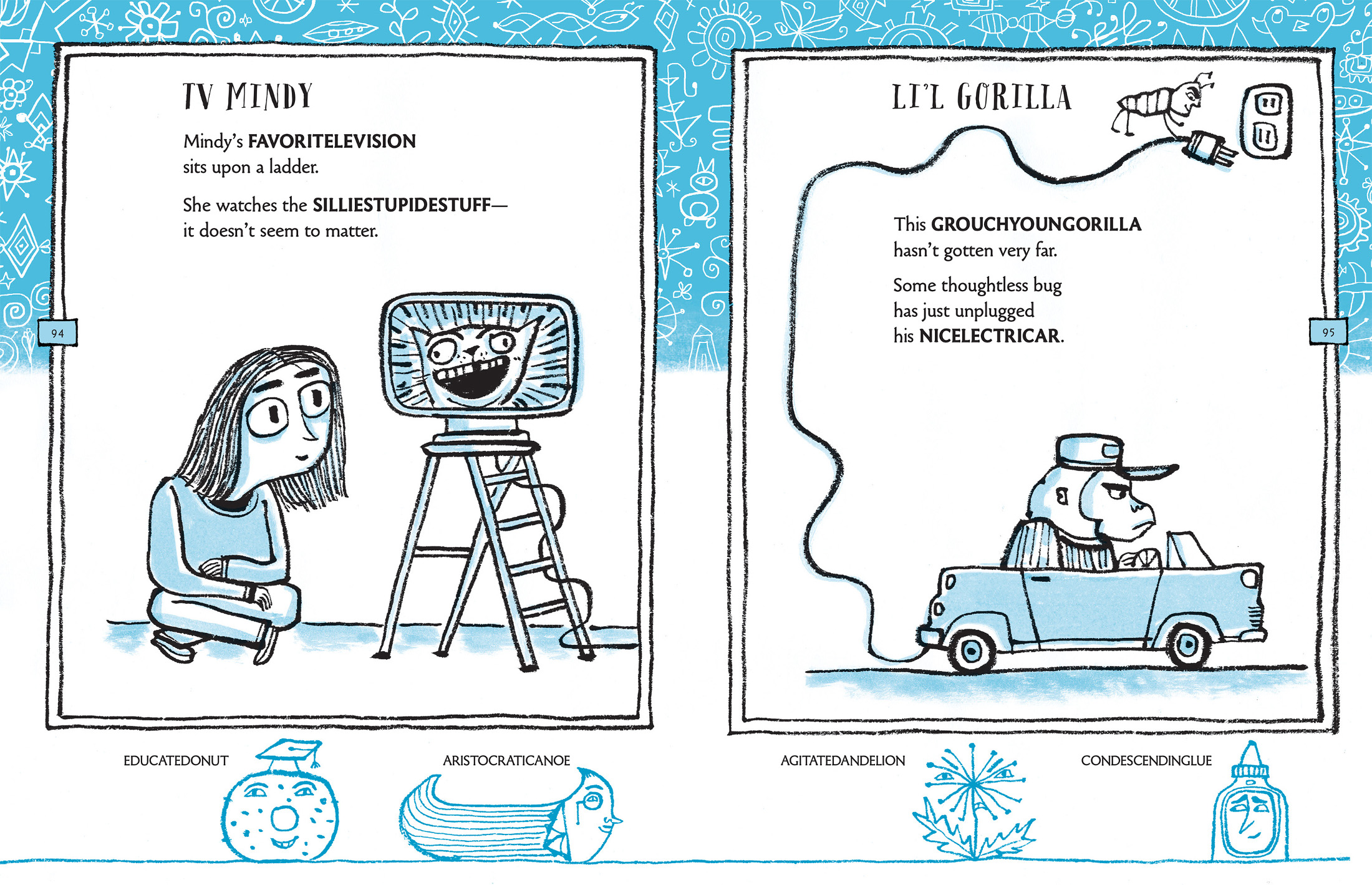
Another aspect of the book that was new was the addition of small drawings and text in the lower margins. For most of the poems, I took some time to write short extensions — codas in verse — and thought there could be fun ways to include them visually into the spreads. It was a chance to employ some extra wordplay, too, which I am always up for. I wanted the characters in these spaces to be sort of like a Greek chorus, commenting on what was happening above them in the poems. Sometimes they are more like little footnotes. My aim was for the feel of these margins to be comics-like and with most of the characters speaking in first person, although their dialogue isn’t contained in word bubbles. In some of the margin spaces there’s no text — just drawings that relate to the imagery of the illustrations — so they act as more decorative borders, almost like the patterns in certain endpapers. Here are two of my favorite spreads, in terms of the relationship between the featured and supporting players, as it were:
(Click to enlarge)
(Click to enlarge)
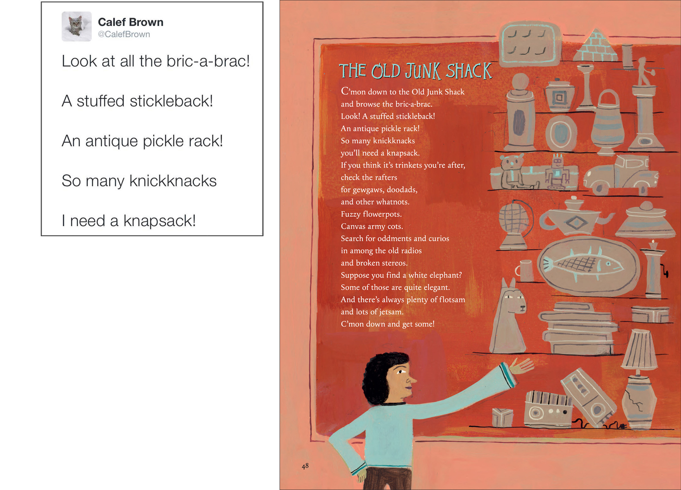
In the spring of 2000, I spent a couple months travelling and, during the trip, wrote my book Tippintown, as well as some of the poems that ended up in Flamingos on the Roof. While playing around in sketchbooks, I dashed off a bunch of silly portmanteaus that rhymed and formed a sort of list-poem. I didn’t think about this for many years, but for some reason they popped back into my head, so I dug up that sketchbook and figured that, with some work expanding on the characters and elements, this could make a nice section of portmanteau poems in the book.

(Click to enlarge)

(Click to enlarge)
Across eight pages in the lower margins of this “Word Crashes” chapter, I strung together a group of 24 rhyming portmanteaus to make one long poem:
EDUCATEDONUT / ARISTOCRATICANOE
AGITATEDANDELION / CONDESCENDINGLUE
INCOHERENTELEVISION / OVEREAGEROCK
OSTENTATIOUSALAMANDER / ENERGETICLOCK
UNDERWATERUTABAGA / FLYINGHOULISHAT
WINDOWASHINGARGOYLE / SUPERSONICAT
AUTOMATICOATTAILIFTER / LARGECCENTRICOMB
DECORATEDACHSHUNDOG / HORRIDANCINGNOME
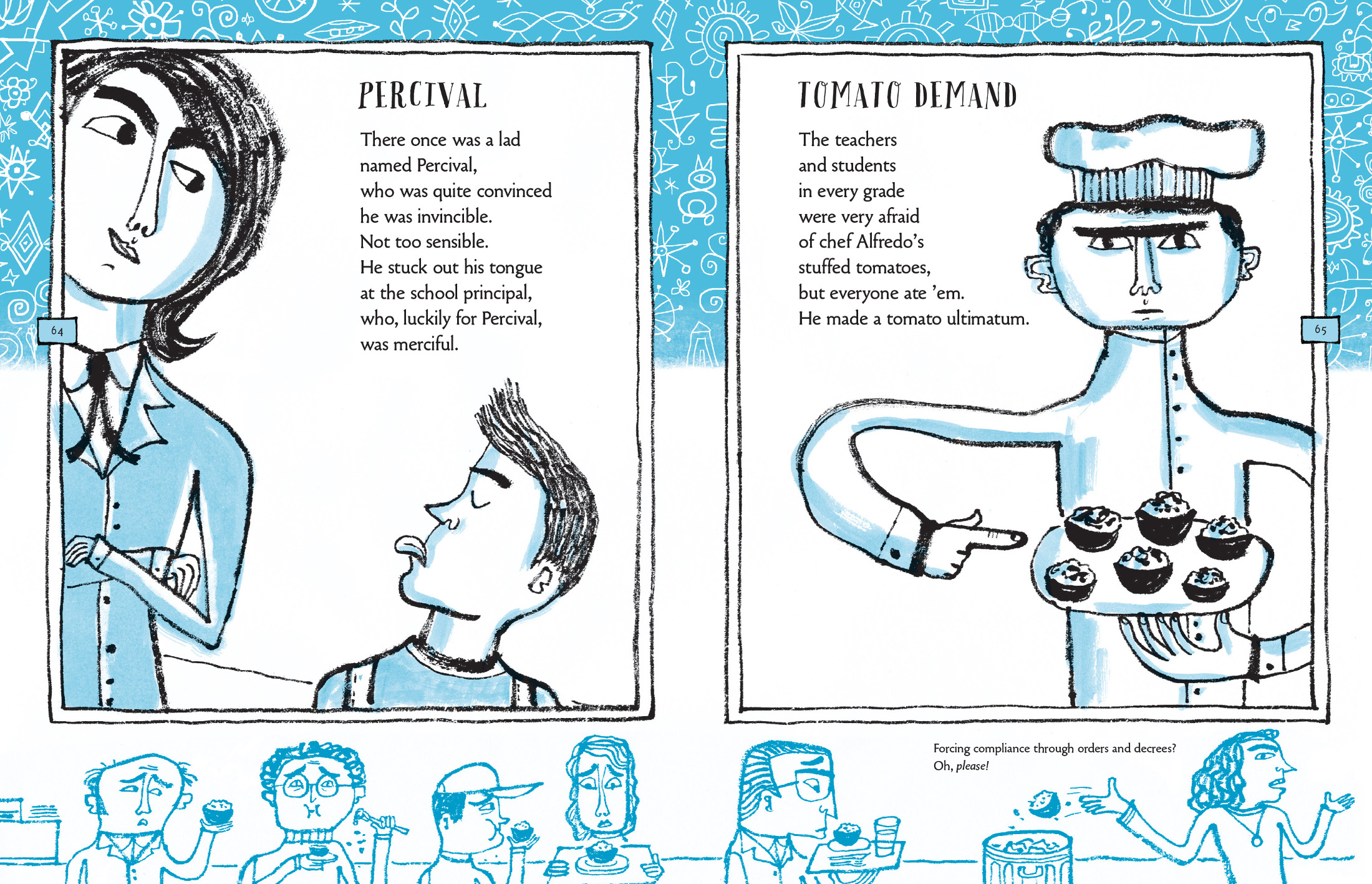
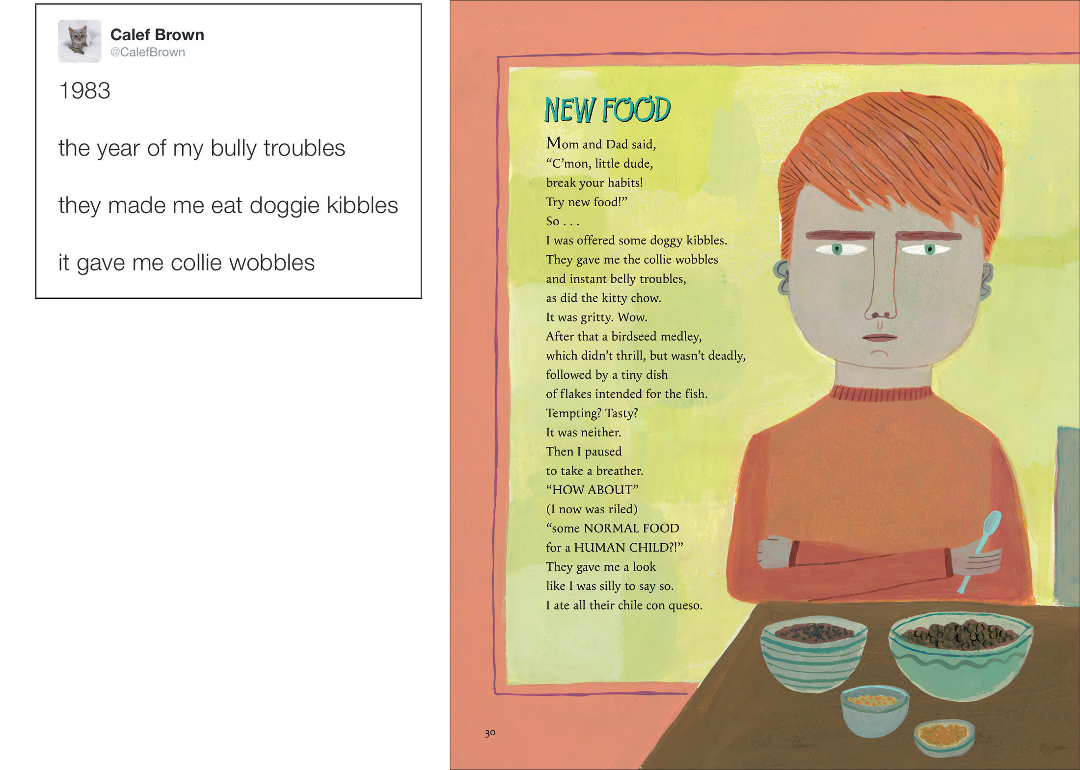
The section of school-related poems (titled “Schoolishness”) was also somewhat different for me, in terms of bringing a nonsensical approach to a more “relatable” subject for kids. Poems in this section deal with familiar stuff, like getting lost and discombobulated in a new school building, odd cafeteria food, bullies, the perils of gym class, the joys of snow days, and more.
(Click to enlarge)
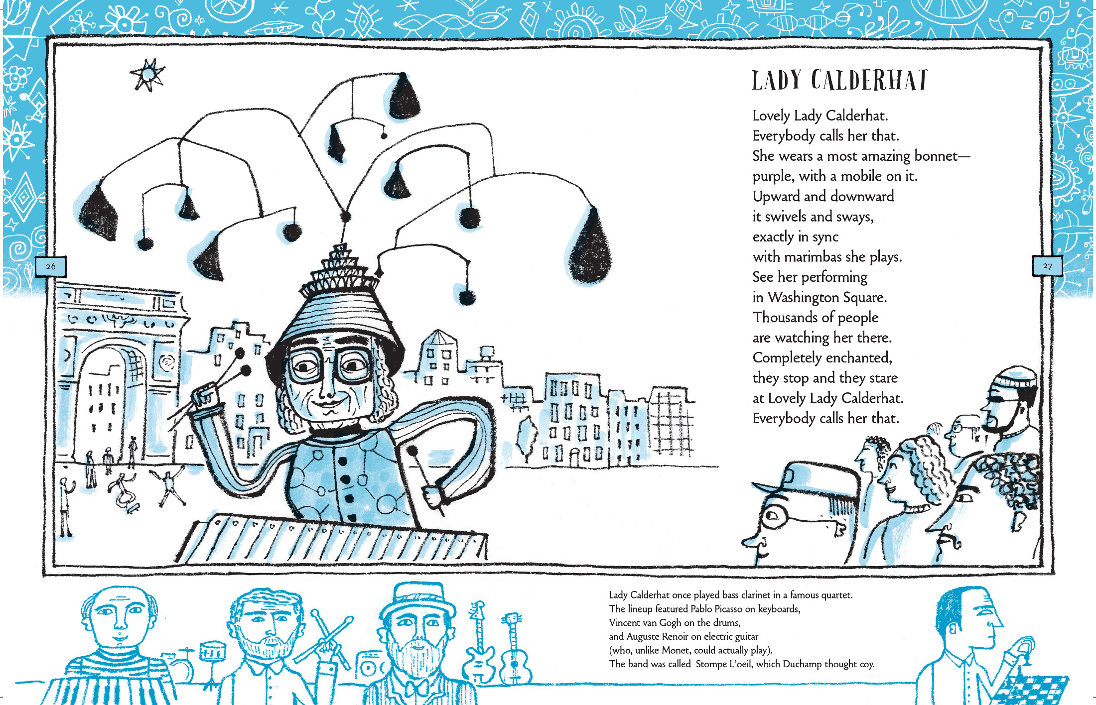
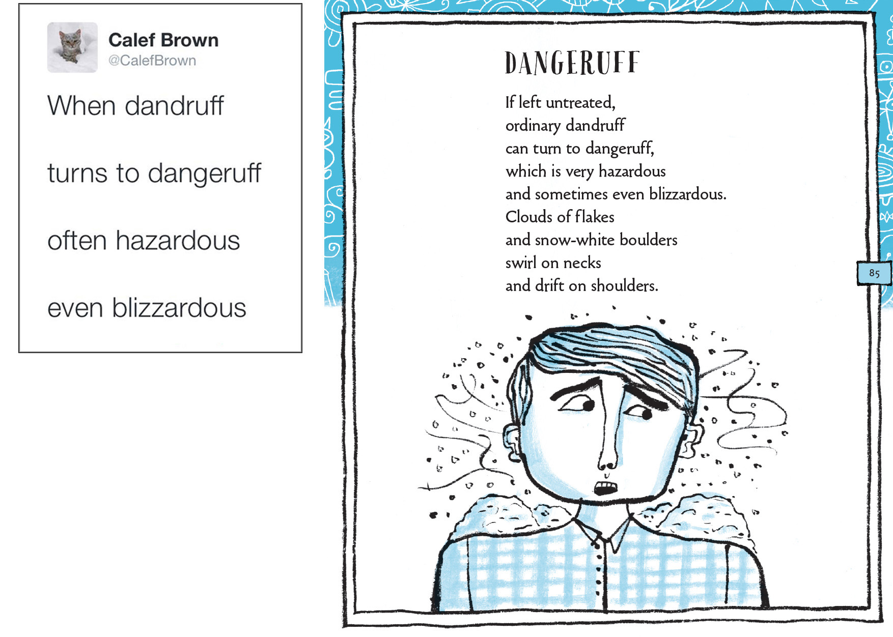
The “Facts Poetic” section came out of noting that there was a bunch of poems in the collection that had a similar kind of assertive or declarative voice to them — laying out scenarios as if they were true. In thinking about putting them together, I was inspired by the old Ripley’s Believe it or Not! comics that I really enjoyed as a kid — those bits of weirdness with a couple of spot illustrations. In my versions, this strange but “true” information includes such vital topics as the potential for dandruff to become “dangeruff”; habits of tuba-playing troubadours; a surprising Icarus-St. Nicholas connection; and the recent discovery that prehistoric critters cooked titanic fritters over volcanic craters, a practice that didn’t end well for our ancient friends.

(Click to enlarge)
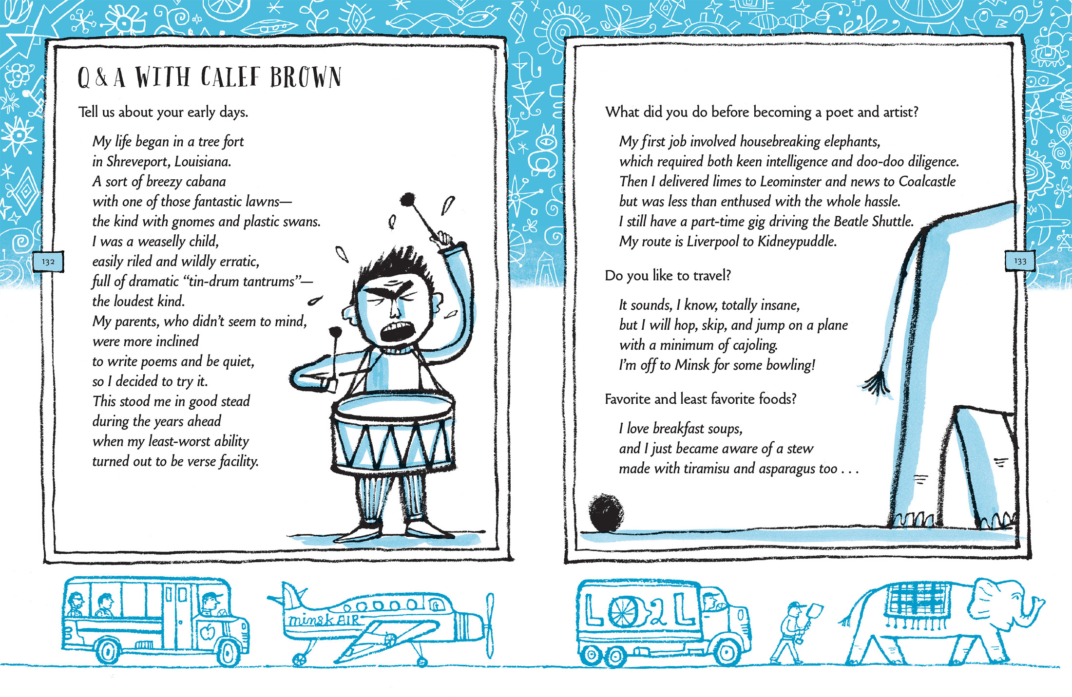
Another aspect that I thought would be fun would be to have as much of the text as possible be in verse, including things like the main titles rhyming with the subtitles of the sections, as well as a nonsensical Q&A, which covers the last nine pages of the book. Pervasive wordplay. Relentless rhyming.
(Click to enlarge)
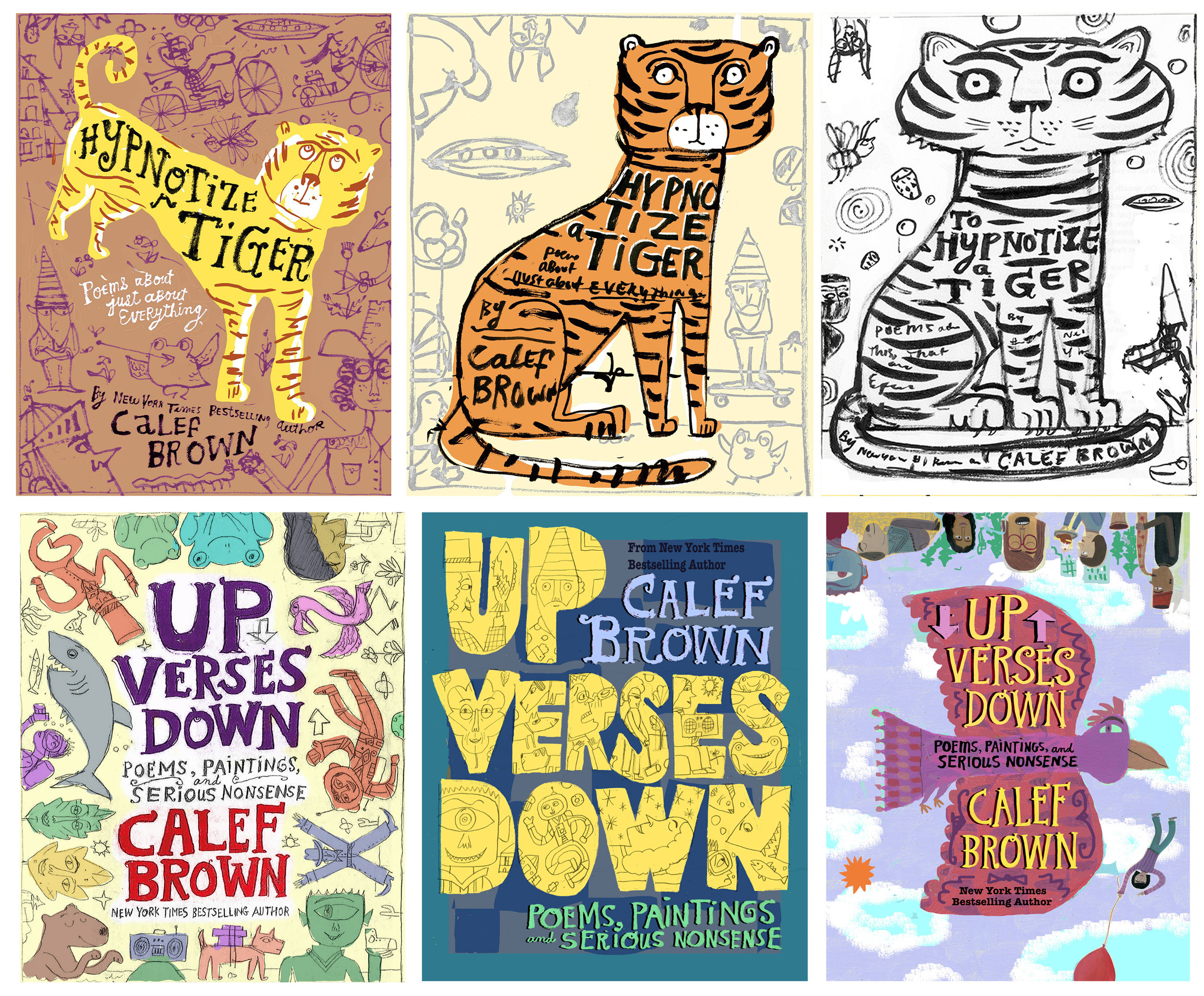
As any children’s book writer, illustrator, designer, art director, or editor knows, covers can be difficult to figure out. I struggled with the covers for both books but had lots of help — and am happy with the way both turned out. Here are a few of the options we considered along the way:
As I said above, I think of my new one, Up Verses Down, as a companion to (or perhaps a continuation of) Hypnotize a Tiger. I wanted to create a big thick picture book this time with a good amount of poems — 55, in all, and over 80 pages — and return to a full-bleed, full-color format.
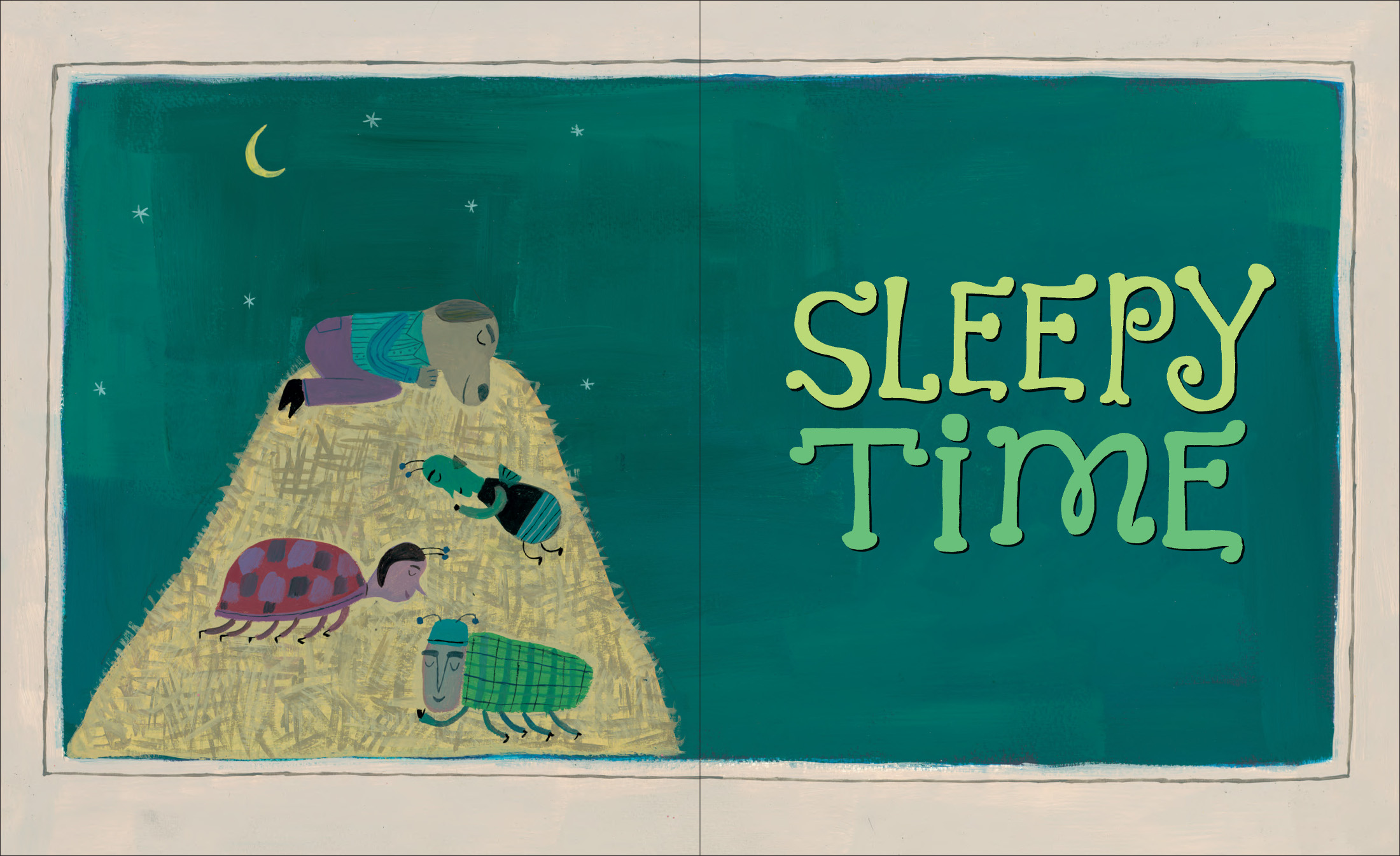
Again working with Christy, I selected poems and created categories. As with Hypnotize a Tiger, people, animal, and food-related poems have sections, as well as another miscellaneous group (“Oddments”), as well as a new subject for me — a chapter of poems about sleep.
I’m not really sure if the poems themselves in Up Verses Down are necessarily aimed at a younger audience than Hypnotize a Tiger, but the full-color paintings may pull in younger viewers in a different way. So, the overall appeal may skew younger. Again, I have a tough time with age categories.
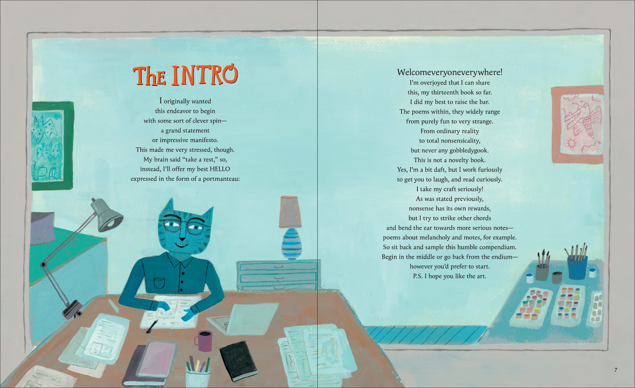
Like all my books, there’s plenty of silly humor in this one, but I also wanted to sneak in some poems that deal with more weighty subjects, seen through a whimsical lens. Serious Nonsense. I lay out this desire to expand my nonsensical aesthetic into some more serious ideas in the introduction to the book. I also make a case for taking an absurdist approach seriously, in terms of attention to craft, with both myself and the reader in mind: “Yes, I’m a bit daft / but I work furiously / to get you to laugh / and read curiously.”
My philosophy in a nutshell.

(Click to enlarge)
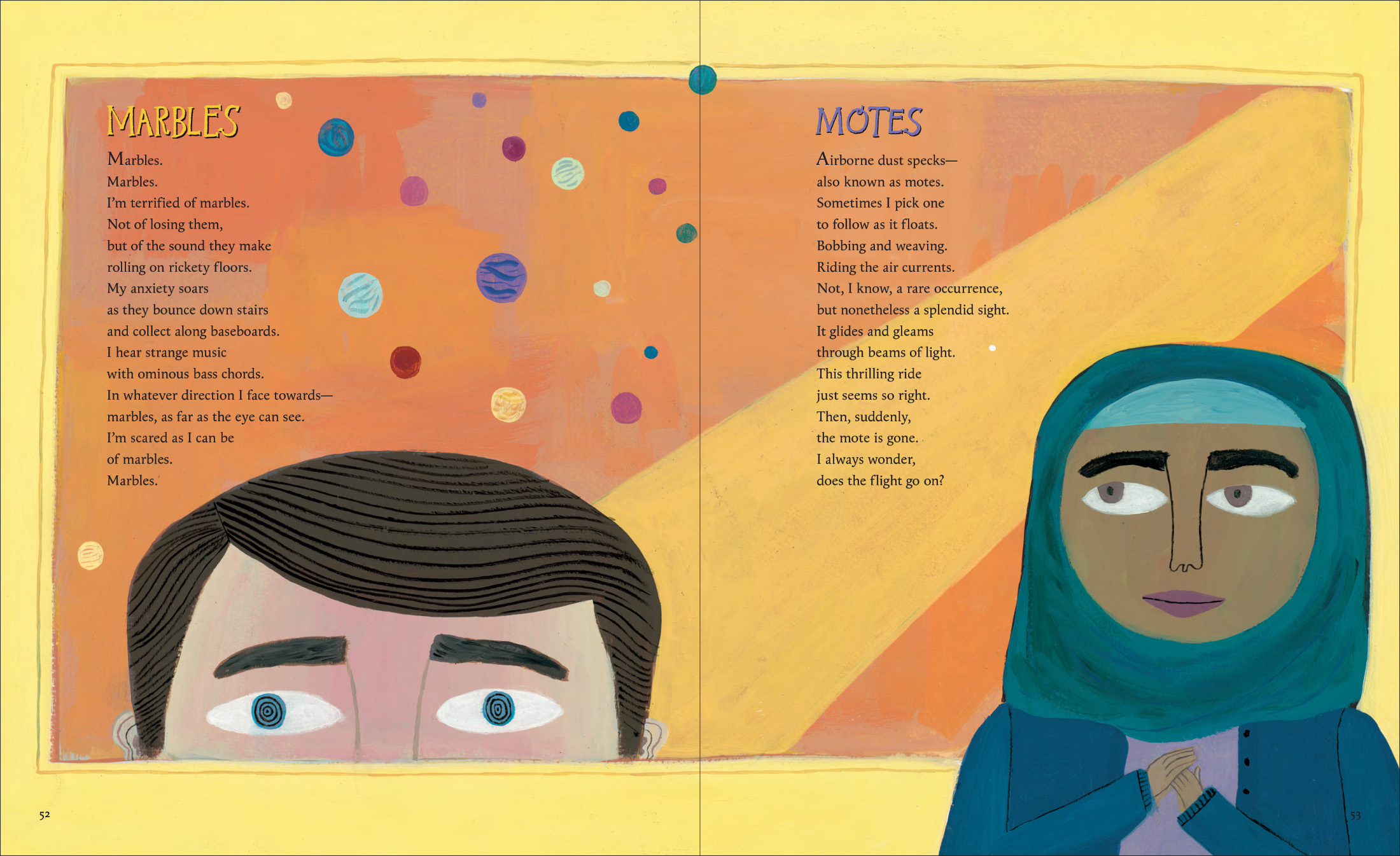
In the Serious Nonsense camp, a poem called “Motes” is a good example. The inspiration came from something I remember doing as a kid — watching tiny floating specks of dust move through a beam of light in a sunny room and trying to track a particular one until it disappears from view. I also thought back to reading The Tao of Physics by Fritjof Capra as a teenager and being introduced to ideas around quantum theory. Are these motes little worlds coming in and out of existence, depending on my perception? Another poem that fits into this mode is called “The Ruby.” It’s intentionally very open to interpretation but suggests possible connections to themes of mortality, materialism, and wanting to hold on to experiences and fleeting moments in life. Or life itself. Another one, “Melancholy,” speaks to feeling blue and ways of coping with it, especially at the time of year when summer comes to an end.
(Click to enlarge)
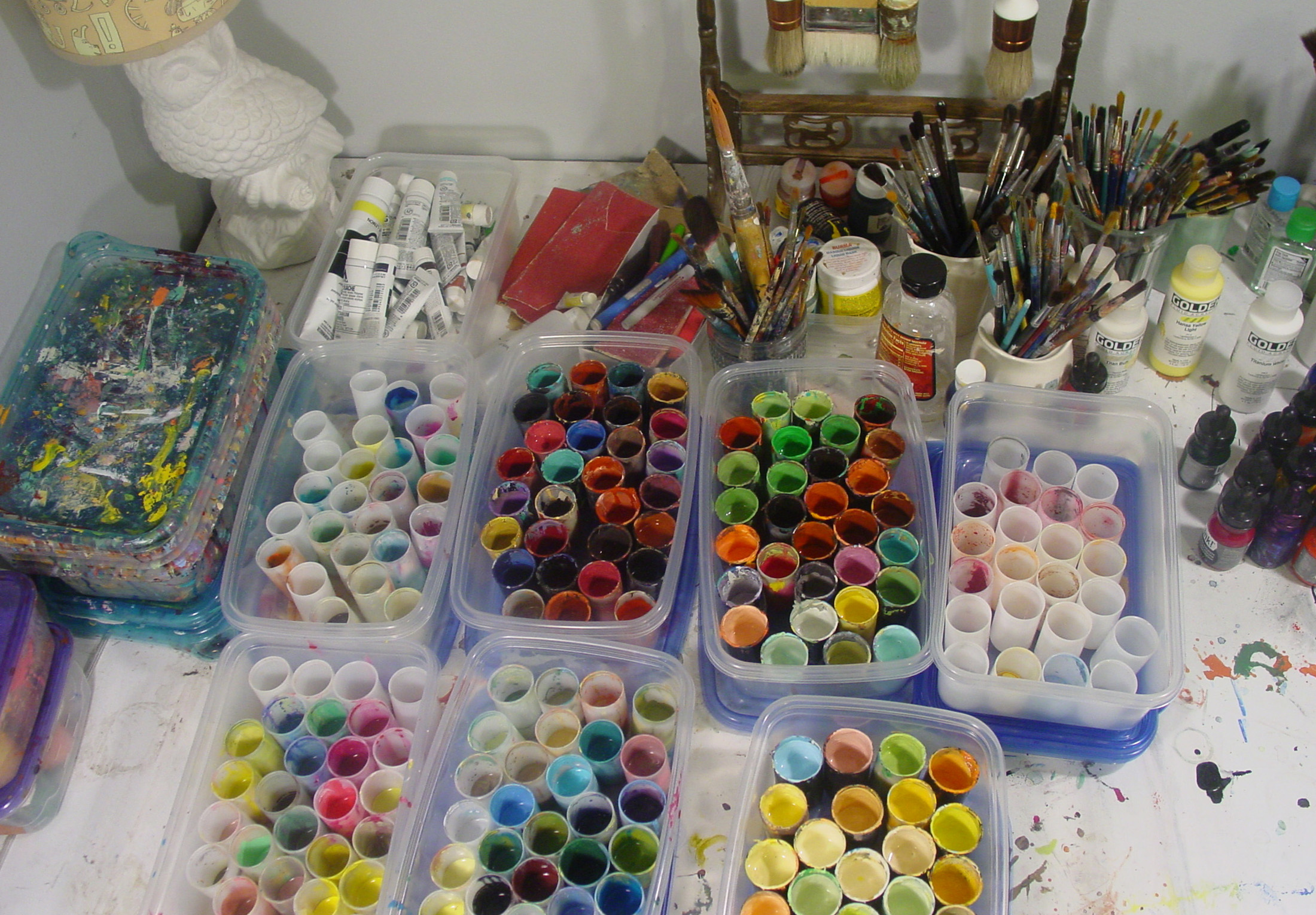
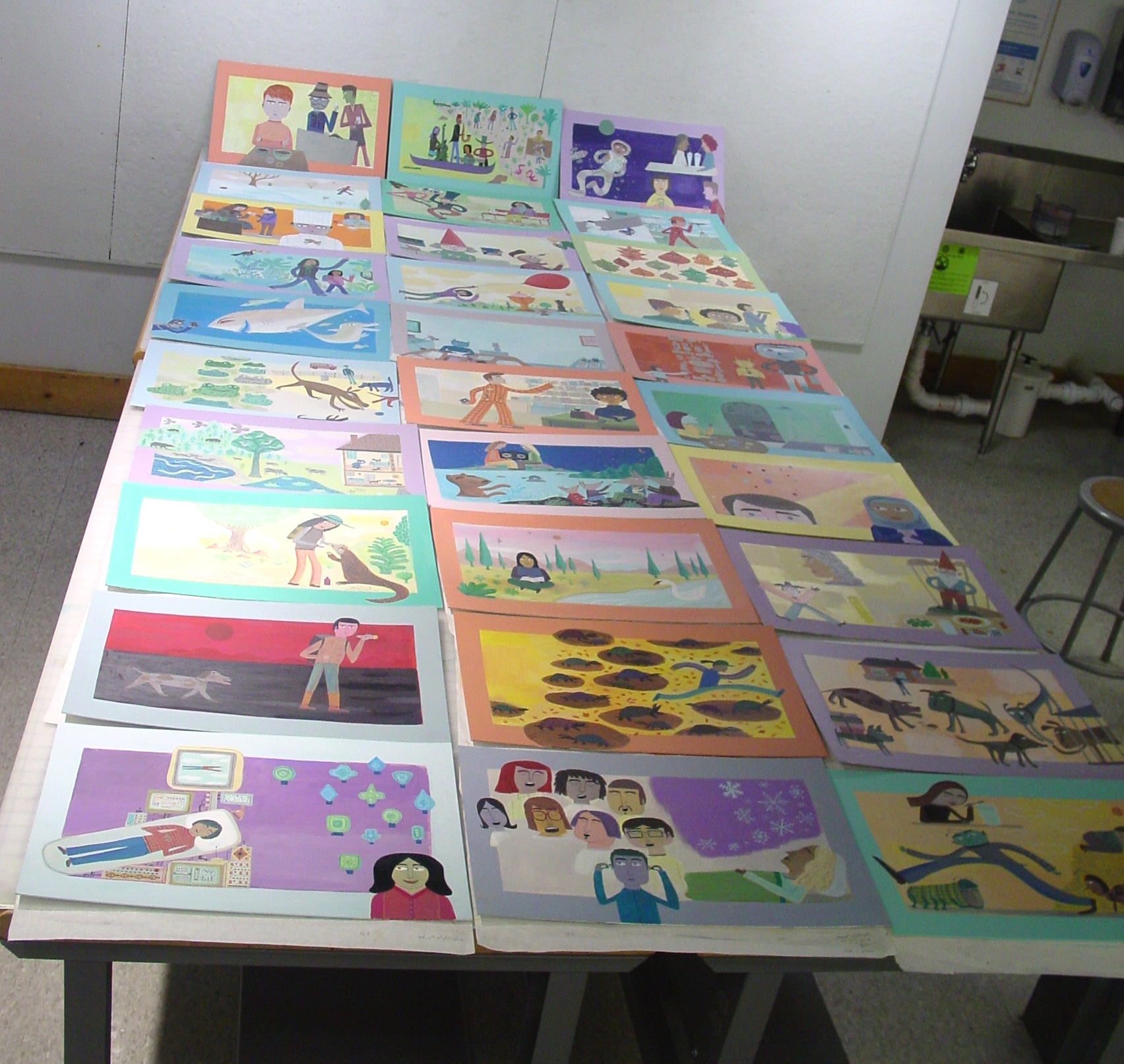
After the blue and black graphic look of Hypnotize a Tiger, I went back to foregrounding full color. I gave the spreads wide borders with a hue to compliment or contrast the palette of each spread. I was inspired by European medieval manuscripts and Indian miniature paintings and the many ways their borders can interact with the interior color schemes. I wanted the reader to be looking into a vivid window with characters and elements existing within, but also breaking out of, these colorful frames. Here’s my paint set-up before I began, plus all the interior paintings nearly finished and laid out together:
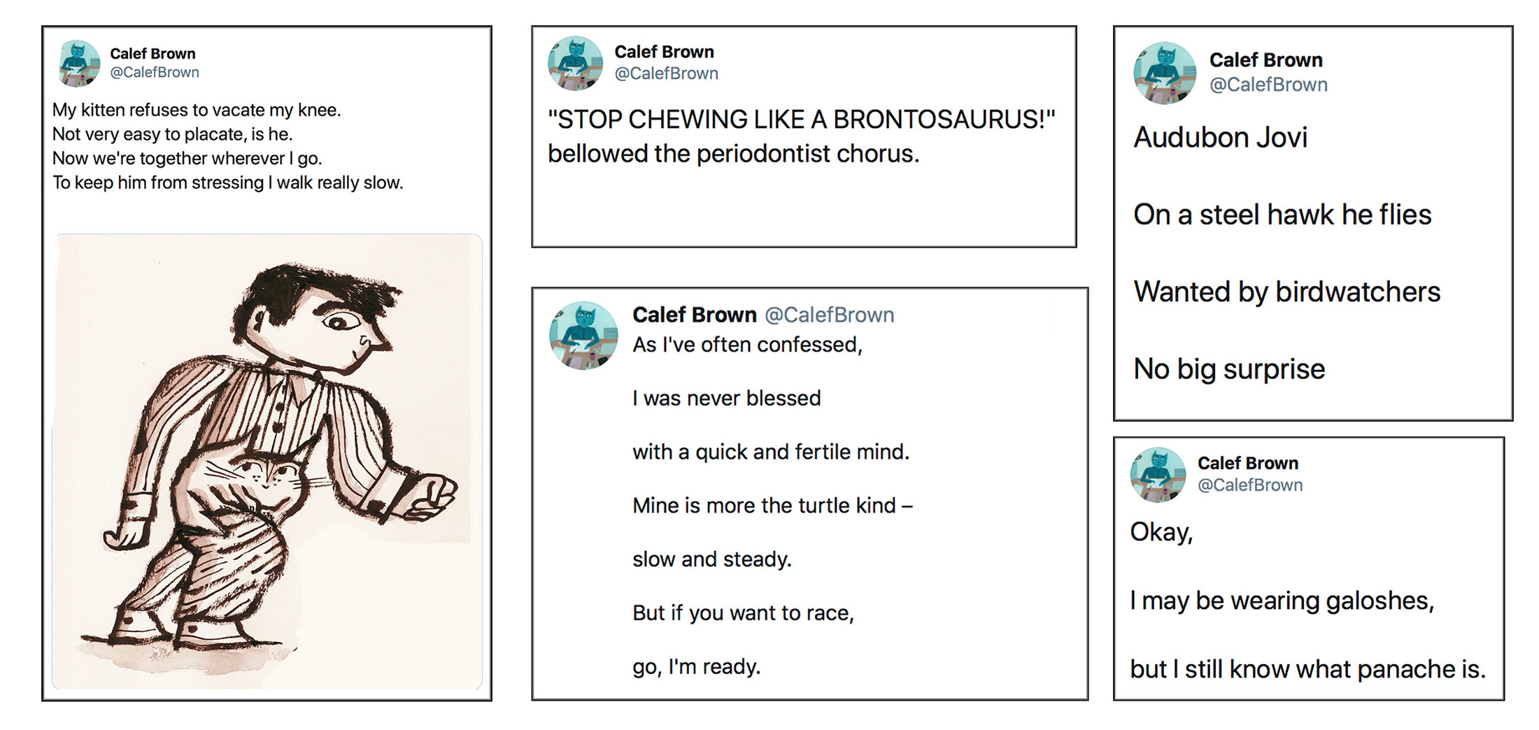
Like lots of other people (maybe everyone), I have mixed feelings about social media, but one of the things I liked about Twitter when I got on there, apart from the kidlit and illustration communities, was the 140-character limit (now 280) as a constraint to work with in writing short poems. So, off and on, as an exercise, I would sit down and try to spontaneously write a poem-tweet within a few minutes. Some of those would spark ideas for expanding upon, and a number of those initial tweets turned into longer poems in both books. A few examples:

And a few more. These didn’t make their way into either book:
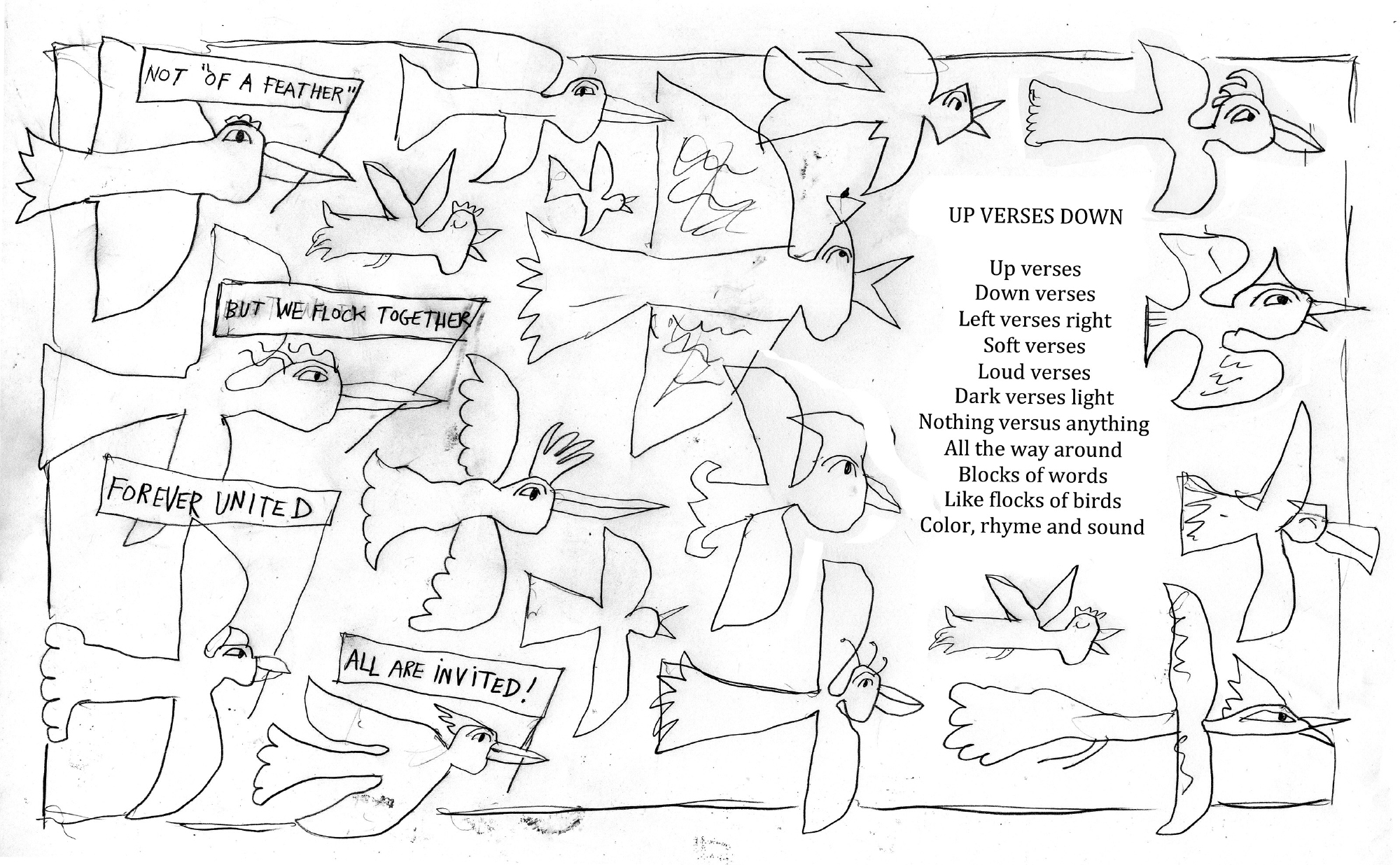
The title poem, which ends the collection, sits in a painting of a flock of birds that are all different from one another. Four of them carry banners with this message:
NOT “OF A FEATHER”
BUT WE FLOCK TOGETHER
FOREVER UNITED
ALL ARE INVITED!
I thought this was a good way to tie my aim to reflect diversity in the representation of the people in the book to the title poem itself, which refers to the variety of tones I wanted for the poetry. It also touches on my desire for a friendly playful vibe throughout. No conflict. Verses, not versus.
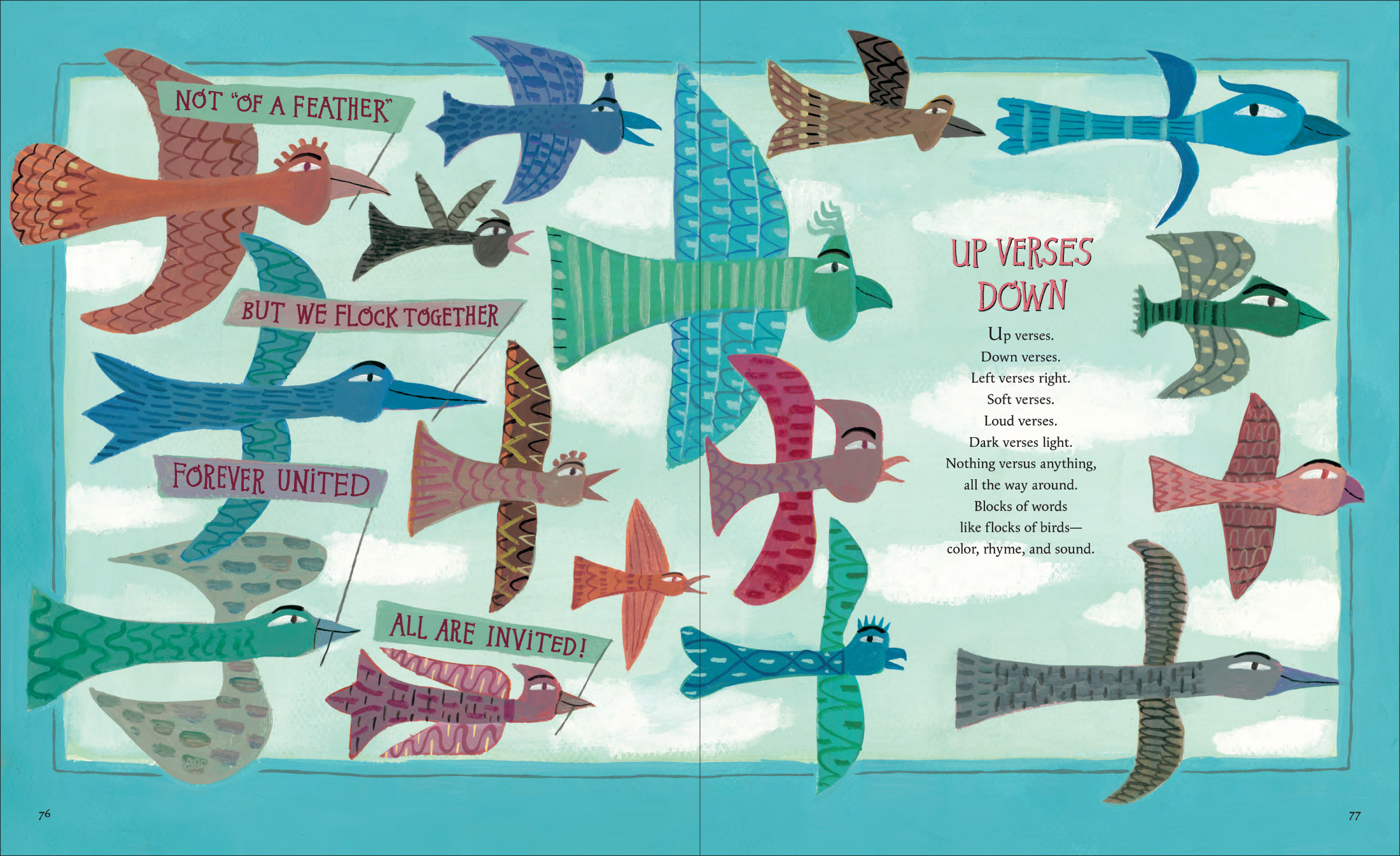
(Click to enlarge)
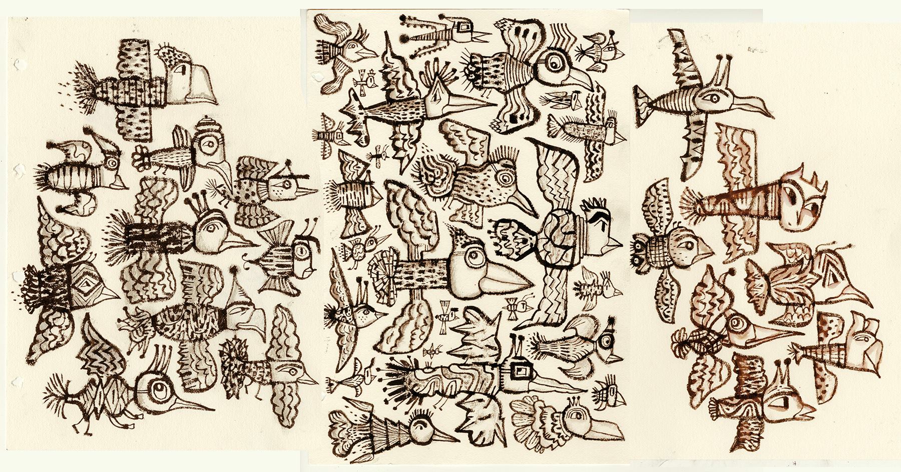
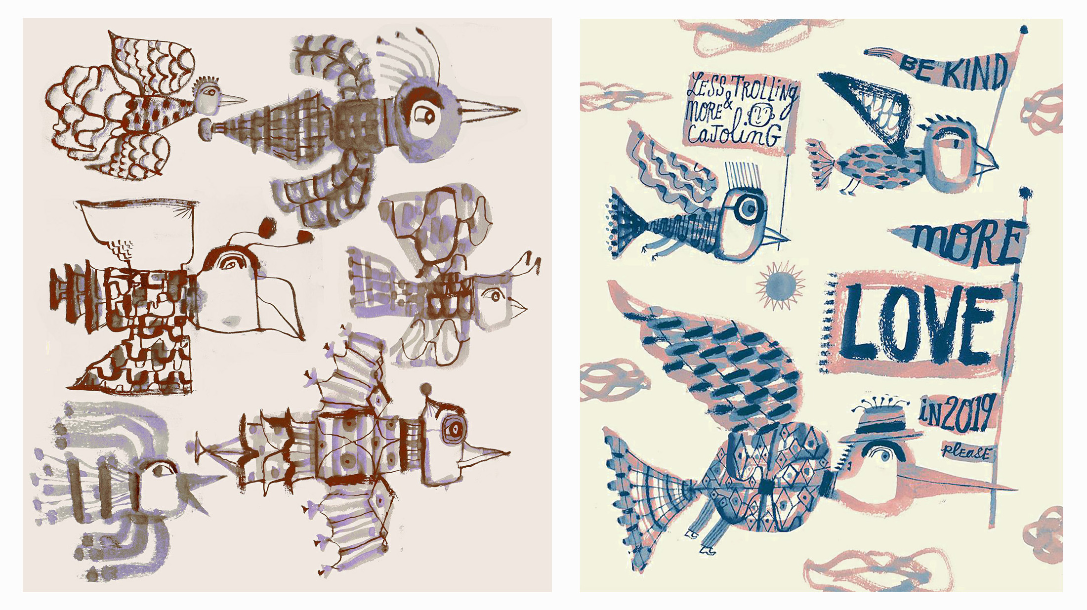
The motif of a flock of different kinds of birds as a metaphor for inclusiveness goes back to a poster I did for Teaching Tolerance and the Southern Poverty Law Center a number of years ago. It has become a theme I return to, and I have dozens of personal bird drawings in this vein — in sketchbooks and as larger ink drawings.


The final spread of Up Verses Down is a companion to “The Intro” called, naturally, “The Outro.” On one page, I talk a little bit about the things that are important to me as a poet and creator, some aspects of my approach to writing, and the wonderfully different voices and forms with which poets can express themselves. On the opposite page, I offer a series of seven short prompts — suggestions for students (or anyone) to get started on writing their own poems. Again, all written in rhyme.
One of the prompts goes like this:
Move back and forth between drawing and writing:
Sketch out a character — make them exciting,
solemn or mischievous, sad or elated.
Jot down your thoughts, even those unrelated.
Then back to drawing, and so forth and so on.
Pictures plus words give you way more to go on.
Who is this being, and what might they do?
What is their image suggesting to you?
In closing, I would like to express my gratitude for the opportunity to share some of my thoughts and process on these two books, and I will sign off with a quote from the Up Verses Down Author’s Note:
Writing a poem is always doable
regardless of time or place.
You can even rhyme in space — on a space station —
and make your verse creation bold and exploratory,
whether abstract, or more of a story,
with a brilliant beginning,
and middle,
and end.
Thank you for reading.Sincerely,
Your friend,
Calef Brown
And a p.s.: If you would like to hear a recorded reading of selected poems from Up Verses Down and Hypnotize a Tiger, beginning with a brief, not-at-all rambling preamble, you can find it here:
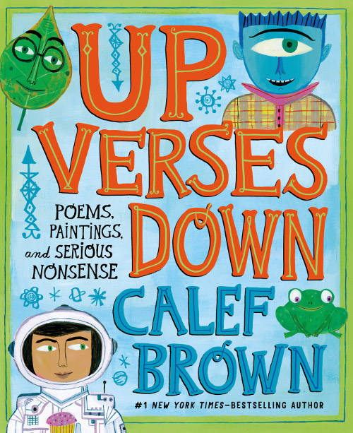
UP VERSES DOWN: POEMS, PAINTINGS, AND SERIOUS NONSENSE. Copyright © 2019 by Calef Brown. Published by Christy Ottaviano Books/Henry Holt and Company, New York.
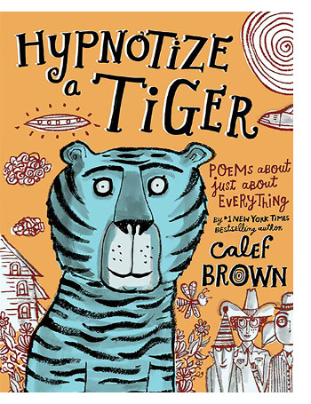
HYPNOTIZE A TIGER: POEMS ABOUT JUST ABOUT EVERYTHING. Copyright © 2014 by Calef Brown. Published by Christy Ottaviano Books/Henry Holt and Company, New York.
All images reproduced by permission of Calef Brown.

btc euro
Seven Impossible Things Before Breakfast