Jessixa Bagley on Henry and Bea
 December 5th, 2019 by jules
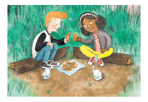
“It’s always lucky to find someone who understands you, and that’s why Henry and Bea were the best of friends.” Thus opens Jessixa Bagley’s Henry and Bea (Neal Porter/Holiday House, October 2019), the emotionally resonant story of how to truly be there for a friend. Jessixa visits 7-Imp today to talk a bit about the book and share some early sketches.
Though they possess a deep and intimate friendship, Bea is baffled one day when Henry withdraws, appearing “quiet and sad. No one, not even Bea, knew why.” Henry is reeling from a personal loss but doesn’t want to discuss it with anyone, not even his best friend. He even bluntly tells her, “Just leave me alone.” Bea, from a distance, keeps her eye on Henry and even cautiously tries to re-connect. When they finally do, on a school field trip, it is with a gentle understanding that Bea responds to the sadness she learns is weighing Henry down.
This is a deeply sensitive story, rendered with a light touch, about a rift in a friendship, one that is repaired with patience and compassion. It’s also a story about loss, depression, and the various ways in which children process both. Here’s Jessixa to talk about the story behind the story and working on the illustrations for the book. …
Jessixa: This project is extremely close to my heart, because this is based on a real event that happened when I was in sixth grade, and also it’s really about my relationship with my husband and supporting him through his struggle with depression. Because this is so real, I knew that the characters had to be kids.
When Neal [Porter] said he wanted to do this book, I was shocked and emotional that he loved the story. Then I asked him who would illustrate it. He was confused. I told him that I didn’t draw kids but that I draw animals, and he quickly told me that was crap and that I needed to illustrate this book. So, I basically started from scratch with myself and my art.
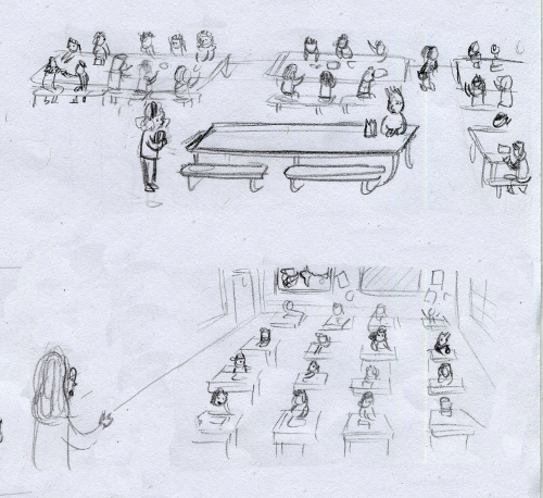
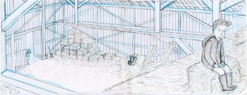
(Click each to enlarge)
These [preliminary images below] all look different than the final art for one reason or another. The truth is that I was working on illustrations for this book for about five months before I landed on how I wanted the paintings to look.
I had been tired of my illustration style and process and wanted to get my work closer to my fine art roots. I had to dig deep, and as you can see [below], a lot of the early test paintings are rough. It wasn’t until my book designer Jennifer Brown told me to put the book down and just draw for pleasure that I started to make artistic breakthroughs. I participated in Inktober that year and, from all of those exercises, I developed a new style and way of working that was more authentic to myself and the kind of visual artist that I want to be.
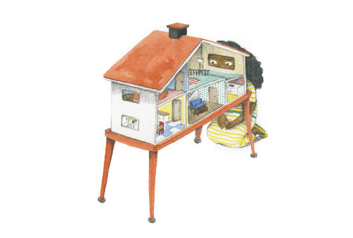
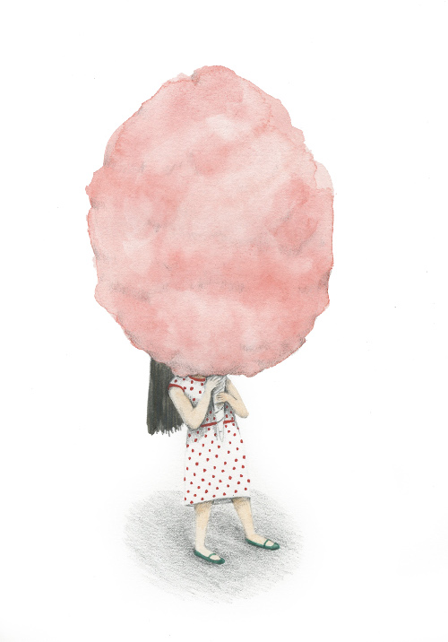
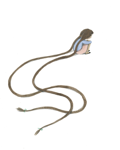
Also, I redrew the compositions in the book numerous times, because I kept wanting to push the angles and perspectives to match the emotional tone of the book. So, some early thumbnails have much flatter/horizontal compositions than what I landed on for the book.
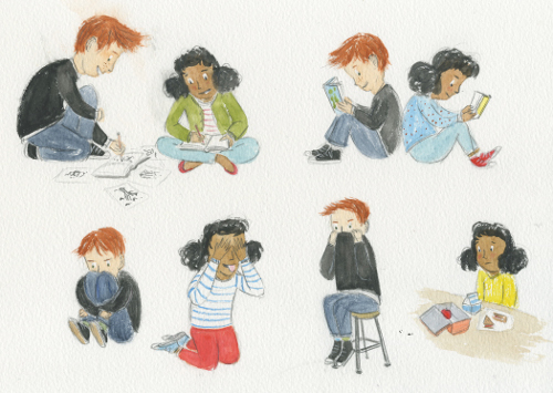
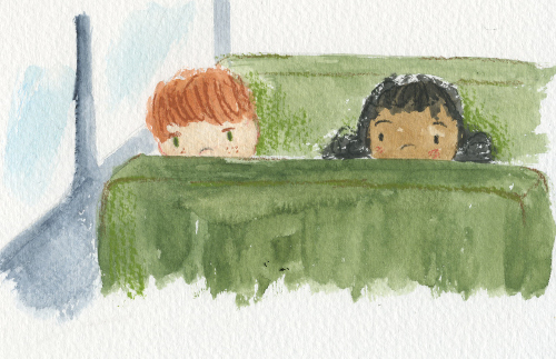
(Click each to enlarge)
It was actually a very good process. About three months in, I wasn’t sure I would get there. I felt like I was in the dark without a flashlight, and the only thing I could trust was how it physically felt to make the art. So, that is what I trusted, the physical mark-making. If it felt bad, I put down the tool and tried something else. If it felt good, I kept exploring. I even threw away the colors I had been painting with and restricted my palette to four colors and a black and mixed all my colors. It forced me to pay closer attention to my hues and my vibrancy and gave my work a more cohesive look. After all of those efforts, I finally found a flashlight and wasn’t as in the dark anymore.
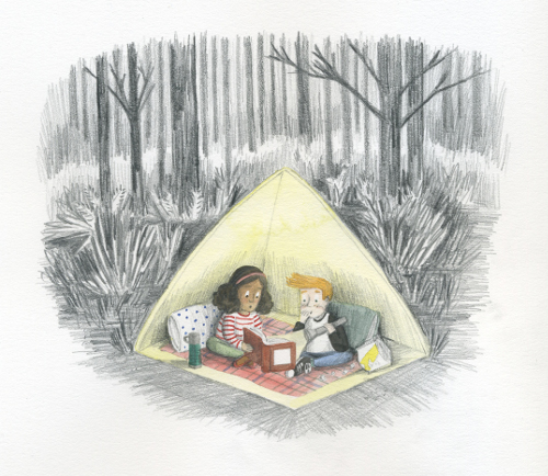
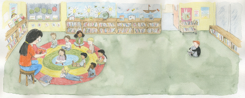
(Click each to enlarge)
This book was a test to me in so many ways, both personally and artistically. I was really scared to talk about it and the backstory with my husband, and it’s been hard but it’s been a really good hard. I’ve grown so much from it. It’s been really healing in a lot of ways.
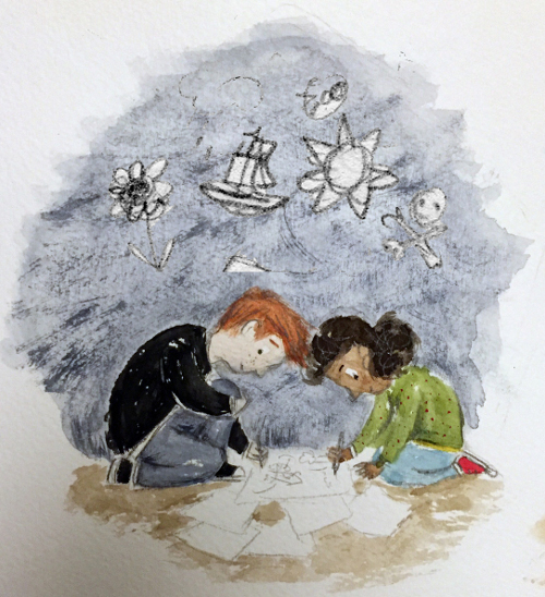
(Oh, and side detail which you might have noticed: Henry always wears black, and on the cover and title page, his shadow is cast. I wanted to be subtle about the larger depression aspect.)
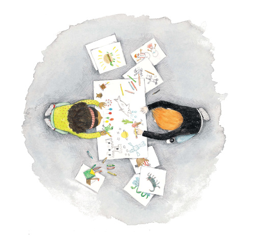
and that’s why Henry and Bea were the best of friends.”
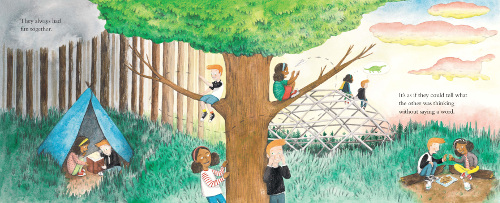
It’s as if they could tell what the other was thinking without saying a word.”
(Click spread to enlarge)
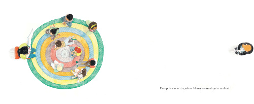
(Click spread to enlarge)
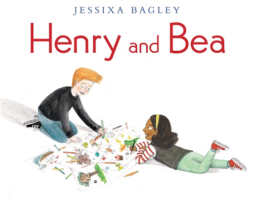
HENRY AND BEA. Text and illustrations copyright © 2019 by Jessixa Bagley. Illustrations reproduced by permission of the publisher, Neal Porter Books/Holiday House, New York. All other images reproduced by permission of Jessixa Bagley.

Any book by Jessixa is bound to be WONderful 😀