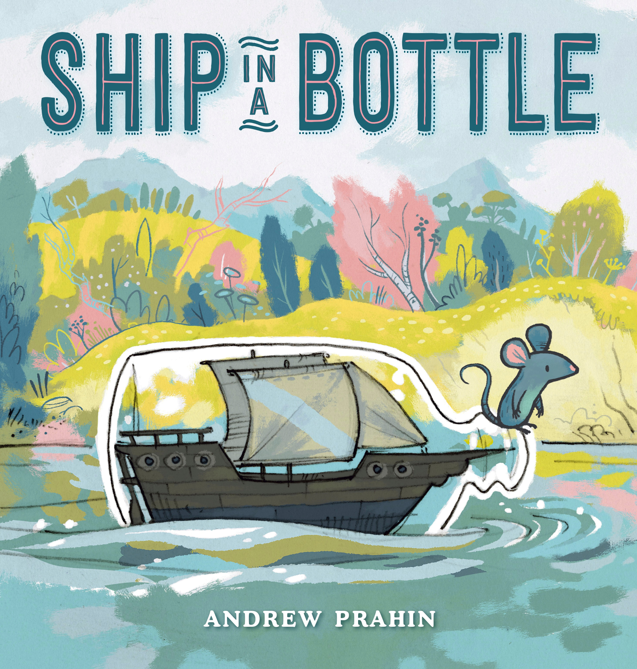
Ship in a Bottle:
A Visit with Andrew Prahin
 May 25th, 2021 by jules
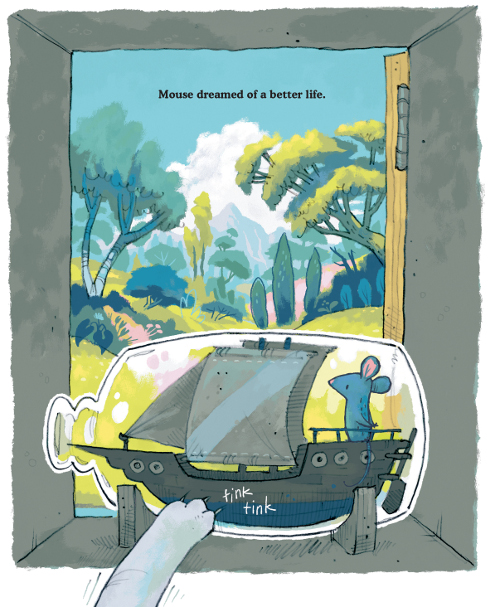
It’s my pleasure to welcome Andrew Prahin to 7-Imp today. I reviewed his newest picture book, Ship in a Bottle (Putnam, May 2021), for BookPage — that review is here, if you’d like to go read about it — and then invited him to come share some process images behind the making of this very entertaining book. He shares generously today, and for that I thank him.
Let’s get to it!
p.s. Don’t miss this 2014 7-Imp post about Andrew’s debut picture book.
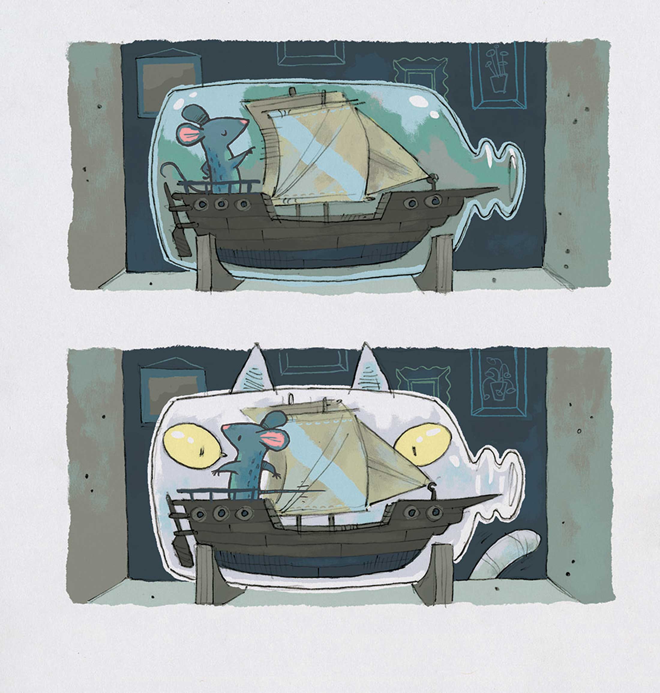
Andrew: These two ink brush drawings were done at my local coffee shop. They are the first two images I created after the story kind of solidified in my head.
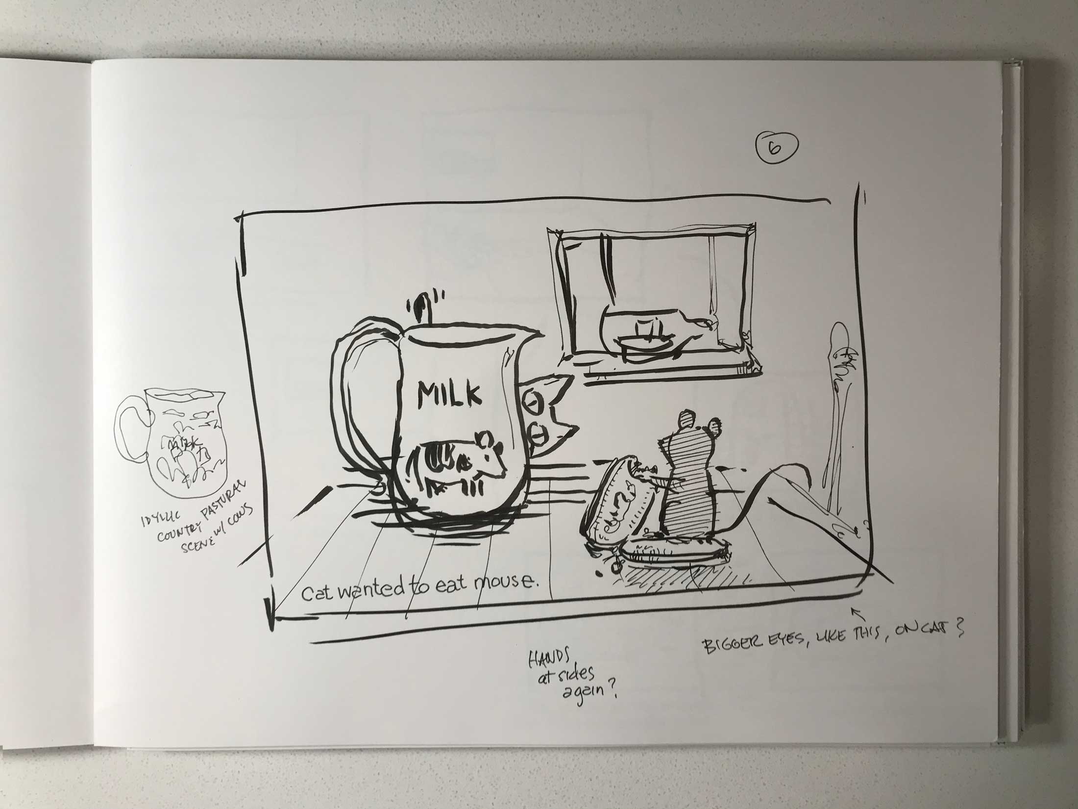
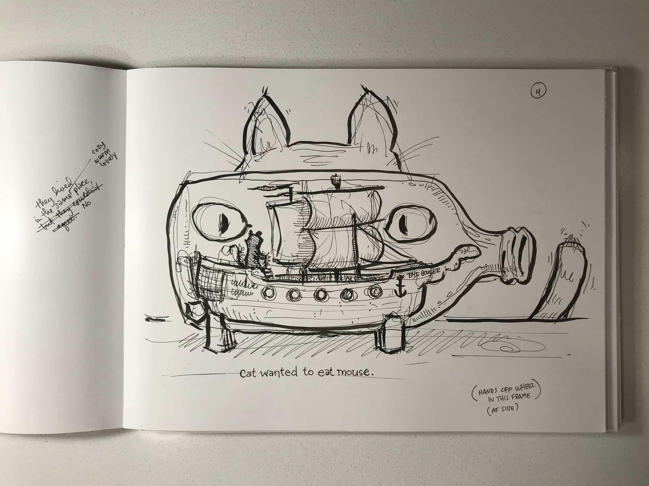
I had been locked in on a tale of a little creature adrift on the seas in a ship in a bottle. That part was set, but I was wrangling with the why. I had thought about a return to an old friend or an adventure for the sake of a fun adventure, but the real world had me thinking about refugees and the hardships they endure and the perseverance into which they have been forced. I thought about what would drive someone to a new life and how some of us can be so quick to judge others from our positions of relative luxury, and then things fell into place. Anyhow, these two ink drawings were the first two committed to paper. Oddly enough, they survived and evolved to make the final book — something that is, in my experience, rare in looking back on original sketches.
Here is the final art [sans text] of those two pages, just as a sort of visual journey / contrast:
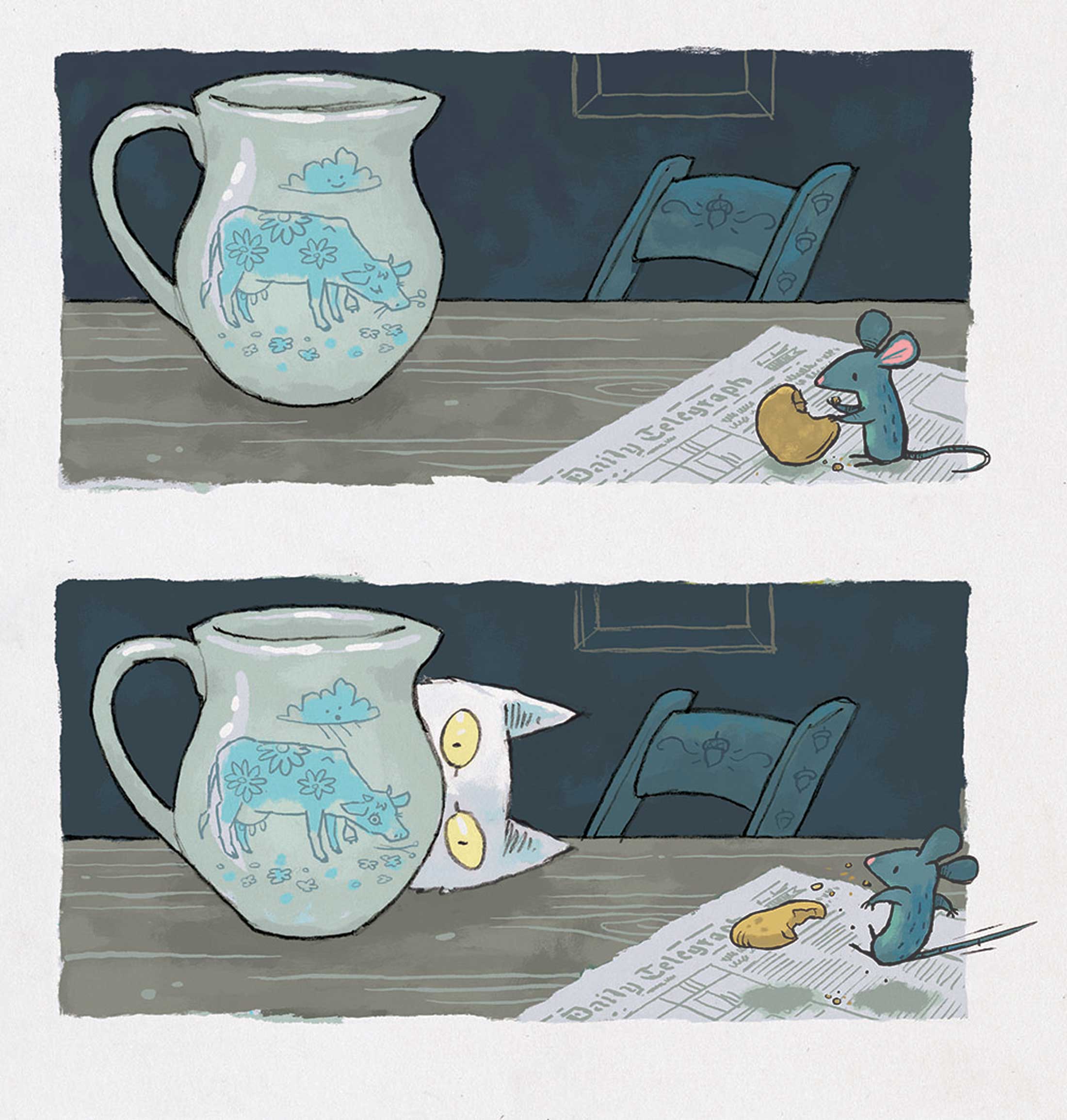
A fun fact: The newspaper that Mouse stands on in the milk jug scene is the same newspaper that a gentleman on the Tube (Underground) is reading in Miroslav Sasek’s This is London.
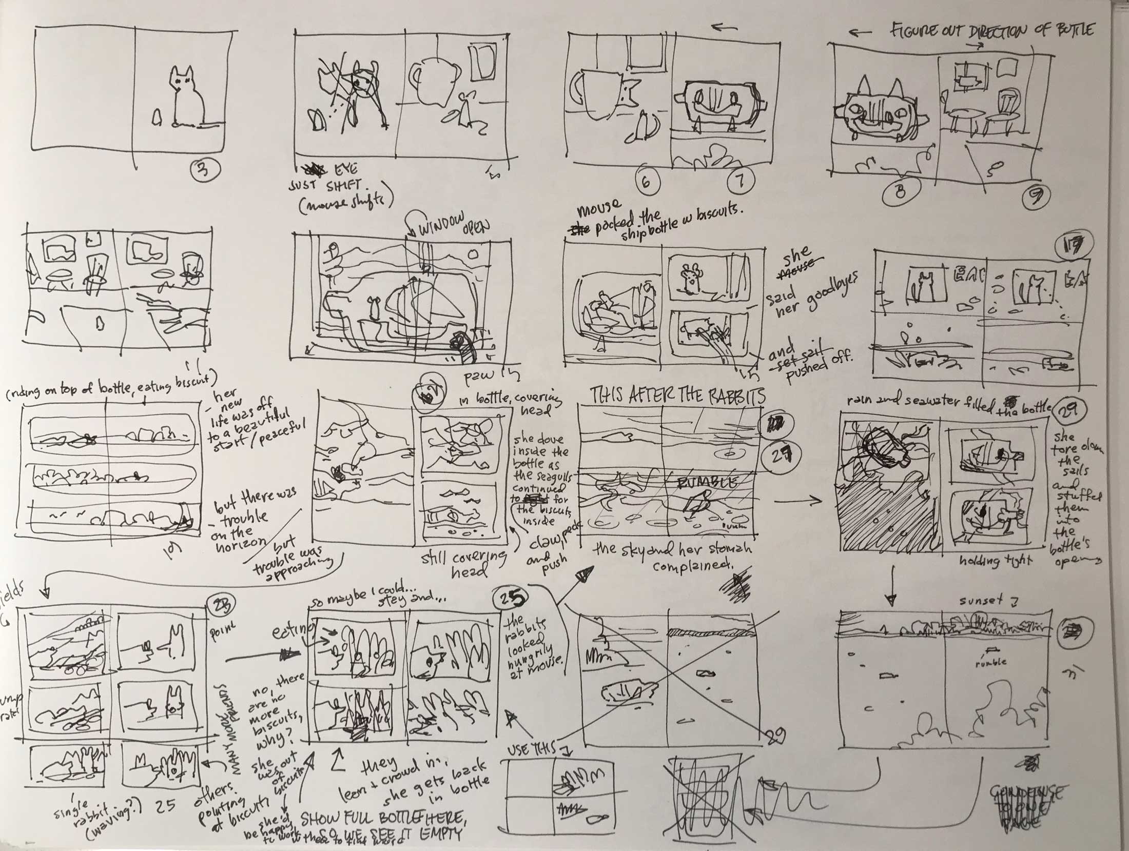
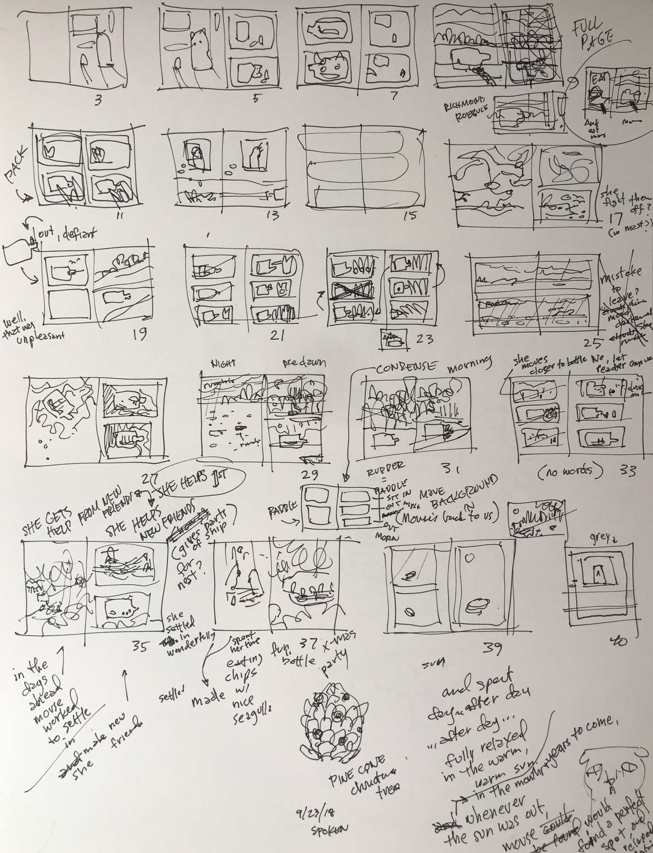
Below, you can see my notes as I work through the full story and pacing after my agent Paul Rodeen gave the initial green light. This page only holds the first 2/3 of the in-progress story. As you can see, I work in a somewhat chaotic fashion.
This vertical layout represents the first time I boiled things down to a place I liked. The initial dummy was created using this page:
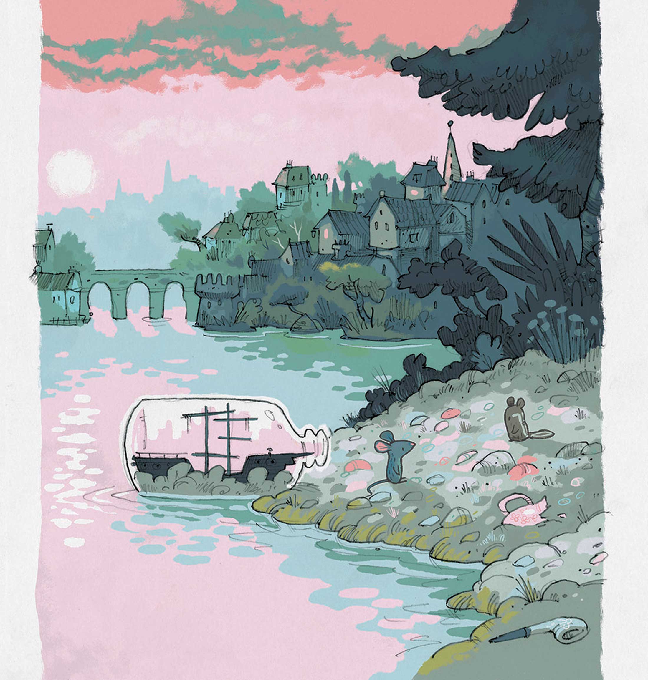
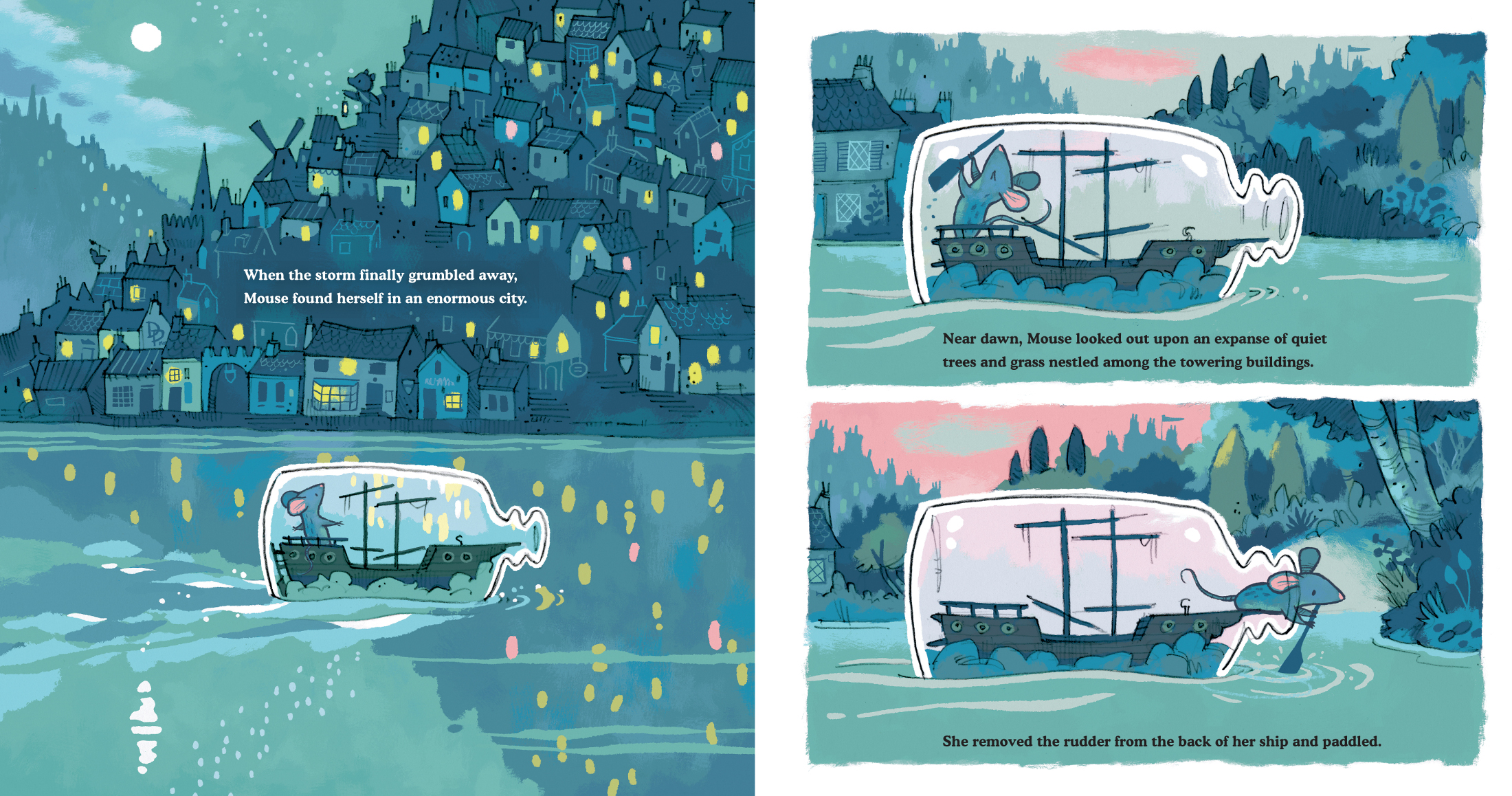
This is early artwork, somewhat detailed pencils where I experiment with framing up the ship floating down the river. I used a lot of foreground elements that were eventually stripped away (a brilliant move by my art director, Marikka Tamura) to allow us to zoom in on Mouse and her bottle and to open up the space a bit, creating a sense of vastness — the massive world in which Mouse now finds herself.
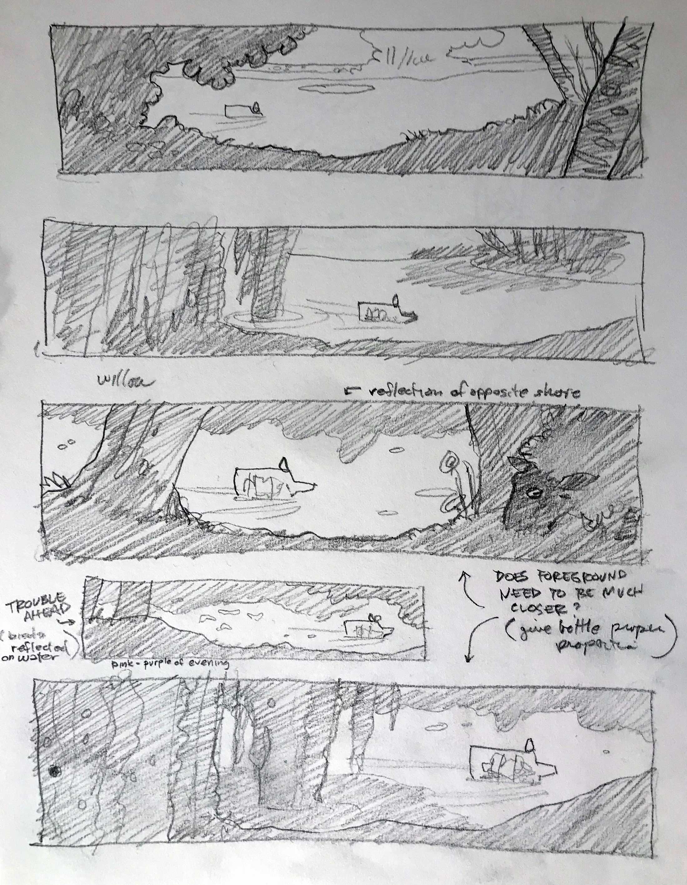
Marikka Tamura was awesome. My style was very much in flux entering Ship in a Bottle. I struggled mightily with Elbert (my second book) and was pushing to return to the illustration style of Brimsby’s Hats. She held firm, and I can never thank her enough for it.
These images below focus on the spread with the cat and the sunlight. Here is the initial dummy, revised dummy, color study, pencil drawing, and final art:
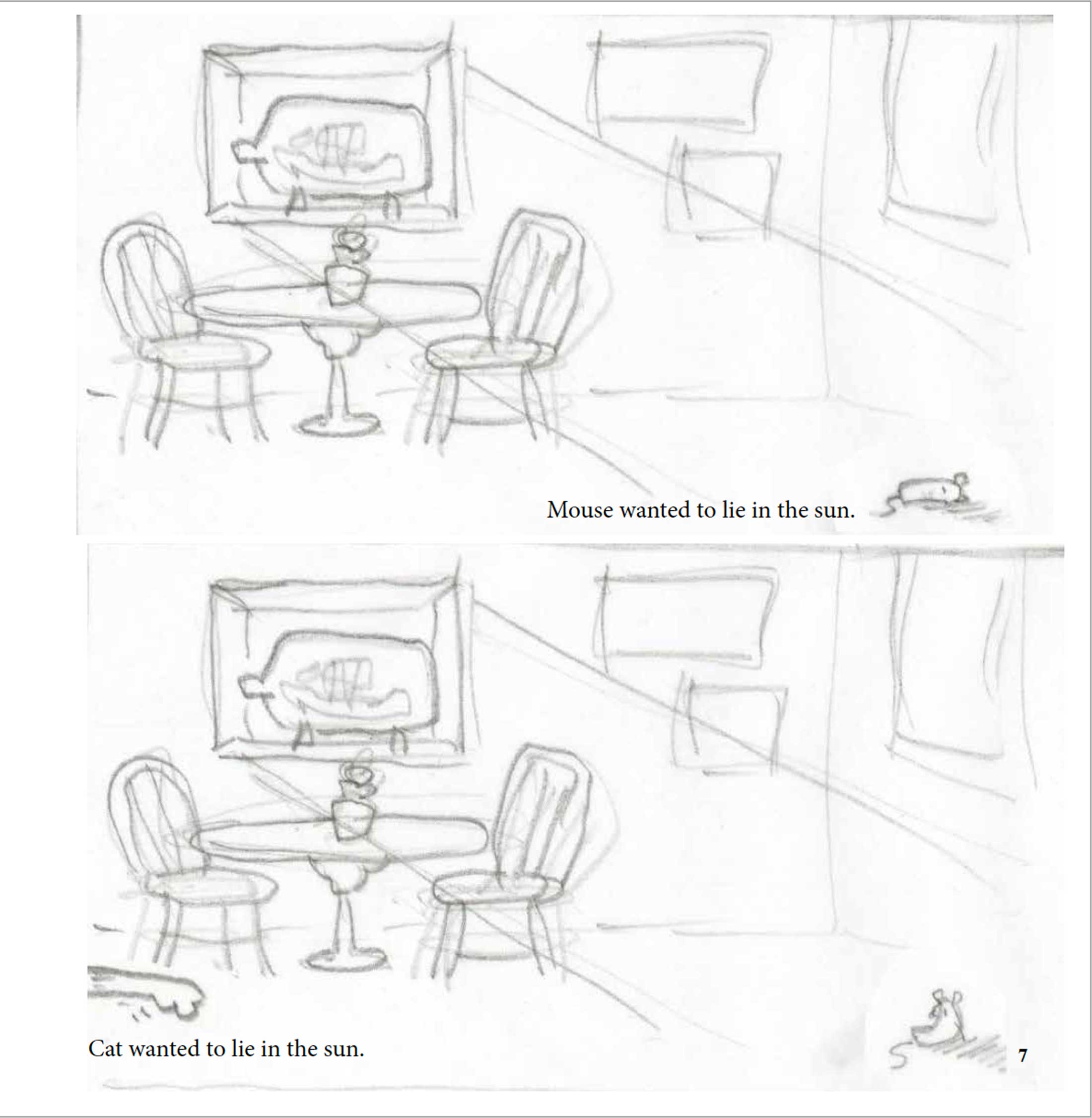

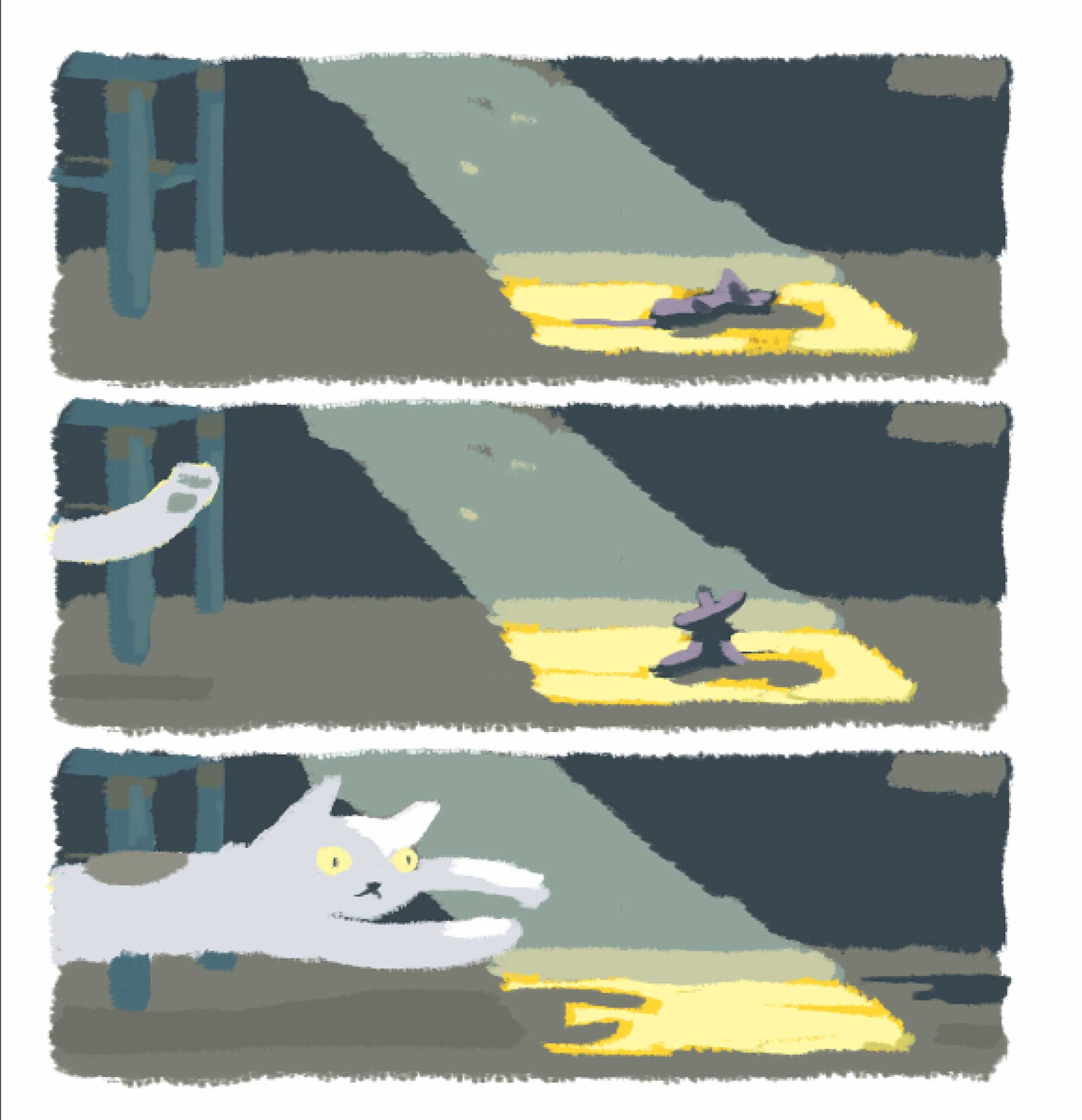
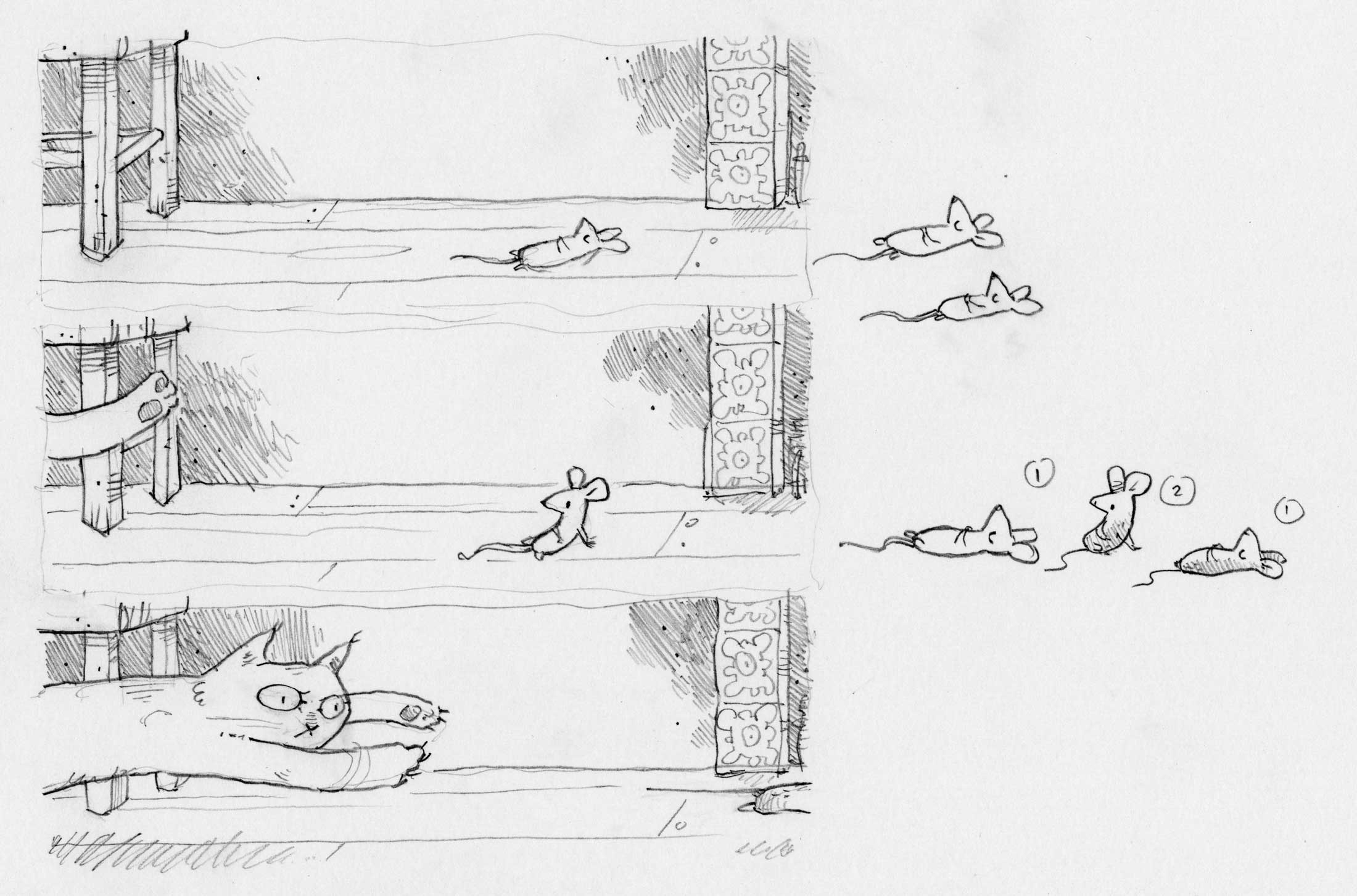
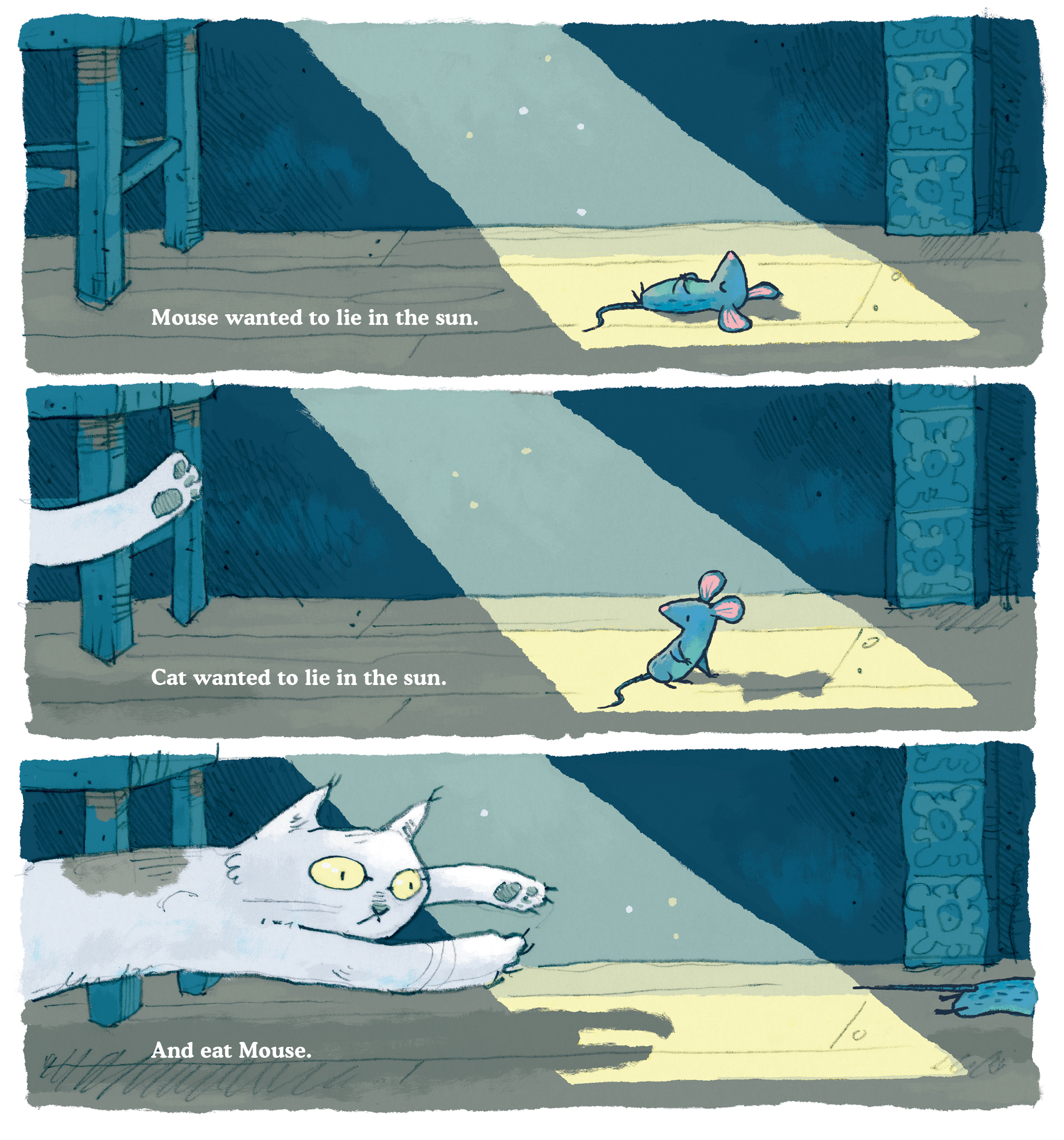
(Click image to enlarge)
Below is a vector art experiment I did while awaiting original dummy feedback. It’s kind of a color study, but something I did on my own time, as I was still struggling with illustration style and wanted to make a case for going back to the Brimsby’s Hats illustration look:
Here’s another pencil study of Mouse. I was working out how she should be positioned. It’s an early, simpler, and rounded version of Mouse.
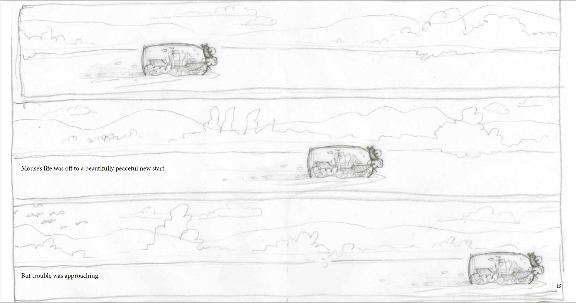
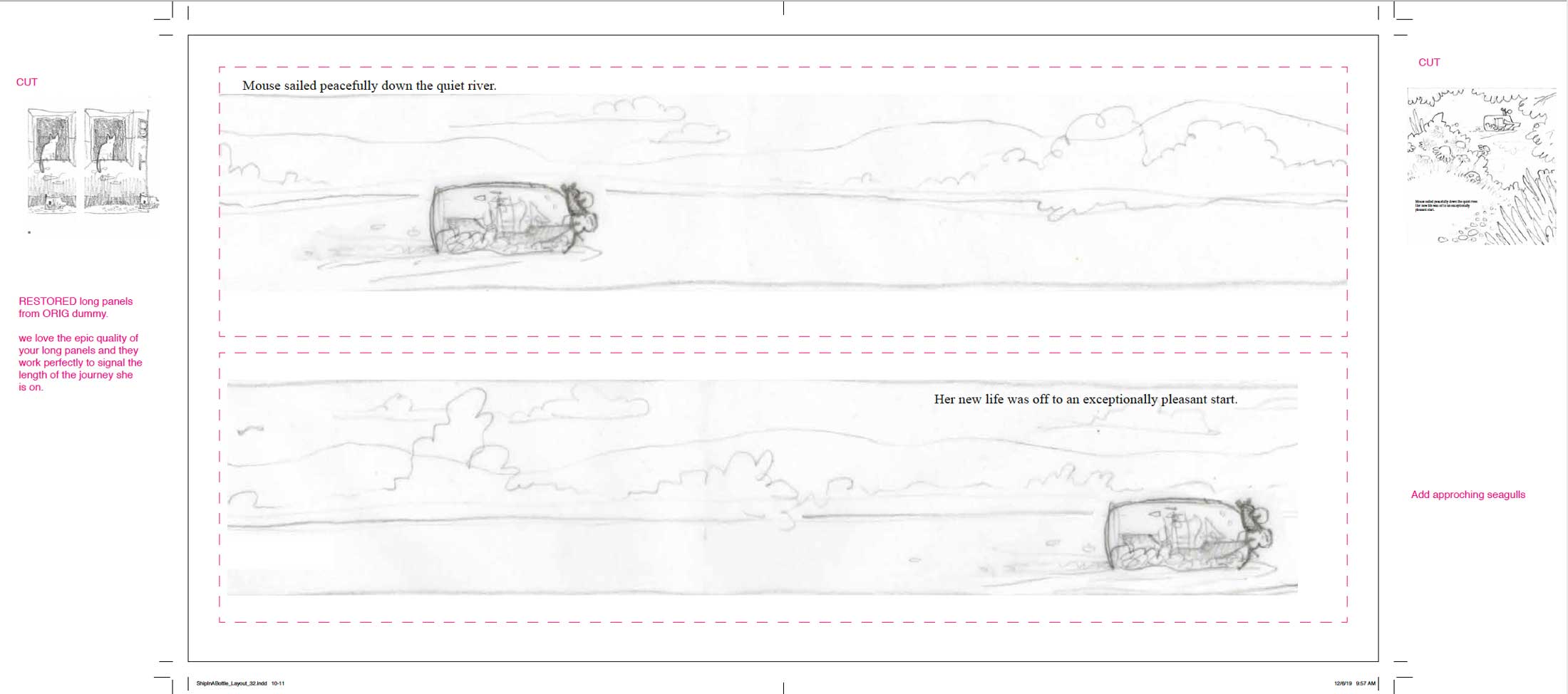
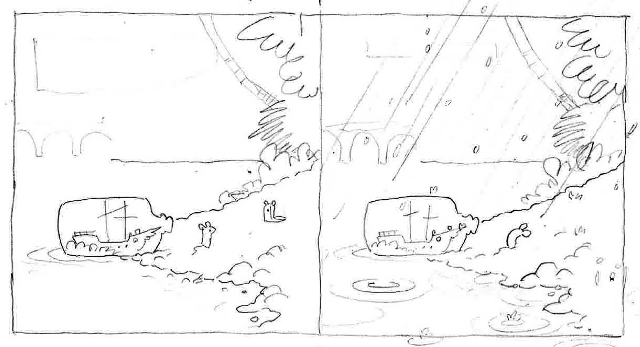
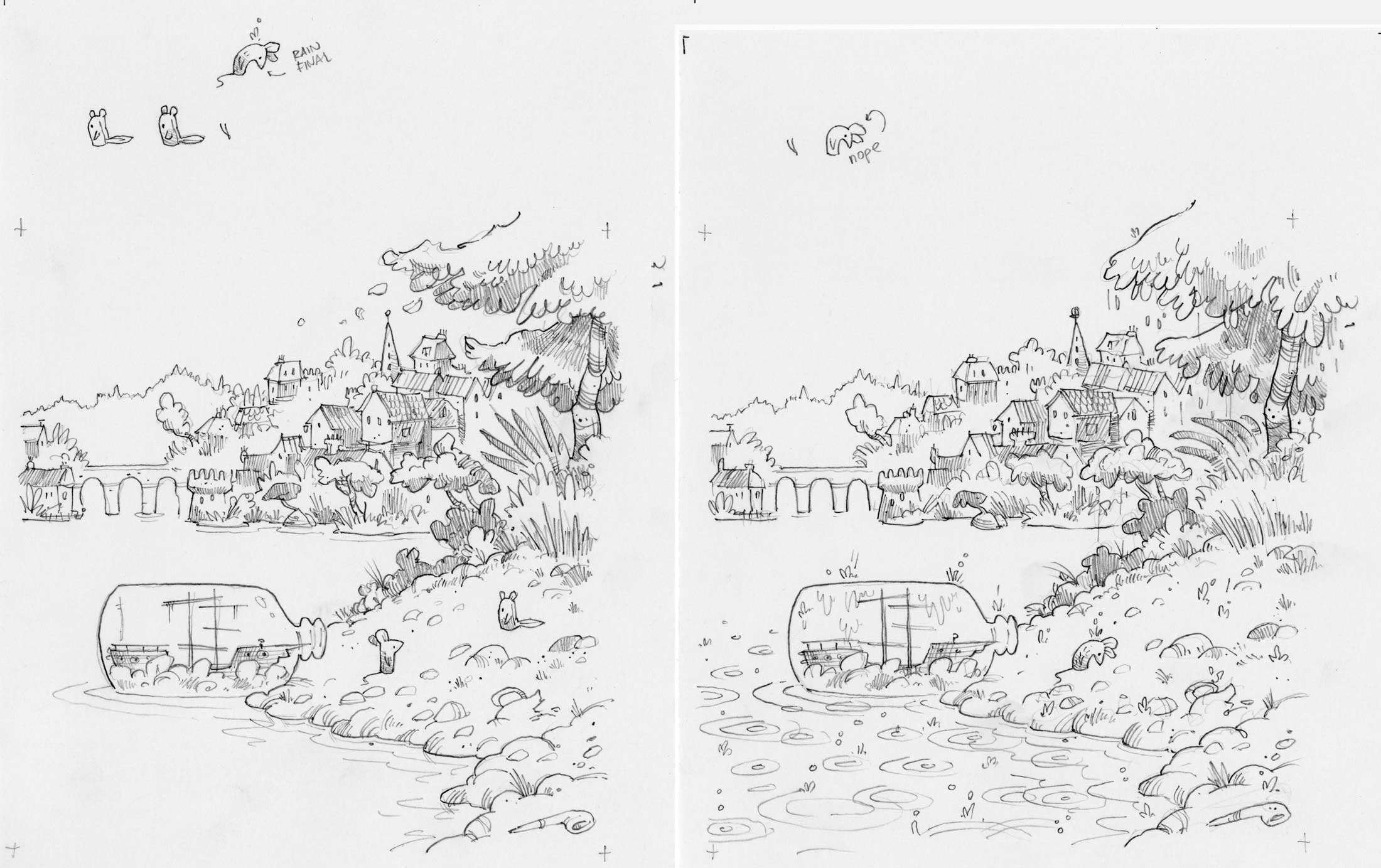
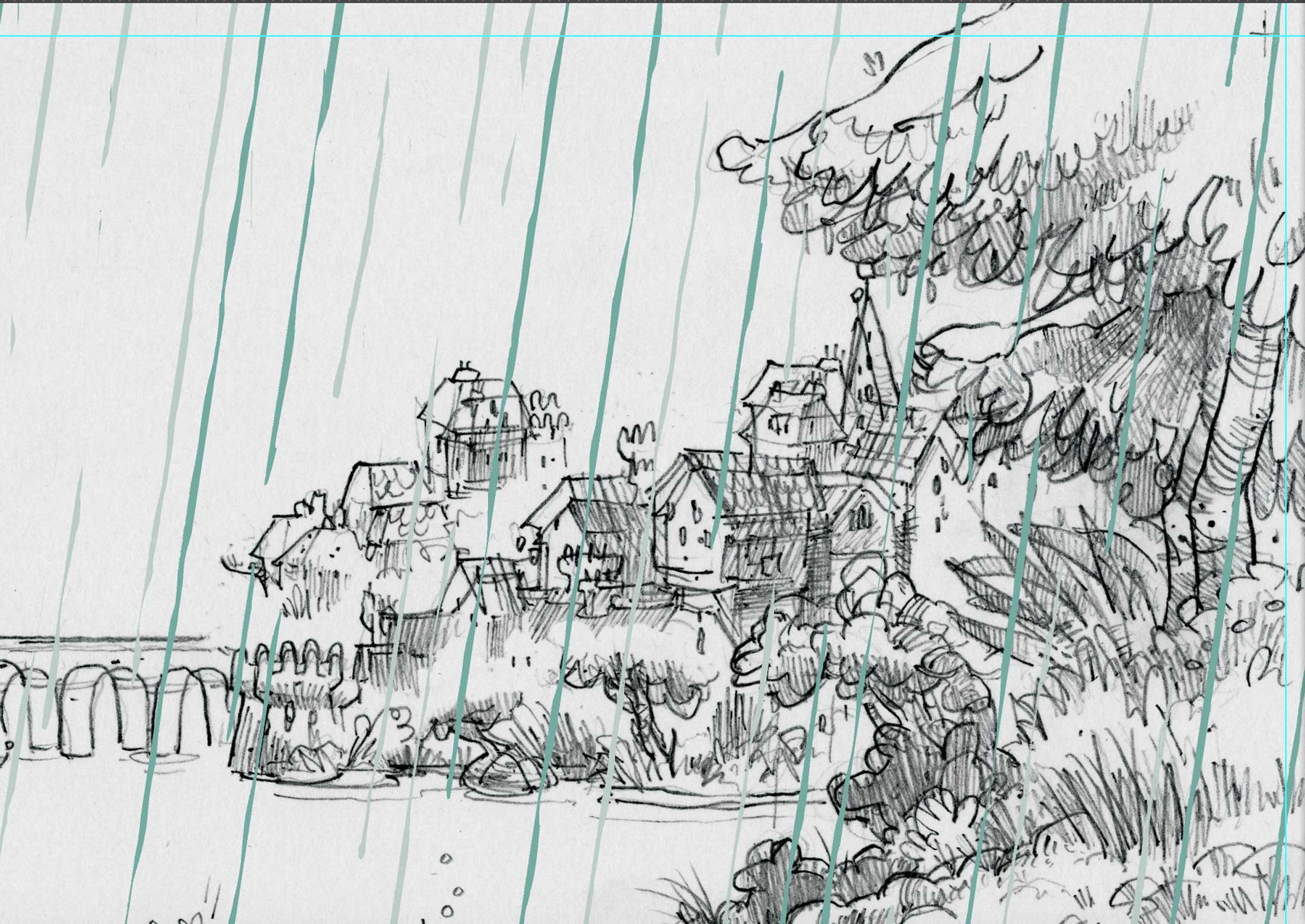
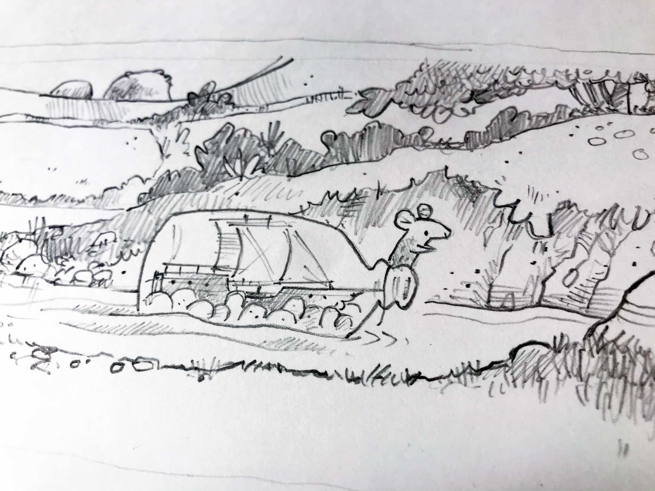
Pictured below is the evolution of the scene of the first true ship in a bottle, floating down the river. There are dummies, including a feedback dummy, pencils, color study, and final art. There are also a couple of detail screen grabs of the work in progress:
(Click image to enlarge)
(Click image to enlarge)
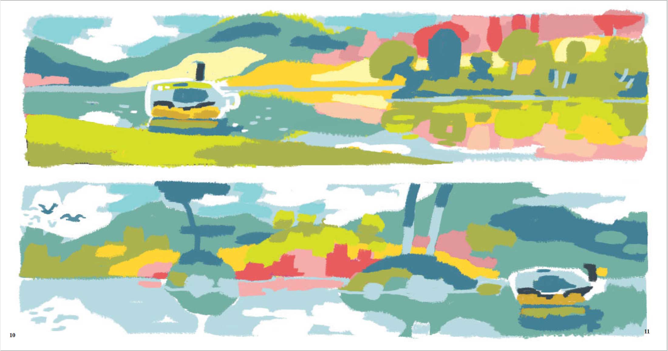
(Click image to enlarge)
(Click image to enlarge)
(Click image to enlarge)

(Click image to enlarge)
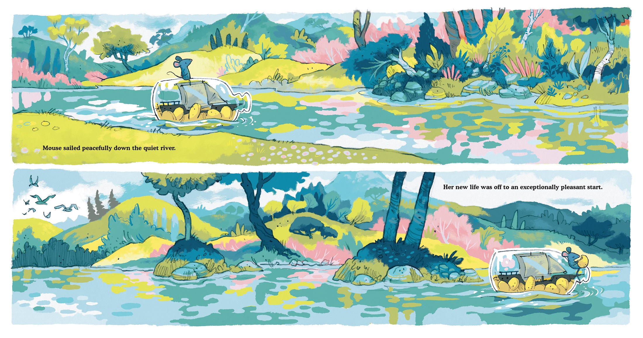
Her new life was off to an exceptionally pleasant start.”
(Click spread to enlarge)
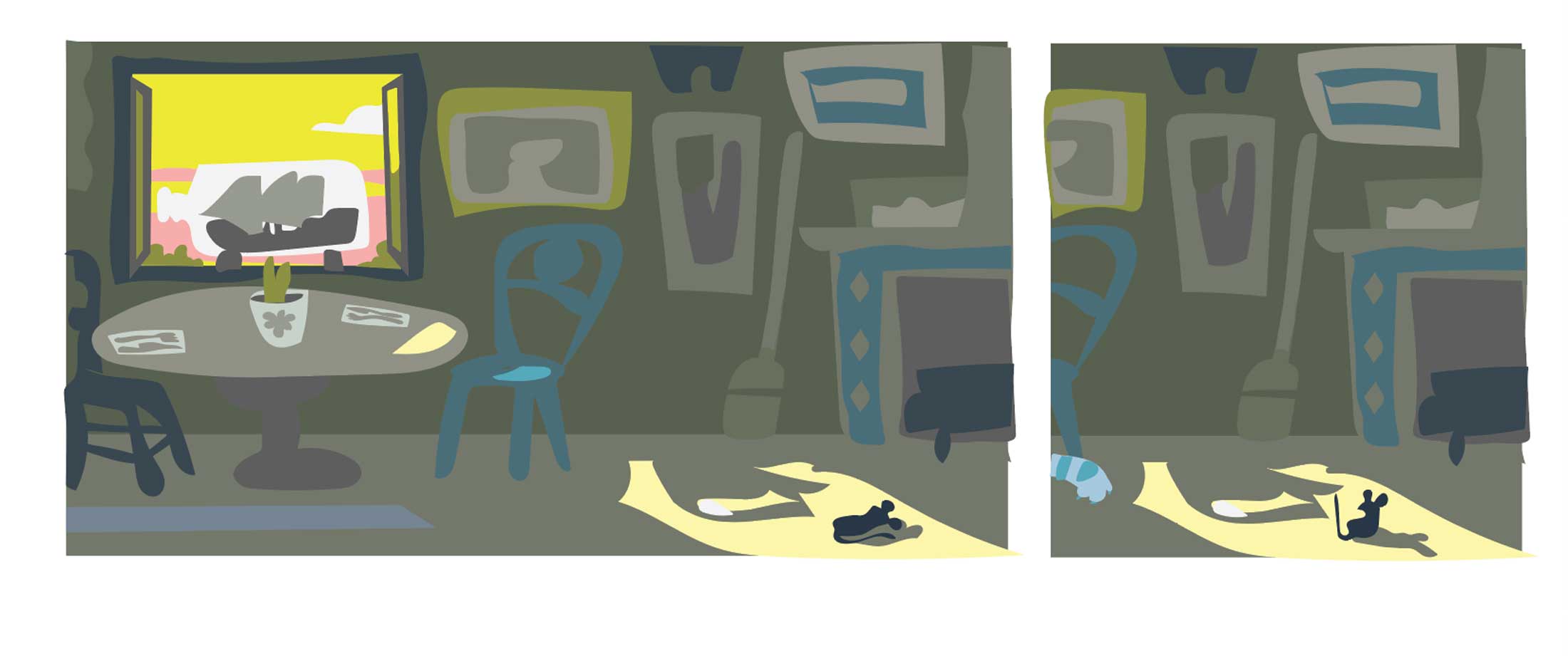
This is the evolution of the chipmunk spread in which Mouse arrives on shore and meets an eventual friend.
I wanted to show the full progress of this spread — from a multiple-frame layout in the original dummy, to a revised dummy layout, to the color study, to the detailed pencil drawing, to the final art. I also included some in-progress detail screen grabs.
During the dummy stage, the layout evolved from multiple horizontal frames to the final, twinned full-page illustrations. Here are an original dummy and the revised dummy, based on feedback from and dialogues with Marikka and Stephanie Pitts. We loved opening the scene up.

And I loved the opportunity to have a direct one-versus-one parallel of this slightly hopeful moment on the left with Mouse hitting emotional rock-bottom on the right. As the color study shows, the only layout difference between the two pages is the warm colors and sun to signal the initial hope and the shift to clouds and cool, desaturated colors to show the plunge back into misery as the rain arrives.
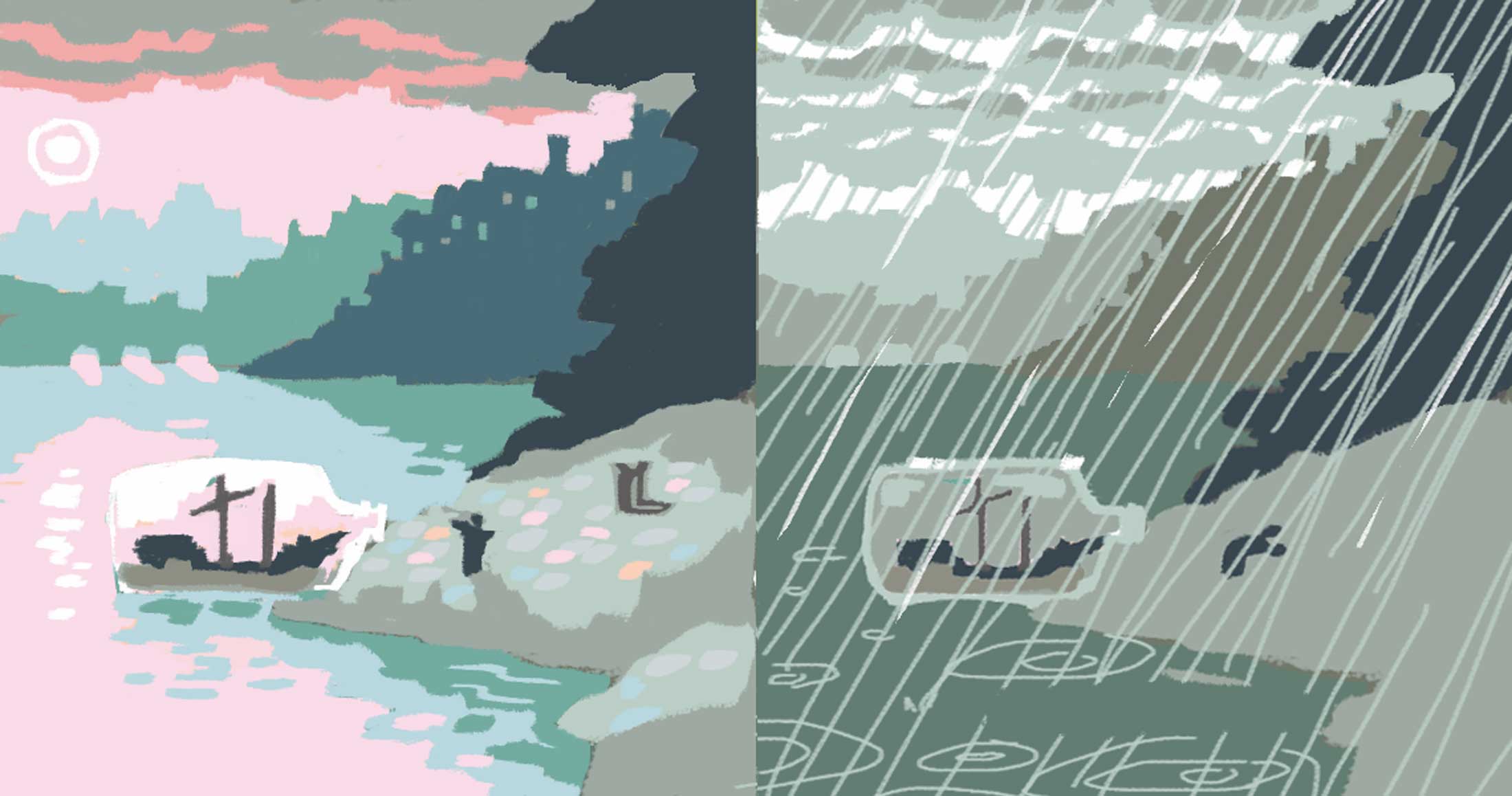
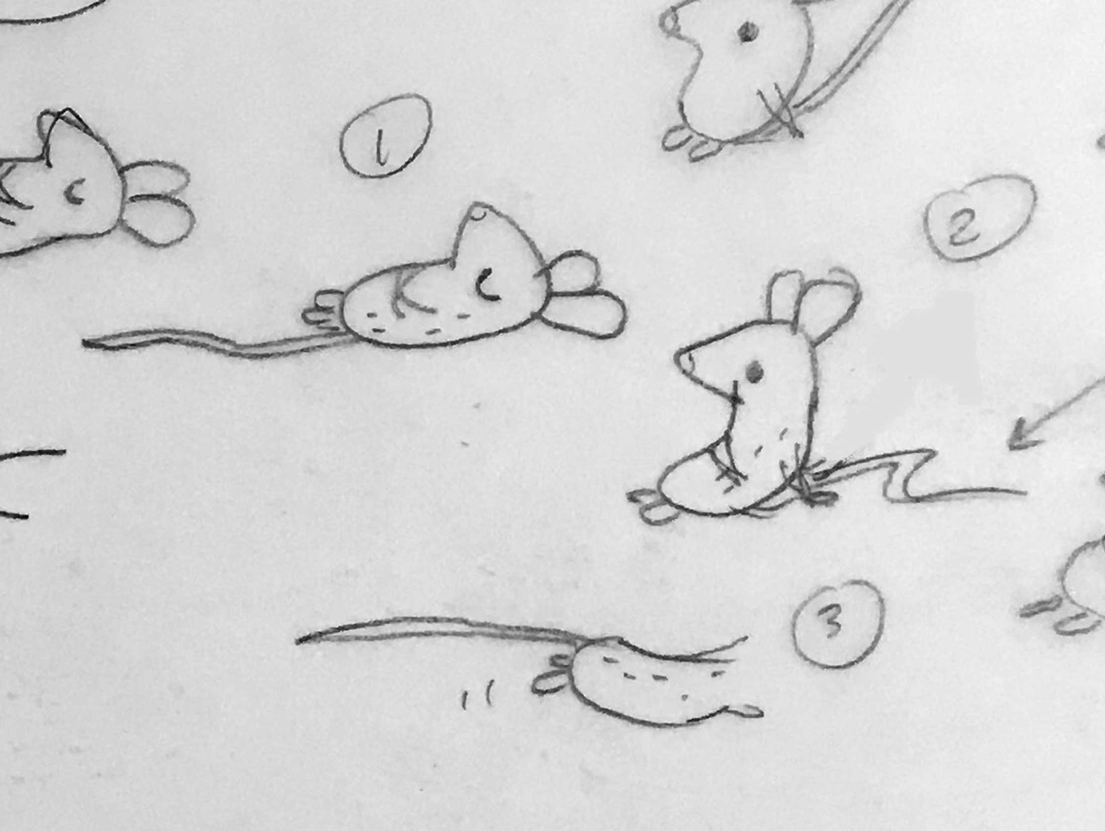
Here is a close-up on Mouse and the chipmunk:

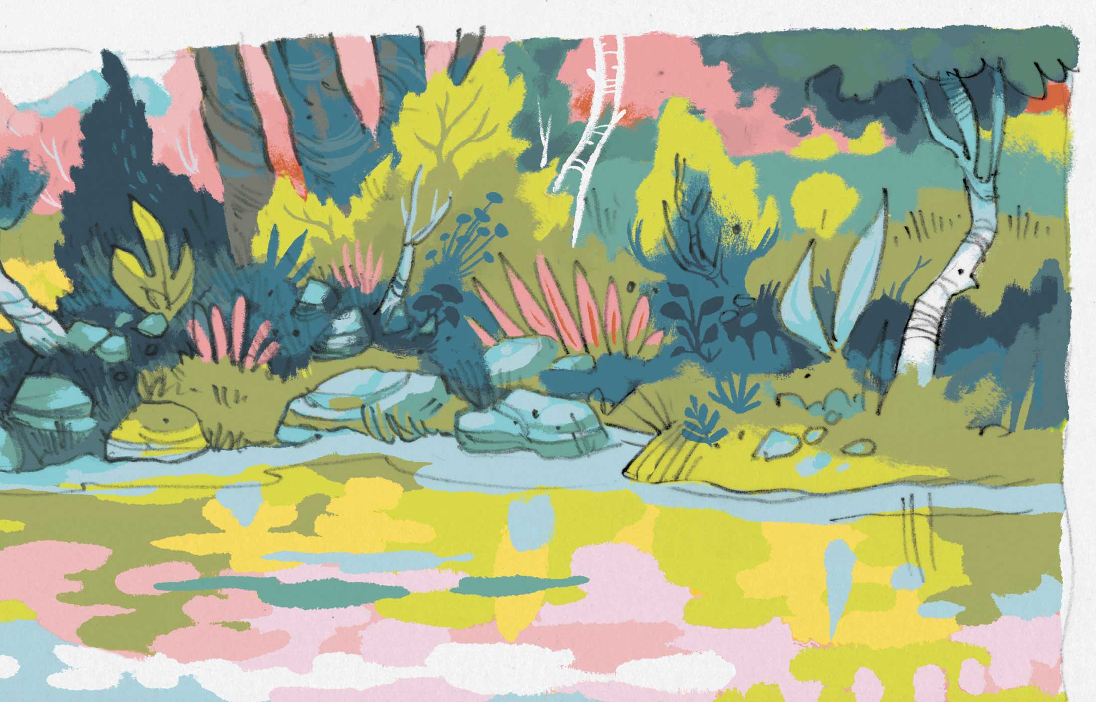
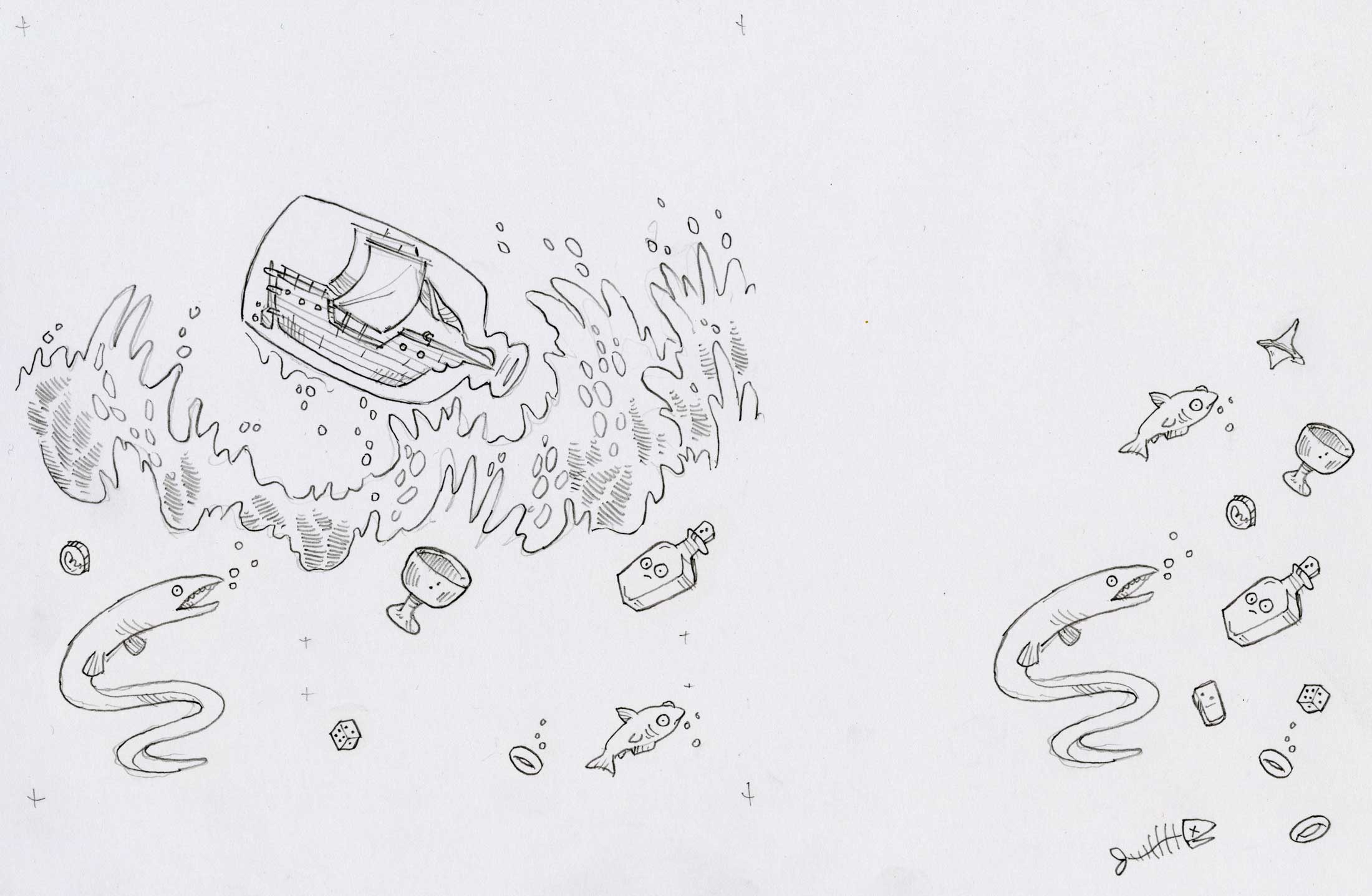
While working on Ship in a Bottle, I had started following a few mudlarks on social media. These are people who search the shores of cities to collect artifacts that have washed ashore. This impacted both the objects stirred up beneath the water’s surface in the storm scene — but also had me adding the pipe and the broken piece of mug or pitcher in the chipmunk scene. Both are common mudlark finds, at least along the Thames near where I lived in London.
This detail image shows a close up of the town in the middle distance:
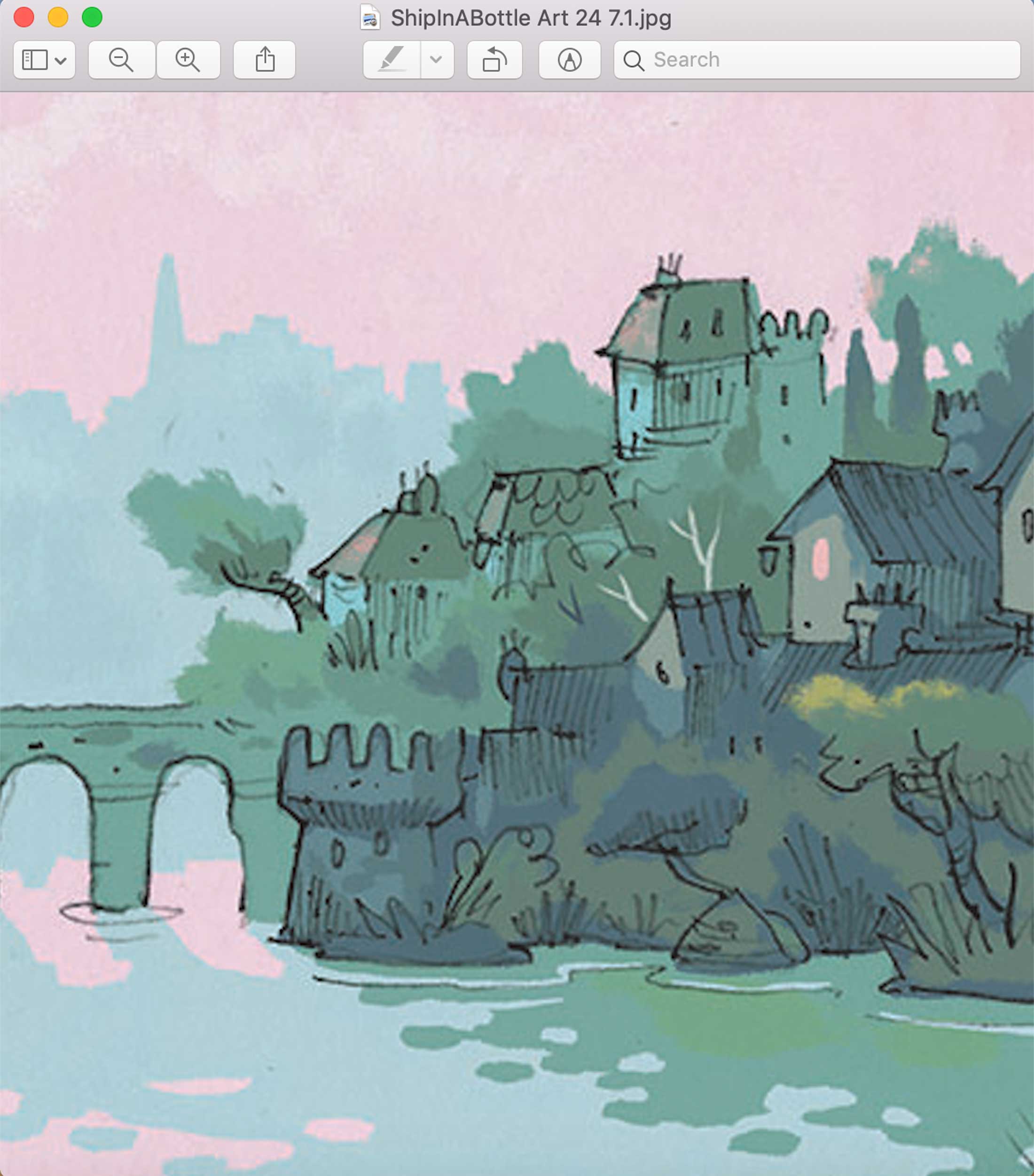
This was the moment I felt the artwork style really clicked for me. I hit my stride with how I wanted to use the digital brush and how I wanted the colors to softly blend. I’d love to live in this part of my imagined city.
This last detail image shows an overlay of the two pages’ pencil drawings. I was reworking parts of the rainy layout to make sure the background elements — the houses and trees — sat in the same position on both pages. I took a screengrab because I liked how it looked.
Here is the final art [verso and recto], sans text:

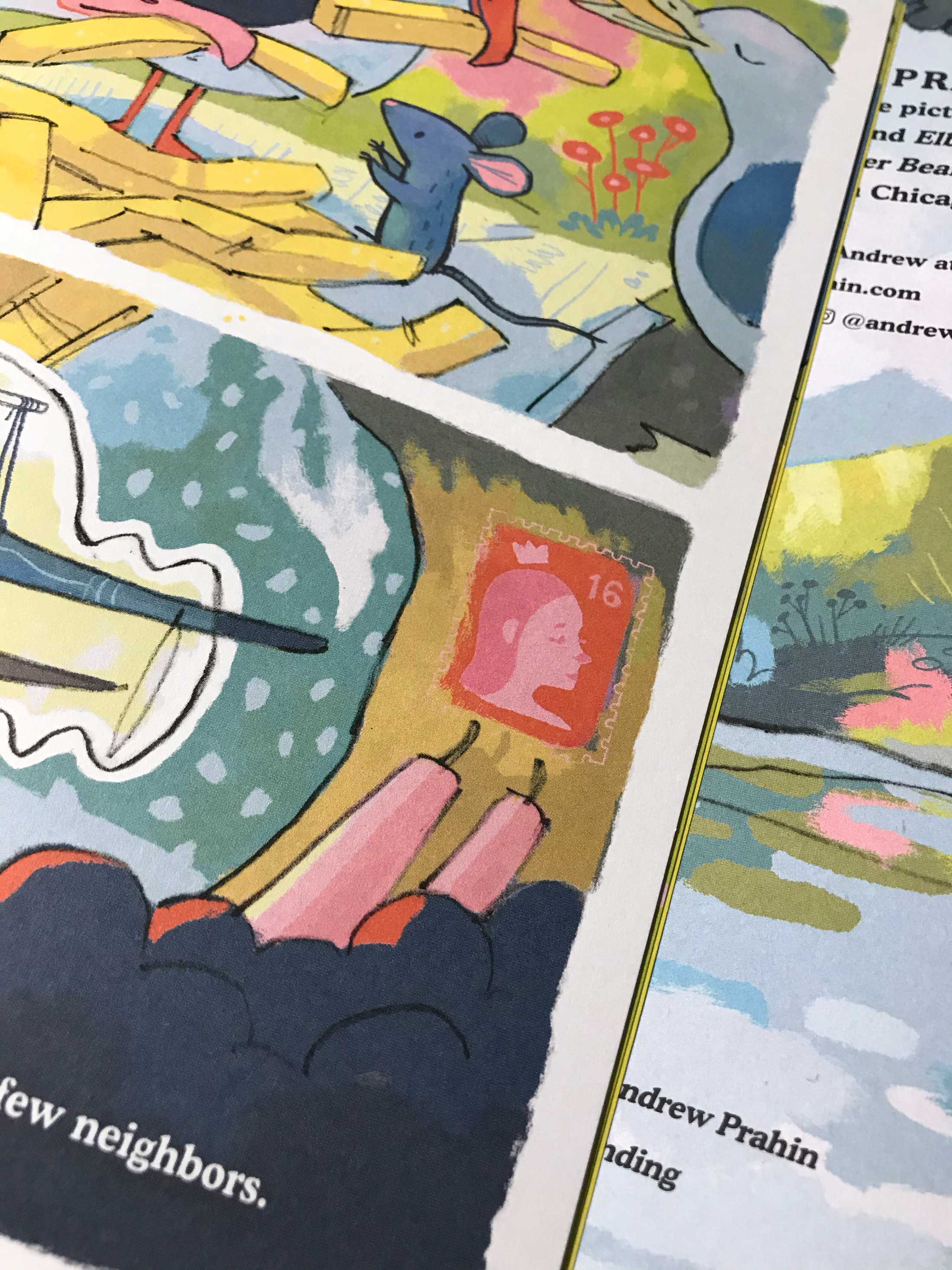
Below are some miscellaneous files. You’ll find a photo of the second-to-last page of the book, showing a detail that depicts my wife. If you look on the second-to-last page of Brimsby’s Hats, you’ll find her there too — postage stamp in Ship, painting on the cafe wall in Brimsby’s Hats. One of the joys of illustrating a picture book is being able to sneak in little jokes or nods to the people in my life. Getting my wife into each book is a tiny way for me to say thanks for the time the book-making process takes away from my day-to-day life, particularly when I have a demanding day job.

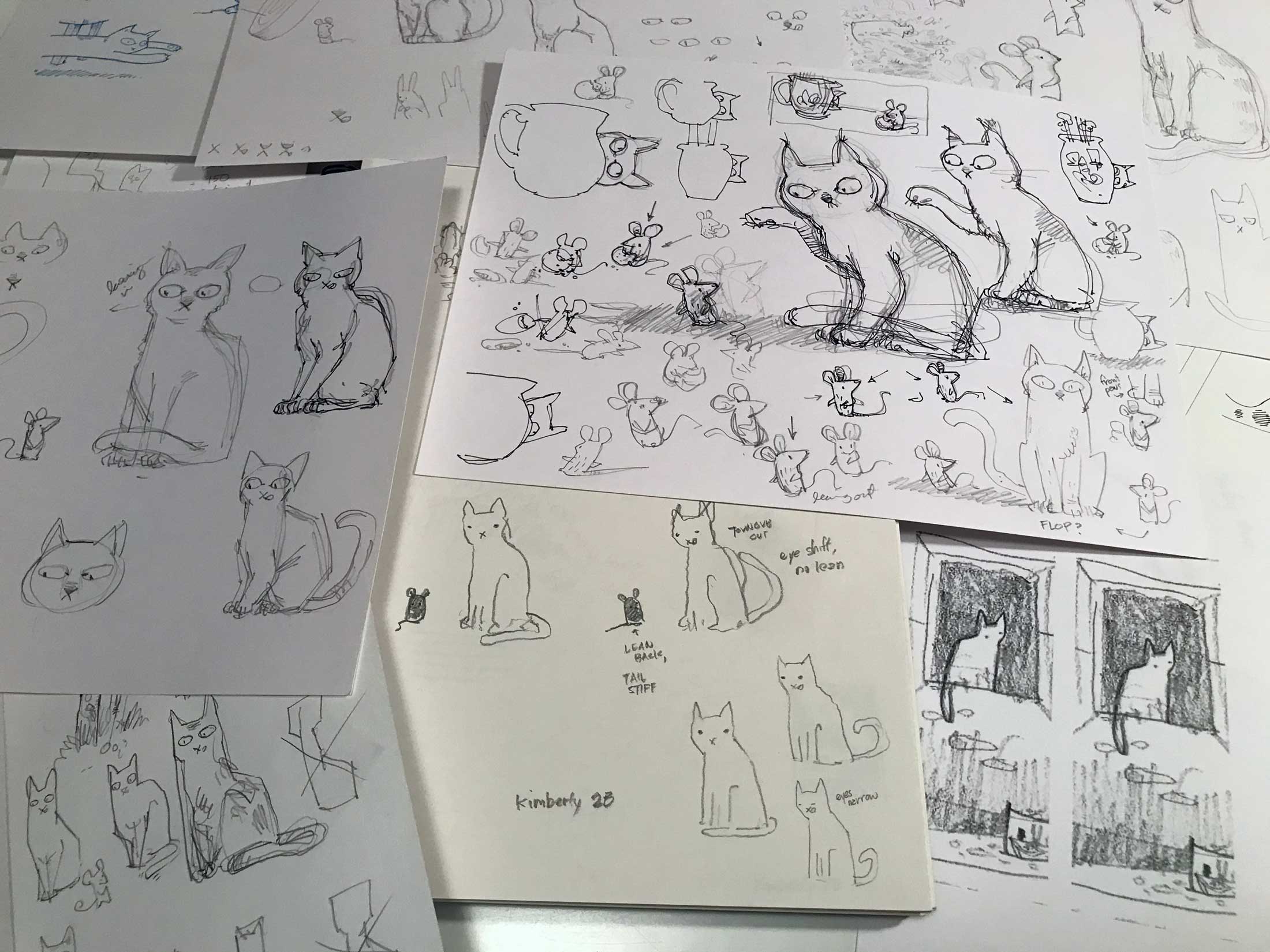
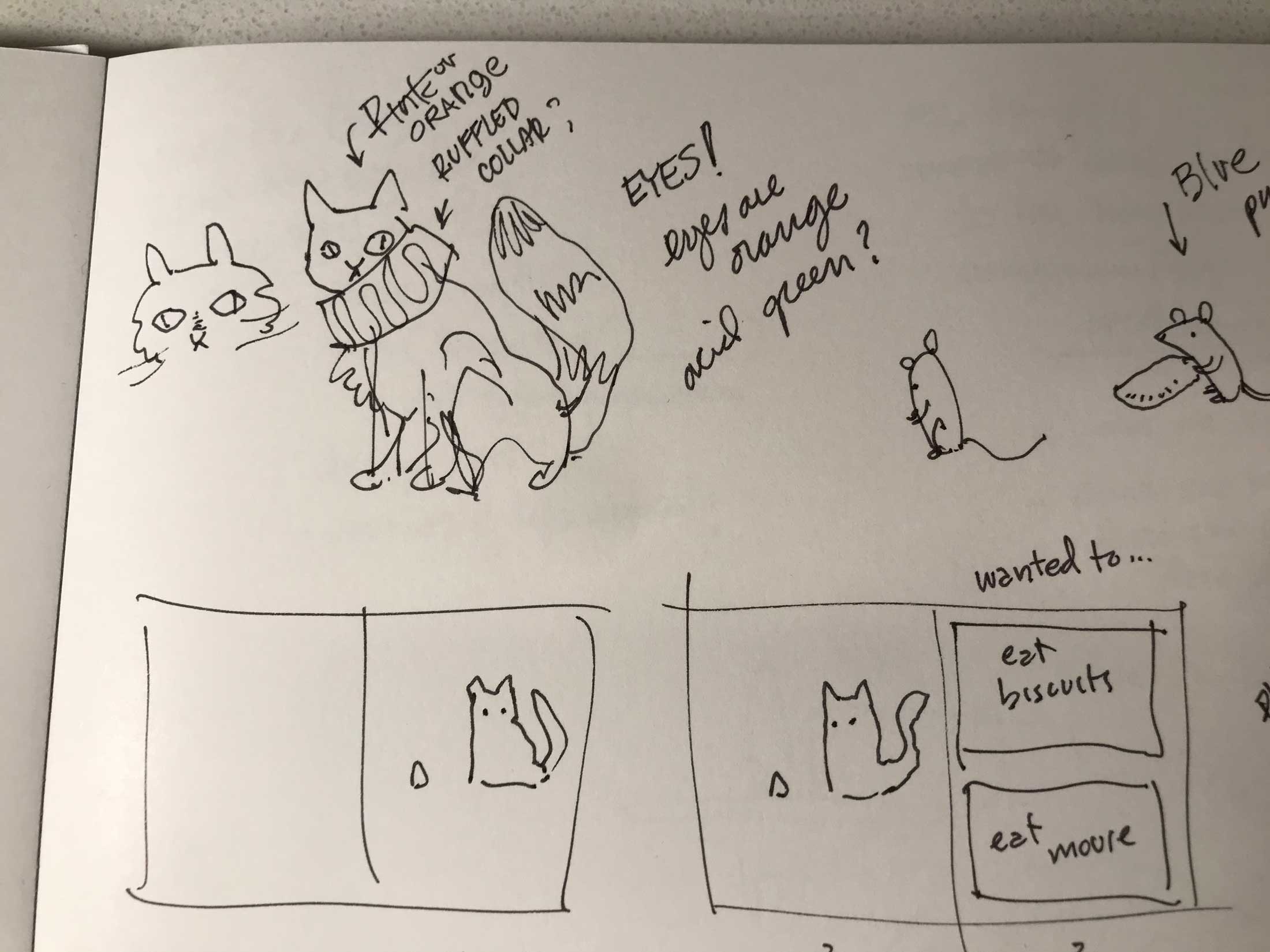
And here are a few images of the cat. One is a collage of a bunch of character study sketches I worked up on a variety of papers in a variety of pens and pencils. The other was one I thought you might get a kick out of. One morning it seems I felt putting an Elizabethan ruff collar on the cat would be appropriate or amusing.
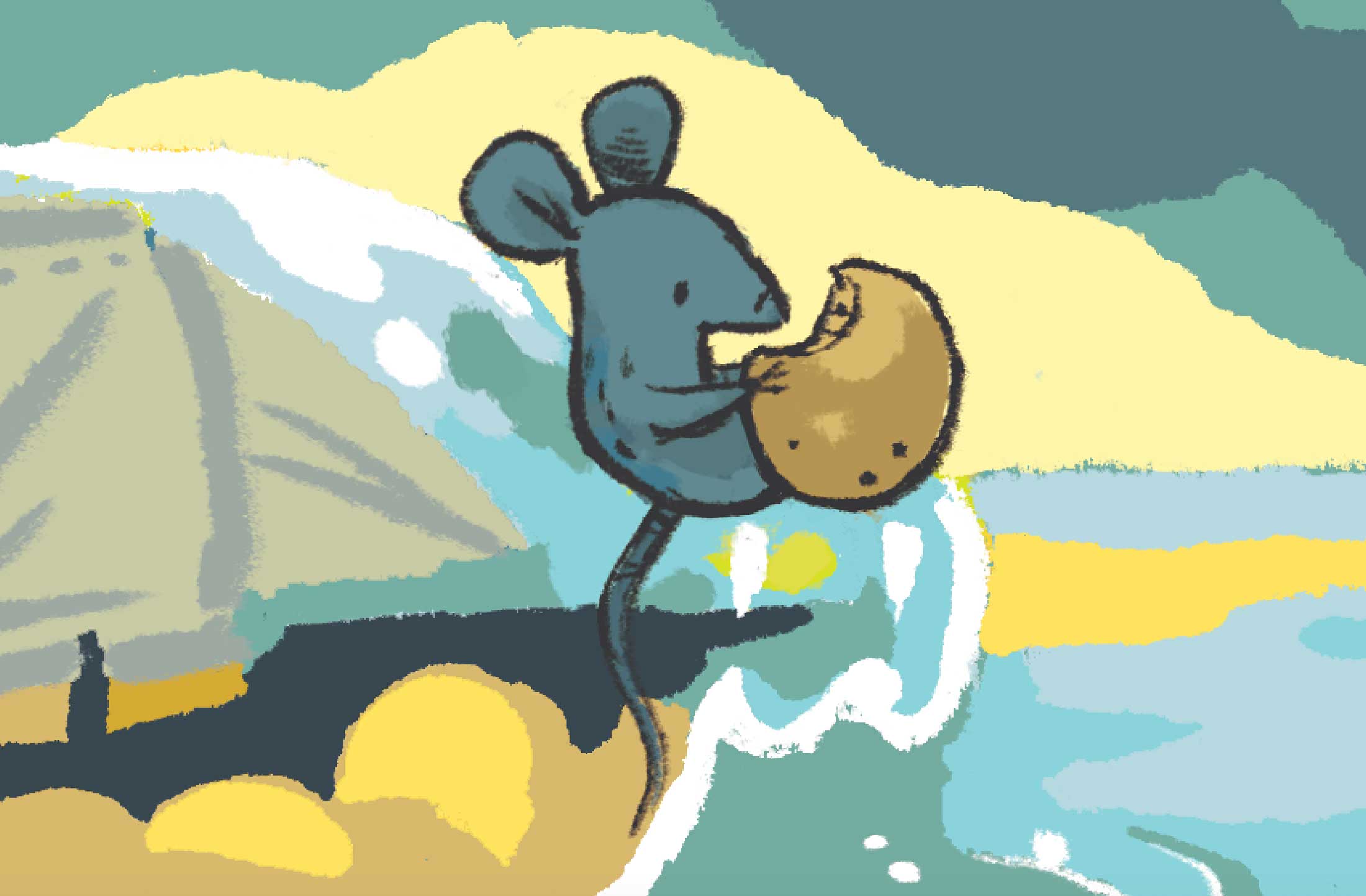
Here’s a detailed pencil of Mouse returning to the top of the bottle that I thought was nice:
Here are some pencil sketches of the seagull layouts, which were tricky. These were done on tracing paper. I was truly all over the board with how I sketched and ideated.

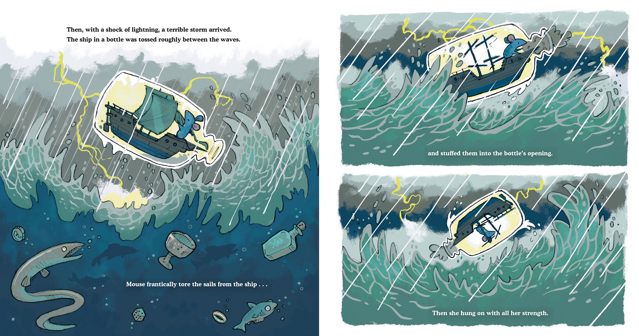
Here’s an example of how I would add some elements to certain layouts. In the storm scene with the initial lightning strike, we see some creatures and artifacts stirred up by the motion of the river. I drew them all in a group, with no concern for layout. Then I scanned them and more thoughtfully cut and placed them into the layout in Photoshop before moving to final art. You’ll notice that the bottle in the pencil has eyes. I imagined some ghost or genie trapped in the bottle who has gotten a bit concerned with the violent motion of the water. The eyes made it to final art but got cut in one of the last reviews. They were more of a distraction and didn’t quite fit with the rest of the book art.
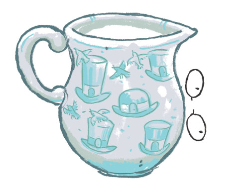
Rounding out this batch is an early alt milk jug that featured birds and hats. The birds are depicted frantically flying away as the cat’s head emerges from behind the jug. I ended up going with a calm / surprised cow and raincloud, which I think works nicely enough.
Here is some more final art from the book …
SHIP IN A BOTTLE. Copyright © 2021 by Andrew Prahin. Final illustrations reproduced by permission of the publisher, G.P. Putnam’s Songs. All other images reproduced by permission of Andrew Prahin.

THIS has got to be one of the most charming little story concepts, EVER. I want to possibly live in that bottle!! I love that there are so many callbacks from this book to other art in other books the author/illustrator has done. SO, so cute and quirky!
Oh I love this! So very cool to see the BTS process. That storm illustration and then arriving in the city is just gorgeous.
This is a great story about the process of creating a great story. The artwork is amazing. It’s interesting to see and read about the changes of style for each book. Well done.