A Bit of Abecedarianship Before Breakfast:
Operation Alphabet and Paul Thurlby
 October 25th, 2011 by jules

That “I” up there is for “impossible” in my world today, because I think that it’s altogether impossible that “abecedarianship” is a word, but who knows.
Yep, I’ve got two alphabet books before breakfast, a quickie post filled with lots of art — and both books with retro-tastic illustrations. I was jonesin’ for some retro art today, and … well, here we go. Paul Thurlby and Luciano Lozano are our guys this morning.
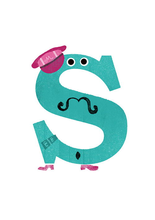
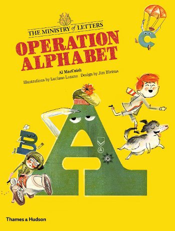 Pictured at the very top of the post is the letter “I” from the hard-working Ministry of Letters. (For the record, his favorite words are “Itchy,” “Ice cream,” and “Icicles,” and his favorite musical instrument is the Irish Harp.) The Ministry of Letters is featured in Al MacCuish’s Operation Alphabet (published by Thames & Hudson), illustrated by Luciano Lozano and designed by Jim Bletsas.
Lazona is a freelance illustrator, based in Barcelona. Jim Bletsas—how much do I love that the designer is listed on the front page of this picture book?—is a designer living in London. MacCuish is a Creative Director at a creative agency in London and also makes his home there.
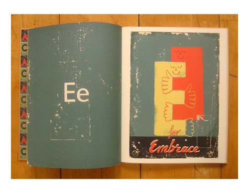
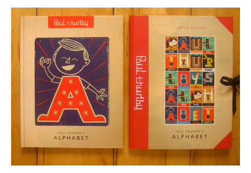
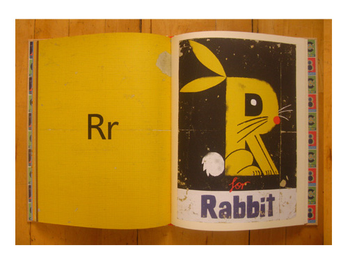
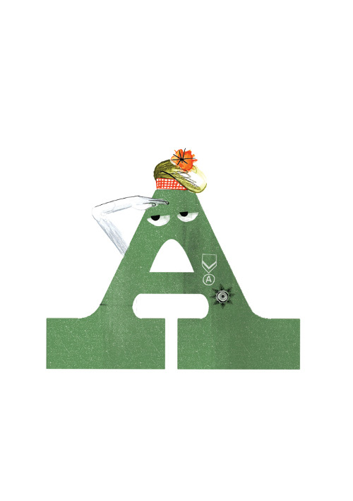
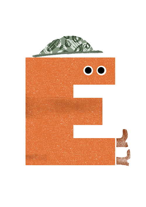
And under the “I” up there is Paul Thurlby’s letter “E.” If you haven’t seen Paul Thurlby’s Alphabet, released by Templar/Candlewick in October, and you’re a fan of alphabet books and/or retro illustrations (and lovingly-designed books), you’re in for a treat. Paul also lives in England. Here below is the cover and one more spread from Paul’s book, which is a straight-up alphabet book, but it stands out for its sleek design, clever concept art (note the rabbit below), and as I’ve already said, its retro vibe. Thurlby states in a closing Artist’s Note that he strove to make his alphabet stand out, so he “decided to pursue the challenge of fusing the object of the word with the shape of the letter.”
“The inspiration for my work,” Paul writes at the book’s close, “comes from mid-century design and illustration. My style has been described as being retro-modern. I use old books, postcards, and pieces of paper for the backgrounds. I will often buy an old book just use its back cover!”
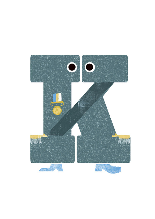
I wish I could show you the cleverness of “K for Karate,” “F is for Fierce,” and “Q is for Quicksand,” but you’ll just have to find a copy for yourself, I suppose. It’ll be worth your time.
Note the cover image above? The book’s jacket slips off and folds out into an entertaining alphabet poster for one’s wall.
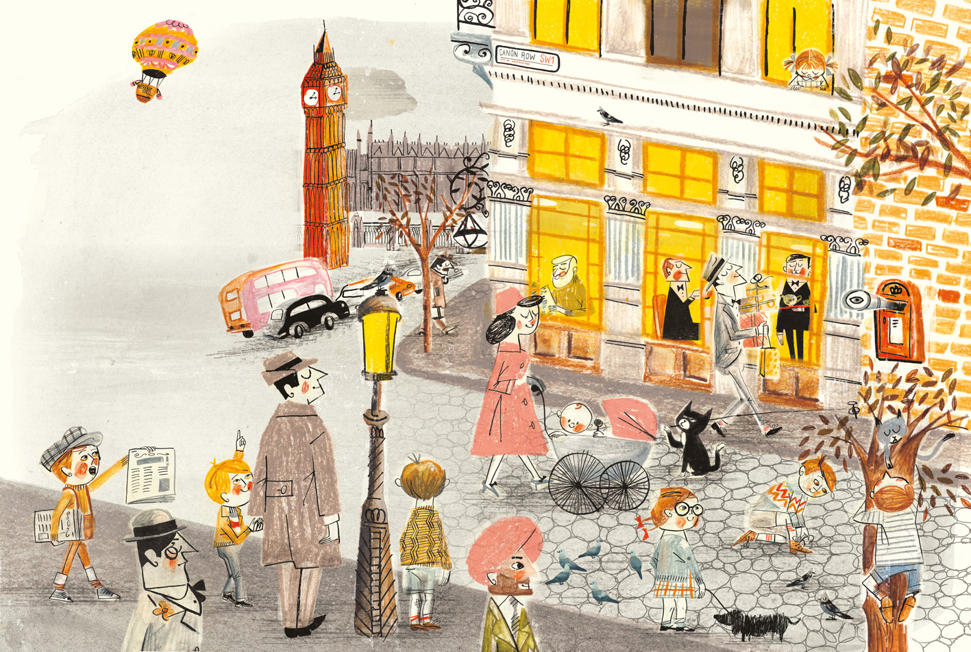
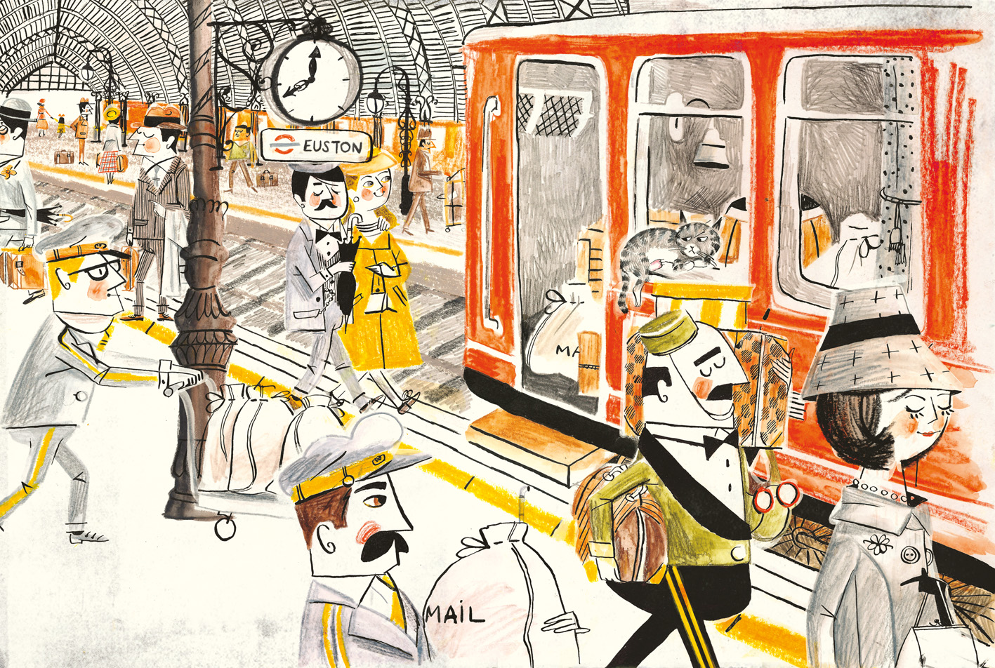
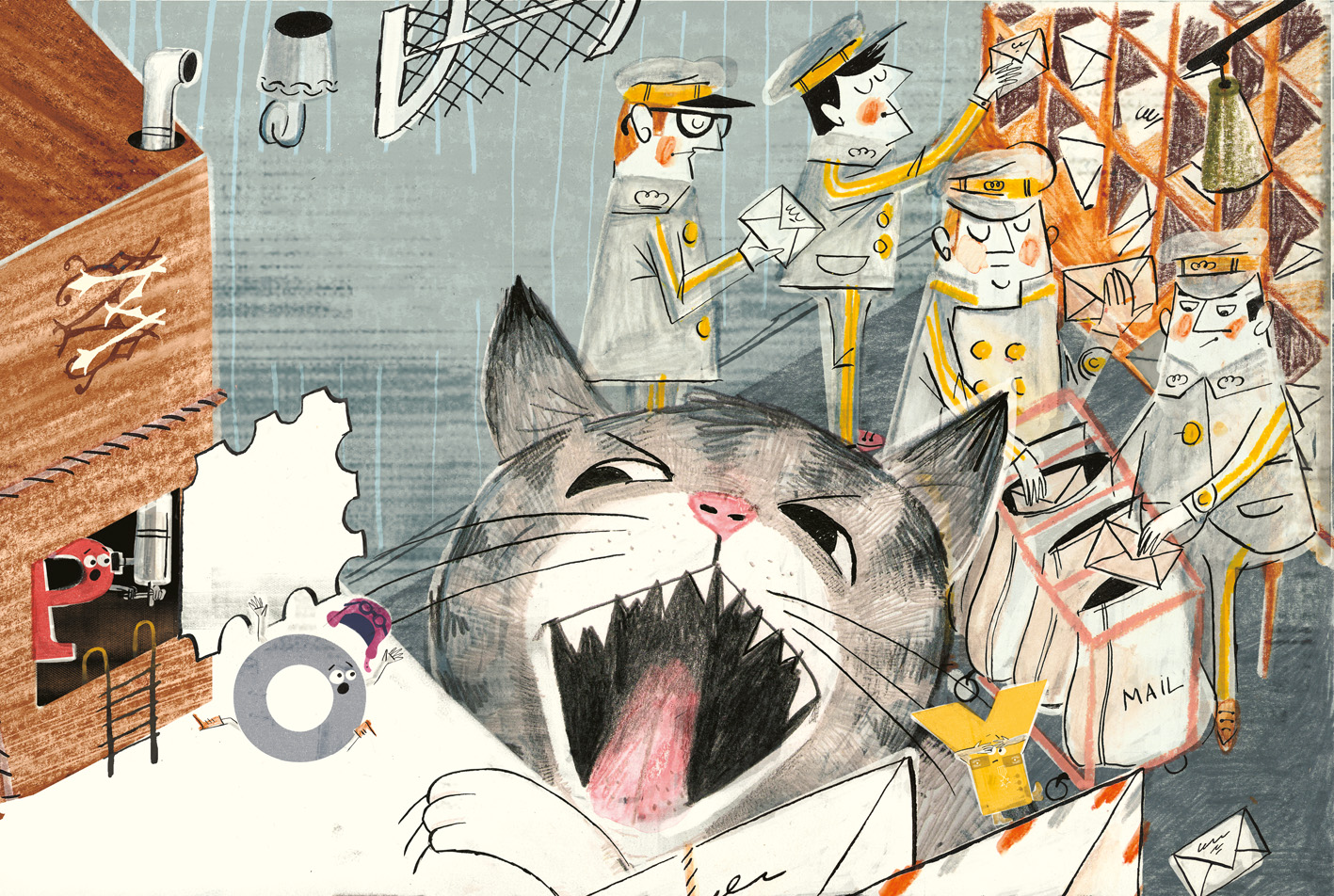
And now back to Operation Alphabet … This is a very wink-wink and sort of British-spy’s-heroic-quest type of tale, quite unlike what you’d see here in the States. (The book was published this year by Thames & Hudson in England. Here, though, is their U.S. site; they are distributed here by W. W. Norton & Company, Inc.)
Young Charlie Foxtrot is learning his alphabet in school and finding it confusing (mostly on account of his daydreaming during class). Cue the Ministry of Letters, who hear of Charlie’s struggles. Hubba who? you say …
But it’s wasn’t people who worked inside …”
(Click to enlarge)
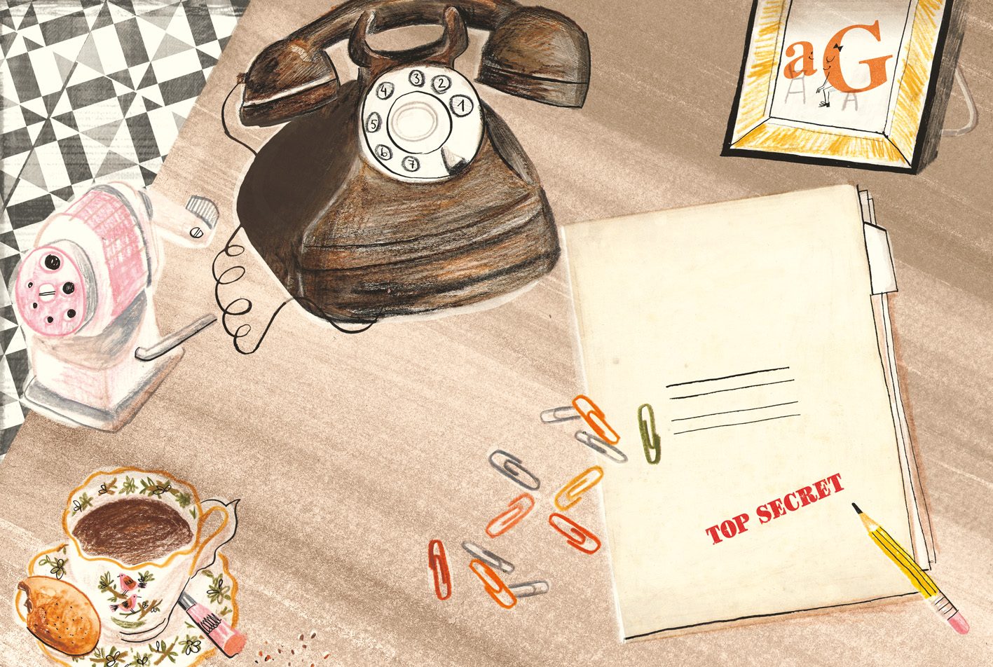
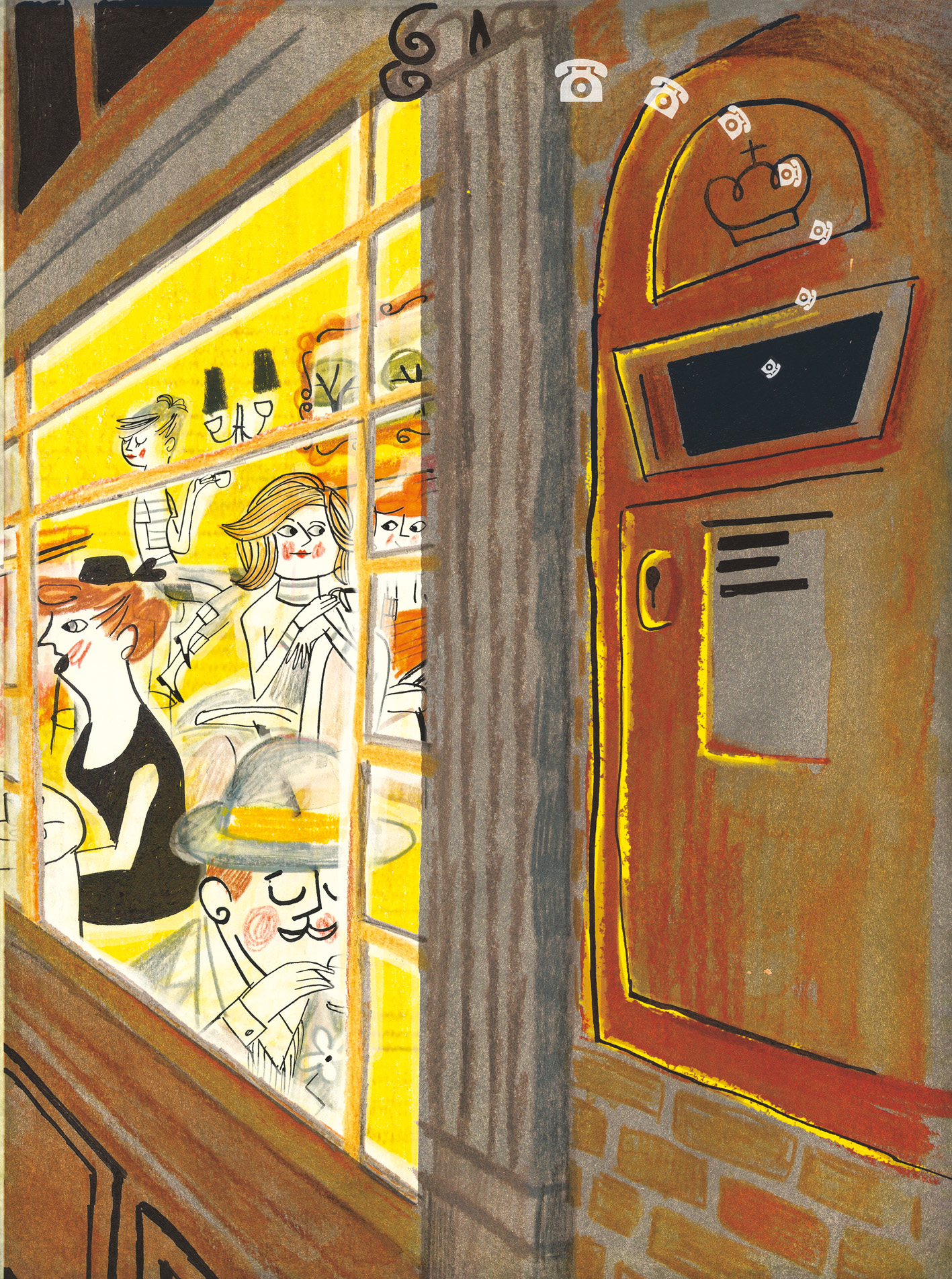
It’s the Ministry of Letters. They make words — all the world’s words. So, all the letters from the Ministry set off to find Charlie; a troublesome cat gets in the way; and a “kindly Duchess” steps in to help the Special Alphabet Service. Magnificent alphabet theatre and lots of “OOMPAH!”s may or may not happen—I don’t want to spoil it for you—and there you have it. (Oh, and this dustjacket slips off, too, to reveal another cover you can switch out OR a mini-poster for one’s wall.)
As you can see, the artwork very much evokes the Golden Age of children’s book illustration. Intriguing how Lozano reaches so far back in terms of style. What do you think, dear readers? Here’s more of the art (sans the text in the spreads themselves) to take in …
(Click to enlarge)
Ministry of Letters emergency message service.”
(Click to enlarge)
and postcards and letters.”
(Click to enlarge)
(Click to enlarge)

and a letter A poked its head out!”
(Click to enlarge)

the whole wide world of words before them …”
(Click to enlarge)
PAUL THURLBY’S ALPHABET. Copyright © 2011 by Paul Thurlby. Published by Templar Books, an imprint of Candlewick Press, Somerville, MA. Images reproduced with permission of Paul Thurlby.
OPERATION ALPHABET. Copyright © 2011 by Al MacCuish. Illustrations © 2011 by Luciano Lozano. Published by Thames & Hudson, New York. Images reproduced with permission of the publisher.

I’ve been collecting alphabet books for years and years. These will make for delightful additions. Thanks for starting my day with this post.
Squee! Just my kind of post. Love these :). Of course my favorite spread is the one with the teacup in it . . .
Love it! I like seeing such ‘old fashioned’ illustrations. I feel it’s great if children see illustrations like these in a new book they might be more inclined to explore some older titles. I am always struggling with my children who truly do judge books by their covers. My oldest especially is very quick to ignore an ‘old fashioned book.’
Just what my eyeballs needed today! Thank, Jules!
Maybe it’s because I’m a writer, but I’m quite fond of each of the letters of the alphabet, and I love the expressions on those letters’ faces!
Retro just seems right for an alphabet book.
I am *completely* smitten with these illustrations!! That S is amazing! Thanks for a bright perk to my day.
I love letters. I love the alphabet.
Beautiful comment.
Thanks
Luciano
Thanks for sharing this wonderful work. I love your blog!
[…] in March. (And if you missed the award-winning Paul Thurlby’s Alphabet in 2011, I featured it here at […]