A Peek at Bob Staake’s Drawing Table
 January 16th, 2013 by jules
(Click to enlarge)
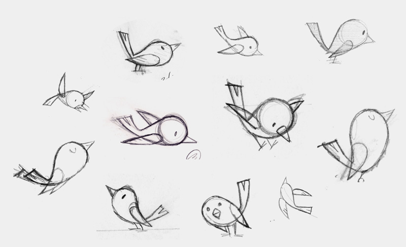
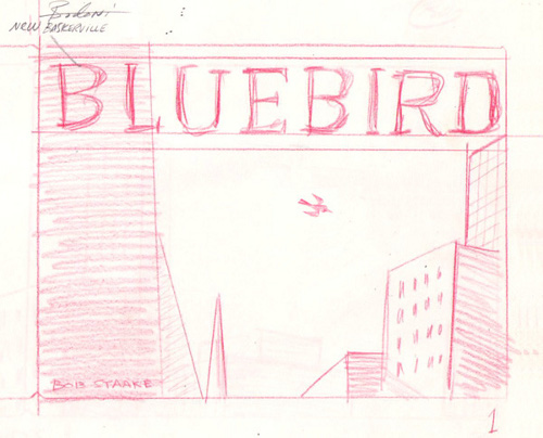
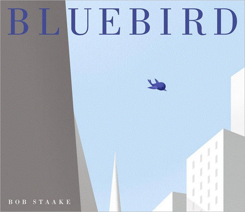
As a follow-up to my Kirkus Q&A last week with author/illustrator Bob Staake, today I’ve got a handful of images — some early and final pieces of art from both Bluebird, coming out this April from Schwartz & Wade Books, and Look! Another Book!, released at the end of 2012 from Little, Brown. Bob is also here to explain how he responds (on some books) to insanely tight schedules. (Note for Staake fans: He’s got a site up that is especially for Bluebird. Here’s the link.)
I’m also including one question and response that I didn’t have room for over at the Kirkus Q&A.
Let’s get right to it.
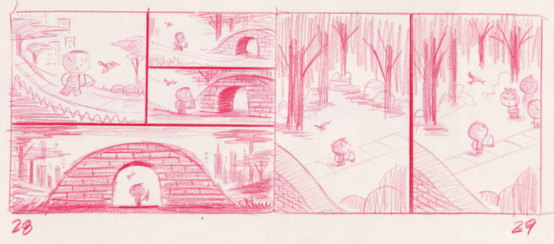
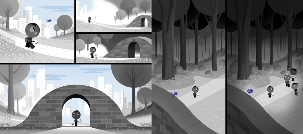
(Click each to enlarge)
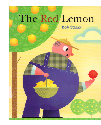
 Bob (on Look! Another Book!): My work schedule is pretty insanely tight, so on some books, I may often skip the sketching/dummy phase entirely. This was the case with The Red Lemon (Random House, 2006), in which no single sketch was created and I simply wrote the story and then went to final art.
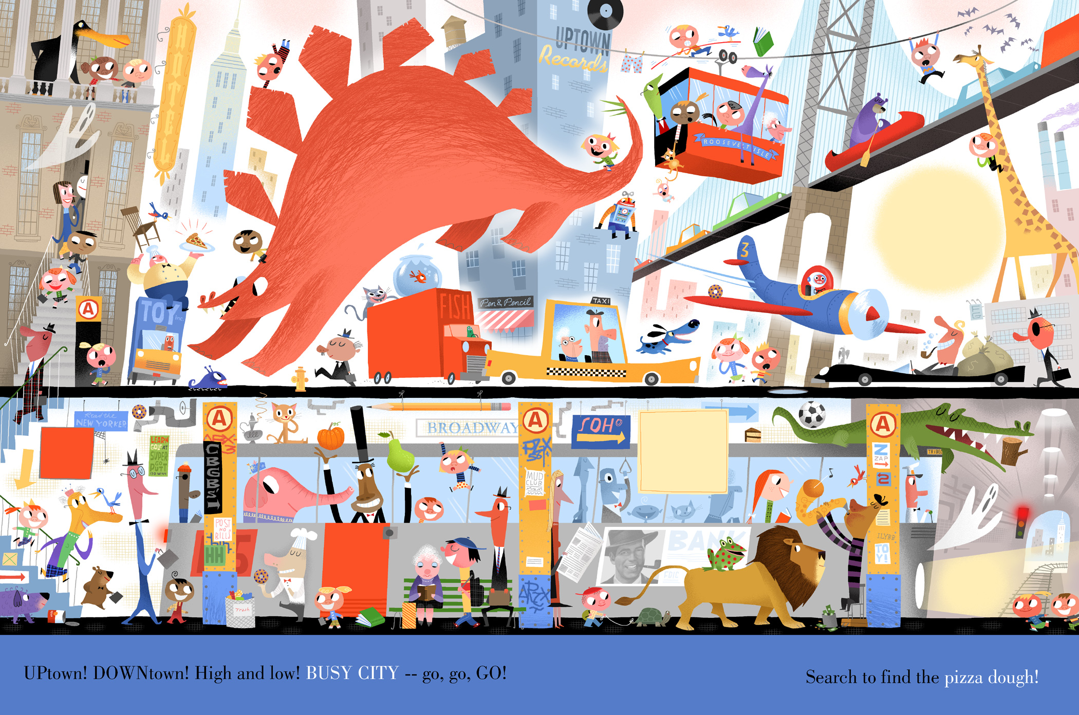
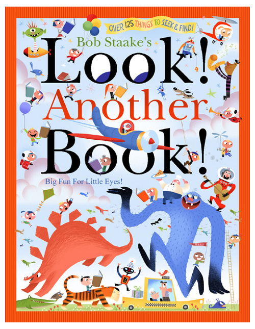
On Look! Another Book!, I explained to Little, Brown that I would have to work the same way and circumvent the sketch process. I did create a sketch for the city scene to demonstrate the complexity level of my art, and since we already had Look! A Book! (2011) behind us, they weren’t concerned about where I would take the final, color art.
When you compare this sketch to the final art [both pictured below], it is evident that I create a basic composition for a scene, but when I get in there with all the color, characters, and details, I try to take a more improvisational approach. For example, I somehow decided that a large pink stegosaurus would work better as a visual anchor than a jolly green giant. The sketch and the final art evoke the same level of frenzy and excitement, but I leave plenty of room for me to derail and go off course. Working this way keeps me engaged — and surprised.
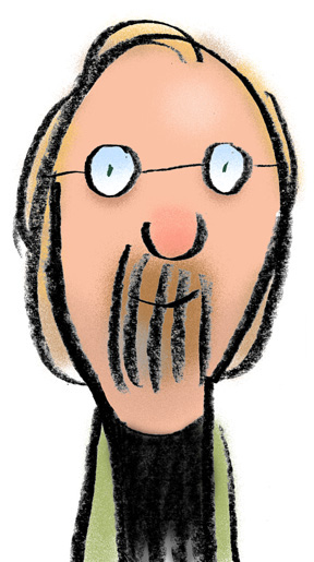
[Ed. Note: Pictured above is what Bob calls his “self-deprecating self-caricature.”]

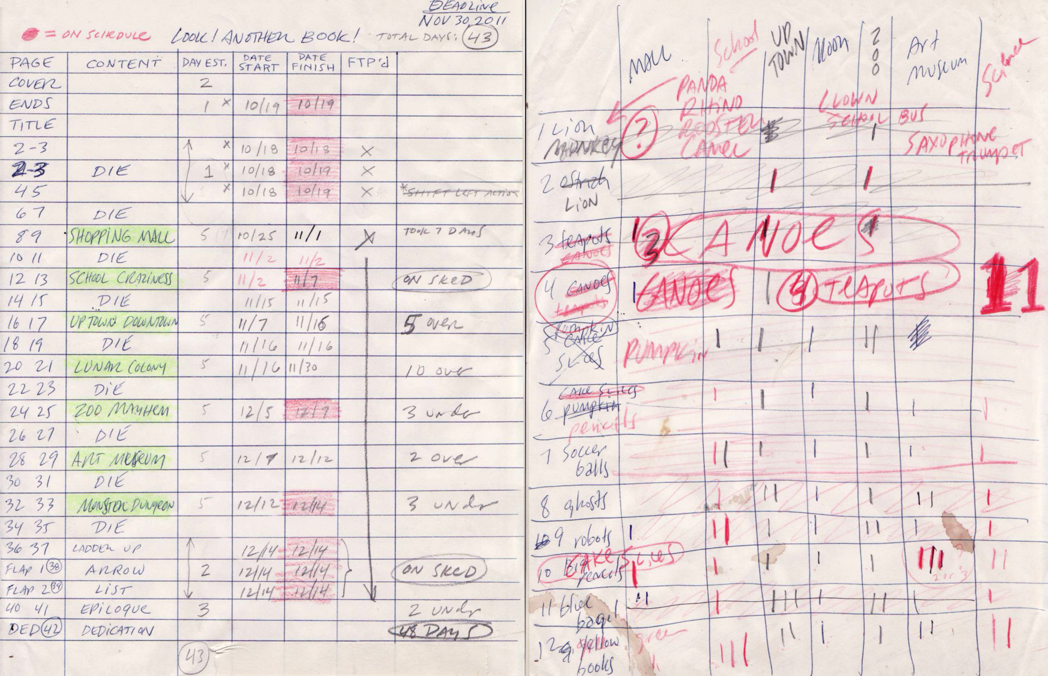
If you study Look! Another Book!, you can see that it required some very meticulous planning and production tricks — more so than my typical picture books. For example, the die cuts need to each work in three very distinct ways — revealing one image, then essentially disappearing, then revealing yet another image. I look at my dummy for the book, and I wonder why my head didn’t explode when I worked out all those mechanics. Additionally, I only had a short window in which to create all 32 pages of art (43), so it was essential for me to estimate and track my progress. (You see on the chart that it took me 48 days to complete the book, five days over my estimate.) More importantly, with literally hundreds of little things—soccer balls, teapots, cake slices, etc.—hidden on all the spreads, I had to make absolute sure that I knew where they were, and the chart helped immeasurably here. Nothing is worse than a mother from Des Moines writing to complain that her little Billy found ten blueberry bagels, but can’t seem to find the eleventh!
One final question for Bob that didn’t fit in last week’s column:
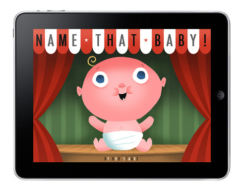
Jules: Tell me about Name That Baby, what you call your “picture ebook/app.” What do you find most appealing about creating illustrations for e-books?
 Bob: Anytime I would read The Red Lemon, The Donut Chef, or Hello, Robots to a classroom of first graders, they’d all giggle and laugh at the right spots, but then I would ask them if I could read them a story I was working on called Name That Baby. I’d start reading it, but I could barely get from one page to another, because the kids were drowning out the next bizarre baby name with laughter. This would happen every time I read the book, so I knew I had something.
I decided to finish the book and pitch it, but virtually every house I took it to worried that it just read “as a list of goofy, insane, totally-wrong baby names.” Exactly!
I held onto the book, sort of forgot about it, but then a company called DailyInteractive.com asked me if I would want to create a book specifically for the iPad. They loved Name That Baby, so we produced it in time for the 2012 holidays.
Traditionally-printed children’s picture books should, and will always, do what they do best in terms of their considerable tactile appeal, die-cuts, pop-ups, and perfection as a vehicle of storytelling, but e-books will have their place as they exploit the power of animation, narration, music, and a more customizable user experience. That said, within five years we won’t be calling them e-books; they truly will be viewed as entertainment apps. And when this happens, I predict that traditionally-printed picture books will be recognized by parents for possessing even more uncommon value as a tool for nurturing a child.
BLUEBIRD. Copyright © 2013 by Bob Staake. Published by Schwartz & Wade, New York.
LOOK! ANOTHER BOOK! Copyright © 2012 by Bob Staake. Published by Little, Brown, New York.
All images used with permission of Bob Staake.

Thank you for posting more process images… they’re my favorite! What’s great (besides the obvious) about Staake in this post is his confidence in his own vision and LB’s willingness to “let him go” without a full, detailed dummy. I would guess that many illustrators (myself, included) know exactly what the final will look like and wish they could skip the detailed dummy all-together… he’s certainly proven his talent and earned it!
Good morning, birdies, books, and Imps!
Hilariousnessness!!! Love this post. And my children agree that Bob’s books are super funny.
For some reason artists’ deadline charts are always interesting! I posted Ronald Searle’s here: http://ronaldsearle.blogspot.com/2012/08/deadline.html
[…] Seven Impossible Things Before Breakfast „When you compare this sketch to the final art [both pictured below], it is evident that I create a basic composition for a scene, but when I get in there with all the color, characters, and details, I try to take a more improvisational approach. For example, I somehow decided that a large pink stegosaurus would work better as a visual anchor than a jolly green giant. The sketch and the final art evoke the same level of frenzy and excitement, but I leave plenty of room for me to derail and go off course. Working this way keeps me engaged — and surprised.“ […]
Thanks for this article. Bob is one of my favorites for drawing, design and ideas, but it’s a lot to take in before breakfast. Bob inspires me and often knocks me off my pins. Bad for the digestion.
[…] including his new picture book, Bluebird, released just last week. After I chatted with him, he stopped by here to share a few […]
[…] a lovely interview with Bob Staake over on Seven Impossible Things Before Breakfast. I always love seeing process evidence, and Bob has posted a lot of it over the years. One shocker […]
[…] a lovely interview with Bob Staake over on Seven Impossible Things Before Breakfast. I always love seeing process evidence, and Bob has posted a lot of it over the years. One shocker […]