Solving Puzzles with Jonathan Bean
 March 25th, 2014 by jules
(Click to enlarge)
Just last week at Kirkus, I wrote about two new picture books that are about children and their families moving. After that posted, did you hear me smack my forehead way over here in Tennessee for having completely forgotten to include Deborah Underwood’s Bad Bye, Good Bye (Houghton Mifflin) in that post? Illustrated by Jonathan Bean, 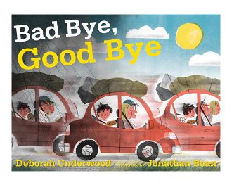 it’s a wonderful picture book with a spare, rhyming text about the range of emotions children can feel when moving away from friends to a new home in a new location. The book’s strength, writes the Kirkus review, “is in the emotional journey that’s expressed with a raw honesty.” It’s true, oh-so true. Look closely, if you get a copy of this in early April, when it’s released. The boy whose family is moving rages on the day they get in the car to drive away. Be still, my heart. (No fear. Things are looking up for him at the book’s close.)
One of the reasons I think I forgot it, though, is that I knew I’d be doing a post in the near future about, in particular, the illustrations for this book. And the illustrations are captivating. I mean, what Bean does with the depiction of light alone in this book … wow.
Regular readers of my blog know I always like it when Jonathan Bean visits to talk about how he creates the illustrations for his books. In this one … well, here’s what Jonathan had to say about it:
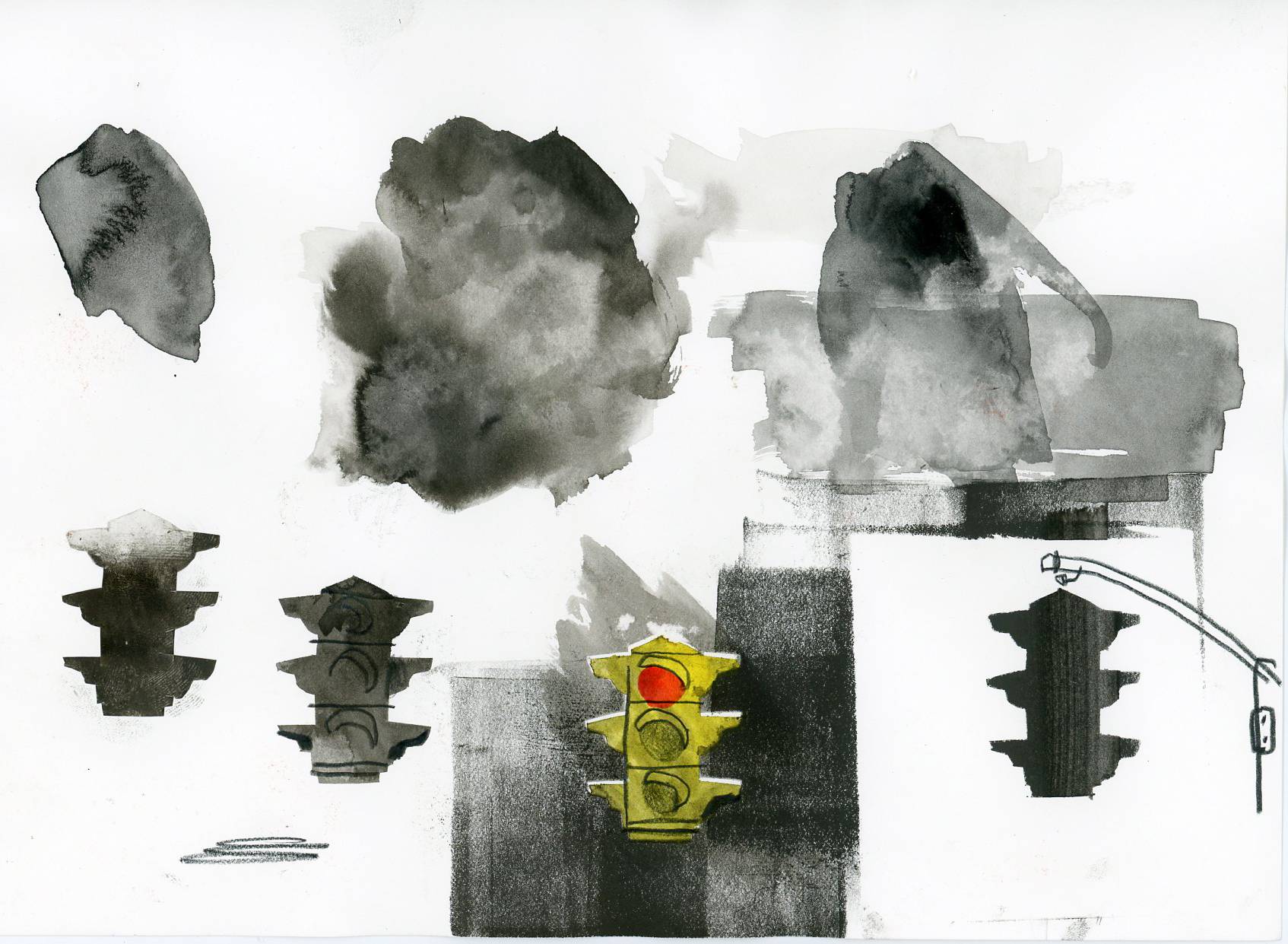
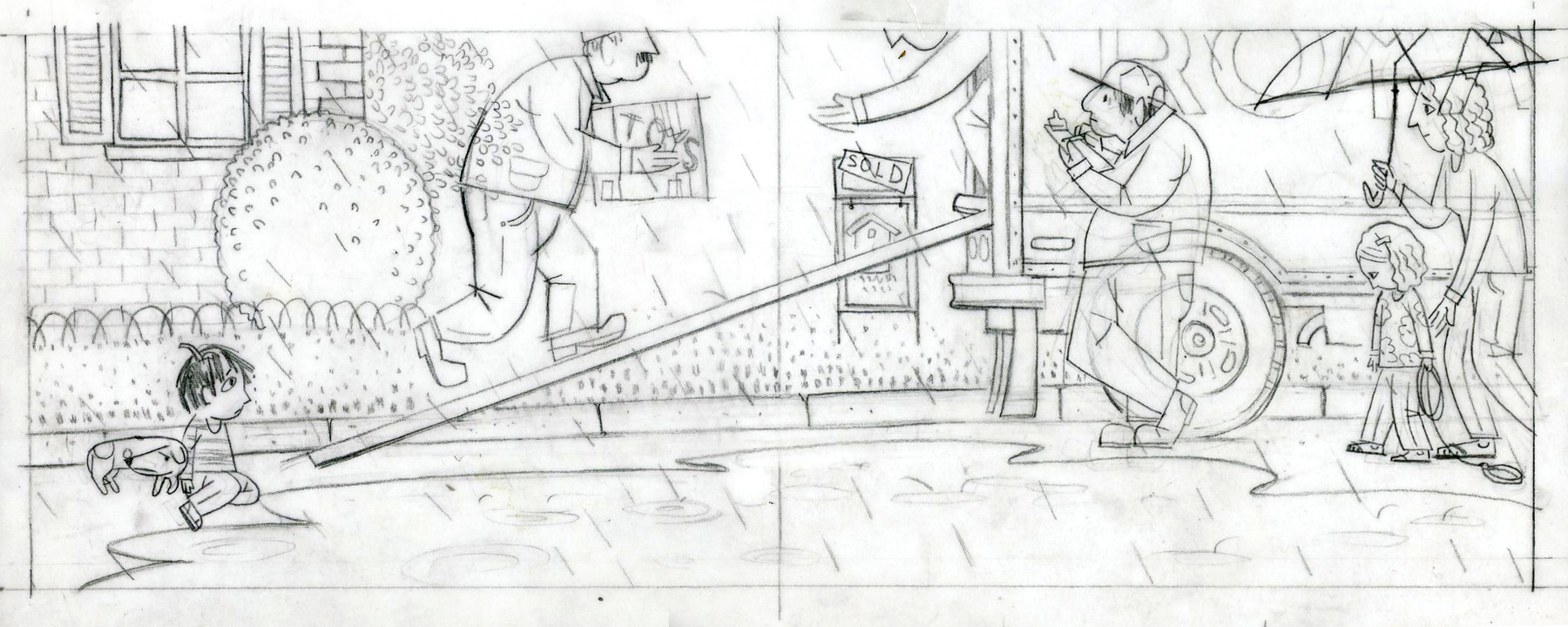
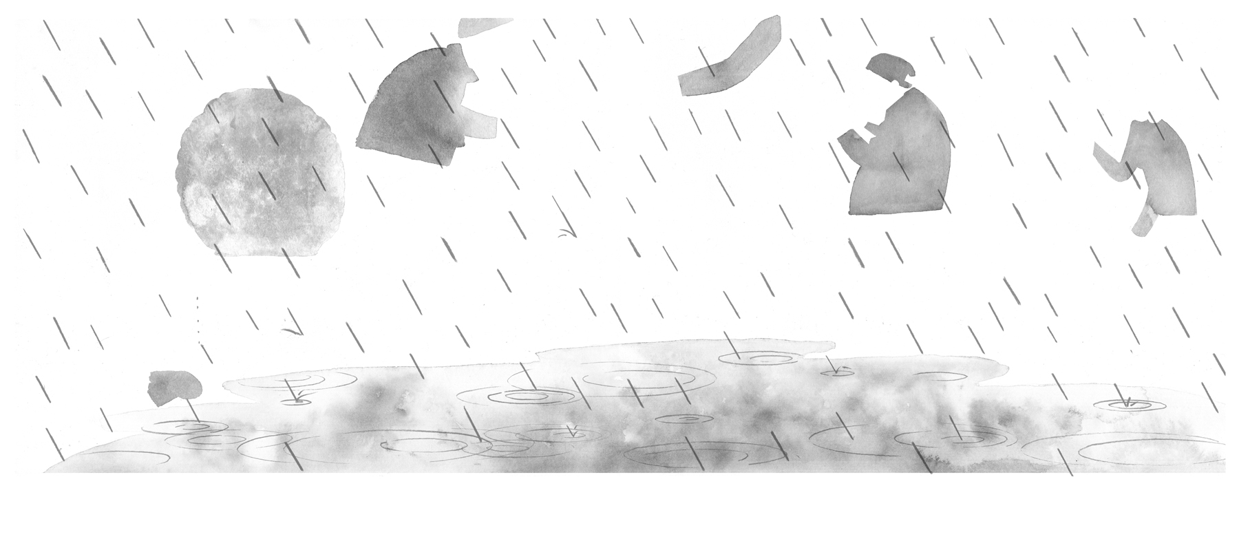
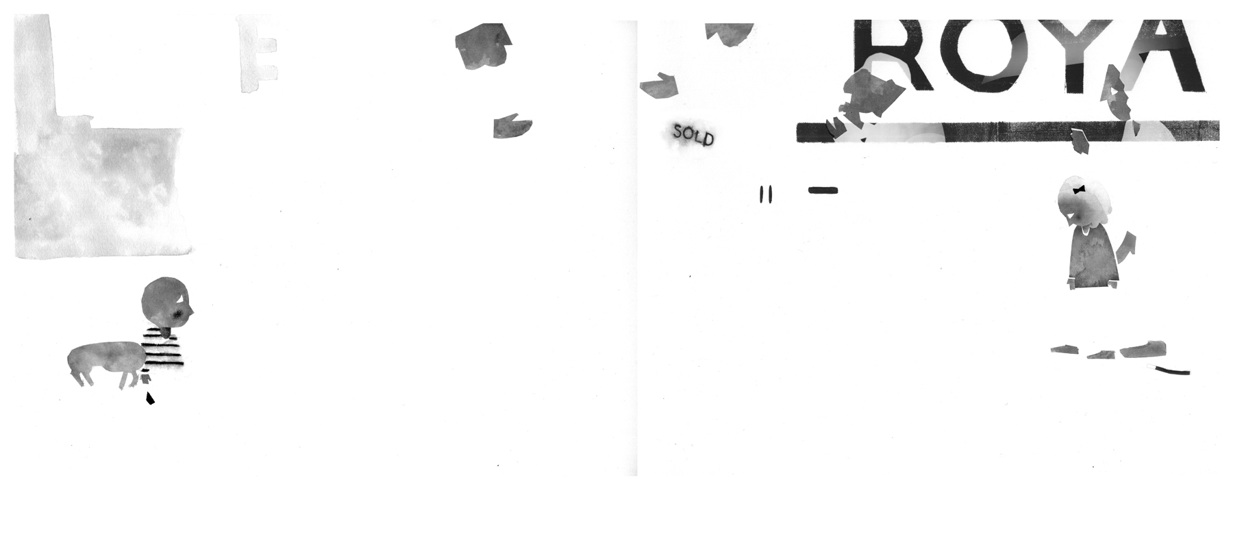
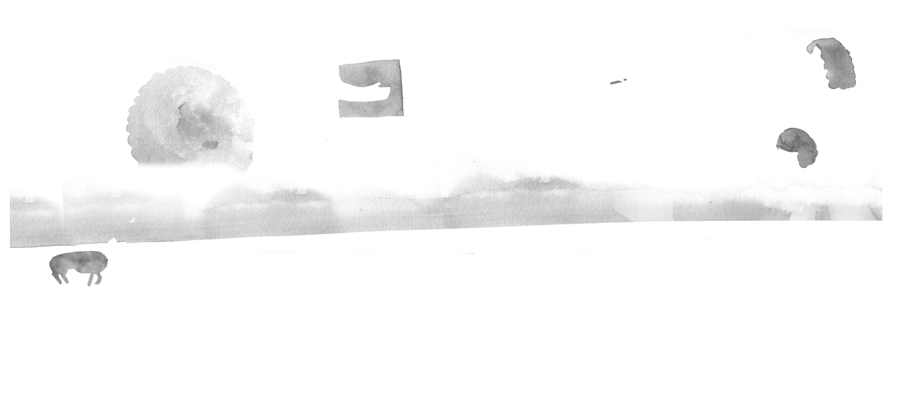
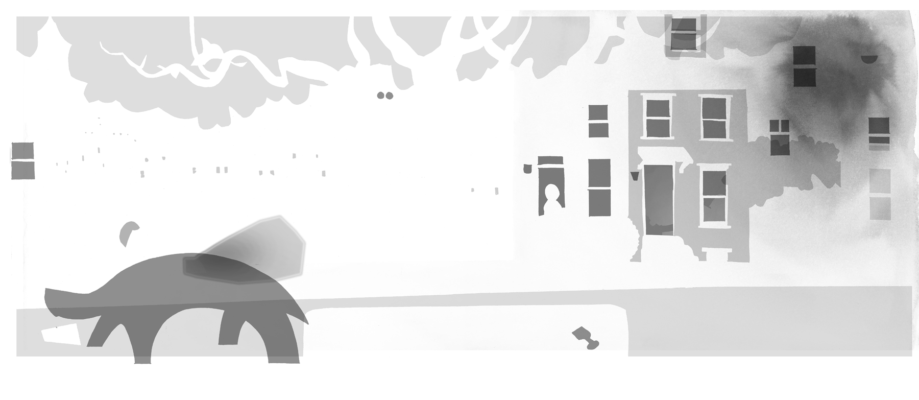
The illustrations are made in a somewhat old-fashioned way. Instead of pre-set CMYK colors (cyan, magenta, yellow, black), I picked Pantone colors from a book of paint swatches, similar to what you find in a home paint shop. This allowed me to create a particular mood, depending on the colors I chose. However, it also meant that it was my job to pre-separate the art (separate the illustrations into four colors, corresponding to the traditional CMYK.) This was a lot like solving a complicated puzzle, since each illustration required four paintings, a separate painting in black and white for each color. The rewards for the extra hassle are consistent and deeply saturated colors throughout the book — an effect CMYK can’t match.
Jonathan offered to talk a bit more about his process for creating these illustrations, but I think that covers it, and as I told him, I like to let the art do the talking anyway. That said, if anyone has further questions about his process, I think Jonathan would be happy to continue the conversation in the comments.
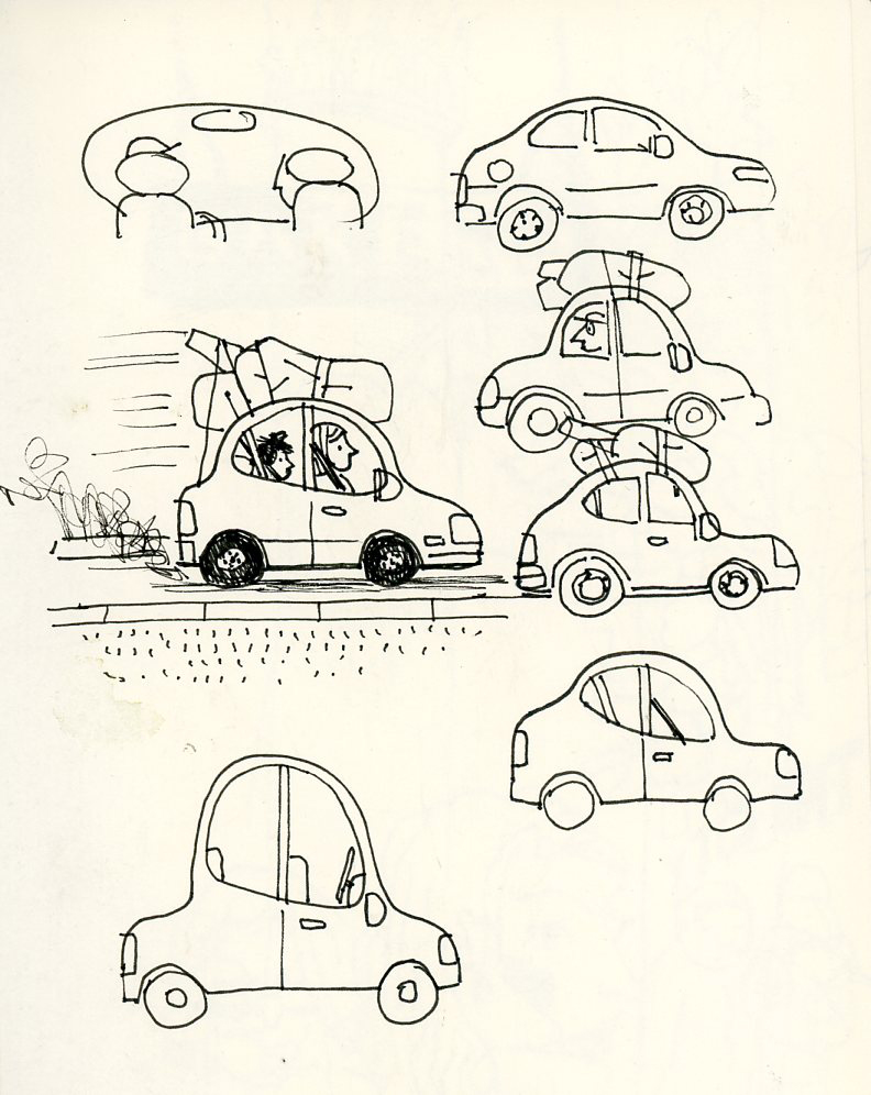
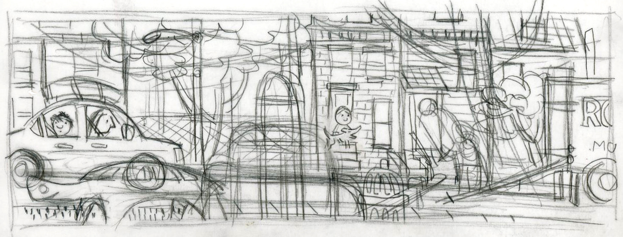
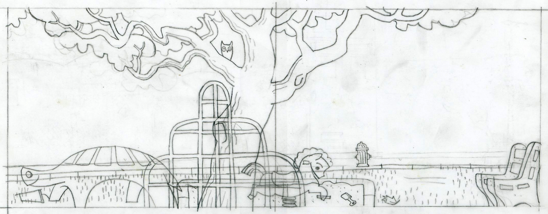
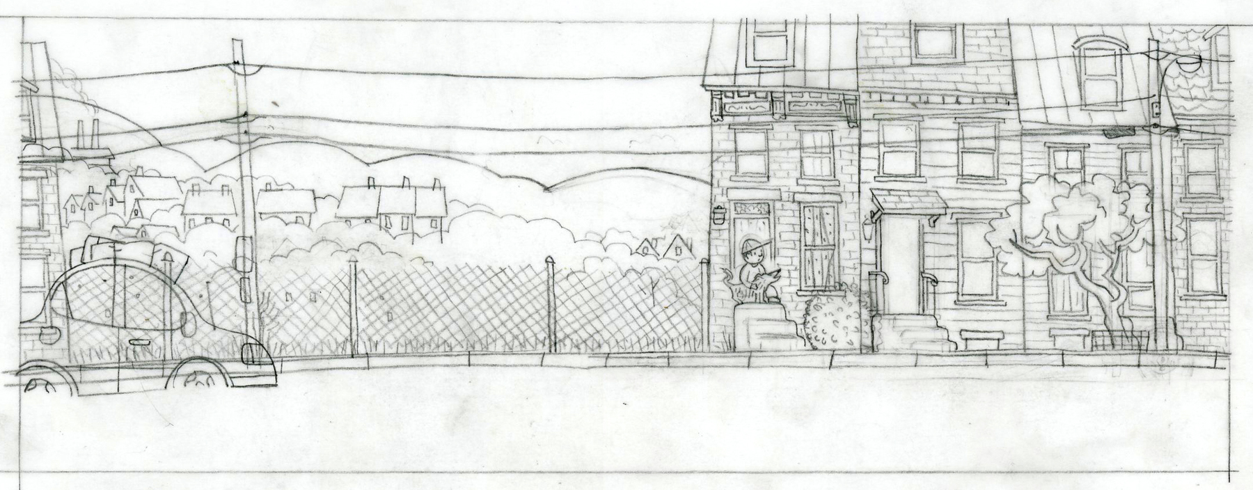
Enjoy the art and sketches below …
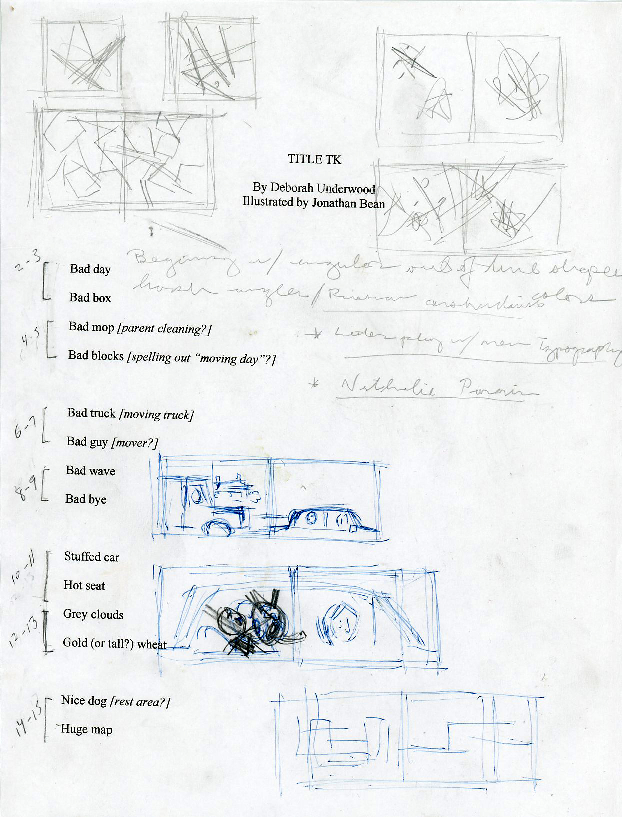
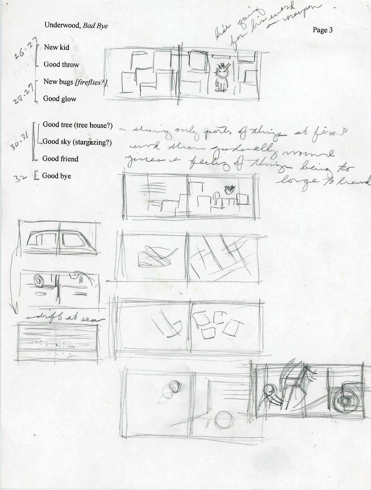
(Click each to enlarge)
(Click to enlarge)

(Click each to enlarge)

(Click to enlarge)
(Click to enlarge)
(Click to enlarge)
(Click to enlarge)
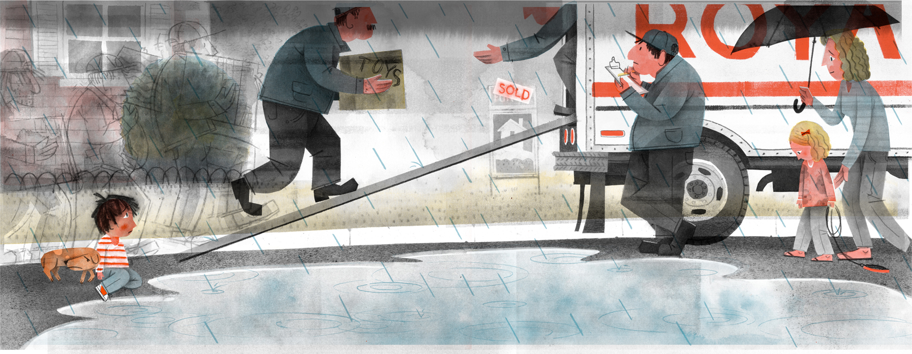
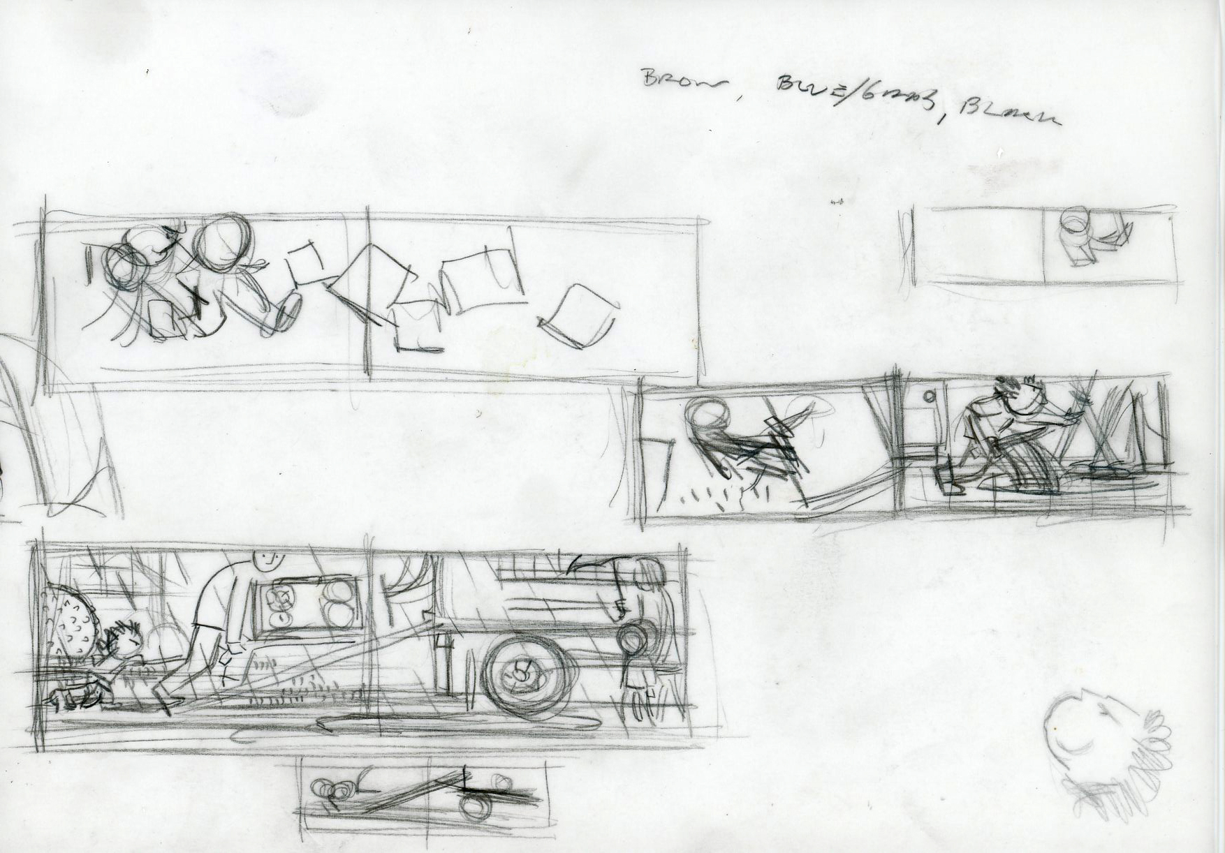
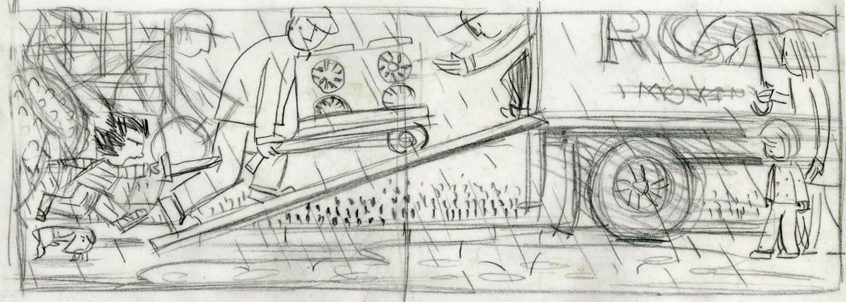
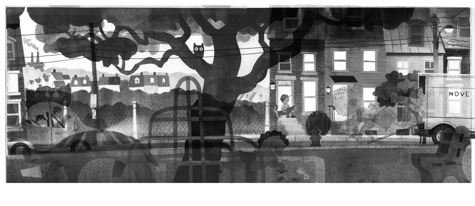
Moving spread — everything combined
(Click to enlarge)
(Click each to enlarge)
(Click to enlarge)

(Click to enlarge)

(Click to enlarge)
(Click to enlarge)

Park spread — everything combined
(Click to enlarge)
BAD BYE, GOOD BYE. Copyright © 2014 by Deborah Underwood. Illustrations © 2014 by Jonathan Bean. Published by Houghton Mifflin Harcourt, Boston. All images here reproduced by permission of Jonathan Bean.

You have no idea how much I love to see all this artwork. It’s interesting beyond measure to see the evolution of illustrations. Thanks to Jonathan and Jules.
These are unbelievably rich and beautiful! Are the black and white paintings for the black and blue layers created digitally or traditionally, or a combination? and do you create a full color version of the painting and then reverse engineer to determine the black and white layers? is it educated guess work or formulaic? and what is the relationship to the pantone colors? ok, jonathan, sorry to bombard you with questions. I just absolutely love these images.
Ariana, I’m glad you like the illustrations! The black and blue layers are painted on watercolor paper with black ink or paint. The same is true of the yellow and red layers. Though, if all I needed was a flat tone of color, I often outlined the shape and then filled it in Photoshop.
One of the reasons I like working this way is that it makes me very conscious of color. As early as the sketch stage I think about what colors will go where and how to get the effects I’m looking for. Of course, there are both happy and exasperating surprises. That’s where the Photoshop preview comes in so handy. I marvel at the skill of artists who made books this way when the only preview was first proofs!
Pantone colors work by percentages. If I paint something flat black, it will be very close to 100% of whatever pantone color I’ve chosen; a 50% gray will be a half tone of the same color and so on. Of course, when you lay a 50% blue over a 50% yellow you get a green, and this is where the fun really begins!
Hope that’s helpful!
I LOVE Jonathan’s rich, sumptuous, yet simple and essential work…and I have learned a lot to boot! So cool to see these! Thanks you.
These are absolutely amazing! This is up there as one of the most beautiful AND interesting and informative posts ever… (which is saying a lot, since I do love this blog). Is it all watercolor and photoshop, or is there any pencil or printmaking? (Like the black floor in the image with the men loading the moving van? Or the early media study with the traffic light?) Thanks for sharing your process Jonathan. It’s a treasure.
Yowza – this is fantastic! I would never have understood what was done without these images and explanations. Just so cool. I love Jonathan Bean’s work, art, books. . Great posting – thanks so much, Jules. I also enjoyed his explanations to Ariana.
Wow–nifty! I love seeing the progression. Just put this on my tbr list–thanks!
Thanks so much, Jonathan, for your detailed response! Still seems like there is a bit of magic thrown in the mix as well. Truly gorgeous.
This is remarkable and mesmerizing and crazy gorgeous.
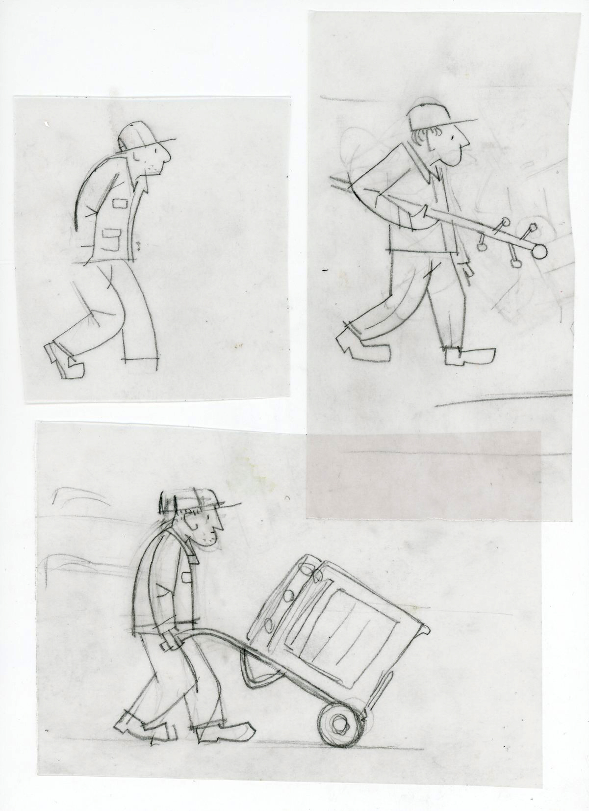
Corinna, Thank you for your interest and question! I did use a black Prismacolor pencil for the line work. The texture you see that looks like it’s related to printmaking IS in fact related, but inversely. Many of the shapes, including watercolored shapes, were created using frisket film, a kind of masking medium. In the case of what looks like printed texture, I cut the shape I wanted from the frisket, then, instead of laying down a wash of watercolor, I ran a brayer loaded with black ink over the stenciled shape. That’s what gives it the distinctive lino or woodblock print texture. I am particularly fond of this effect because it has a kind of asphalt feel to it, appropriate, I think, for a book about travel and moving.
Brayer, ink, and frisket! Amazing to hear your process Jonathan. I’d relied on deliberately bad xerox for asphalt texture in the past. The texture in these is incredible!
The colors are so luminous! I especially love the contrast in the park spread, with the cool on one side and warm glow in the windows on the other. So great to see all of these steps and then the final product. I’ll definitely share this with my students. Thanks so much for this fantastic glimpse into the process! What a beautiful book!
Really lovely illustrations… And so cool to see your process Jonathan! 🙂
I loved every bit of this – thank you Jonathan and Jules – such a treat to see manuscript doodles, stencils, texture, all combining to beauty and “good glow!”
Hi Jules and Jonathan!, What a great interview Jules, and thanks Jonathan for sharing so much of your process. It is amazing! As well as the book!
Travis Jonker’s 100ScopeNotes alerted me to the fact that I’d missed this interview. I love Jonathan’s work. I am absolutely crazy about the last spread featured. BEAUTIFUL.
Wow! Just wow! Thank you for these illustrations, and this book.
This is absolutely wonderful! I’ll be exploring this more and THANK YOU for your generous sharing of all these facts, and your book. Such a treat!!!
[…] this book months and months ago when Jules Danielson interviewed the illustrator, Jonathan Bean, here on her blog. Go and read the link, because his explanation of color separation (old school!) is […]