Owl Sees Owl, and I See Rob’s Sketchbook
 September 27th, 2016 by jules
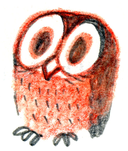
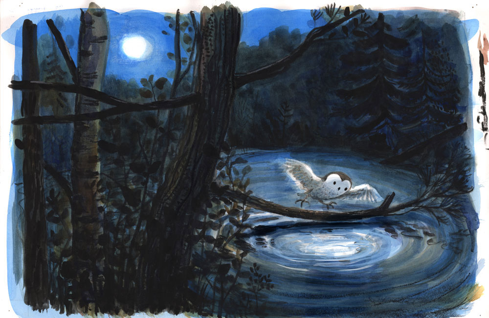
Illustrator Rob Dunlavey is here this morning to talk about creating the illustrations for Laura Godwin’s Owl Sees Owl, released this month by Schwartz & Wade. (Pictured above is an early sketch.) Godwin constructed this story of an owl’s night-time adventure (home, journey, and home again) in the form of a reverso. The text is spare and the illustrations, wondrous. It’s a story possessing a quiet, lovely restraint, and I find that with repeated reads, I spot something new and rewarding.
As you’ll see in some of the images below, it’s also a fitting book for the arrival of Autumn. (To read more, head here to the Horn Book, which featured its starred review of the book as this week’s Review of the Week.)
I thank Rob for visiting to give us a peek into his sketchbook and show some final art. Let’s get to it.
[Incidentally, I got to meet Rob earlier this month, while traveling, and see his sketchbooks in person. Needless to say, his sketches are even better up close and in hand.]
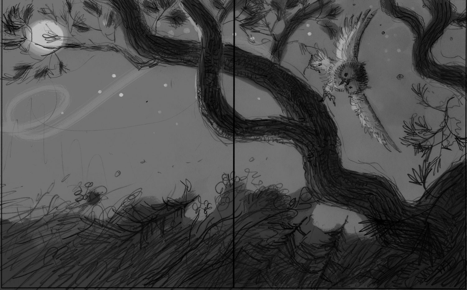
Rob: In the summer of 2014, I received the green light to begin work on Owl Sees Owl from my agent and the wonderful staff at Schwartz & Wade. Owl Sees Owl was the third book I’d illustrated for Lee Wade and Anne Schwartz. The text for the book, by Laura Godwin, is in the form of a “reverso” poem: four word stanzas proceed to a logical point, flip, and then are repeated in reverse word order. And since this book describes a baby owl’s solo night-time flight away from and back to its nest, the action based on the word order would be simple with the words carrying subtlety and potential. The action I would suggest and the character development would have to be gentle and logical, yet possibly hint at larger ideas.
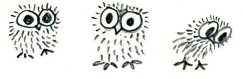
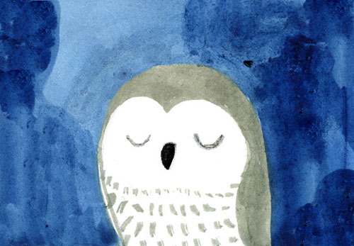
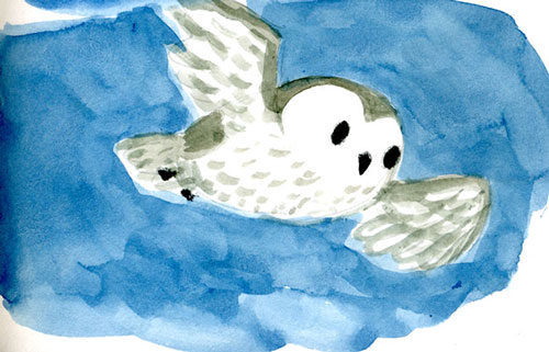
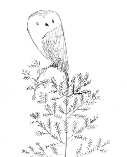
The main character is an owl, obviously. Who doesn’t love owls? And there’s no need to debate the cuteness of baby owls. I explored a variety of approaches to our Baby Owl:
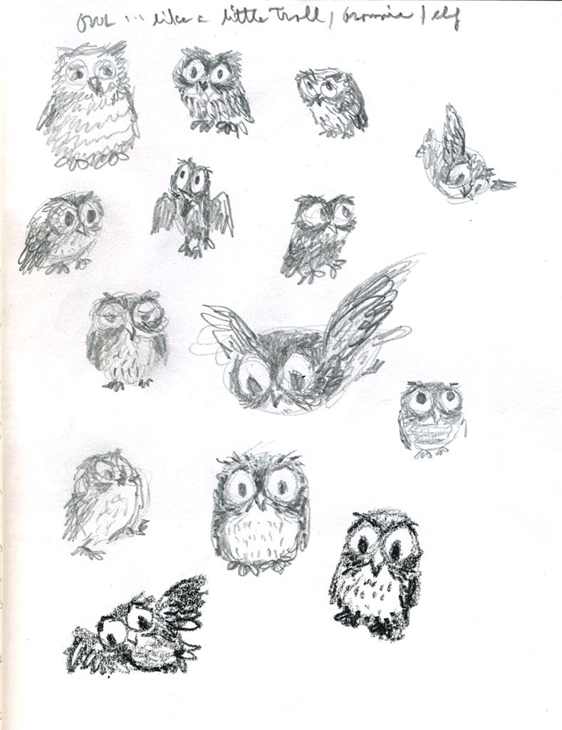
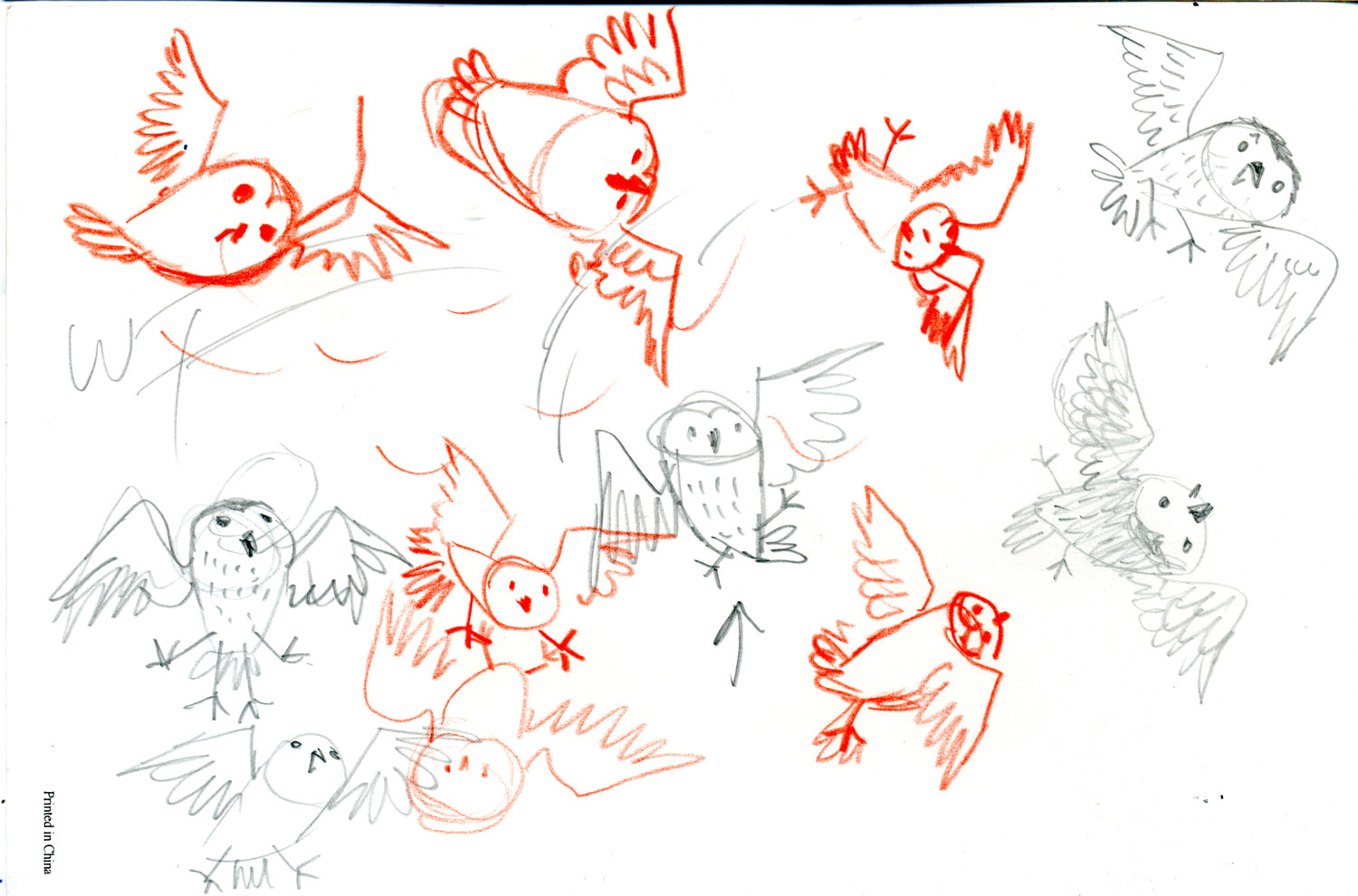
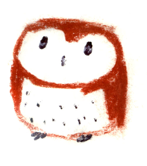
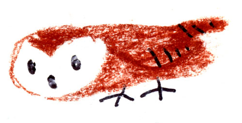
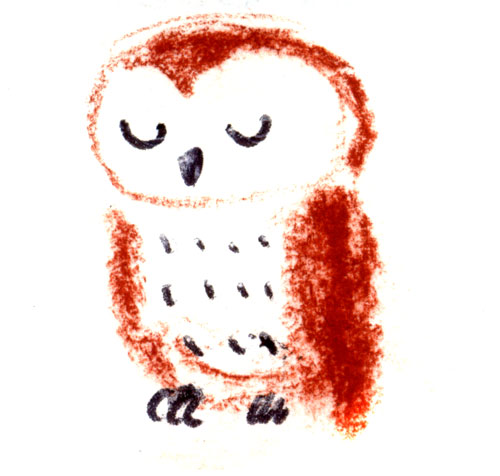
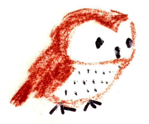
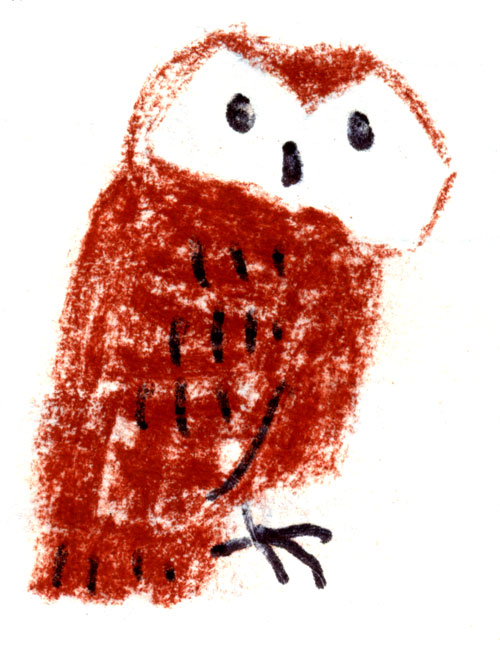
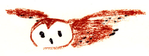
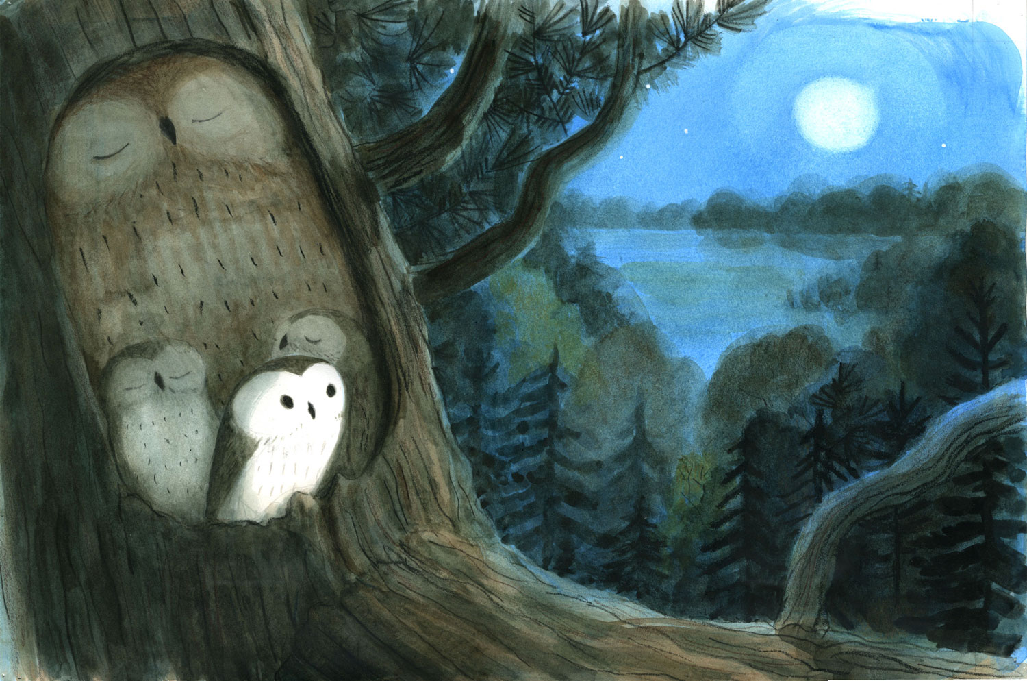
I doodled owls everywhere I went. These were done during meetings. I carried charcoal and chalk with me. By my third draft of the book, I needed to nail down some consistent approach to the owl. Keeping in mind the night-time mood of the book, I went for a watercolor approach.
Now, onto the story!
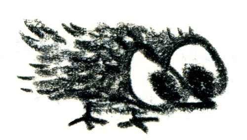
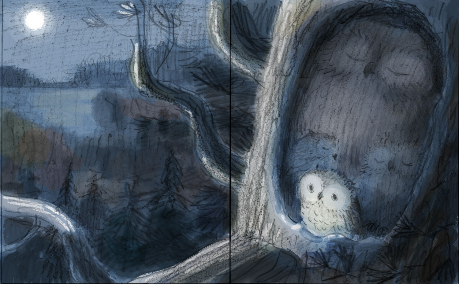
These accepted sketches also include the background (as simple as it is). This was a revelation to me: Little Owl wasn’t just a character; he was part of a larger story. A story of curiosity, freedom, night and his forest home. In my second draft, I explored mood and different camera angles. Little Owl was still kind of a big-eyed slapstick character.
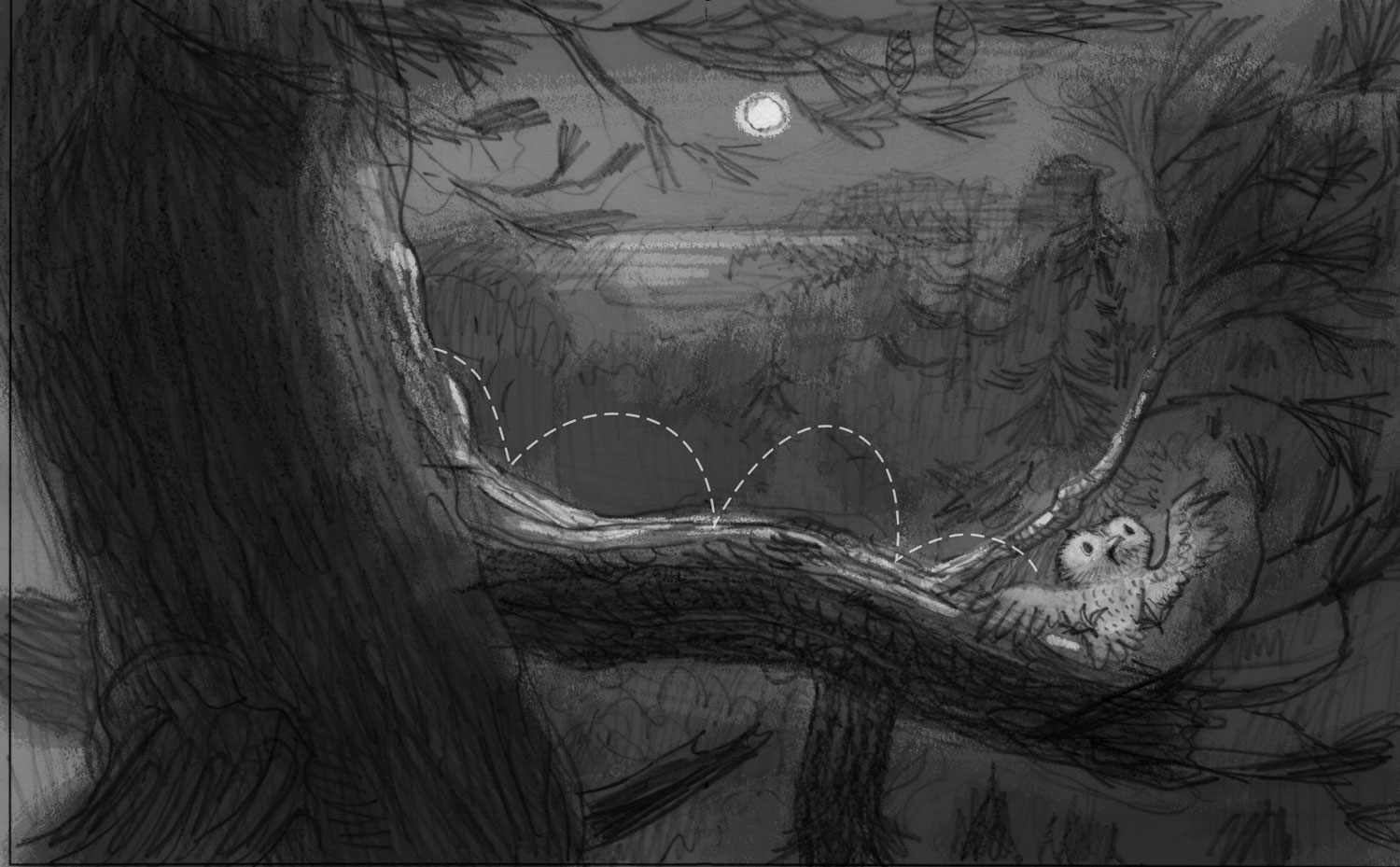
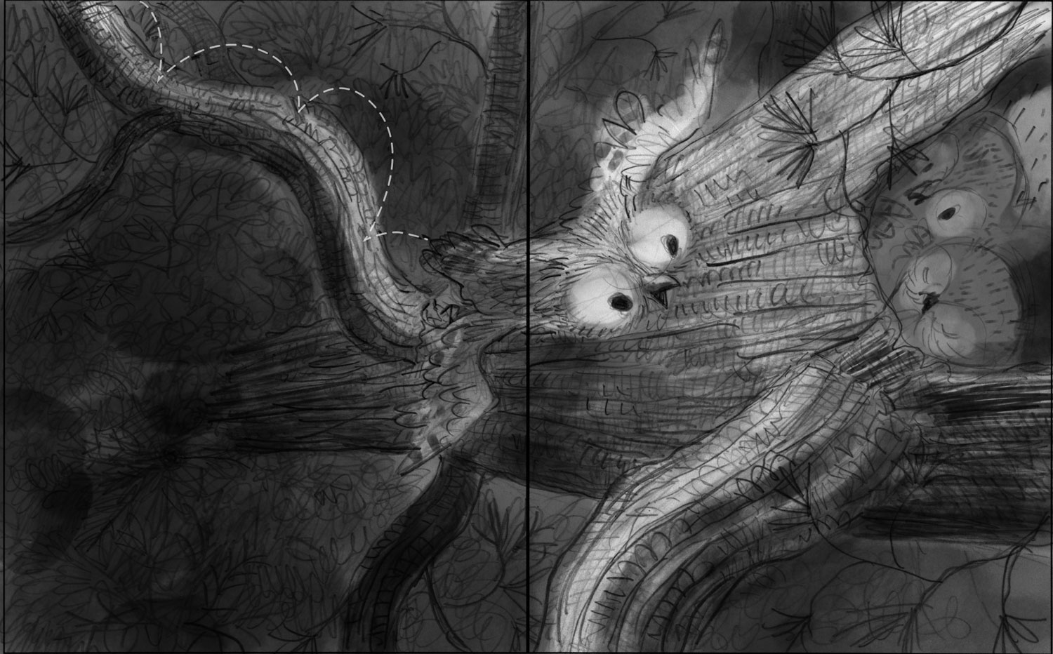
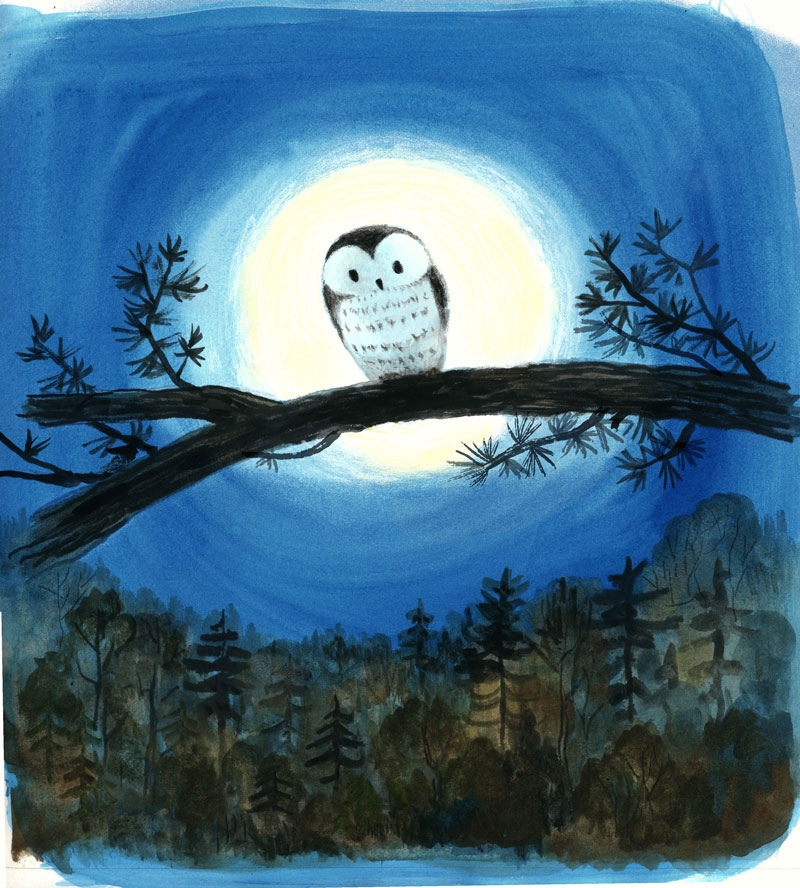
Designing where the text would break was pretty straightforward. The poem was written in groups of four words and hinged on the palindromic “Owl Sees Owl” stanza in the center. We tried several approaches to this climactic moment. With the final art accepted, Schwartz & Wade decided to break this stanza across two spreads. It was a fascinating choice, and it keeps me a bit off-balance as I admire the printed book. I read it aloud to a class this past week and it was pleasing to read “Owl” and let the suspense settle in before turning the page to see owl regarding himself … “Sees Owl.” And then the text rewinds to the inevitable return home.
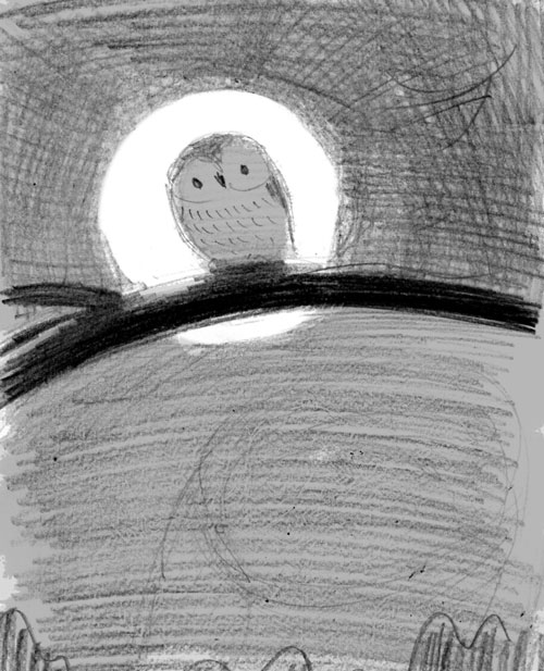
[Here is] an early sketch for the “Owl Sees Owl” spread of the book:
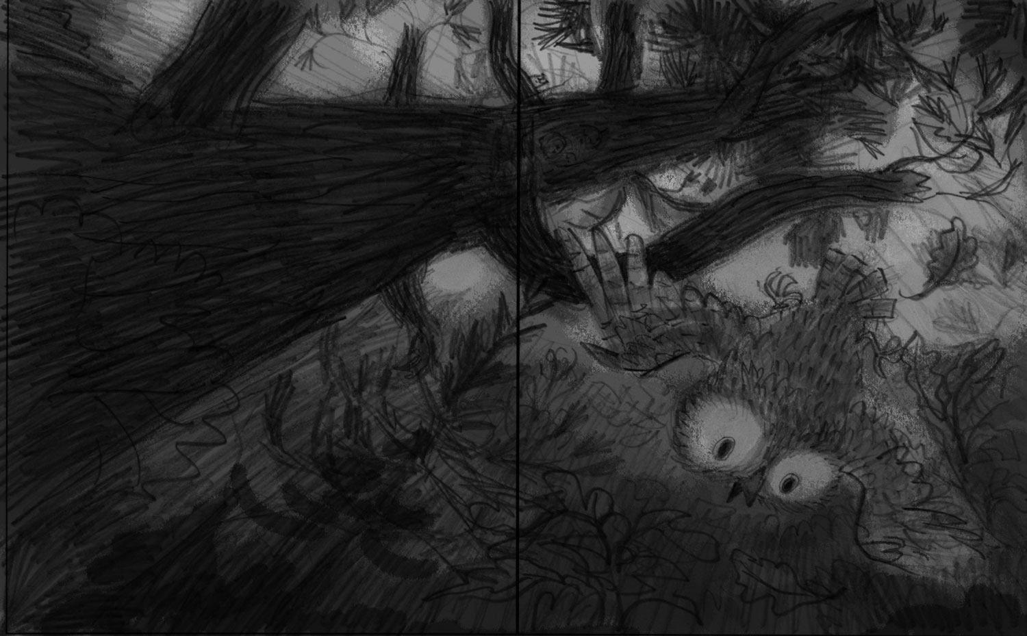
[Below is] another drawing with shading added with Photoshop. In both of these, the owl has a bit too much personality.
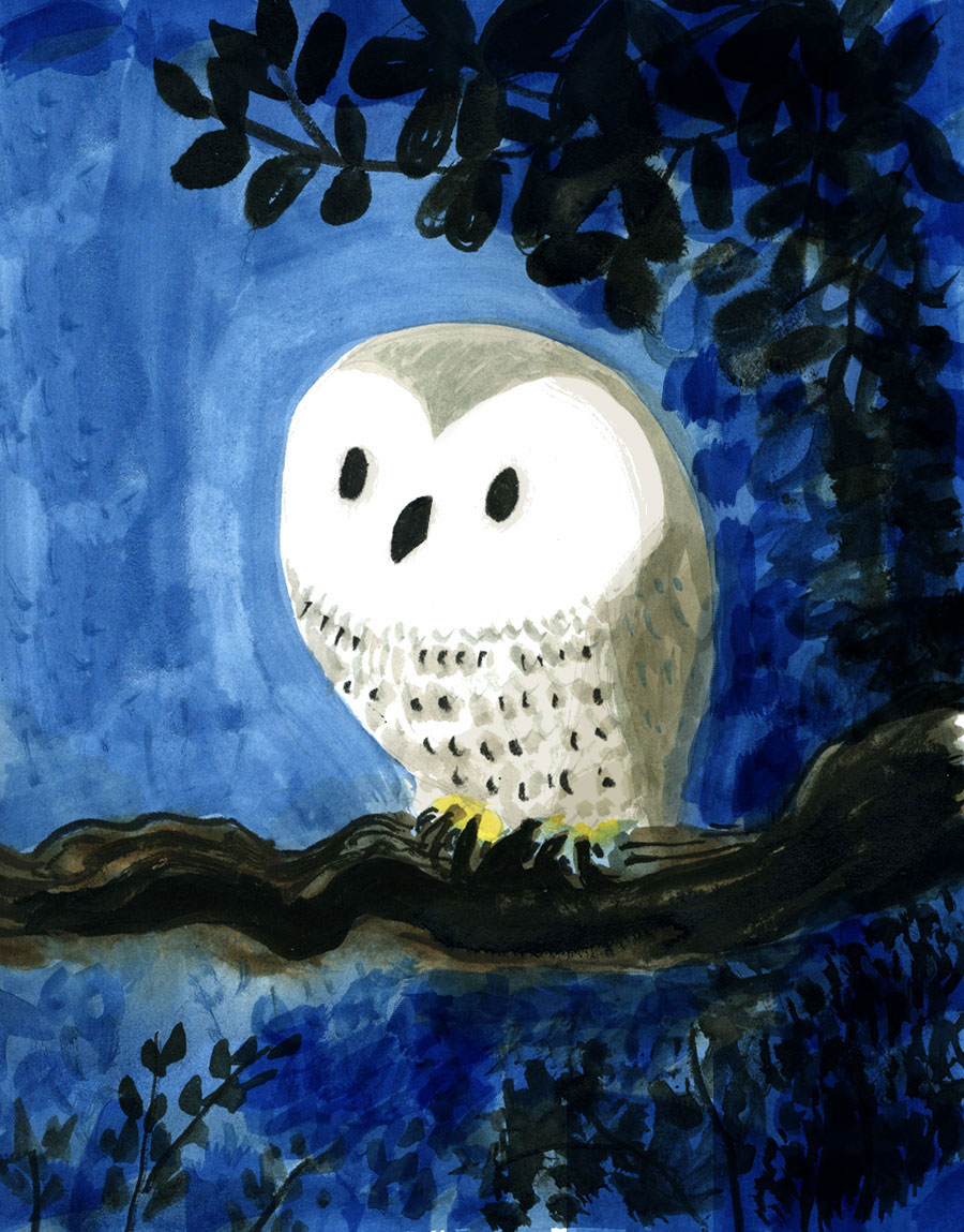
Below [is] the final illustration for this spread with details of the reflection removed. The text simply says “Owl.”
[As for] technique: All sketches were done in pencil at various sizes. Some were recomposed digitally. I did create a color draft of the book with digital color blocked out. The finals were an analog adventure. I printed the approved sketches at 100% and traced them to 2-ply vellum bristol paper. This was stapled to a board before painting with a variety of water-based media (watercolor and water soluble block printing ink or permanent ink). There is extensive drawing with inks, colored pencil, charcoal, chalk and crayons. I scuffed up the skies with sandpaper and made necessary edits in the 11th hour with Photoshop. There is a little collage used here and there too. Mixed media all the way with much experimentation that had to get folded into the final “style.” I tried to work in the same open-ended manner that I do in my daily sketchbook journals. There are many awkward moments and near disasters.
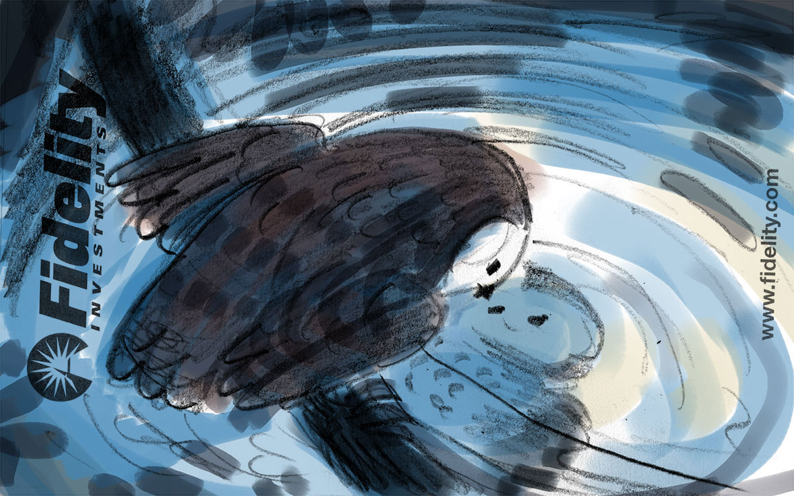

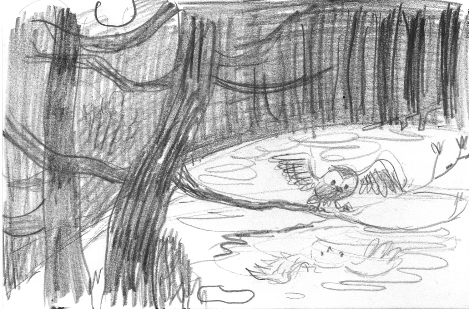
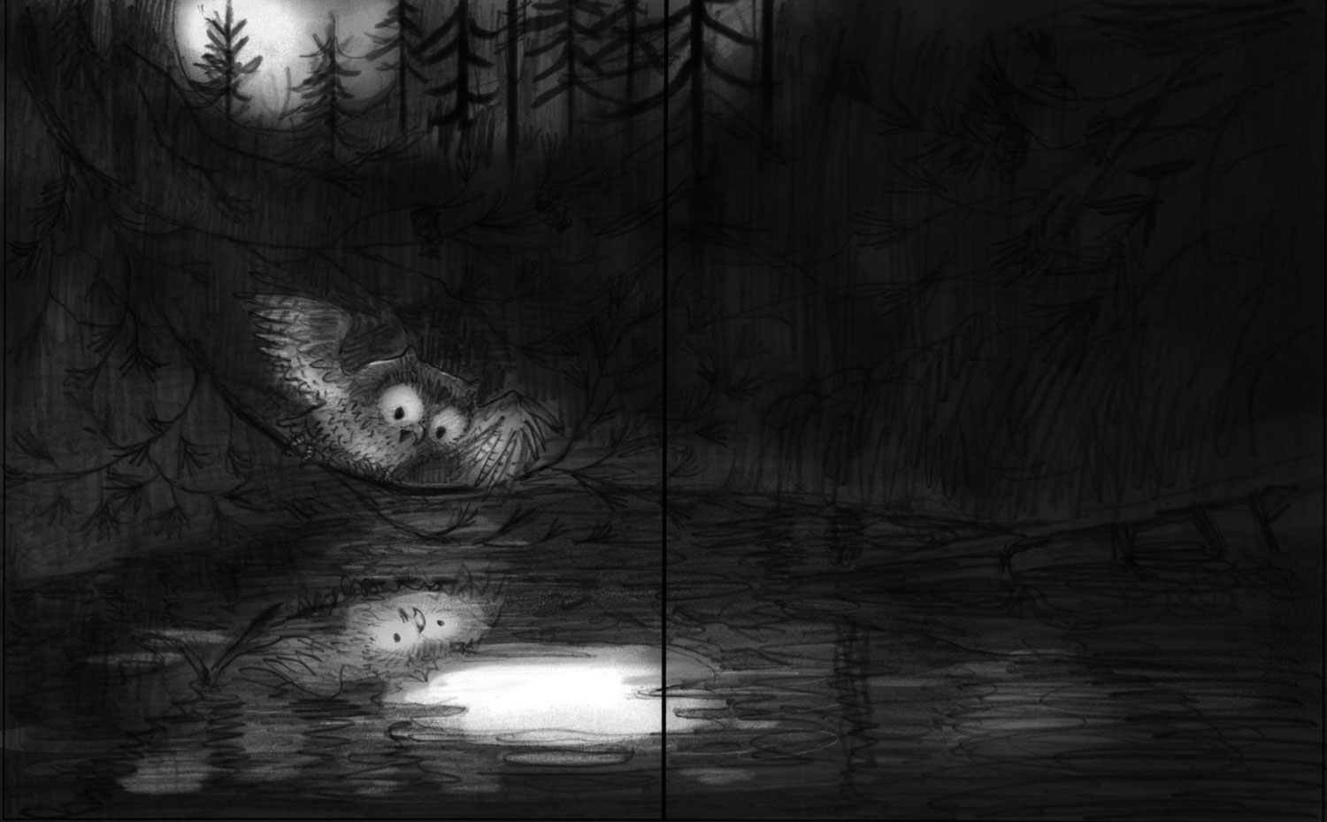
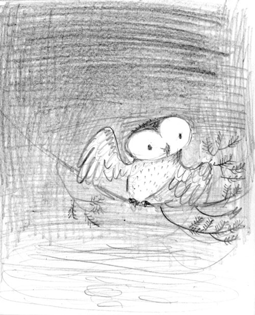
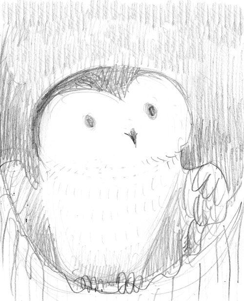
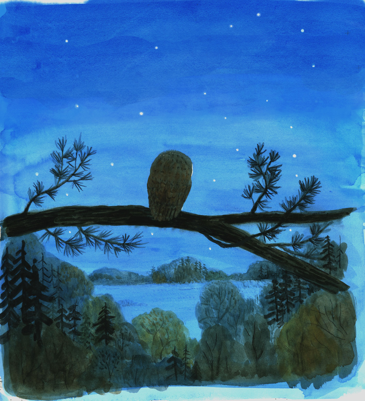
Right up against the production deadline, I was looking for better ways to show the moment when Little Owl sees himself. [Above] we are peering over his shoulder in a quick digitally colored sketch on some note paper. Below that is the final painting. The text for this spread is “Sees Owl,” and Rachael cropped it tightly so we can’t avoid Baby Owl’s interesting encounter.
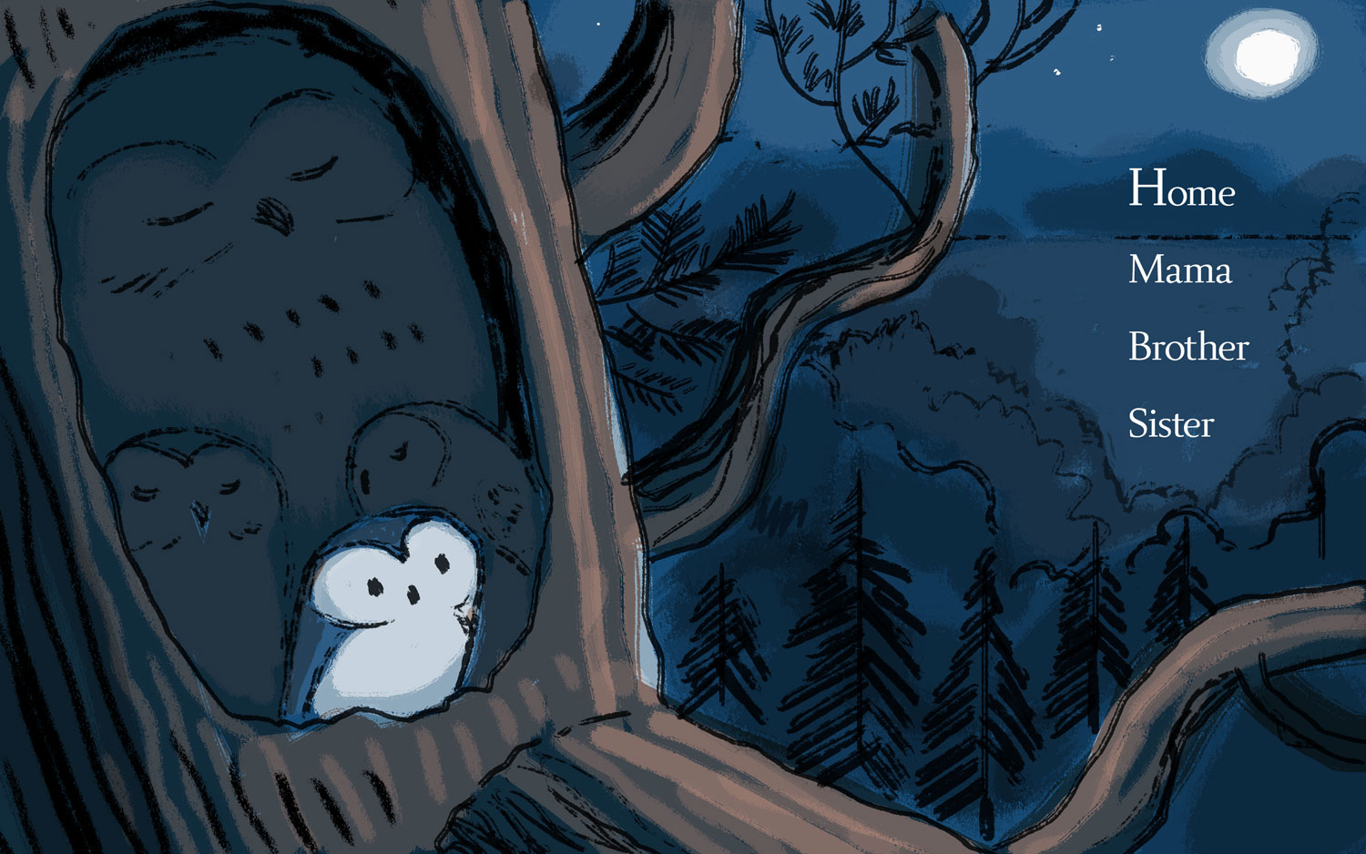
The opening spread of the book was decided in the first draft. Here is a first sketch digitally colored. Next is a digital color study, and we decided to flip the composition. Below that is the final illustration.
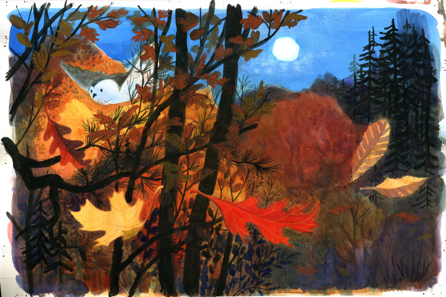
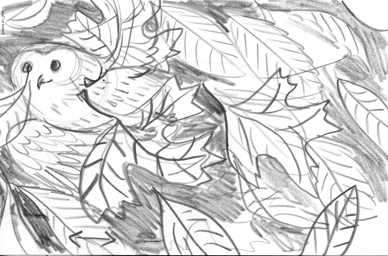
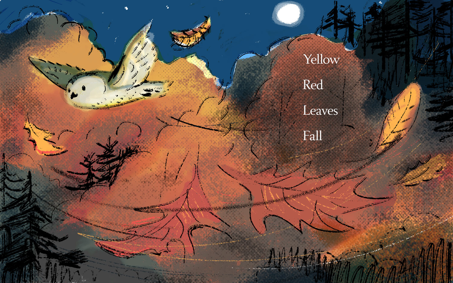
[Below is the] “Yellow Red Leaves Fall” final, pencil sketch, and another sketch with color added.
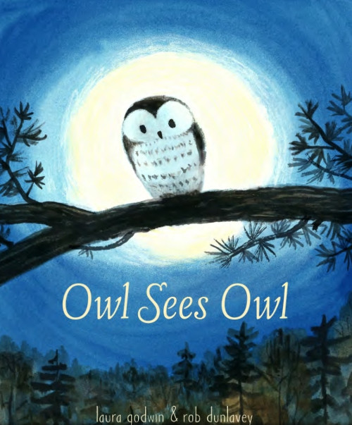
At some point, the cover needs to be designed. This came in the midst of my adventures with the interior illustrations. Here are a few sketches:
We agreed that the first one was the strongest. I really liked Lee Wade’s solution for the book’s back cover: a view of Little Owl from behind. The cropping and color were adjusted in production so they lined up exactly. For me, so far, book design and production are the combined efforts of a lot of people chiming in at just the right moment with an insight or idea that will probably make a book stronger and more compelling for the reader. And as an art form, there are so many nuances in the endeavor that it must be a positive contribution in some general way. Yes, there are agents and agreements, payments and deadlines, and personalities, but the end result can be magical. I hope that librarians, teachers, parents, and children can feel some of that in this book.
Currently, I’m preparing for an exhibit of illustrations and my personal work. It will be about birds.
OWL SEES OWL. Copyright © 2016 by Laura Godwin. Illustrations © 2016 by Rob Dunlavey. Published by Schwartz & Wade, New York. All images here reproduced by permission of Rob Dunlavey.

Beautiful intuitive art! I went to Green Apple Bookstore during lunch and picked up my very own copy. Thanks, as always, for the introduction!
Thank you Jules! It was such a special treat meeting you in Somerville and swapping stories. Thanks for your support for illustrators (and me!) over the years.
Wonderful!
Magical!
Breathtaking!
[…] That perspective’s aided by Rob Dunlavey’s gorgeous, warm, immersive artwork. (You can enjoy all the stages of its development here!) […]
I just loved this book! The art is elegant and beautiful, and I loved the simple beauty of the reverso text too.