My Heart: A Visit with Corinna Luyken
 January 16th, 2019 by jules
(Click to enlarge)
Over at BookPage, I’ve a review of Corinna Luyken’s newest picture book, My Heart (Dial, January 2019), which she both wrote and illustrated. The review is here, if you want to read about the things I like about this book.
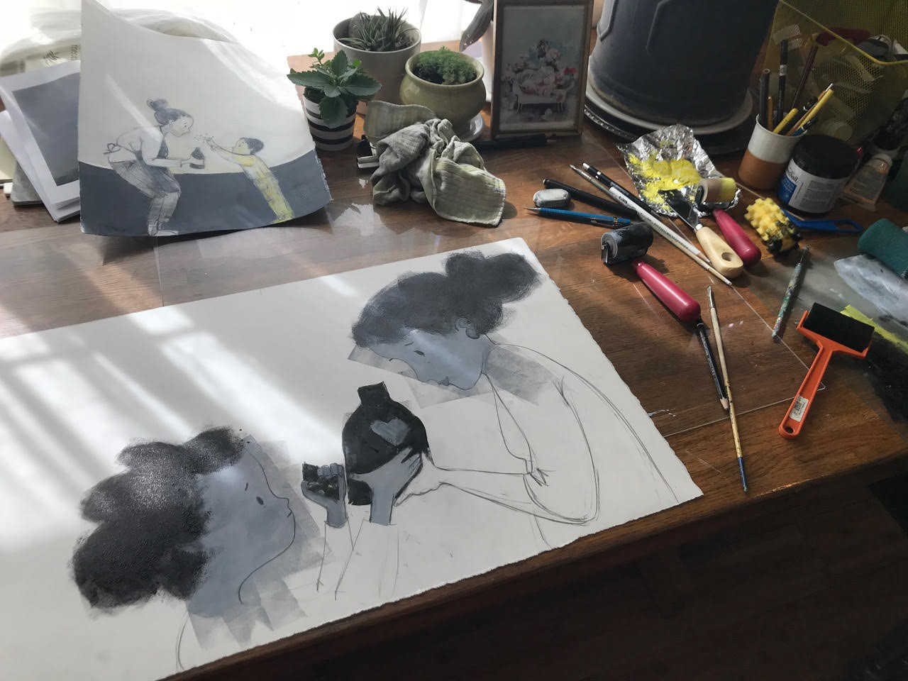
Corinna visits today with lots and lots of art (which makes me happy) to talk about illustrating this one and balancing the book’s emotions — its darkness and lightness, as she puts it. Let’s get right to it, and I thank her for visiting.

Corinna: My Heart began as a poem that I wrote a few years before I wrote The Book of Mistakes. Early on, it was illustrated with watercolor and ink — in a style more akin to Mistakes or Adrian Simcox Does NOT Have A Horse. Over the course of the next few years, I kept coming back to the project and each time I did, the images would change, shifting toward a darker, rougher, more textured look that provided a better balance to the rhyme and sweetness of the text.
And so the initial ink and watercolor gave way to a combination of watercolor and cut-paper, with cut-paper-stencil printmaking techniques added to the backgrounds. Eventually, the watercolor and ink disappeared completely, and the book became pencil (dark, smudgy 4B, 6B, and 8B pencils) on top of monoprint printmaking.
Monoprinting is a printmaking process that uses plexiglass plates and ink brayers to make images that are one of a kind, like a painting. As I continued to experiment, many of the images in the book changed multiple times. And as they did, there were many times when I had to let go of images that I really loved in order to follow the heart of the book.
Because of this, I thought it might be fun to share some examples of how a few of the images evolved over time, as well as examples of a few images that were particularly difficult to let go of.

(Click to enlarge spread)
Some of the earliest exploratory sketches for My Heart were of heart-shaped leaves, flowers, and gardens. These started off as watercolors and then shifted toward a combination of cut-paper and printmaking — and ultimately became monoprints. These earliest images were the starting point for what is now the title page, as well as an alternate version of the cover (that I really loved but had to let go of — but more on that later!).

(Click to enlarge)
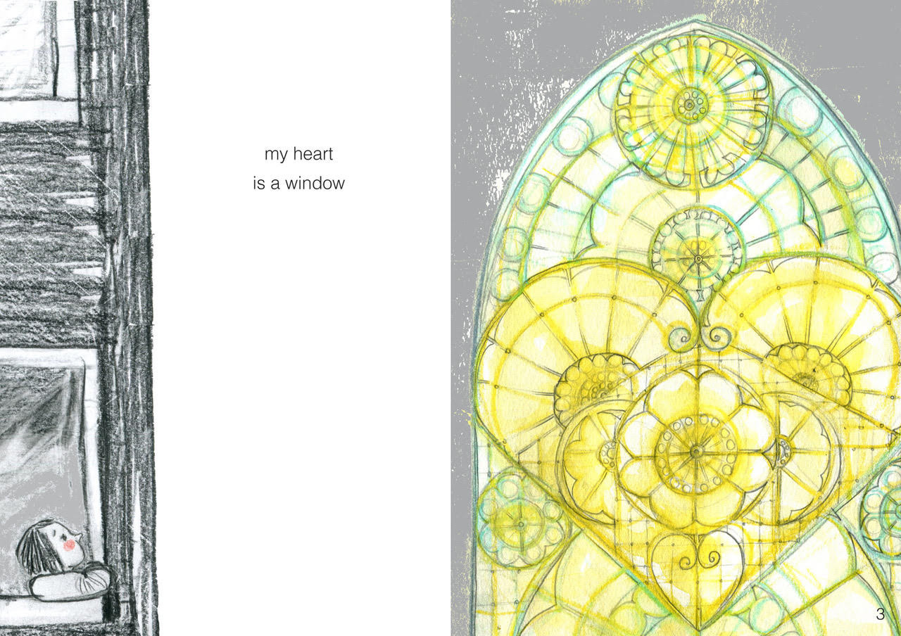
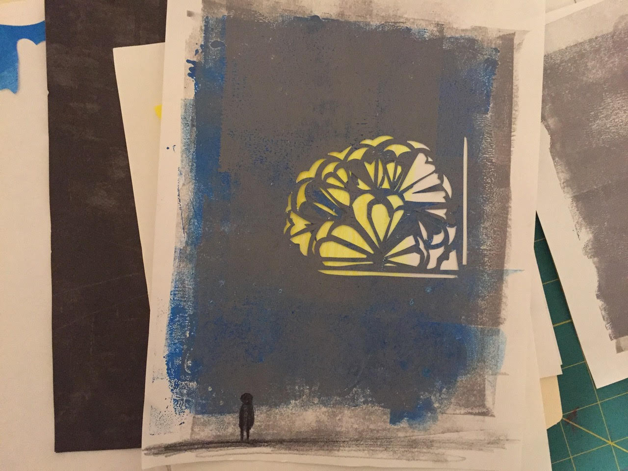
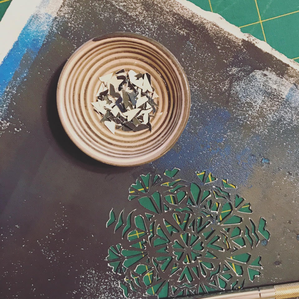
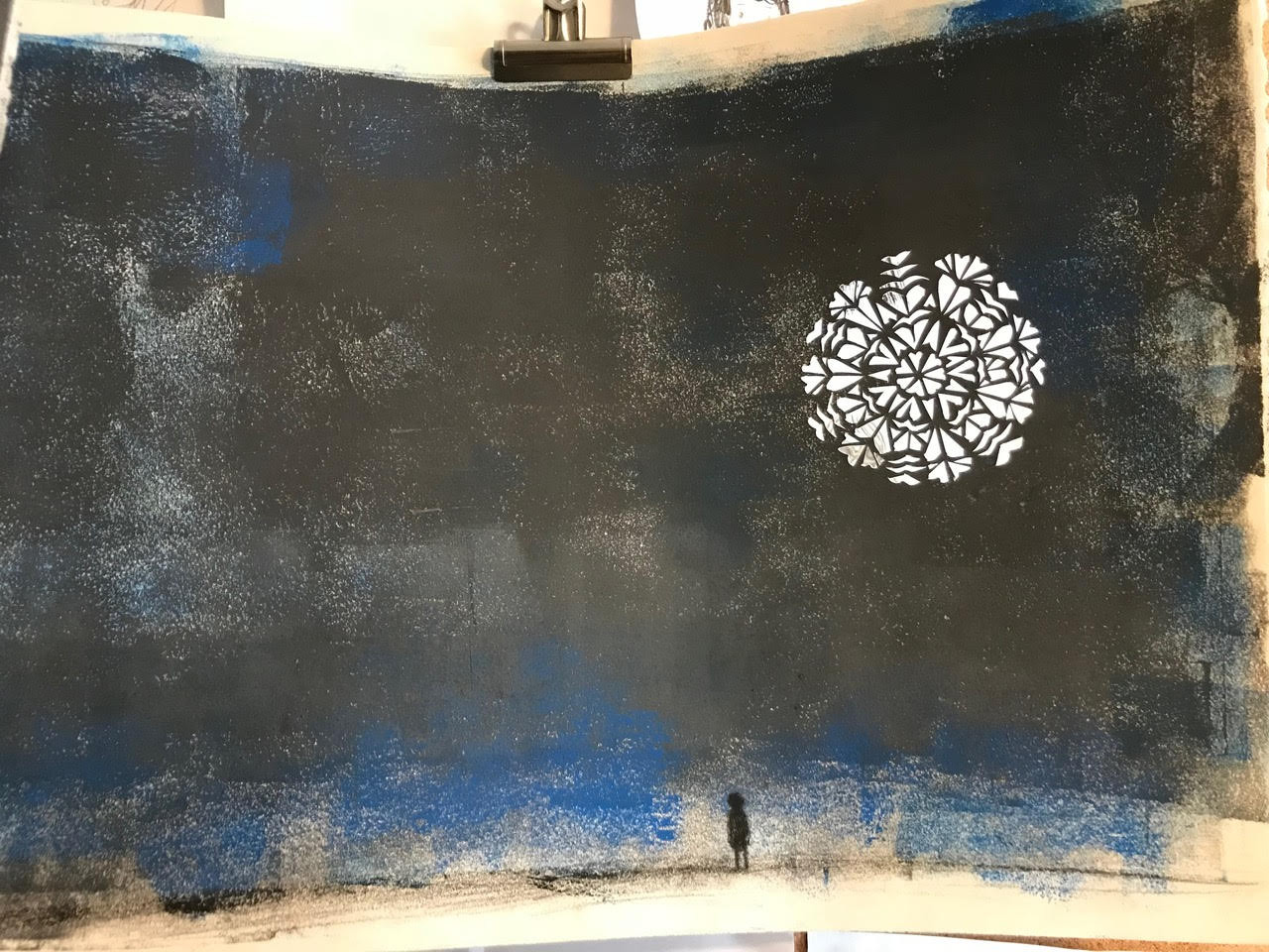
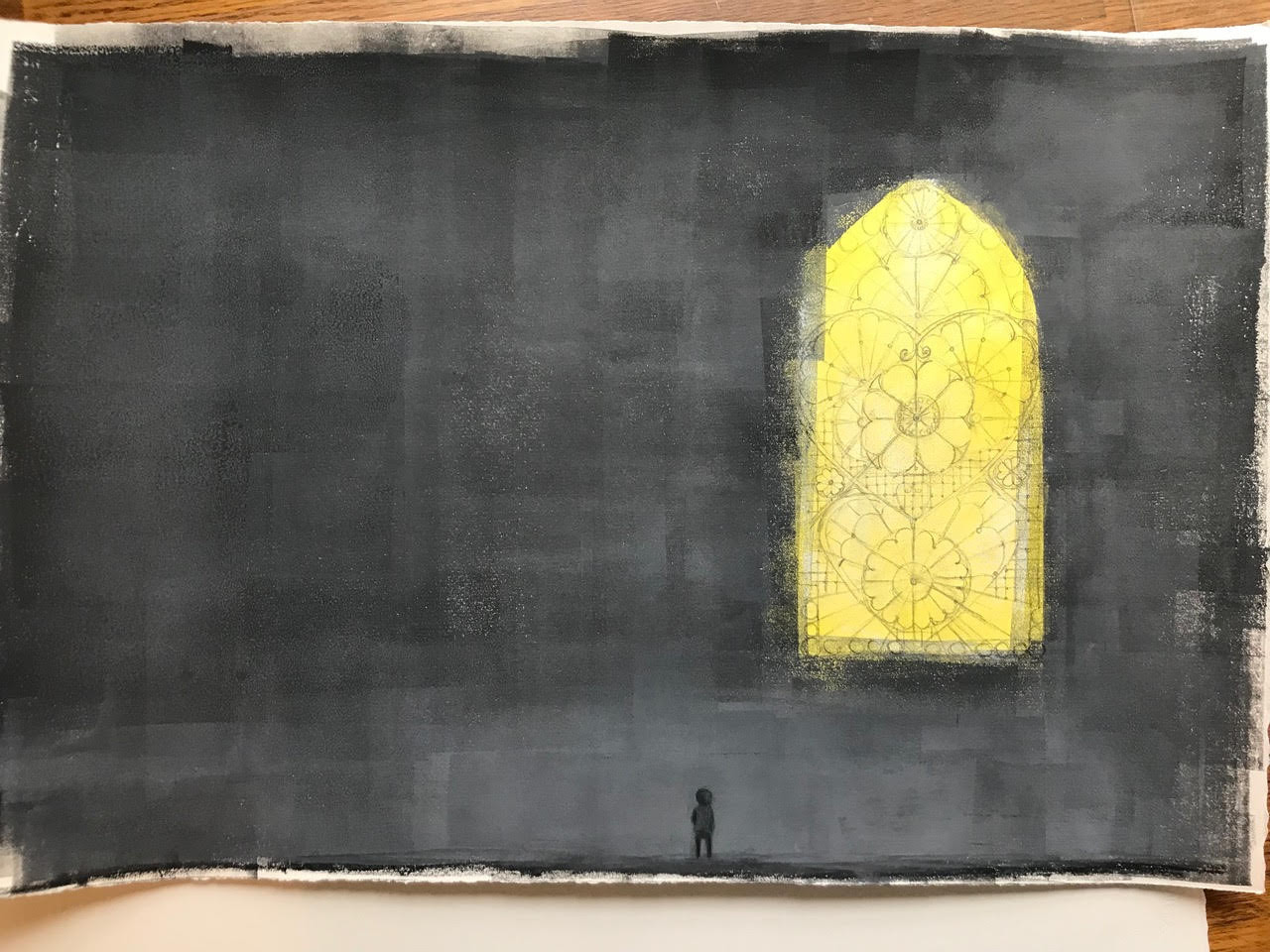
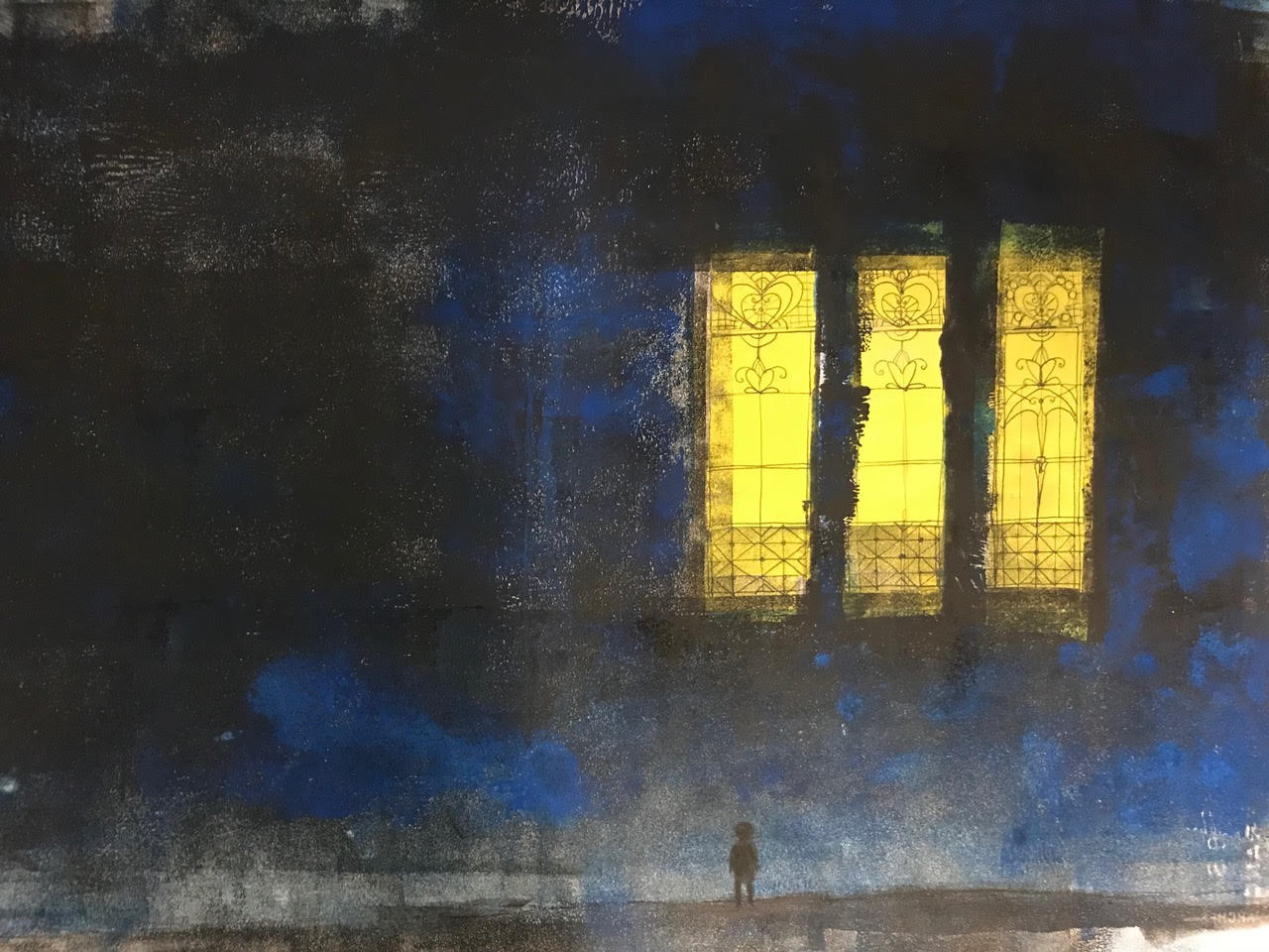
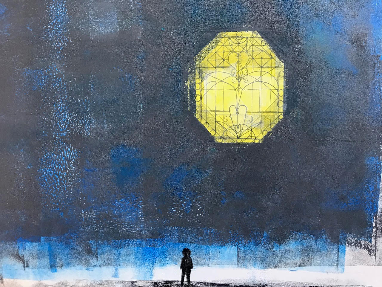
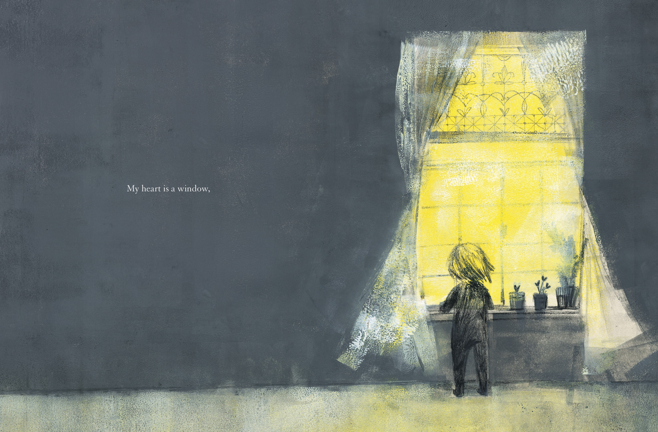
I reworked the very first image — “my heart is a window” — more than any other throughout the making of the book. I experimented with many versions of colored pencil, watercolor, ink, and cut-paper before finding my way to the final images where I used brayers to apply printmaking ink directly to the paper. This image, although it changed multiple times, still served as a guide for the emotional tone of the rest of the book. You can see some of the variations here:

(Click to enlarge spread)
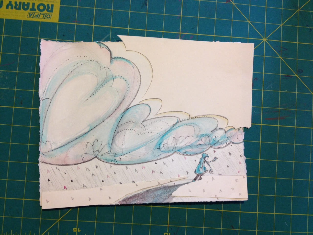
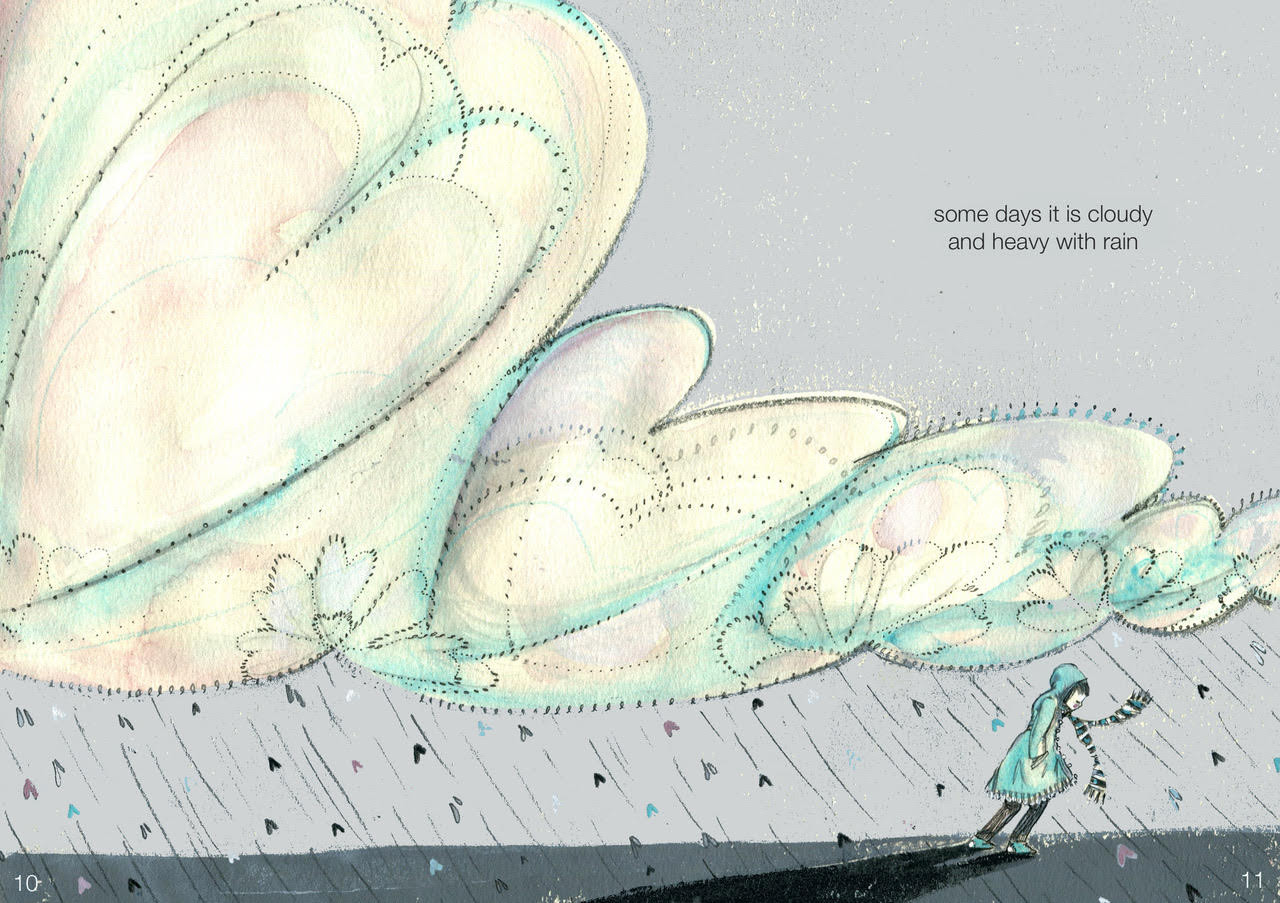
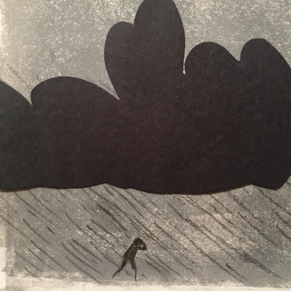
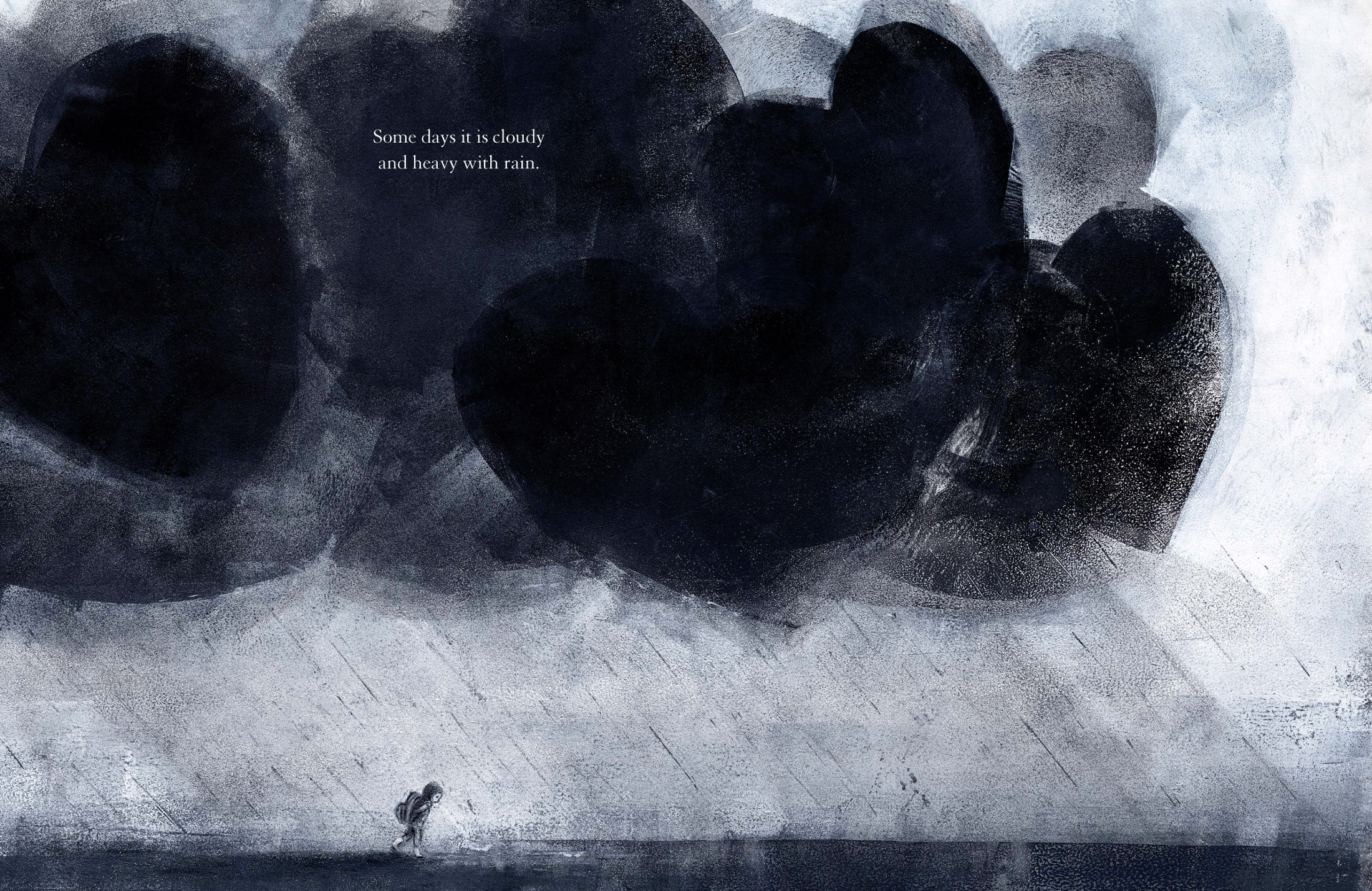
The “cloudy and heavy with rain” spread was another one that changed dramatically and really informed the final look of the book. As you can see, the original version was more colorful and had a lighter feel to it. But the book needed more balance between light and dark.
And so (in early January 2017) I made a few much darker versions of “cloudy and heavy with rain.” It was a stormy time for my family, as well as our country, and it was nice to be able to funnel some of that emotion into a few of the darkest images in the book.

(Click to enlarge spread)
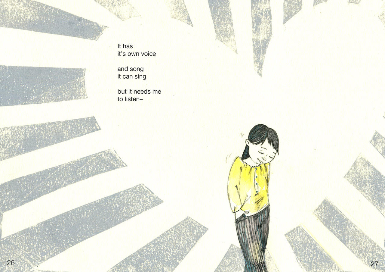
These next two images are ones that I made early in the watercolor/printmaking stage of the book’s evolution. Although both text and image changed completely from this first image, the idea of listening, the idea of choice, and the feeling of having an open heart stayed.
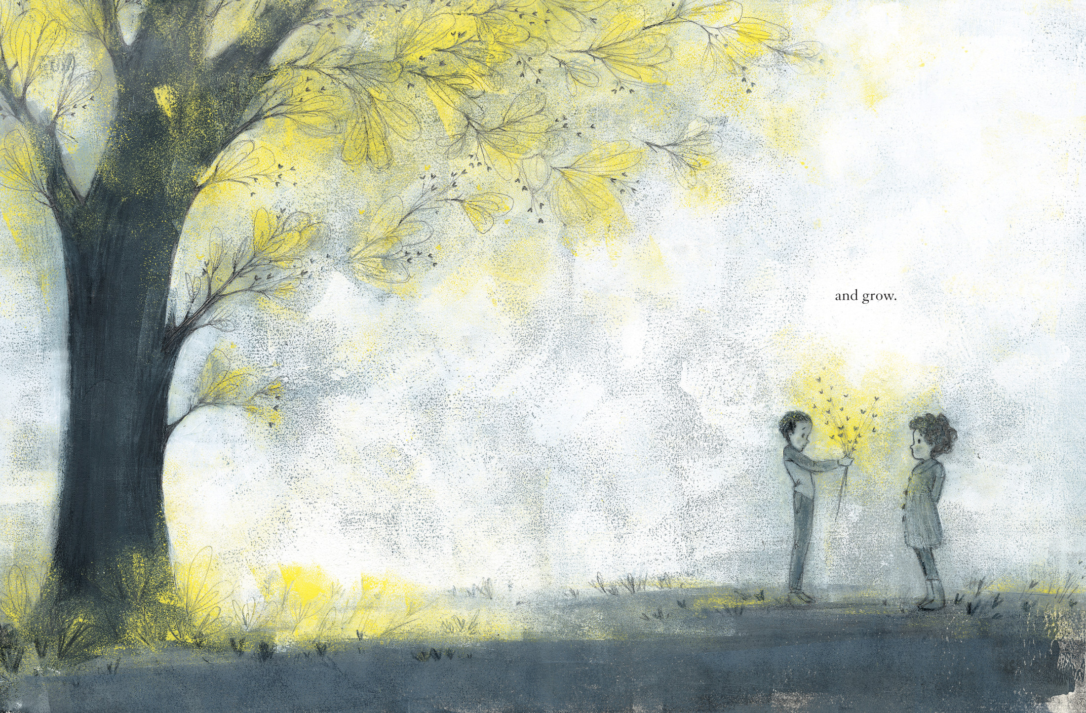
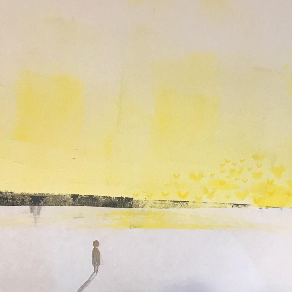
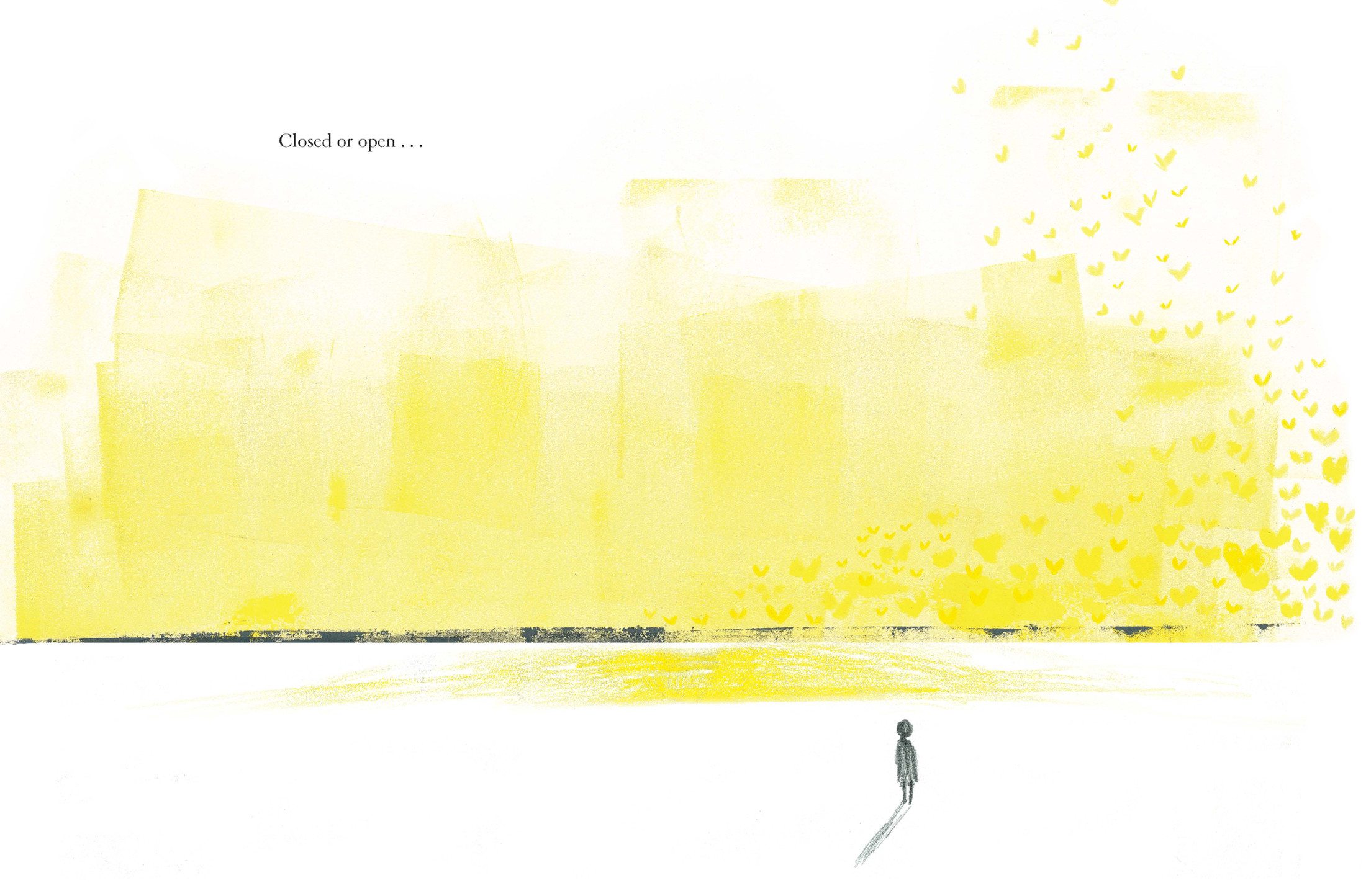
This girl listening eventually turned into the “closed or open” spread — with a silhouetted figure and a murmuration of yellow hearts against an inky yellow sky. This was one of the very first monoprints that I made. I was trying to capture the feeling of being alone, yet full of love and connection — that sense that there is love in the world, all around you, and that you belong to it. For the rest of the time that I was making My Heart, I kept it up where I could see it, to guide me toward the glowing sort of feeling that I wanted the book to end with.

(Click to enlarge spread)
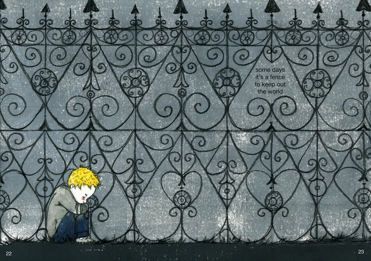
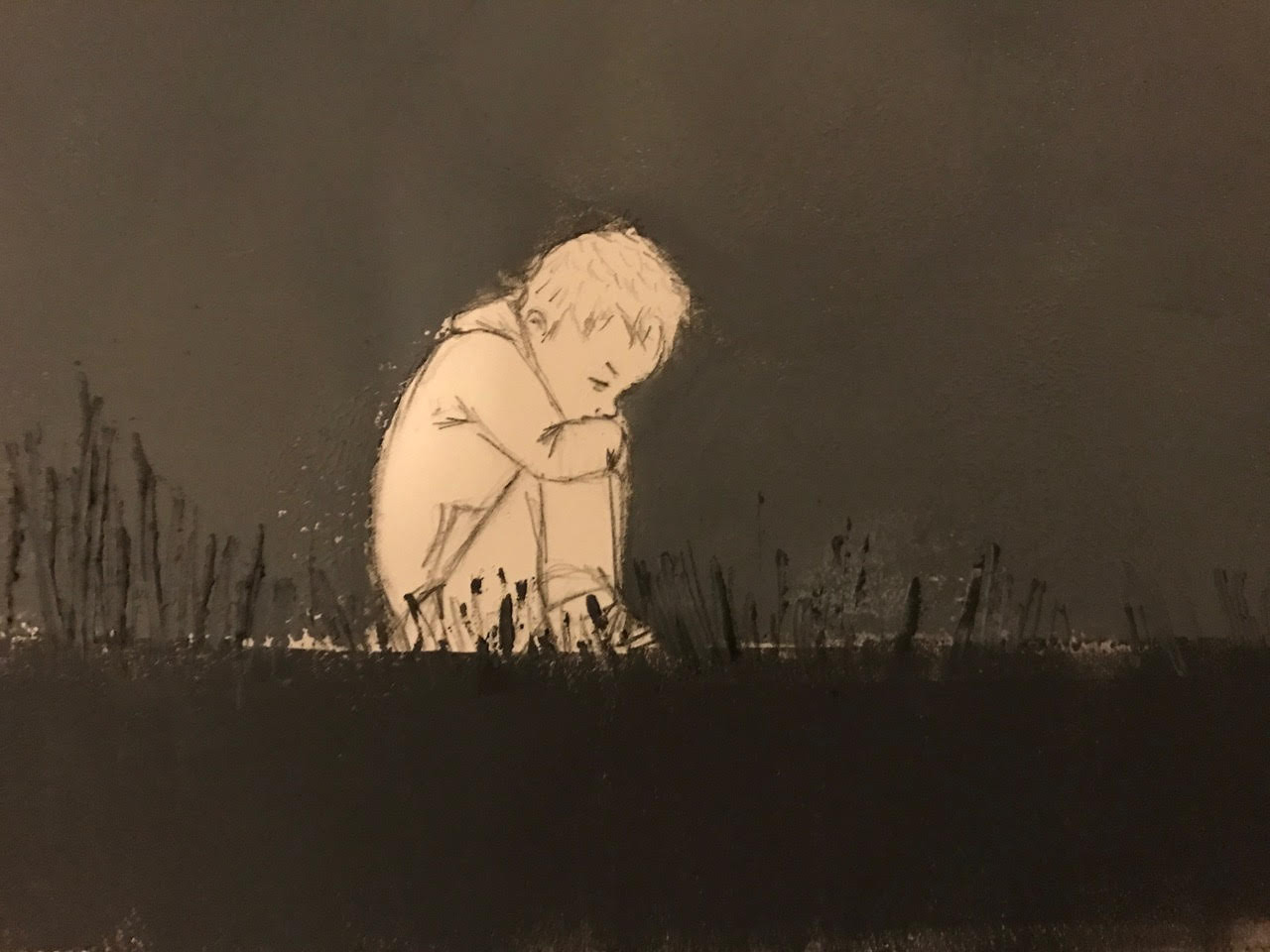
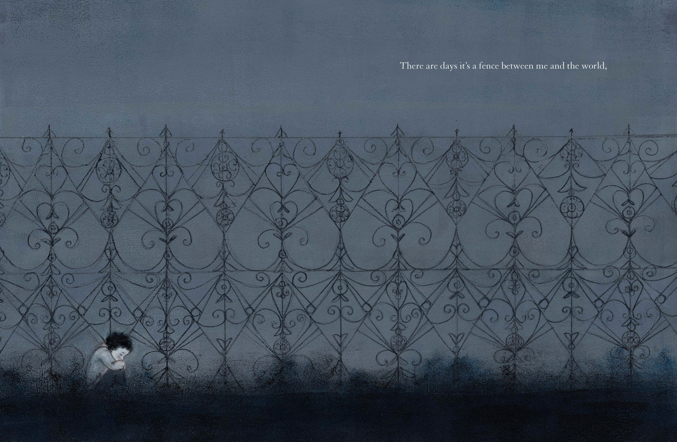
The heart-as-fence image is one that changed very little from my first idea of it in 2014, but I still had to rework it a few times to find the right balance between dark and light, fence and sky. You can also see a few stages in the printmaking process below.

(Click to enlarge spread)
However, most of the images in the book changed a lot more than the fence image. An important part of the book-making process is pruning. And as an illustrator/author, this can be exciting, because you have so much control and the ability to get rid of anything that isn’t serving the heart of the book. This makes things much easier in some ways — but so much harder in others. With the art especially, it can be painful to let go of an image that you have worked really hard on and that you love. But you are following a thread, the whisper of a story — and holding on tightly to anything that isn’t working will just make you lose your way. An insightful editor (Namrata Tripathi), art director (Lily Malcom), publisher (Lauri Hornik), and agent (Steven Malk) can help a great deal with this! Smart writer-friends can be very helpful too. (Thank you, Marcy Campbell and Eliza Collins.)
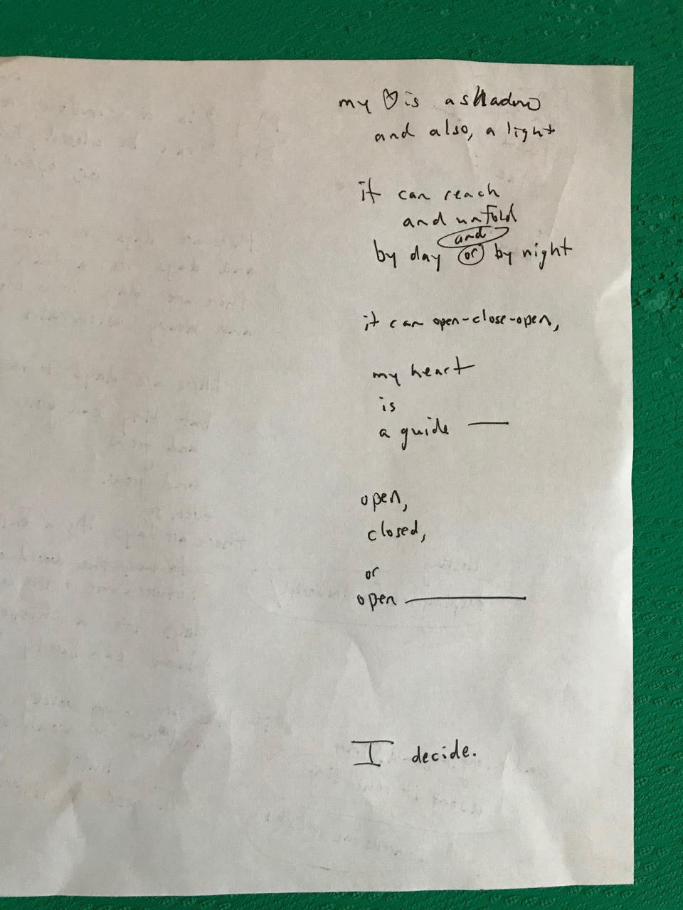
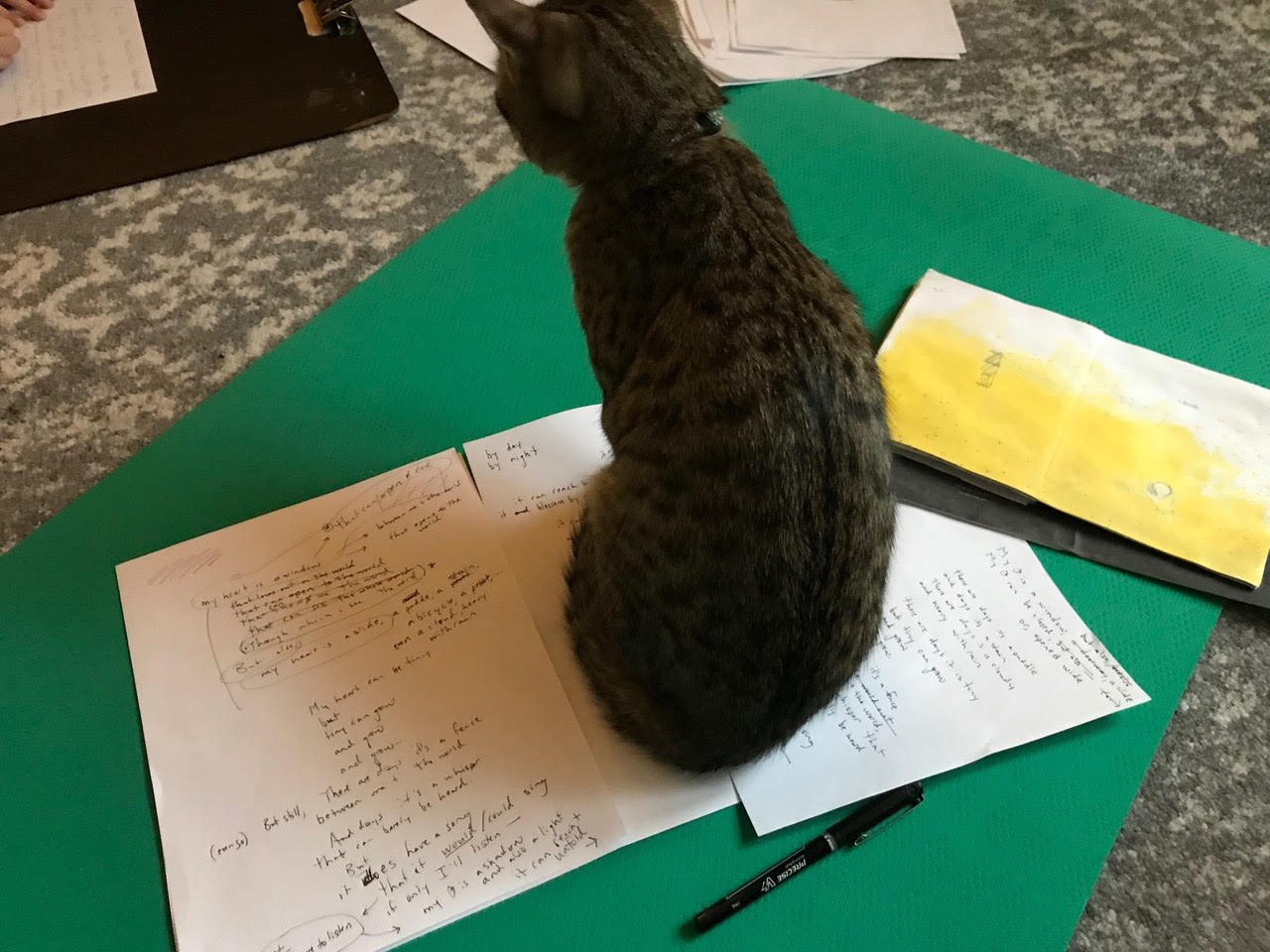
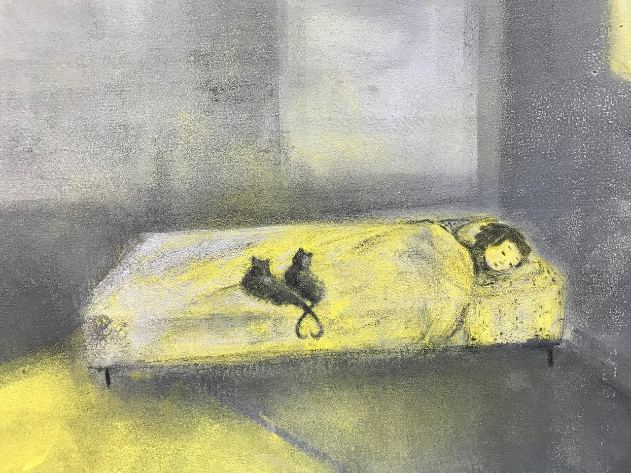
Here is a peek at a variation of the text from the end of the book, as I tried to sort out how to shorten the whole book by an entire spread and still keep the rhythm, rhyme, and emotional impact. You can also see what my cat thought of the whole thing.
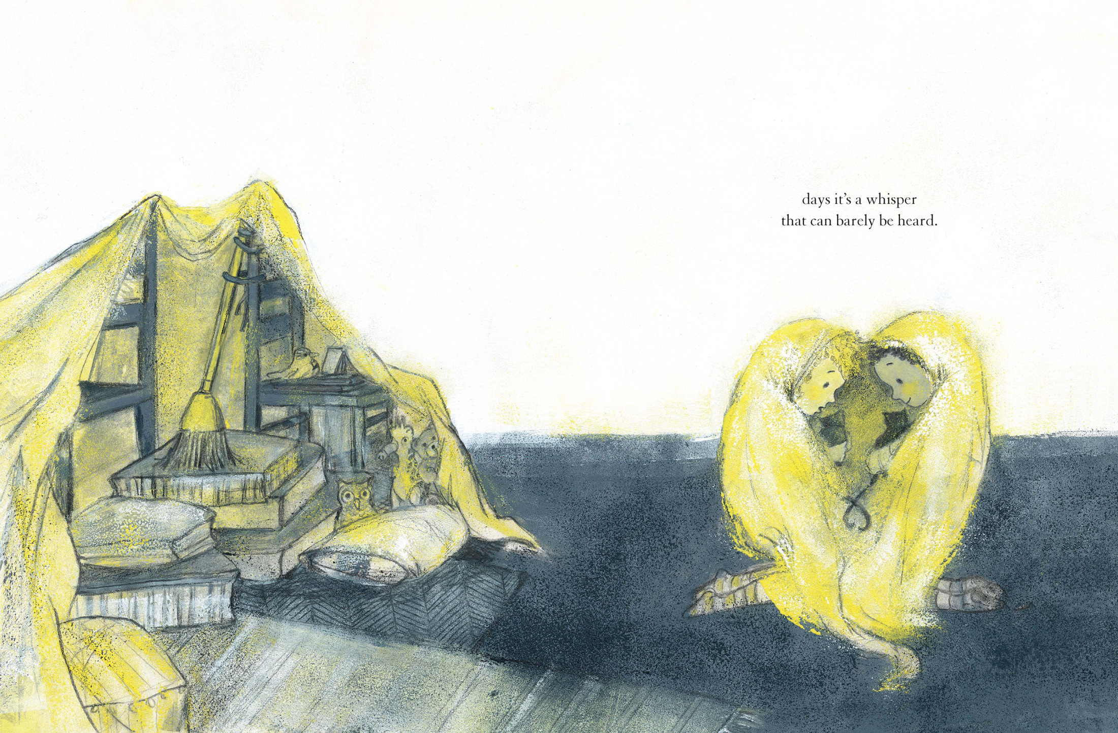
And here is an alternate for “there are days it’s a whisper” that was hard to let go of. Fortunately, two cats did find their way into the final version.
(Click to enlarge spread)
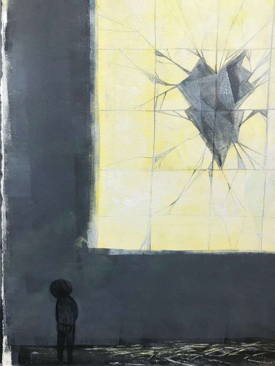
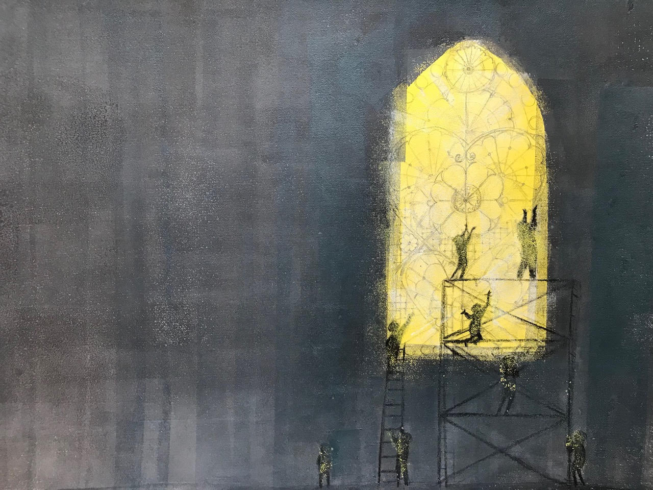
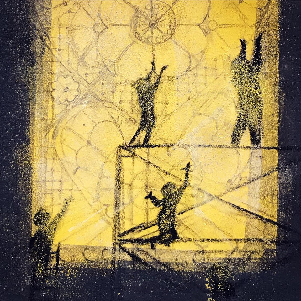
One of the images that was the hardest to release, as the text evolved and the needs of the book changed, was the “but broken can mend” page. Early on, I was playing with the idea of a broken stained glass window. However, my editor and art director both encouraged me to find something more intimate for this scene. The stained glass image was reading as a broken church window, which I liked, but it felt distant and also implied a much bigger kind of broken in the world. Part of me really wanted to include that in the book; however, the overall feeling and tone was becoming darker and darker, and we all felt like it needed a better balance between dark and light. In the end, the image of the parent and child was much better for the book. Changing the broken image also made room for a new interpretation of mend. And as much as I loved the old one, the new mend ended up becoming one of my very favorites pages in the book.
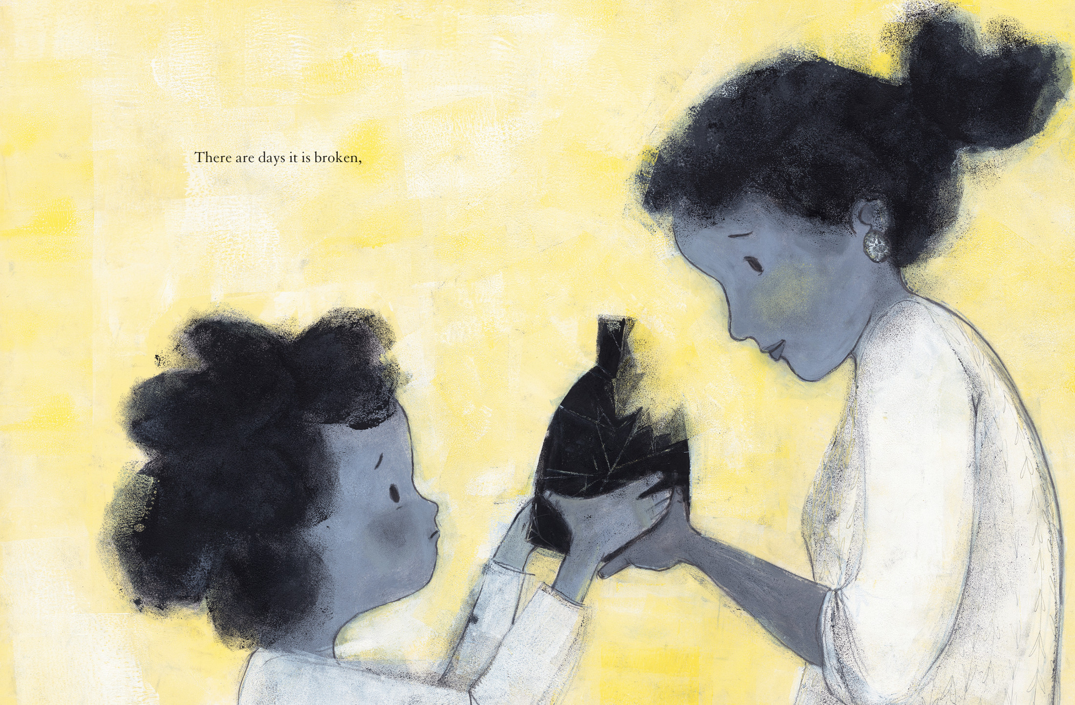
but broken can mend,
and a heart that is closed can still open again.”
(Click each to enlarge)
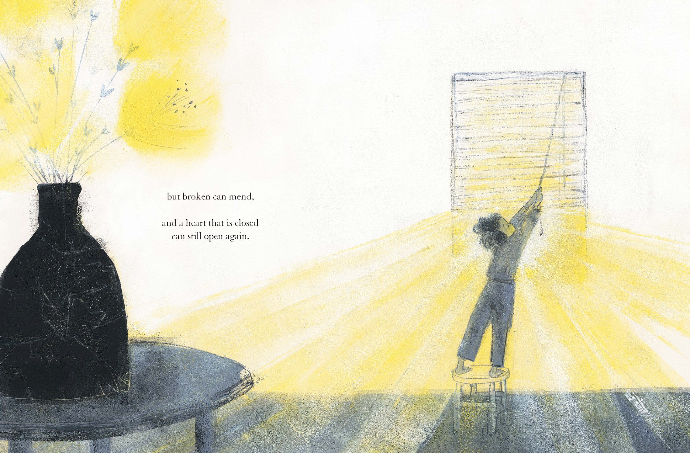
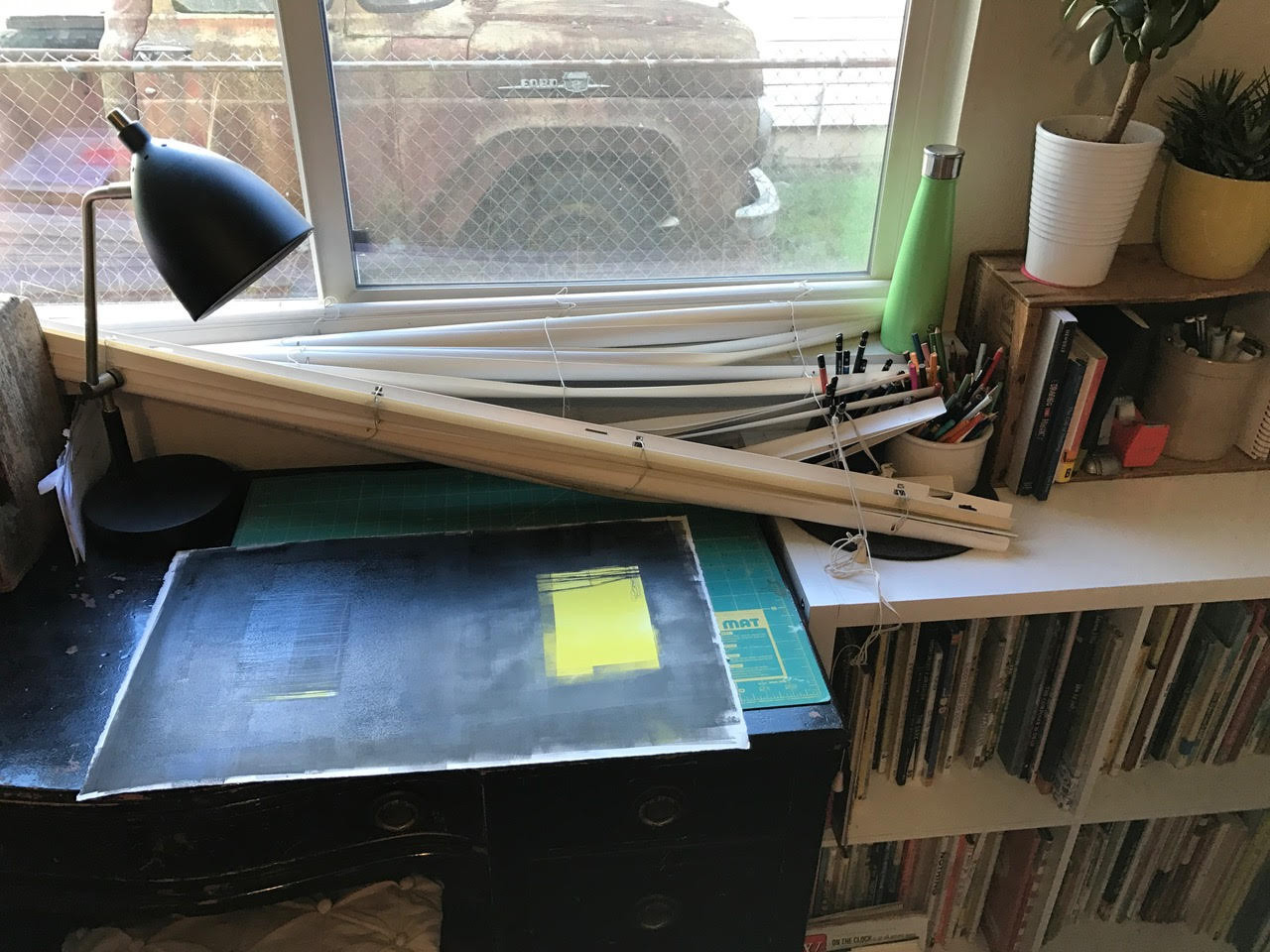
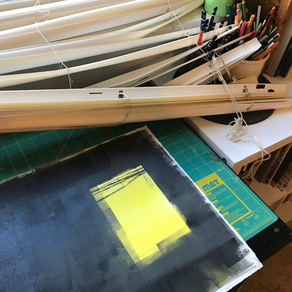
Midway through the making of this book, my family moved, and so the art was made on kitchen tables and in studios with two very different types of windows and window treatments. My first studio had blinds like you see in quite a few of the spreads in My Heart. (Later, my studio had white curtains, which look like the curtains in the “my heart is a window” page.) However, in the first studio, the view past the blinds was of my neighbor’s vinyl siding, chain link fence, and rusty truck. It was the only window in the studio, and I really needed the natural light. But if I didn’t close the blinds every night, the room and I were lit up and the neighbors could see right through my studio and into our bathroom. The blinds were also broken — and very difficult to open and close. So, twice a day I stood on a chair in my studio and held up the top of the blinds with one hand, while I wrestled them down with the other. And every single time, I felt like they were about to come crashing down on me. And then one day, they did. It was the very same day that I was making the image for “my heart can be closed or opened up wide.” I was trying to pull them up just a bit higher to let in a little more light, when they were suddenly on my desk, splayed out amidst my colored pencils. I laughed for a long time. And then I took these pictures. It was like they were shouting at me to be included in the book! What’s also funny is that I hated those blinds at the time, but they ended up being one of my favorite visual details in the book — which is a pretty good metaphor for life and the creative process. You can see here that the ink wasn’t even dry, and I hadn’t added the child’s face yet. But there they are:

(Click to enlarge spread)
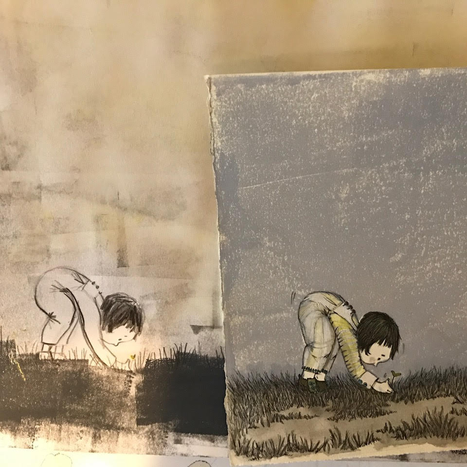
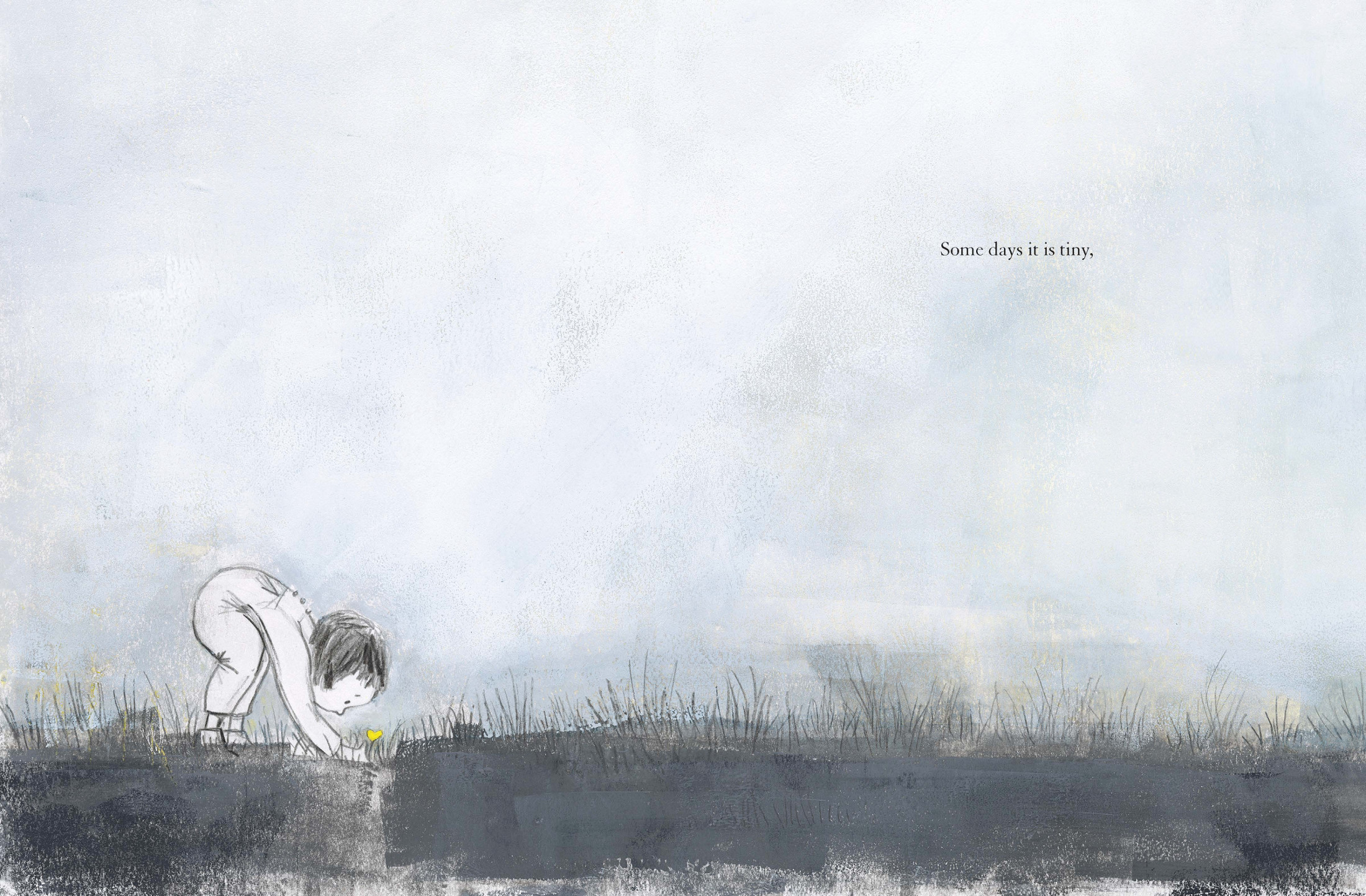
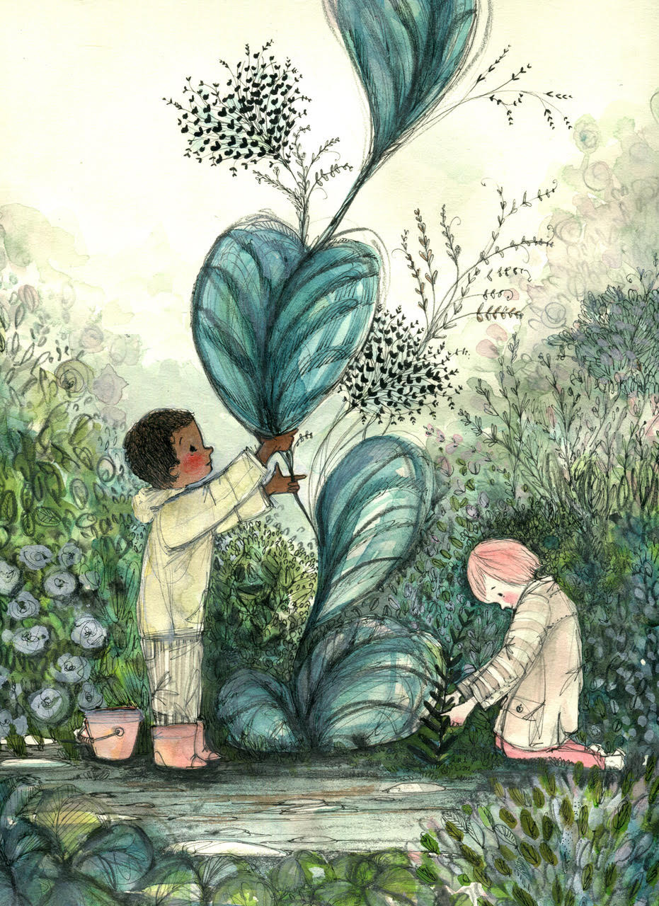
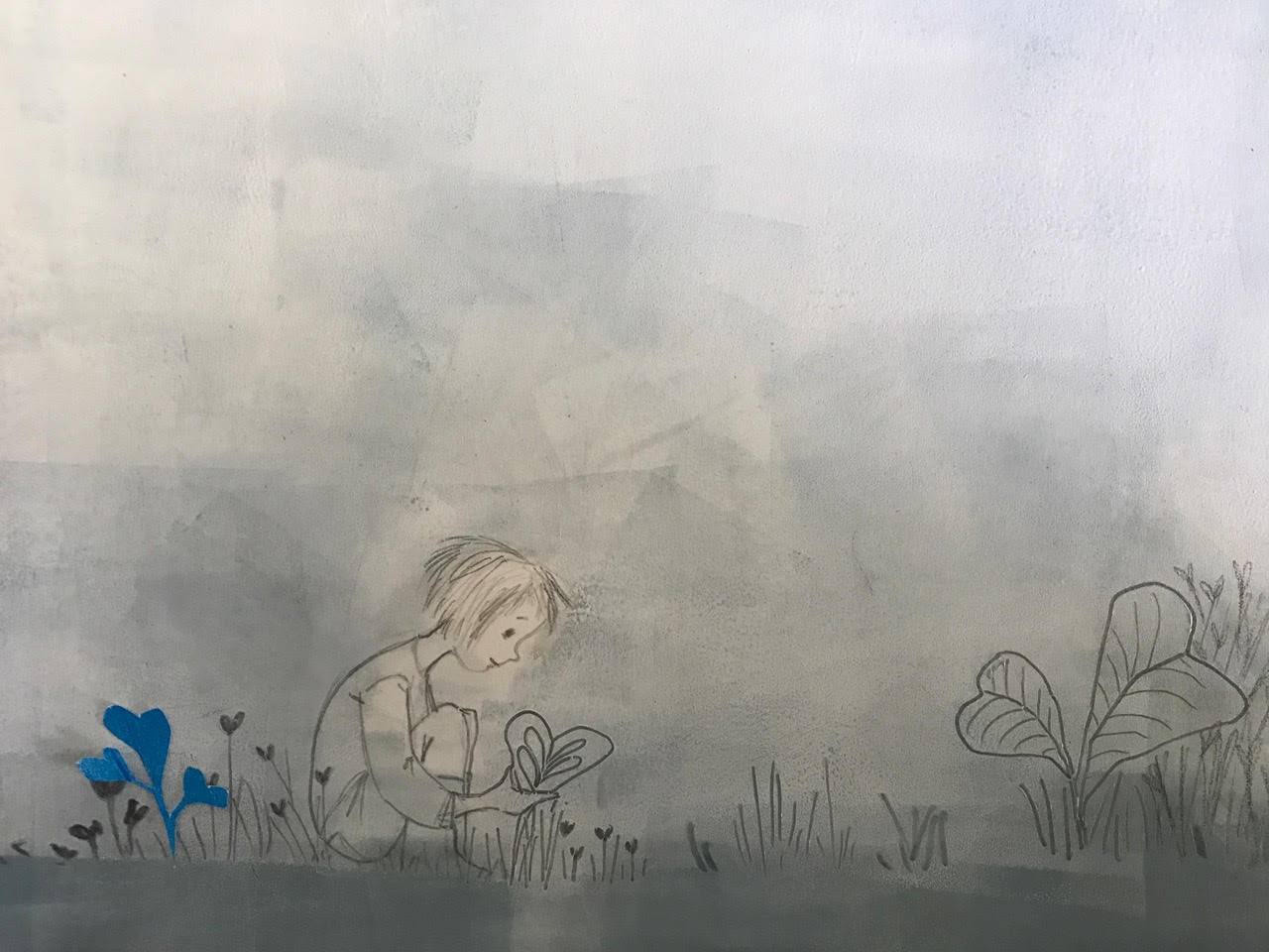
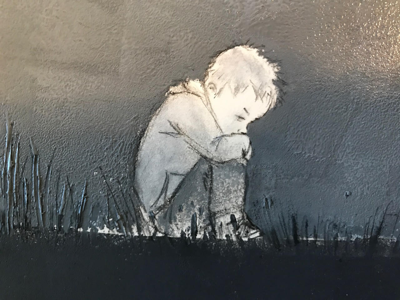
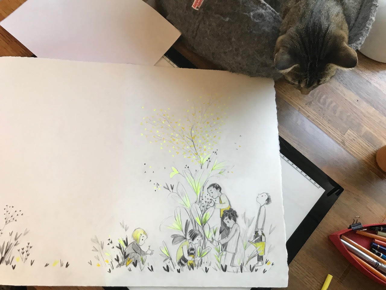
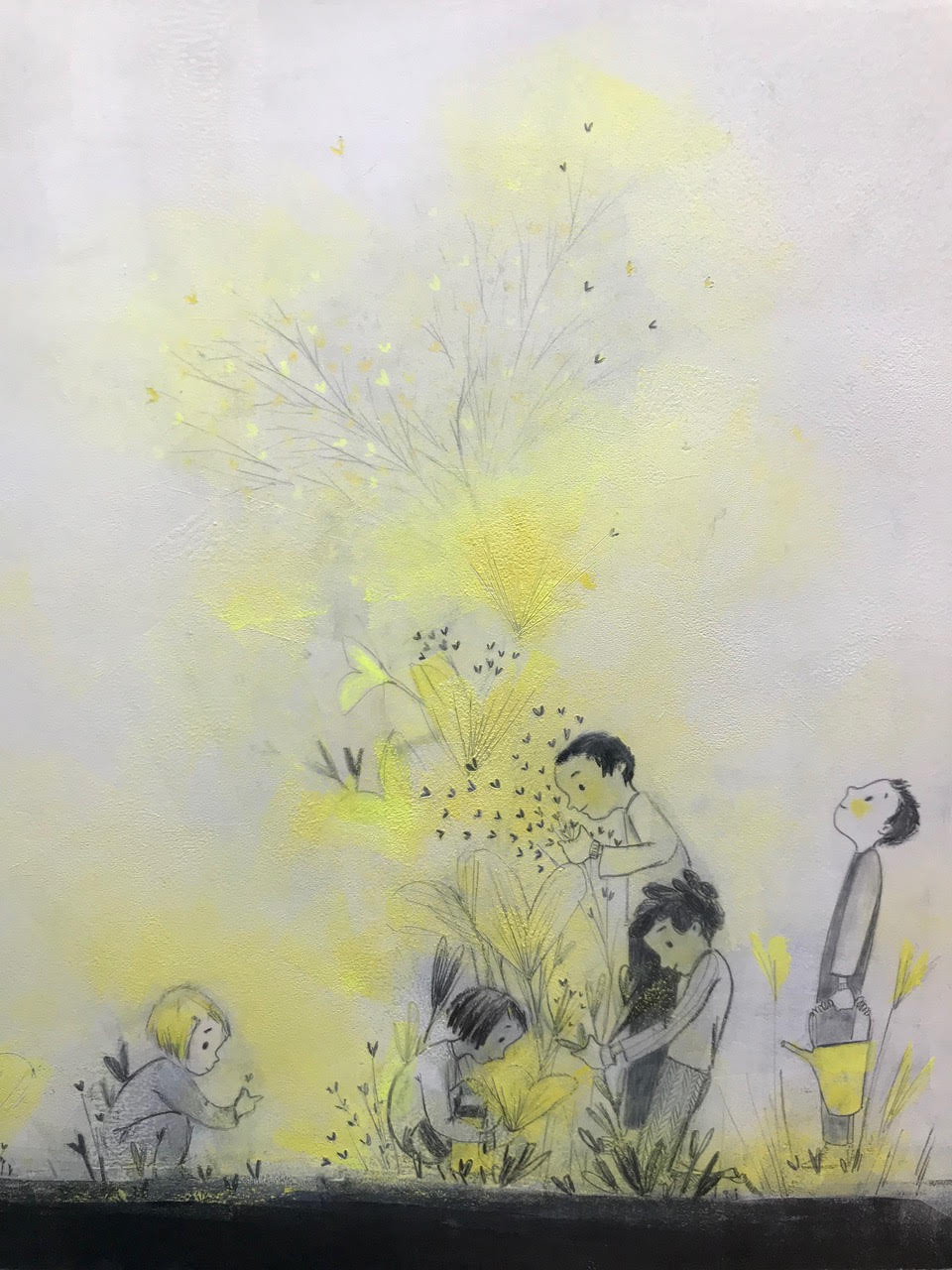
Late in the process, my art director and editor suggested that we change the cover from an image of a bunch of children tending a garden (that we all loved) to the solitary child from the “there are days it is tiny” page. It was a version that we had considered early on and a possibility that I had always liked. Even so, this was the most difficult image to let go of. But it was the right choice for the book, and so, painful as it was, I let it go.
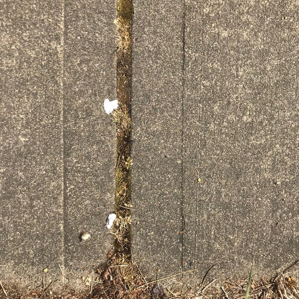
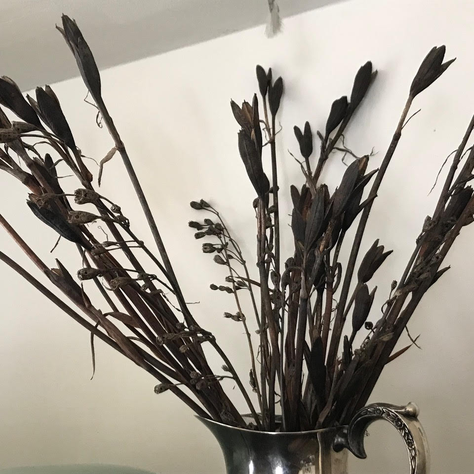
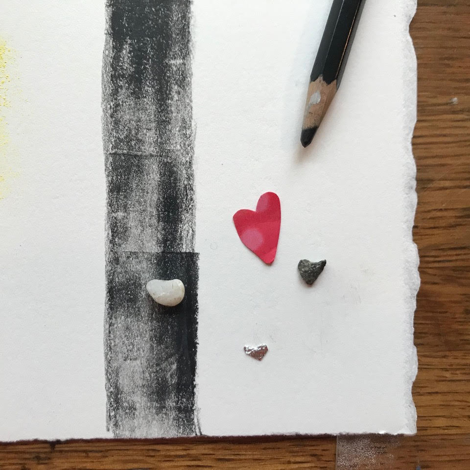
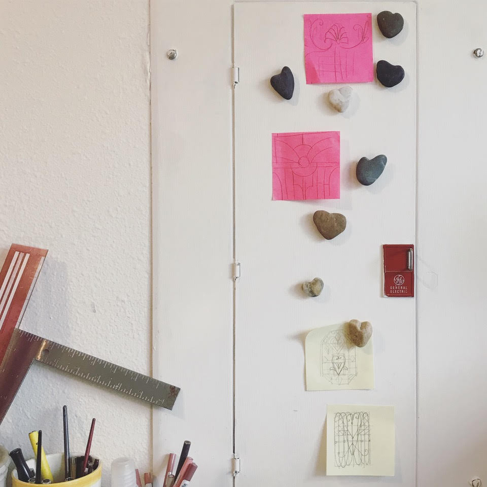
Finally, throughout the making of this book, I played a game of looking for hearts in the world around me. Each one that I found was a reminder that hearts (and love) are all around us, all the time. I found them in bushes, in tendrils of hair, in seed pods and fence patterns, in broken bits of tissue and tinfoil and shells. There were so many that I couldn’t find a way to fit even a fraction of them into the pages of this book. But a few found their way in. And when I could, I took pictures of some of the others. We live near the coast, and many of the hearts that I found were beach rocks. But some of my favorites are the broken bits of bark and sandy chunks of concrete that I found on sidewalks and in parking lots.
At this point, I’ve amassed quite a collection.

MY HEART. Copyright © 2019 by Corinna Luyken. Final illustrations reproduced by permission of the publisher, Dial Books for Young Readers, New York. All other images reproduced by permission of Corinna Luyken.

i love love love this book!!!
it is perfect and beautiful.
thank you for this interview.
seeing the process was super inspiring.
and jules, thank you, as always, for this magnificent blog!
Gah! This is so beautiful I’m losing words!
I think this is one of those “must have two copies to frame pages from one” kinds of books. True gorgeousness – words and pictures.
Ooh I love. What a beautiful journey.
I look forward to getting my own book and sharing it.
Thank you so much, Jules and Corinna, for the depth of insight into process in this post. I think it is one of my favorite 7imp posts of all time! Of course, the book is so exquisite that helps too. 🙂
I was lucky enough to see early early early images of this book so many years ago! It is amazing to see how it travelled through time and transformed into it’s beautiful current form. Congratulations dear Corinna, and thanks, as always Jules, for shedding so much light on the wonder of illustrated books.
I can’t wait to get get a copy of this book. I love Corinna’s glimpse inside her process. So many ideas are floating around my head about combining printmaking and other mediums. Beautiful work, beautiful book!
It’s so great to see the spreads that didn’t make it into the book…to understand all the thought and care that goes into what becomes a group effort. Thank you for this glimpse, Jules and Corinna, this labor of love.
This looks amazing! I am so excited to read about this beautiful and touching book. Going to get this book right away. Thank you for creating it and thank you Jules for sharing another important story.
Love this beautiful book, Corinna. Thanks for sharing your process.
This book is breathtaking and it’s so inspiring to read about how it was made. Thank you for sharing this Corinna and making another gorgeous book to add to our library!
So so beautiful 💛 thank you for sharing your heart
[…] She visits “7 Imps” and walks us through her process; fascinating, lots of images, check it out. […]