Elisha Cooper Makes the Case for His Favorite Cases
 June 3rd, 2021 by jules
 If you’re a regular reader of 7-Imp, you know that author-illustrator Elisha Cooper is fond of creating a compelling case for his books.
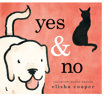
I reviewed Elisha’s newest book, Yes & No (Roaring Brook, April 2021), for the Horn Book. That (starred!) review is here, if you’re so inclined to read more about this wonderful book, illustrated (as I note in my review) in the same style as the Caldecott Honor-winning Big Cat, Little Cat.
Today here at 7-Imp, Elisha shares an essay — instead of waxing on about his own book (though, fortunately, he does briefly mention the beautiful case for Yes & No) — about the case covers of some of his favorite picture books. As the picture-book fan I am, I love this post and his eye for color, design, and what generally makes a good case. I’m about to teach this summer my picture book grad course, and you can bet that when I talk to my students about design, I’ll send them to this post. I thank Elisha for sharing.
Let’s get to it.
p.s. See here for Betsy Bird’s April chat with Elisha about Yes & No.
Elisha: The case is often the last element designed in a book — but the first thing I turn to when I open a book. I want to know how carefully the author took the design and also if she had fun making the book. Did she hide something special for us?
I understand that some educators feel the case should be the same image as the cover (because then it’s easy to identify the book when the cover comes off). I’d respectfully disagree. A good case, even with a different image, tells us exactly which book this is. And a good case can make a great book wonderful.
A good case, for the purposes of this study, has two important criteria:
The first is design. How does that thin band of color on the case, seen from the side, interact with the cover? Do the two colors complement each other (like a well-chosen pant-and-shirt outfit)? Are they matching or contrasting? Does this aesthetic choice work?
The second is editorial. When the cover is removed, does the image on the case give us something more? Something additive that deepens our understanding of the book, rounding out the subject and the story? Something sly? Or informative? A new perspective? Something that makes us smile? A case should be about the book — and also beyond the book.
Before I discuss the cases of the ten books below, I want to turn these criteria on myself. State my own case.
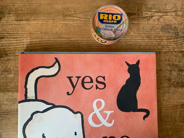
Since the cover of Yes & No is creamish-pink, I went for a blue case (a color combination inspired by an Italian can of tuna!), accented with dashes of ink. Together they reflect the color palette of the book: blue for moonlit night, pink for dawn. Because the book is the story of one day.
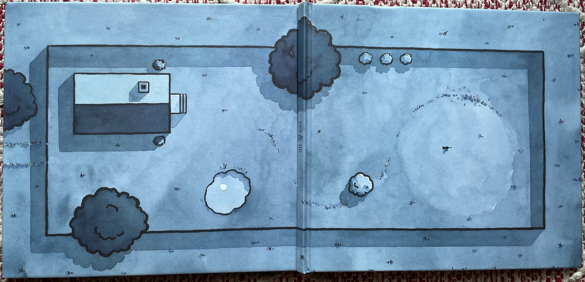
Then we open to the entire case. It’s the geography of the book. A map. A bird’s-eye view of the puppy’s and cat’s backyard (the ink dashes are shoots of grass), showing where they spent their day: the house, the tree, the pond, the hill. If you look closely, there’s the cat on the top of the hill, looking homeward.
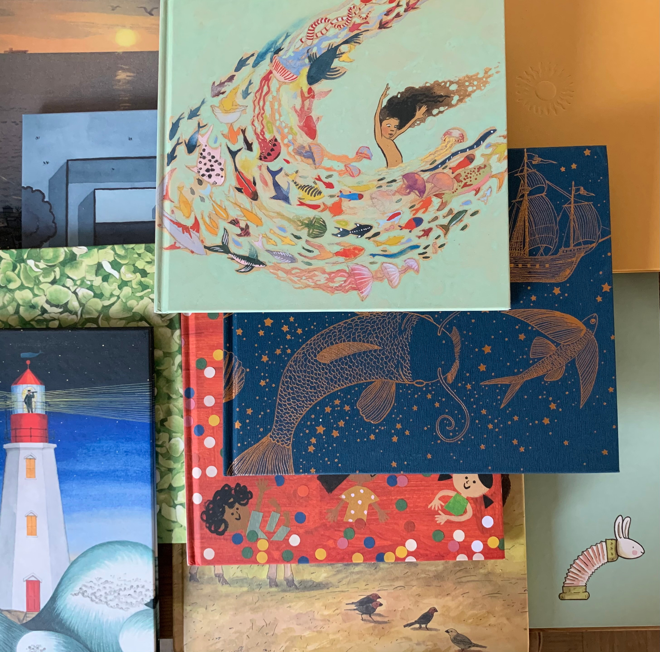
Now here are ten cases from ten books I just pulled from my bookshelf. These are books I love and authors I admire, revealing my own biases. Because what comes first, the author or the book or the cover or the case? The nature of bookmaking is that these questions overlap. So, what are your favorite cases? What cases deepen your appreciation for the books you love? I’m curious. But here are, in no particular order, ten cases I love:
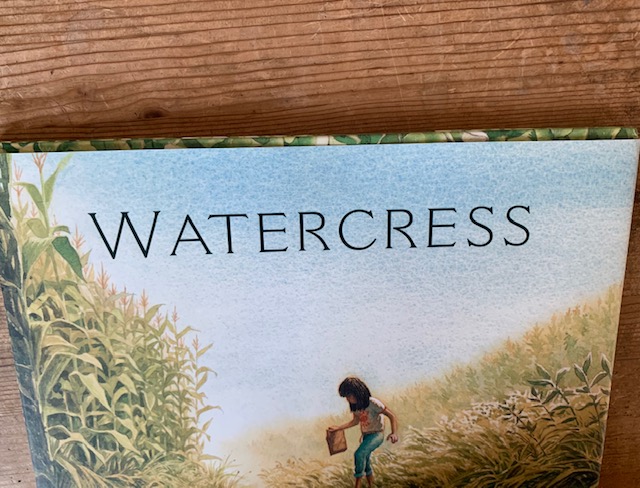
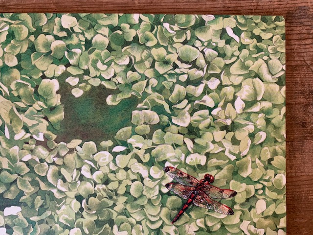
This book just came out and is profoundly beautiful, so I am primed to like its case. (Indeed, its case inspired this essay.) The cover is soft blue sky and the edge of the case, a mottled green, which when the cover comes off, reveals itself to be a bed of watercress. With a red dragonfly. Wonderful.
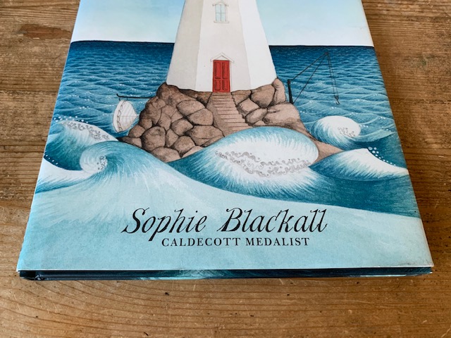
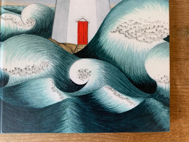
The case has the same lighthouse as the cover — but seen at night and with stormy waves of dark blue ocean. This deep blue — or is it Payne’s Gray? — contrasts perfectly with the calmer, lighter blue ocean on the cover. Together they give us a comforting, steady sense of time. Day or night, the lighthouse is always there.
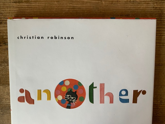
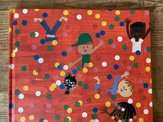
The case is a painted red, sprinkled with colorful dots and playful children, and does the important work of supporting the white cover. The “o” in the “Another” is the same painted red, with the cat peeking out. So, we’re actually looking through the cover to the case, a clever nod to the hole-into-another-world plot of the book.
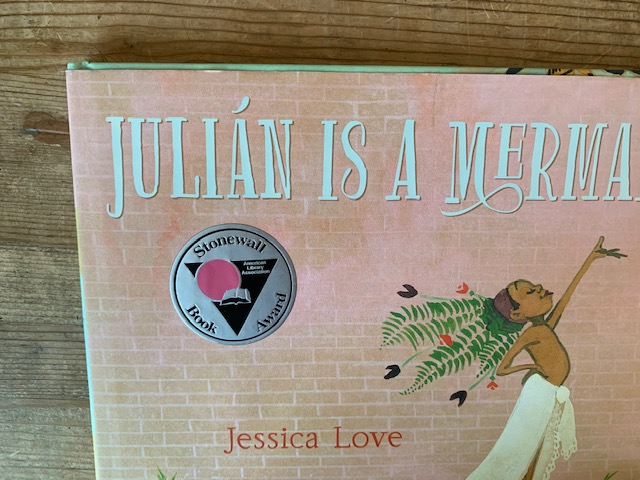
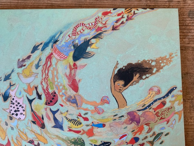
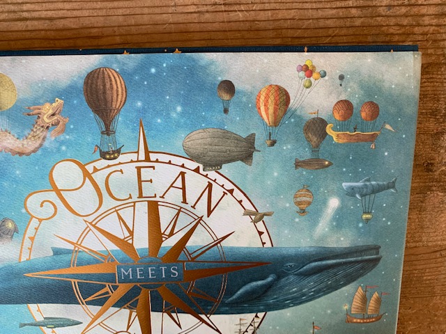
The cover is a peachy brick, so the aqua green underwater scene on the case makes for the prettiest contrast. Green and pink work. We see Julián swimming among a fantastical cornucopia of fish and jellyfish. The case makes no sense. And perfect sense. Love!
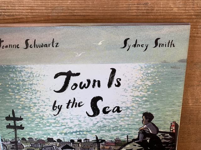
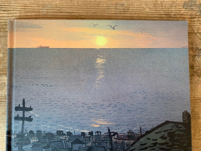
The cover is already pretty great, all shimmery light and wistfulness, and when the cover comes off, we see the same perspective but without the watching boy. The sun going down, in blues and grays, the town’s lights flicking on. Sydney Smith — it does not need to be said — is a genius with light.
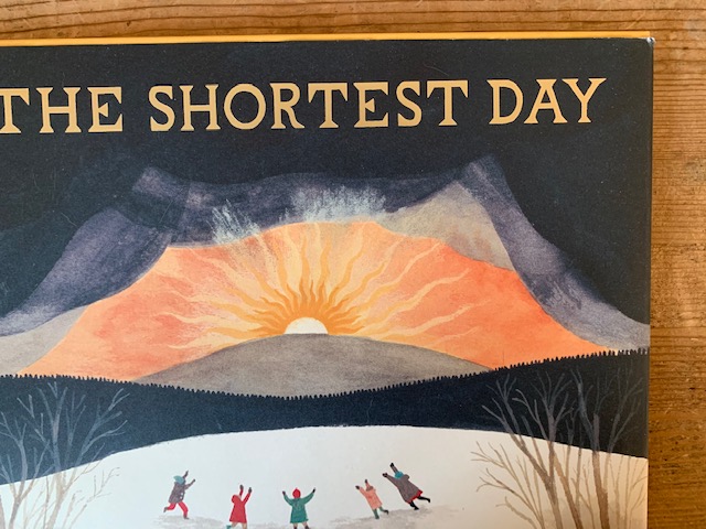
The case here is not illustrated; it’s just the single color of the board. The choice of a warm yellow plays perfectly against the foreboding gray sky of the cover. One central punched-out sun icon mimics the sun on the cover. Sometimes simple is best.

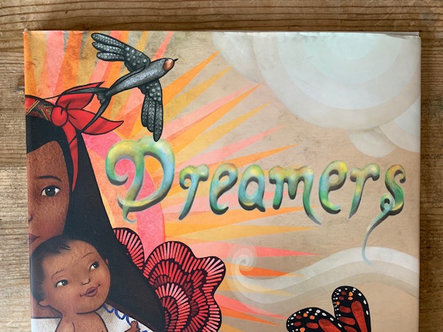
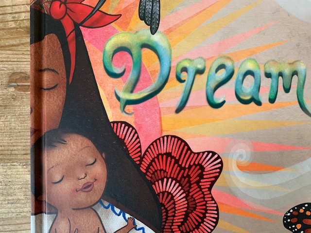
At first glance, this case is the same image as the cover. But look closely — the eyes of the mother and child are closed. They’re dreaming.
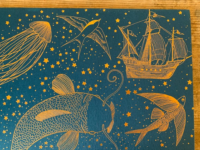
A dark blue case, gilded with thin lines of gold. Two colors are a spare design decision. But, again, the lines are gold, illuminating a wild tapestry of jellyfish and submarines and ships. This case is so ridiculously gorgeous that I don’t know what else to say about it.
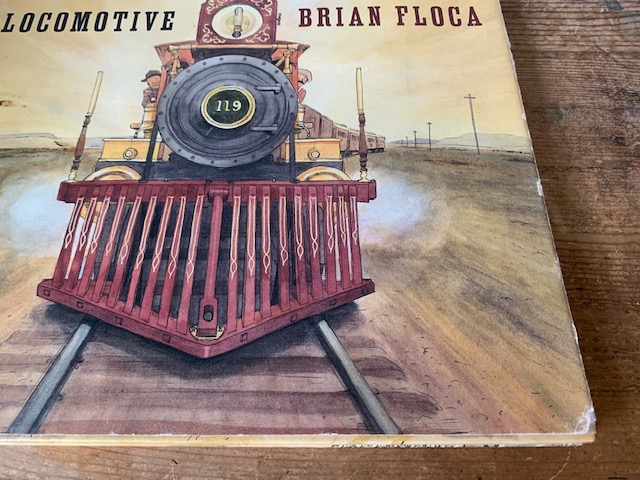
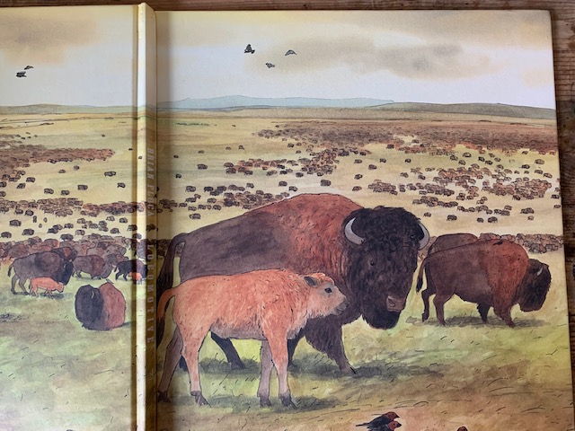
The case’s ochre edge is actually in the same color field as the cover. It opens to a stunning view of the Great Plains, filled with bison (based on the diorama at the American Museum of Natural History). By showing the geography and animals that the locomotive passes through, the case grounds the book and gives it even deeper meaning.
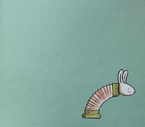
A soft green case holds the edge against a white cover. Opened, we see the single image of the bunny toy with its sproinging neck. Bending to the right, urging us inside the book. Perfection! This case makes us smile. And that, in the end, may be the most important thing about cases.

This might be THE most delightful post ever!!
Eye opening essay! I have several of Elisha’s book so I got them all out – I thought I’d noticed all the little surprises but I hadn’t! And the other books are just stunning. What love and care and delightful detail have gone into their creation! What a lovely read this was today! Thank you!
A lovely article! I love Elisha’s celebration of these hidden treasures in books. I feel the same way about end pages. Many publishers leave them blank or use a solid color, but I’ve always enjoyed exploring what I could do in my own books with these valuable pieces of real estate. In “So Few of Me” the first end pages show a very long “To Do” list on lined paper with a harried lad super-imposed. The end of the book’s end pages show the same fellow napping blissfully on a page of blue lines… not a “To Do” in sight. Take a peek at your collection of books and see what extra delights await you.