If You Want to See Some Linoleum Blocks …
 May 7th, 2013 by jules
(Click to enlarge)
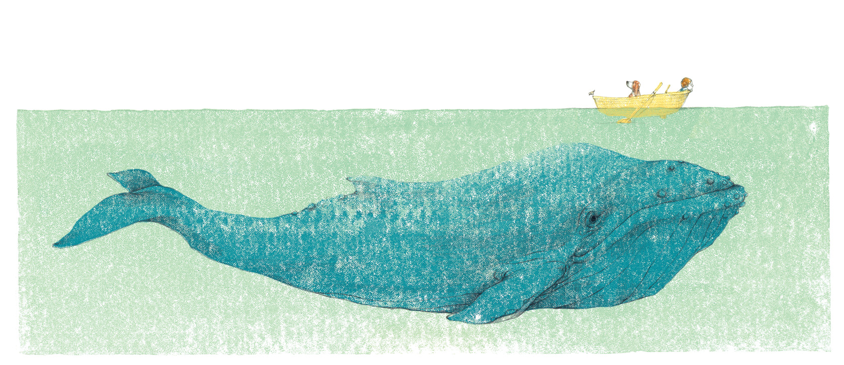
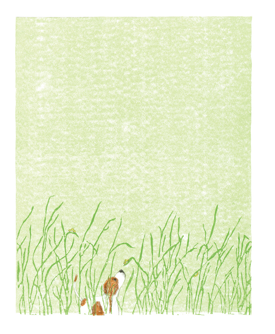
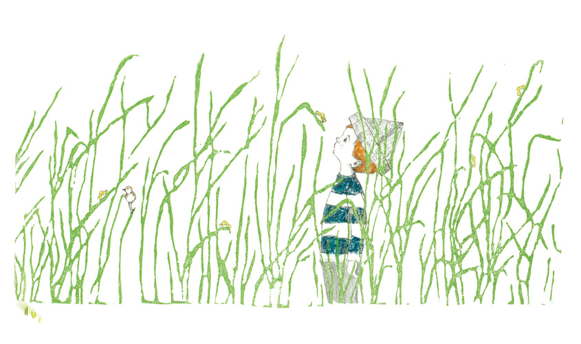
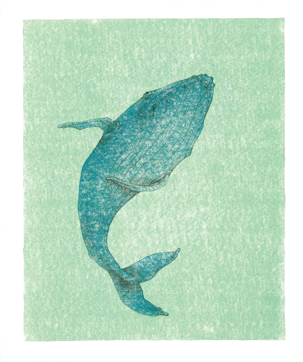
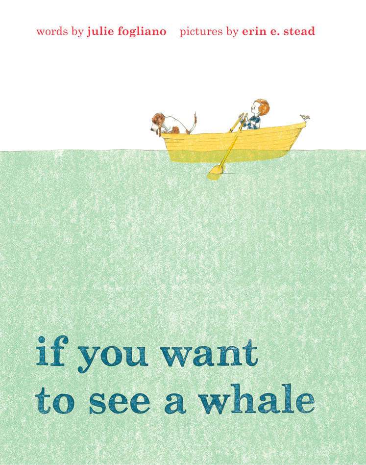
Pictured directly above is the illustration, as I mentioned in my BookPage review, in Julie Fogliano’s if you want to see a whale (Neal Porter/Roaring Brook Press), illustrated by Erin E. Stead, that took my breath away when I turned the page and first saw it. You should do yourself a favor today, if you’ll allow me to make the suggestion, and click on that image to embiggen it. And just soak it in for a while. Boy howdy and howdy boy, do I love that spread.
Above that are some images that show how Erin Stead got from point A (or somewhere near it) to point B.
Last week, I linked here at 7-Imp to my BookPage review of this book, and I thought it’d be fun to follow up here at 7-Imp with some art from the book. Then Erin sent some sketches, too, and some images of what her process was like in creating these beautiful illustrations (linoleum blocks and pencil, as you’ll read below). I thank her for taking the time to share.
She sent these just yesterday, and I thought I’d post them soon; given a busier-than-normal schedule this week, I figured I’d be lucky to post them this week at all. But I just read that today is the book’s big release day, so I decided to drop what I was doing and post this now. (You might think, if I didn’t admit these things, I were actually organized.)
If you read my review, you know I love this book. It’s a whisper to a friend, a book you should step away from a busy schedule to read and savor, and a beautiful thing to share with a child.
Here’s Erin …
Erin: Julie wrote if you want to see a whale while she was vacationing with her family in Maine a few summers ago. If I remember correctly, she wasn’t sure it could be a picture book, which is also what she thought of the first book we made together, and then it’s spring. It’s a feeling that I didn’t agree with, and neither did our editor, Neal Porter. She does tend to write about things that aren’t there. (In spring, there is no Spring to illustrate most of the time, and in whale … well, there really isn’t a whale for quite a while). As someone who makes pictures, drawing the absence of something poses a problem. But her writing is such a delicate and open problem to solve that it’s a satisfying challenge. Most of the time.
There are days when I don’t feel like I’ve got it.
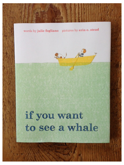
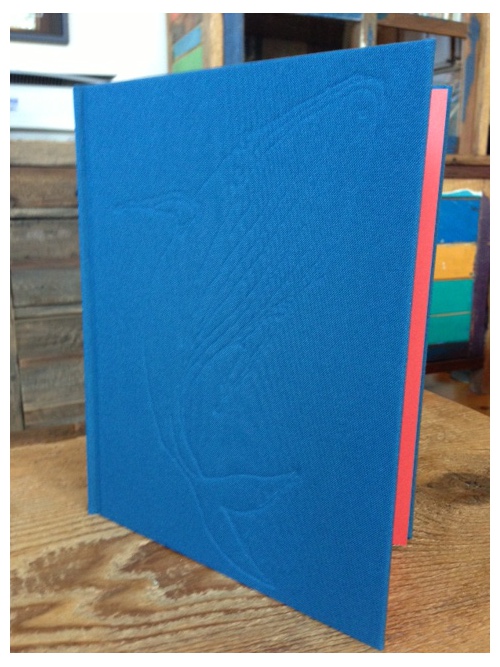
But in the end there is a book and it has a cloth binding dyed to a custom color, and it is a this-book-is-my-very-own-secret trim size. The book comes out this month, and I am customarily nervous.
I started this book very slowly. I thought it was important to scale the setting back as much as possible, so the pictures could be in an imaginary, abstracted space. The drawings for this text had to be very open — to me, that is. (If someone else illustrated this book, maybe not. Julie’s texts tend to have no characters or setting, so I get to invent it.) I got some help from Phil (my husband and often co-author, who is also an illustrator), who helped me design much of the book. Most of the conversations we had were about finding the proper balance between drawing something specific and leaving something out. Pacing Julie’s text also takes some thought. When I receive the writing, it’s the poem as she wrote it. I have to find the page breaks and respect the pace. It takes a lot of reading. Luckily, she is an awfully good writer.
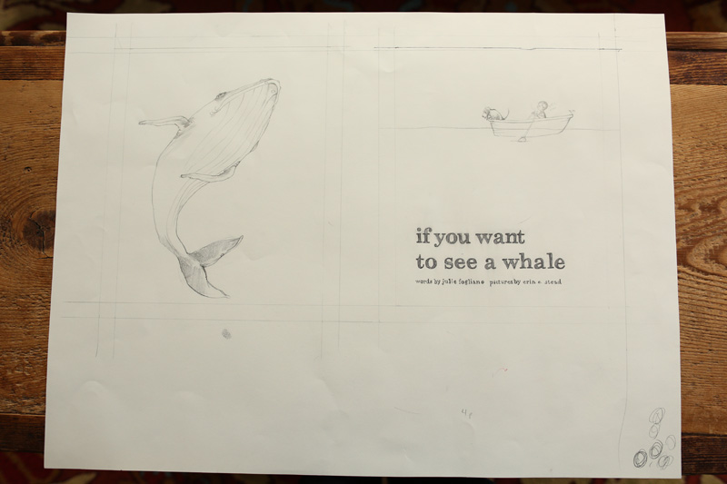
Here are some pictures of the sketches, process, and final illustrations for if you want to see a whale. I made these pictures using linoleum blocks and pencil. It seems like a pretty simple jump after making spring in woodblock and pencil, and yet (!) it took a while to get there. I tried and failed with a few different processes first.
I start the whole process with a sketch.
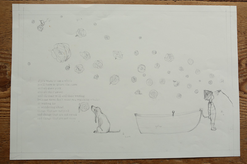
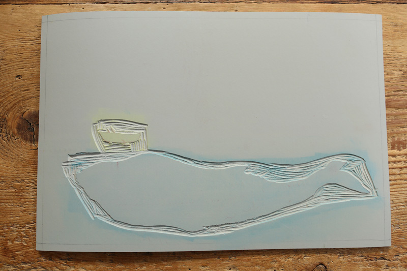
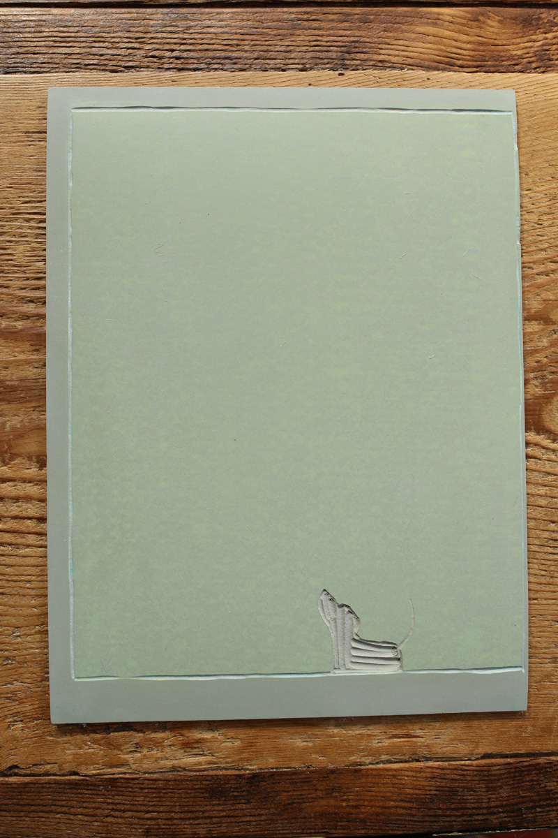
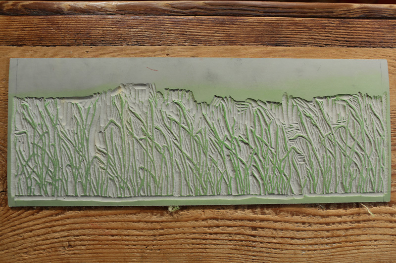
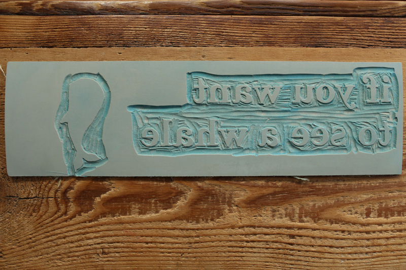
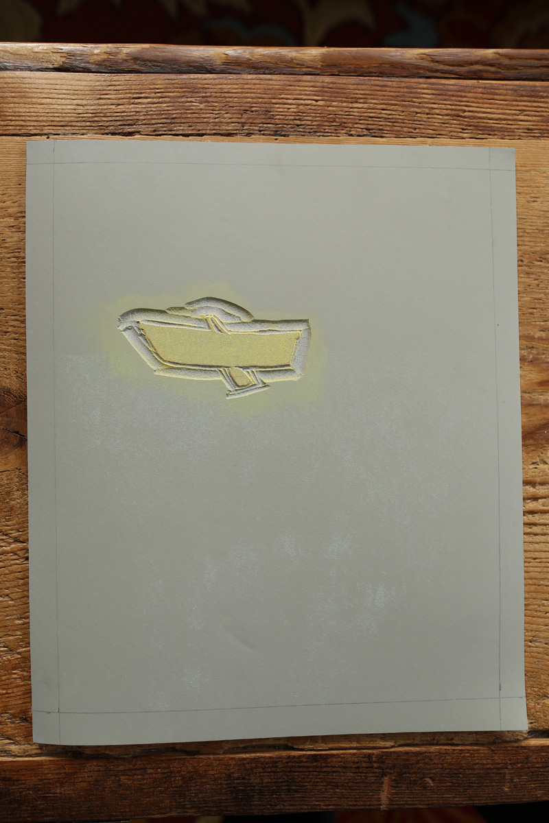
These are the linoleum blocks. I have to work backwards, which I often forget to do.

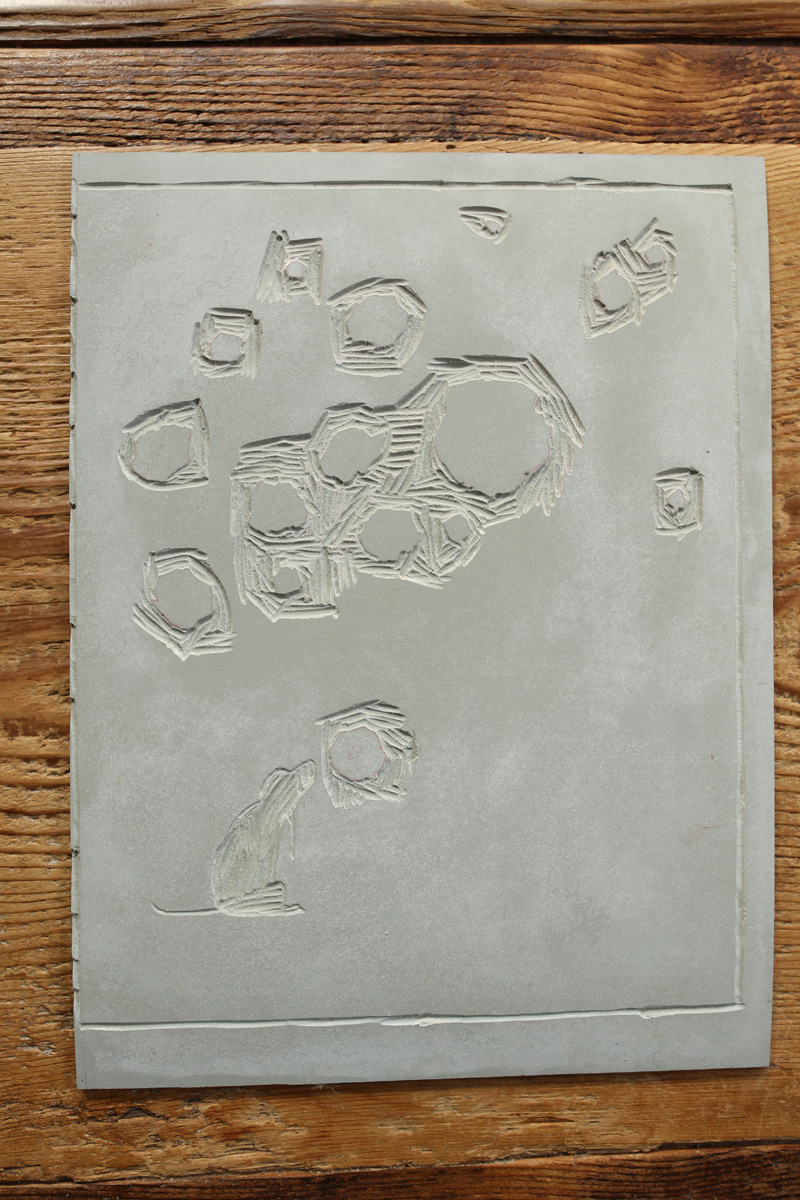
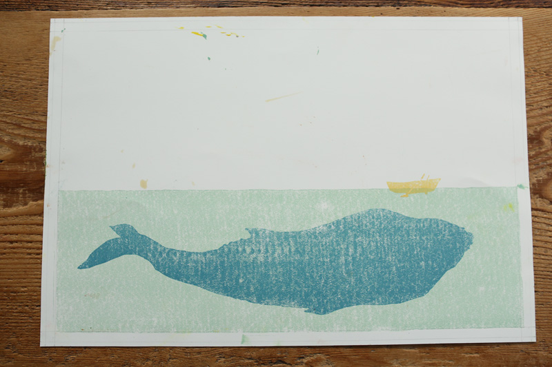
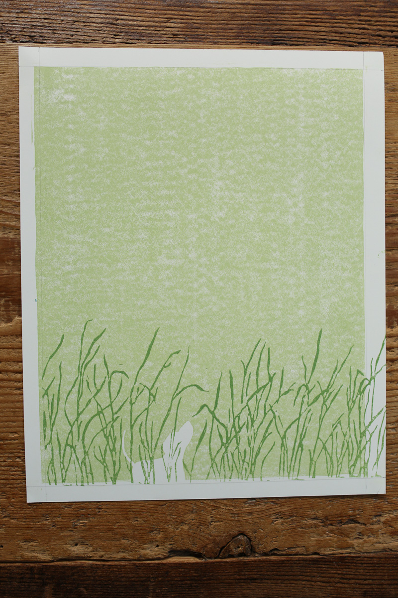
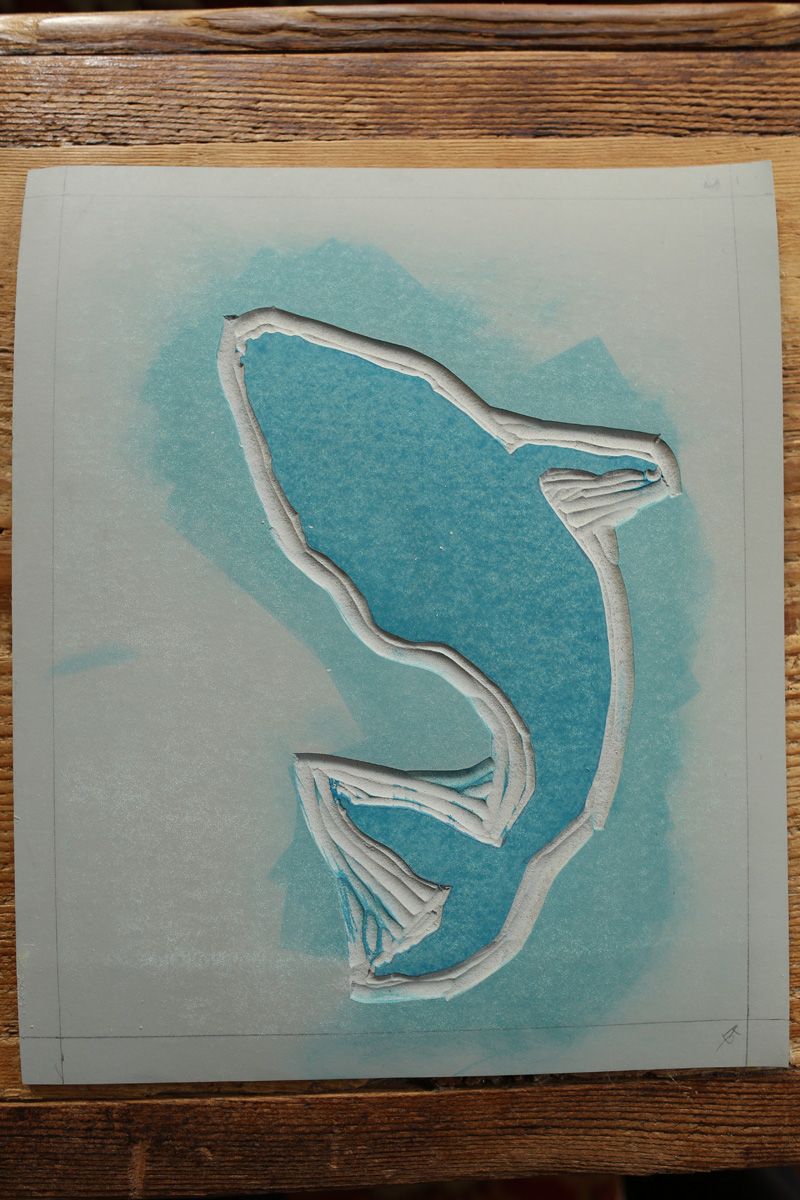
[The image directly below] is an example of what the print looks like before I draw on it. This is actually a print that didn’t make the cut. I tend to print a few times and then decide which one I am going to draw on after hemming and hawing a bit.
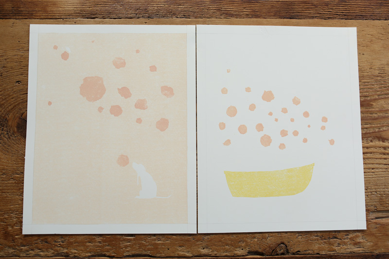

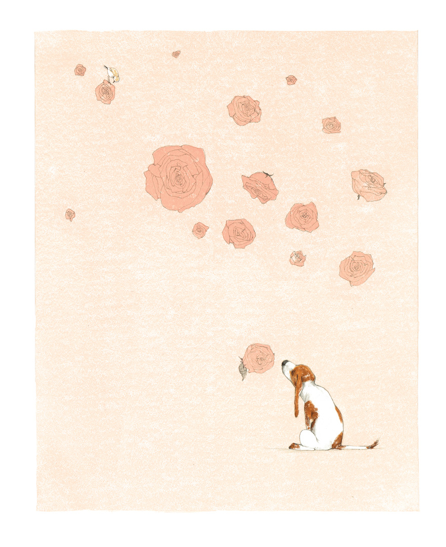
and things that are not sweet / and things that are not roses”
(Click to enlarge)

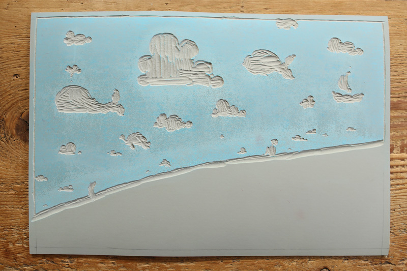
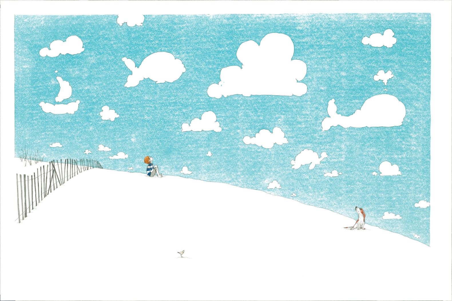
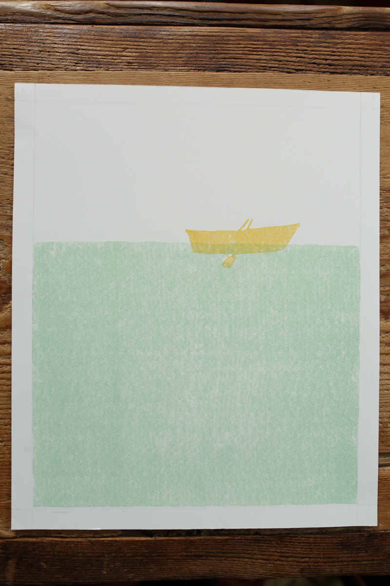
some hanging down / in the sky that’s spread out, side to side / or the certain sun that’s shining / because if you start to look straight up / you might just miss a whale”
(Click to enlarge)
You might notice [below] the grasses I sketched don’t match the grasses I carved. There are a couple of reasons for this. There is a design element in the book where the page on the left in a double page spread is a full color, but the page on the right has a white background. I wanted the grass to spill over to the right page, as though I made the picture as one big double-paged spread. So I had to cut the grass (ha!) separately on a long linoleum block. The grass also looks different from the sketch, because I cut it free hand. At the time, this seemed logical. But as I type this, what a terrible idea! I was working backwards and what if I made a mistake? Still, I know if I had to make the picture over again I would do the same thing. Artists aren’t exactly known for their responsible choices.

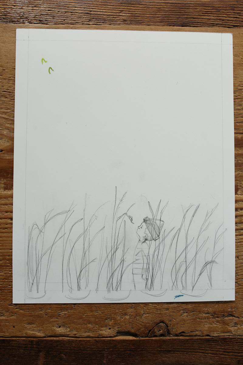
small and green / across the leaf, just nibble scoot / because things that are smaller than most things / can’t be as giant as a whale”
(Click to enlarge)
We moved the “words” and “pictures” line after the final art was made, because this version was too monochromatic.

That’s it! That’s some of the book. Thanks for letting me stop by!
IF YOU WANT TO SEE A WHALE. Text copyright © 2013 by Julie Fogliano. Illustrations copyright © 2013 by Erin E. Stead. Published by Neal Porter/Roaring Brook, New York. All images here reproduced by permission of Erin E. Stead.

Oh, *SWOON*.
YES. Want that.
How do they EVEN, with the linoleum blocks, and the x-acto knives, and the PATIENCE? how do they see backwards and color?
Man. Artists.
This is amazing. The book, the process, the imagination, the patience, that adorable little dog. Can’t wait to read it.
Tanita: You made me laugh outloud. You had me at the “how do they EVEN?” … That would be precisely my response.
I bet you all enjoy this book, once you see it.
Unbelievable…. makes me want to take a class and then give up ’cause I could never be that good… could I? Thanks for sharing!
Can’t wait to have this one in my hands.
So lovely…but it would be hard for my brain to work in reverse like that! Such a peaceful, pretty outcome.
Oh, I’ve been waiting for this one! I LOVE Erin’s process and how delicate and lovely her work is. My favorite thing in the world is how an illustrator’s personality is reflected in their art. Her work is quiet, and lovely, just as she’s seemed in her interviews. Thanks for sharing, Jules!
This is outrageously fantastic — thanks for sharing the process of this brilliance.
Erin’s art takes my breath away every time I see it.
heavy sigh…amazing.
(Speechless) Okay not quite…my heavenly days Erin is an incredible artist!
What lovely images. Thanks to Erin for sharing the process pictures.
Cutting linoleum has a bit of a learning curve but obviously worth it in this case.
Keep on rockin’
I adore seeing how Erin works. I really admire that she uses her hands (hooray!) and is so meticulous in planning the stages of her images. The results are breathtakingly beautiful. Inspiring! Refreshing! Just lovely! Thank you for this post.
How wonderful to be allowed to see so much of the process! Thank you!
Absolutely stunning. The patience to cut those delicate grasses… The whale has the expression of one who has seen it all.
I DO want to see a whale!
This is just mind boggling. And of course it is! But wow, the beautiful attention to the tiniest details, and I love the thought of how fragile and tender Erin is to Julie’s words. What a pair.
Add me to the list of people with boggled minds. I still feel like we (the world) are so special and loved because we got and then it’s spring, that I can’t even believe our luck that we get another book. And that that book….looks like this. (Never mind the fact that I am a Julie who lives in Maine, so there was that sudden dreamy 7-year-old moment of “Wait…are they talking about me? Is this book for ME?”)
this post just really nailed down how much hard work was put into this amazing book…all the thought, design, patience… totally breath- taking!
Wow.
I love seeing illustrations at different stages of the process. Thank you so much for sharing this!
Thank you so much for sharing all this information and art process. Just absolutely beautiful. I love Erin Stead’s work. Lovely and inspiring. It makes me want to run to my studio and sketch. Off I go….
[…] one at 7-Imp with Erin Stead showing some of her linoleum blocks from if you want to see a whale. (http://blaine.org/sevenimpossiblethings/?p=2562) […]
Thankyou for shareing. This is soo beautifil and i cant wait to buy the book. I love seeing how it was made and as i use alot of collage it is wonderful to see what other illustrators use! Thankyou again you are both wonderful!!!! Xxxlisa
A fascinating, inspiring post as usual. Love that elegant whale!
Beautiful. Breathtaking. A thank you to Erin Stead for sharing her creative process – both the actual design and the thought behind it! I have to add that it was the interview here on Seven Impossible Things with Erin demonstrating her process for A Sick Day for Amos McGee that got me thinking about drawing on top of monoprints – thanks so very for the inspiration!
[…] read recently include: Journey by Aaron Becker; Ol’ Mama Squirrel by David Ezra Stein; if you want to see a whale by Julie Fogliano and illustrated by Erin Stead; Bink & Gollie: Best Friends Forever by Kate […]
[…] Stead’s art— composed of whisper thin lines, fervently detailed and ever so delicate—invites the reader to study each spread. Color, at once saturated and transparent, is used sparingly. Stead’s incredibly involved process of creating the art can be viewed here. […]
[…] with her characters and fills them with a single flat tone of color, simple yet effective. Her approach is rather interesting, usually using woodblocks and linoleum blocks to carve the shapes for the […]